BoardMobile app
StatusBacklog
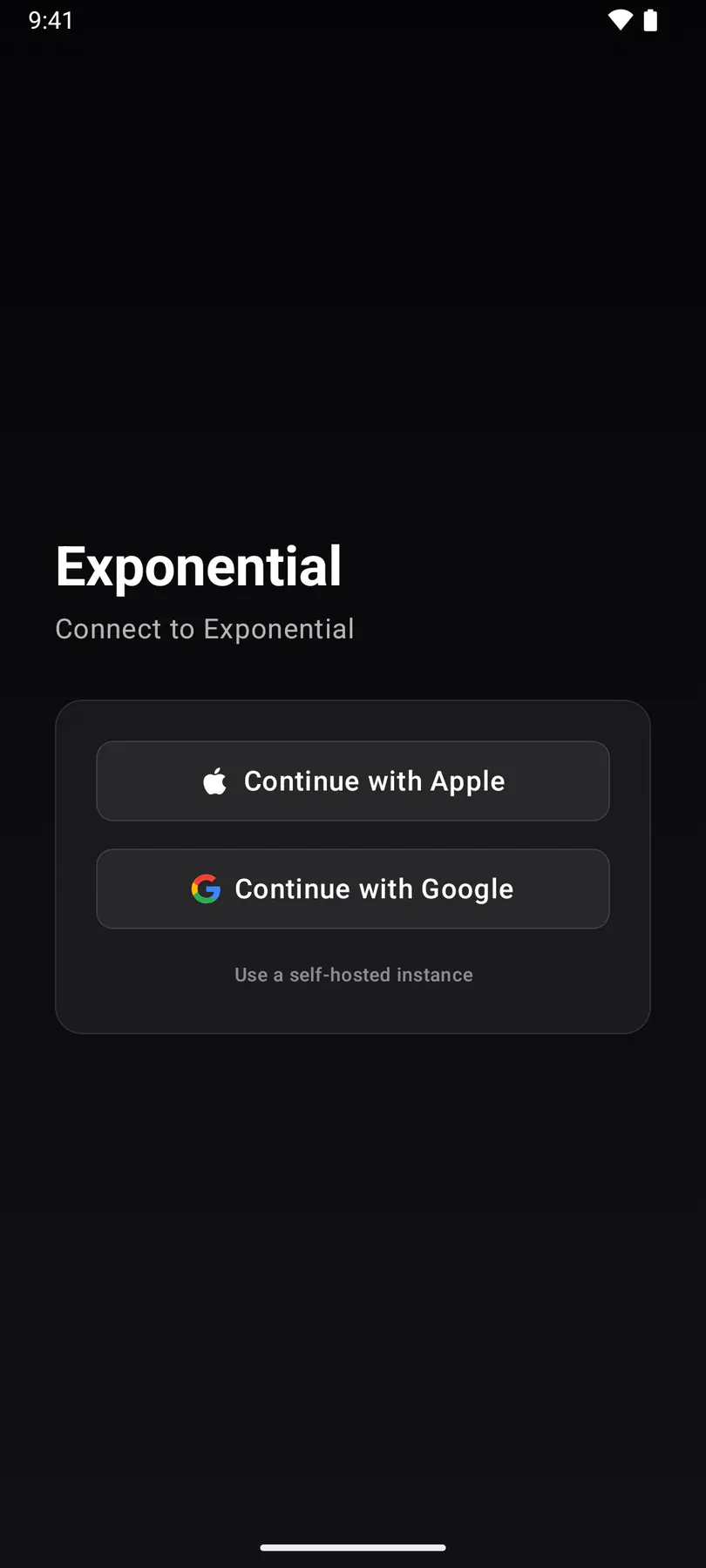
sign-inThe one pre-team surface every client shares: one Continue list with the OIDC providers the instance advertises, email and passkey.
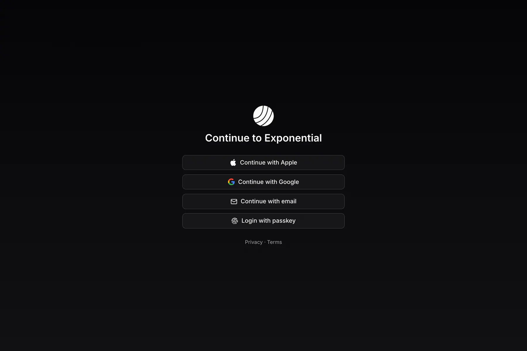
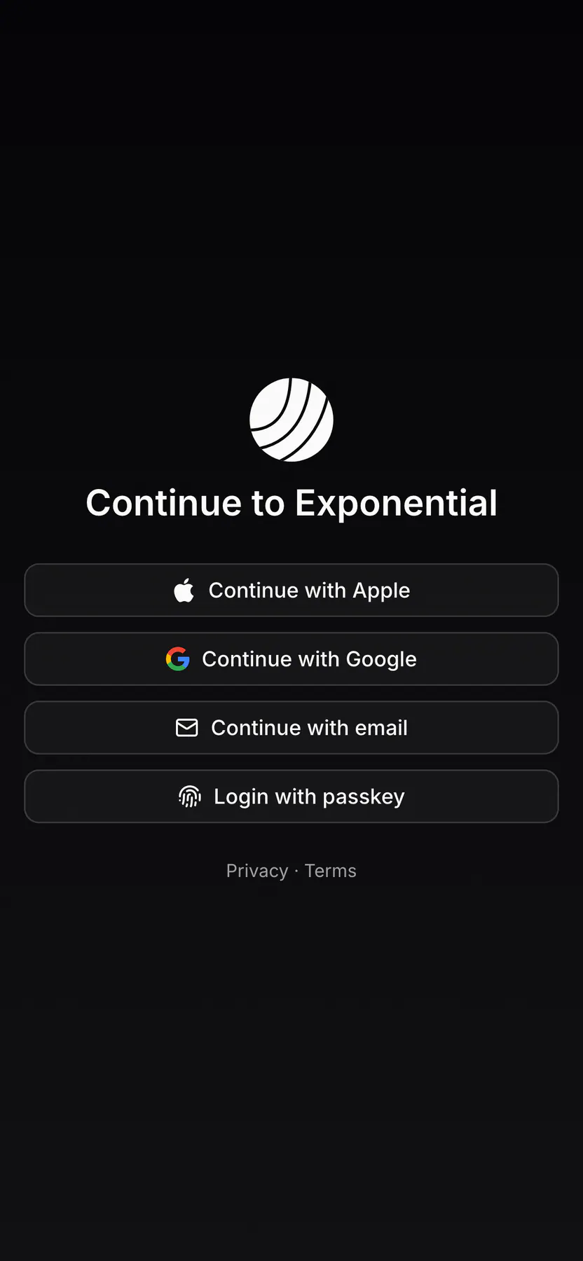
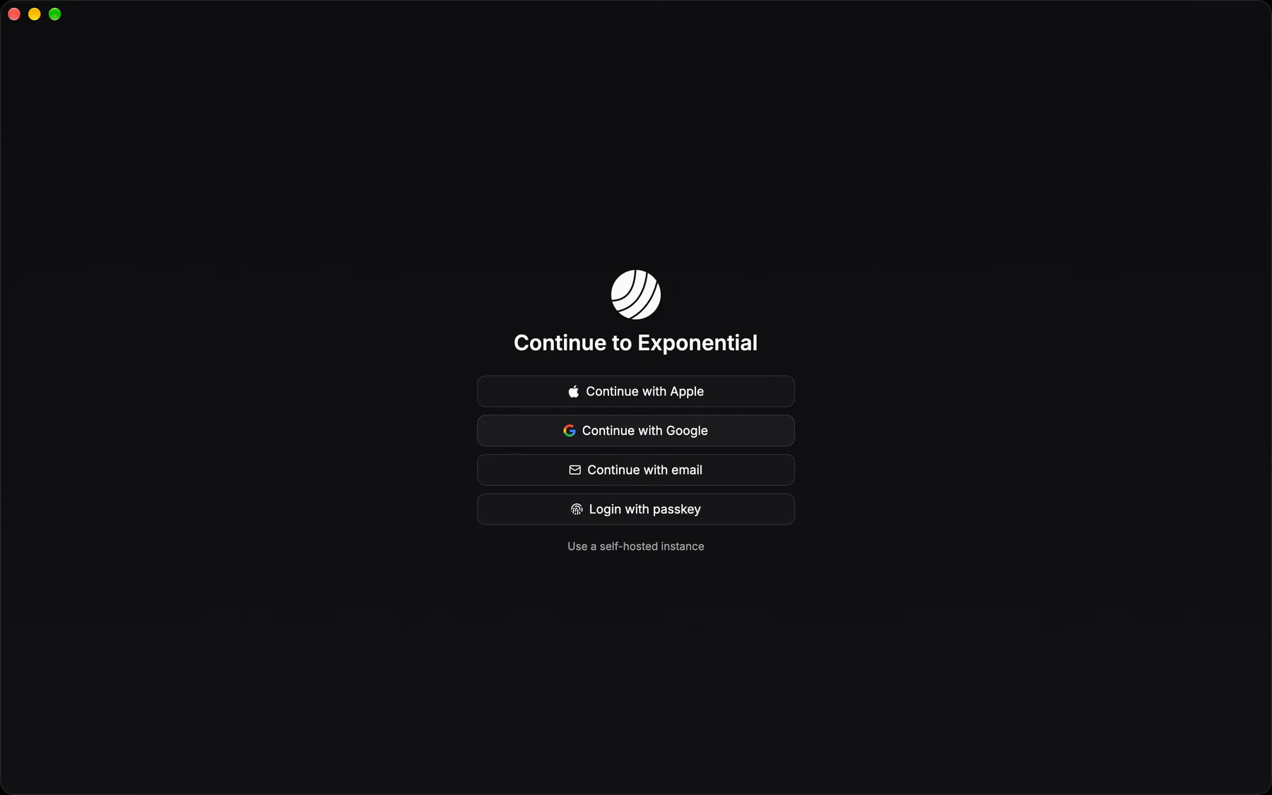
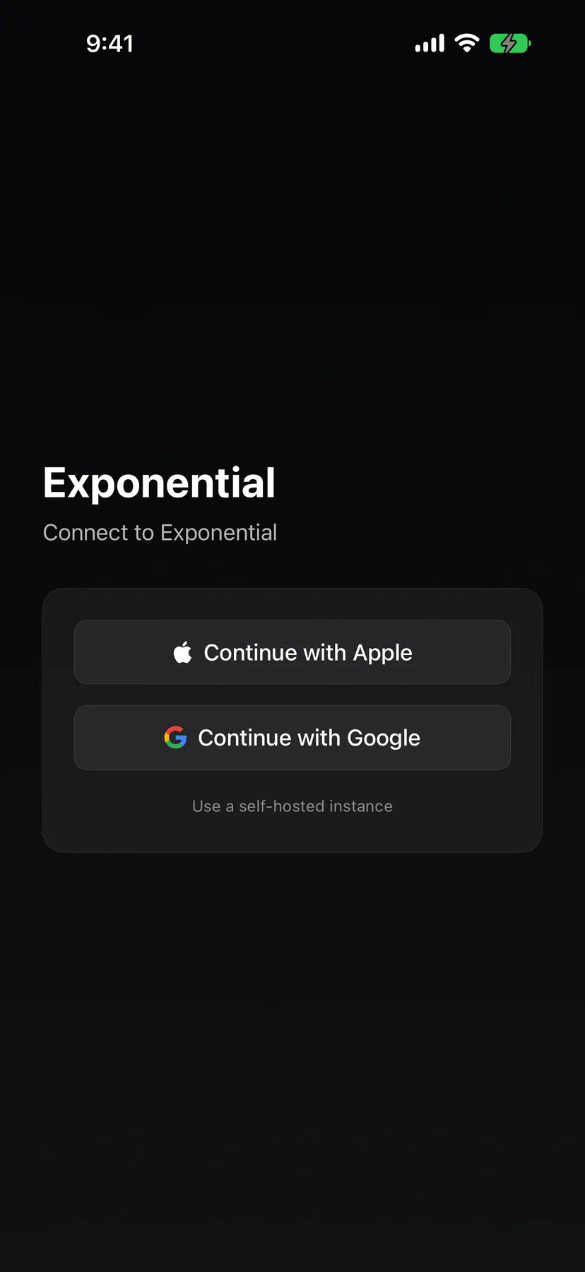
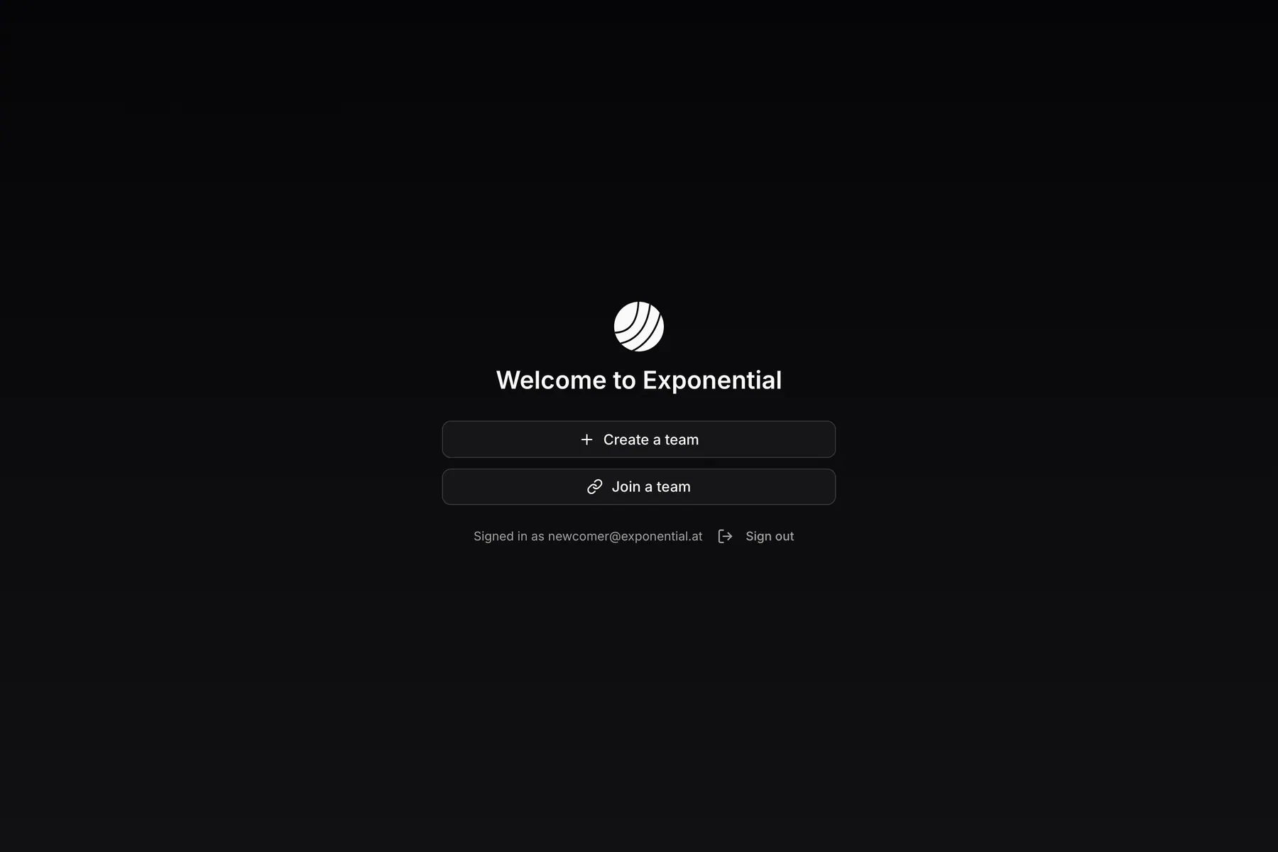
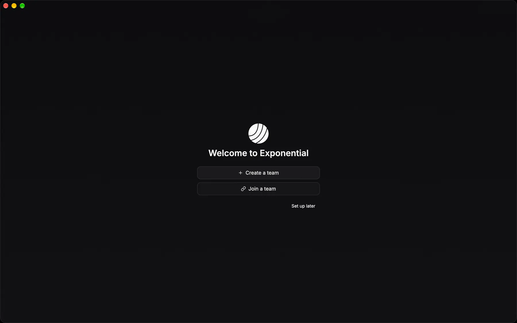
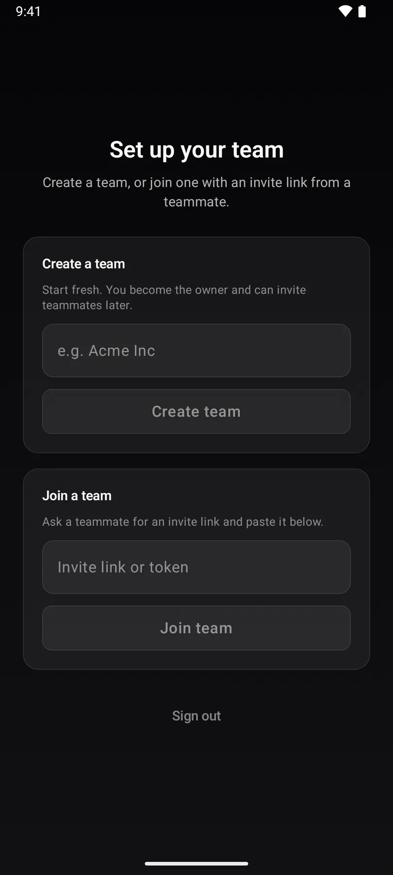
onboardingCreate-or-join: the choice card every signup lands on before it has a team.

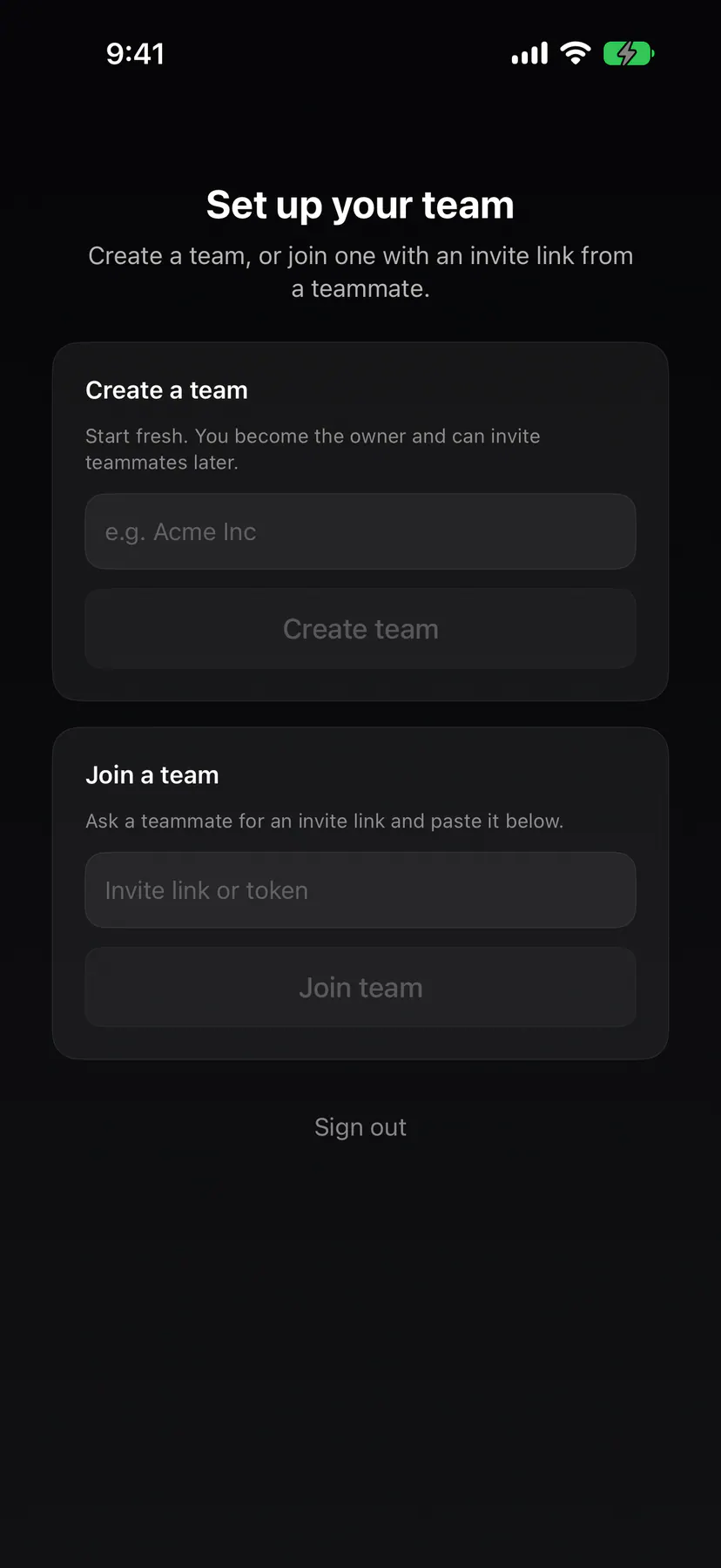
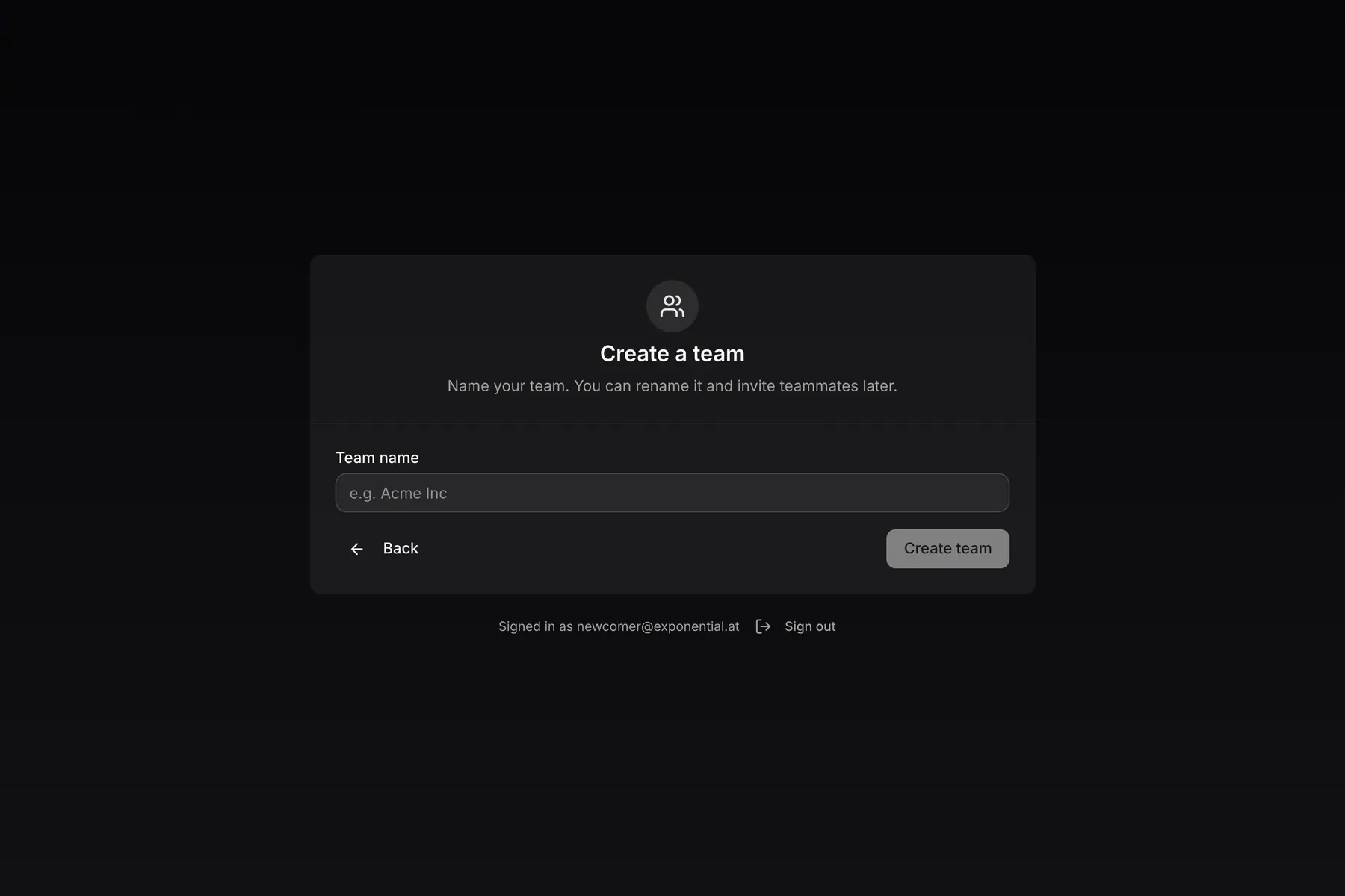
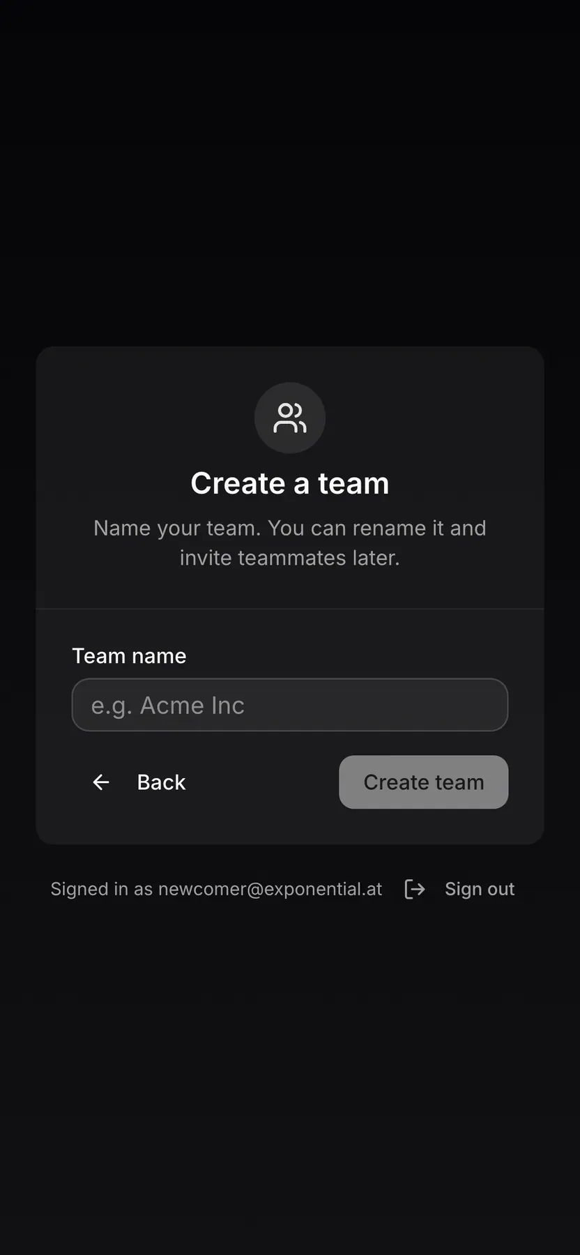
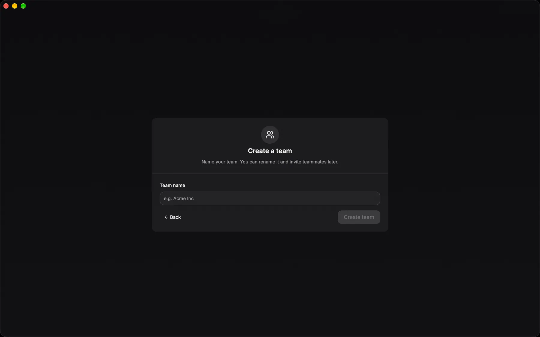
onboarding-create-teamName the team you will own: the wizard’s create branch on web and desktop, the sheet behind the board switcher’s New team row on the phones.
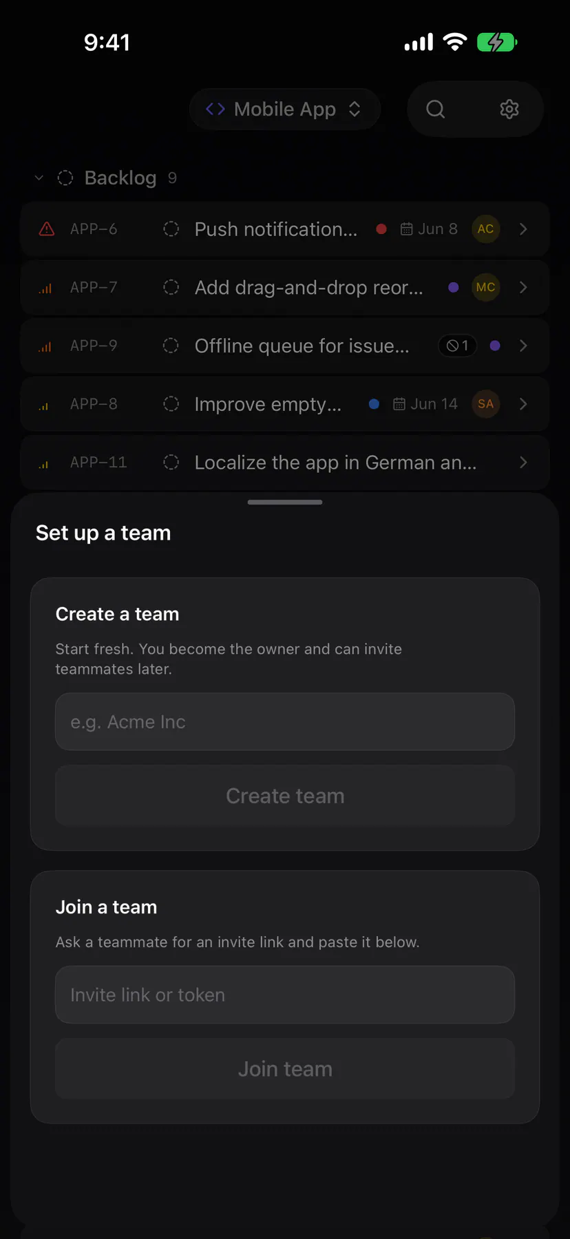
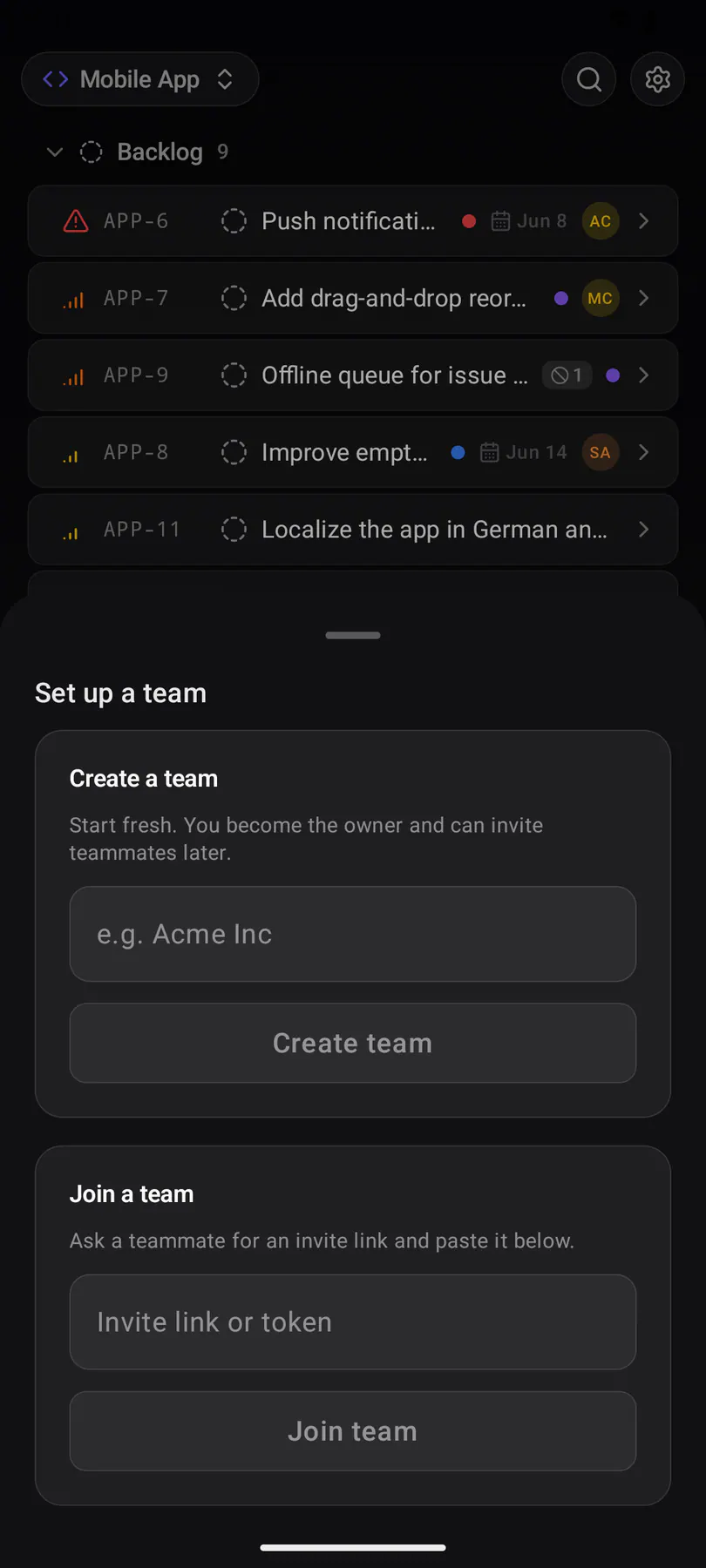
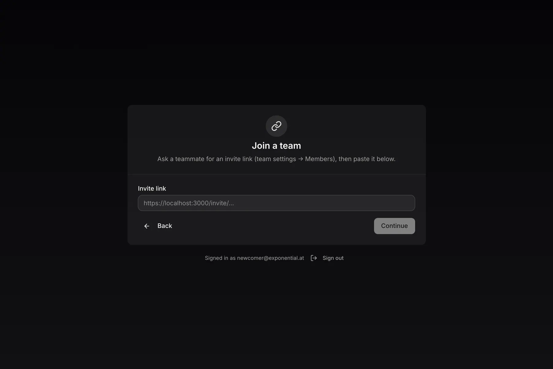
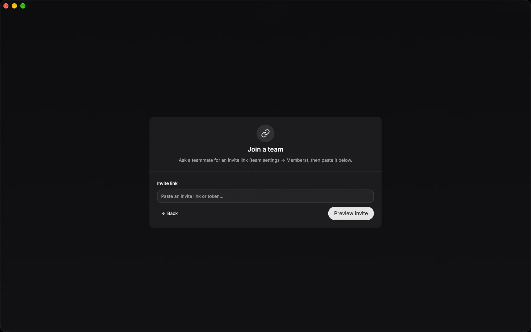
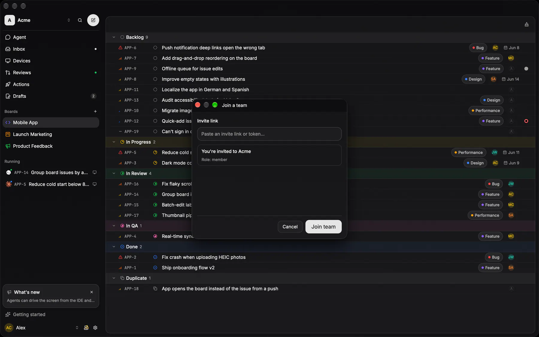
onboarding-joinThe wizard’s other branch: paste the invite link a teammate sent you.

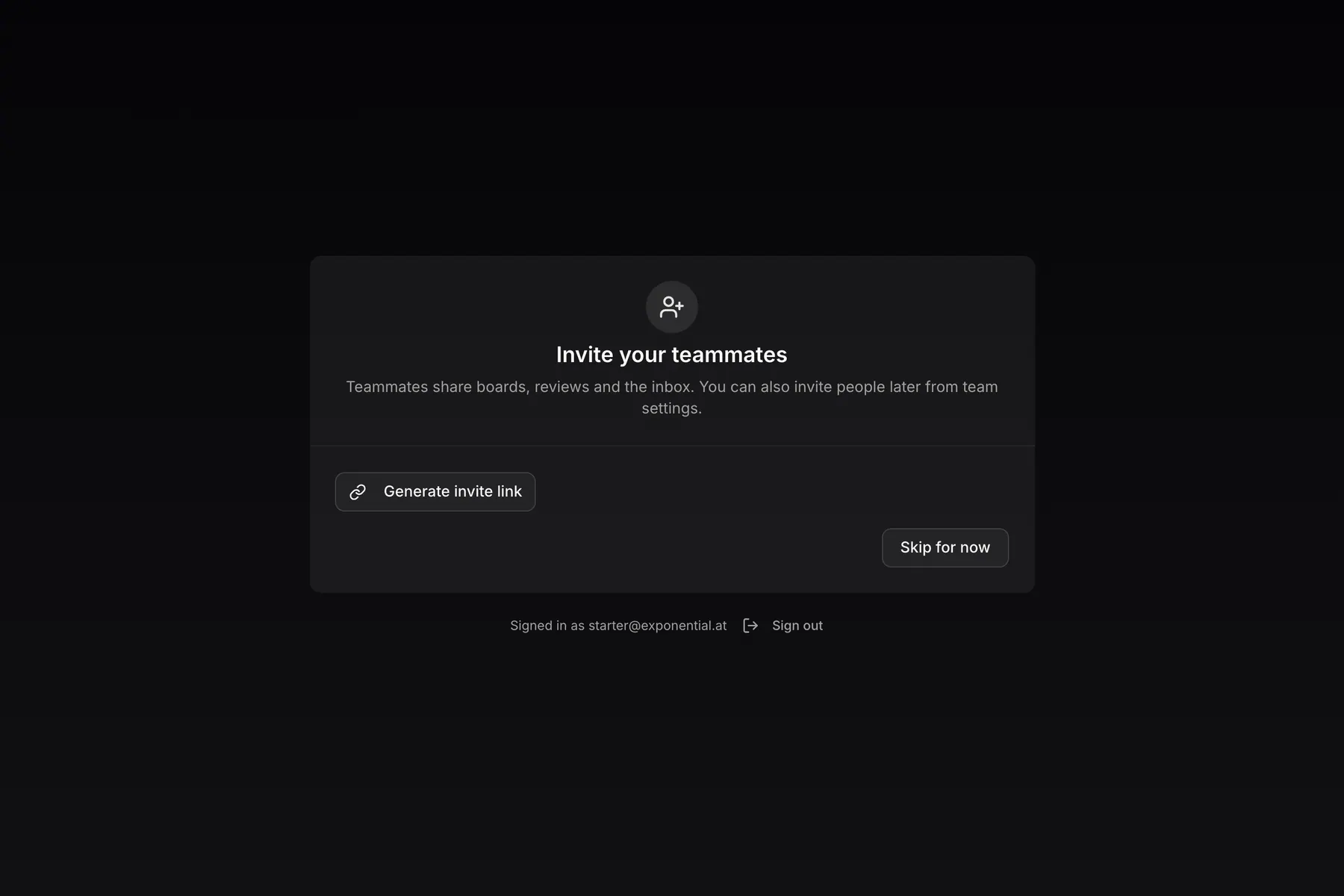
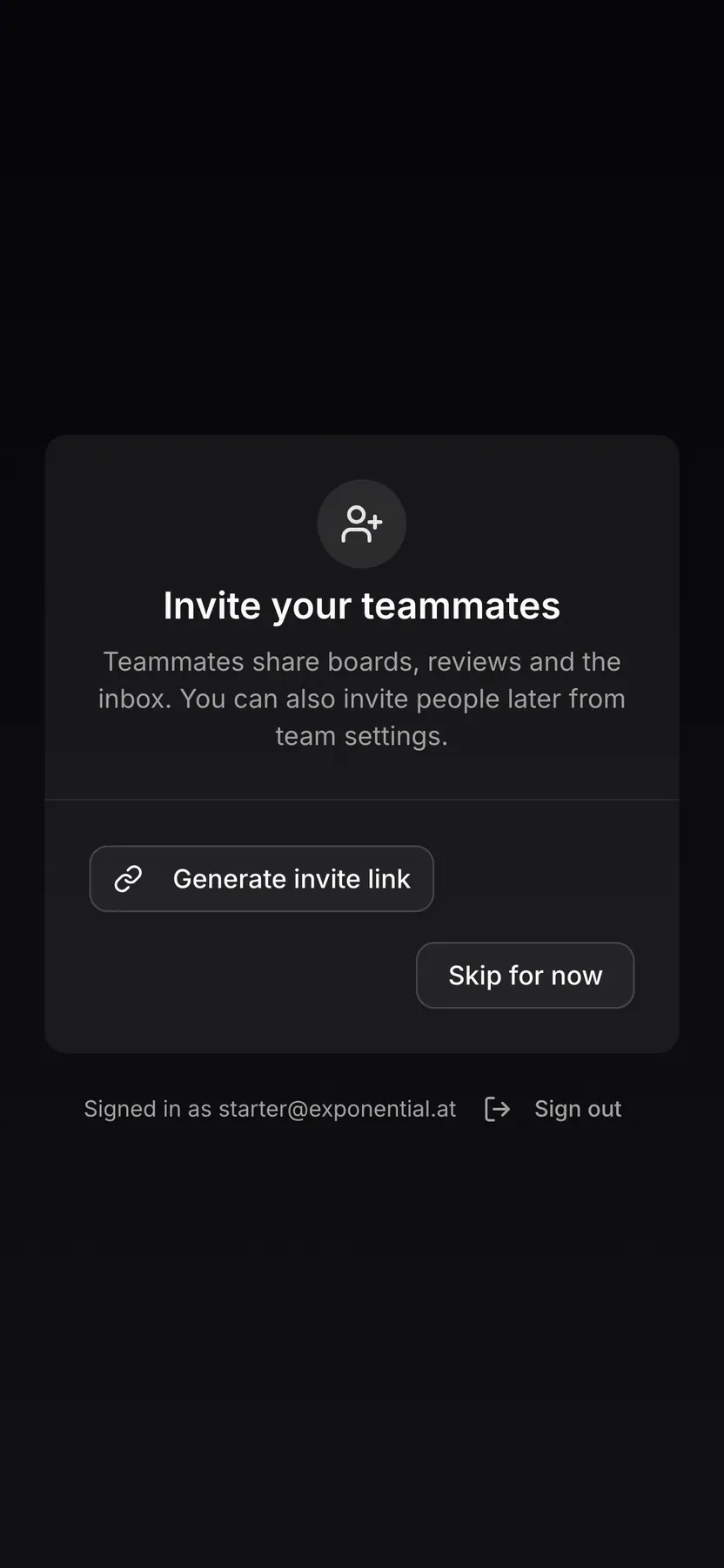
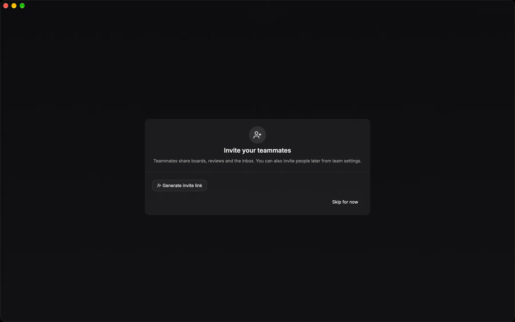
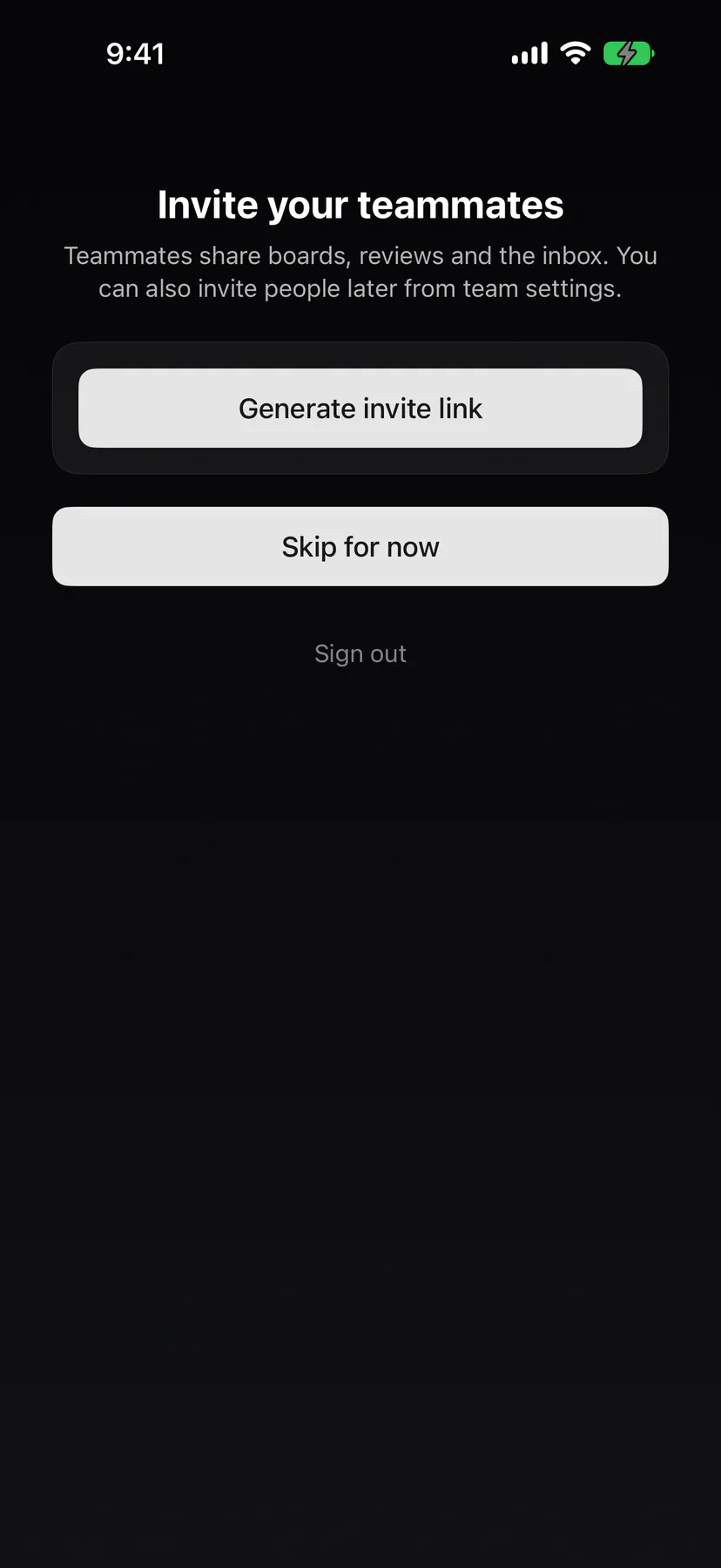
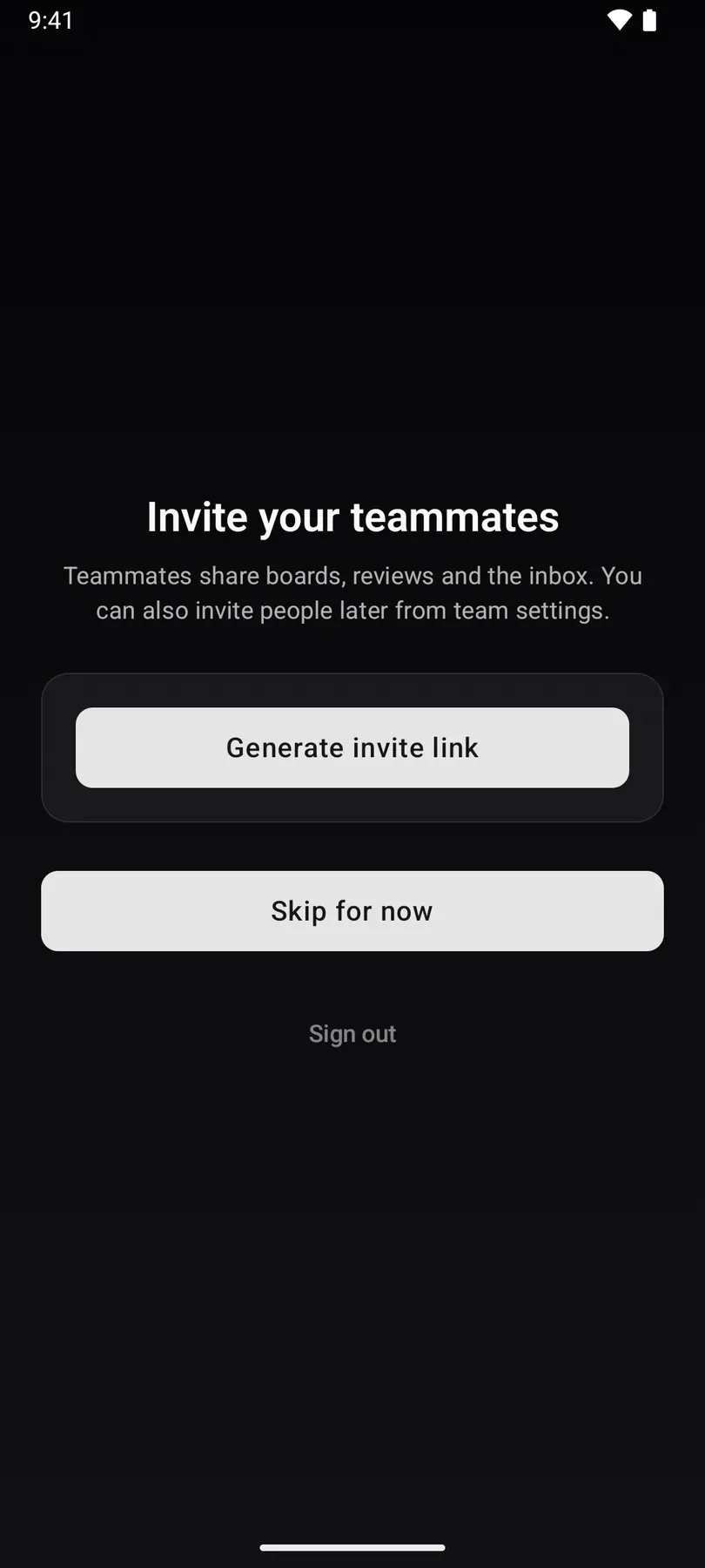
onboarding-inviteStep 3 of the first-run wizard, right after the first board: mint an invite link to share, or skip. The phones show the control only while the team has free seats.
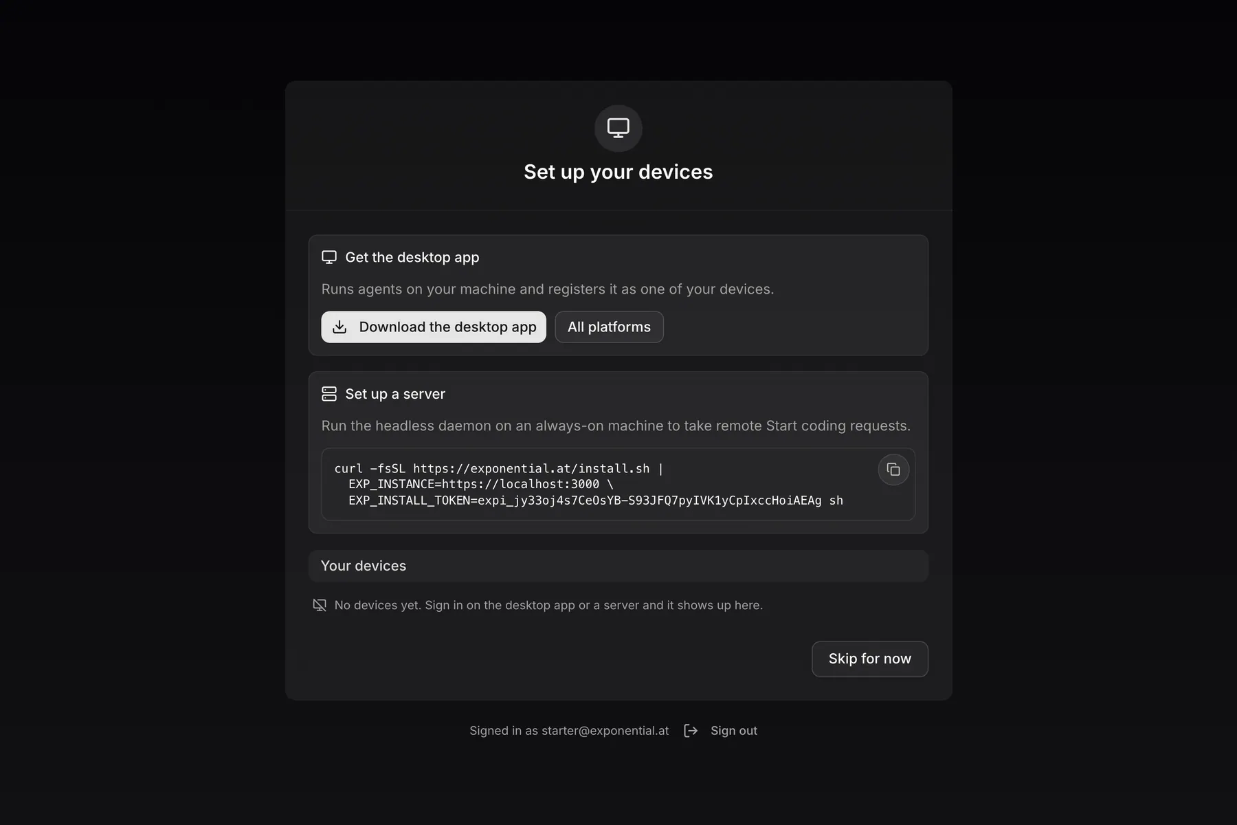
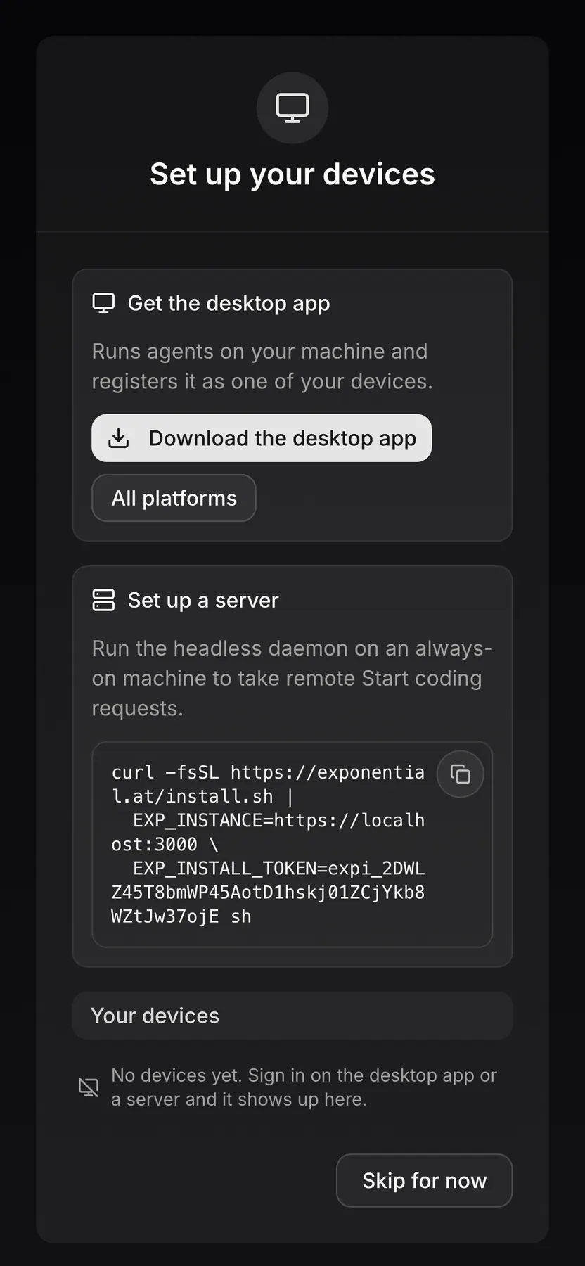
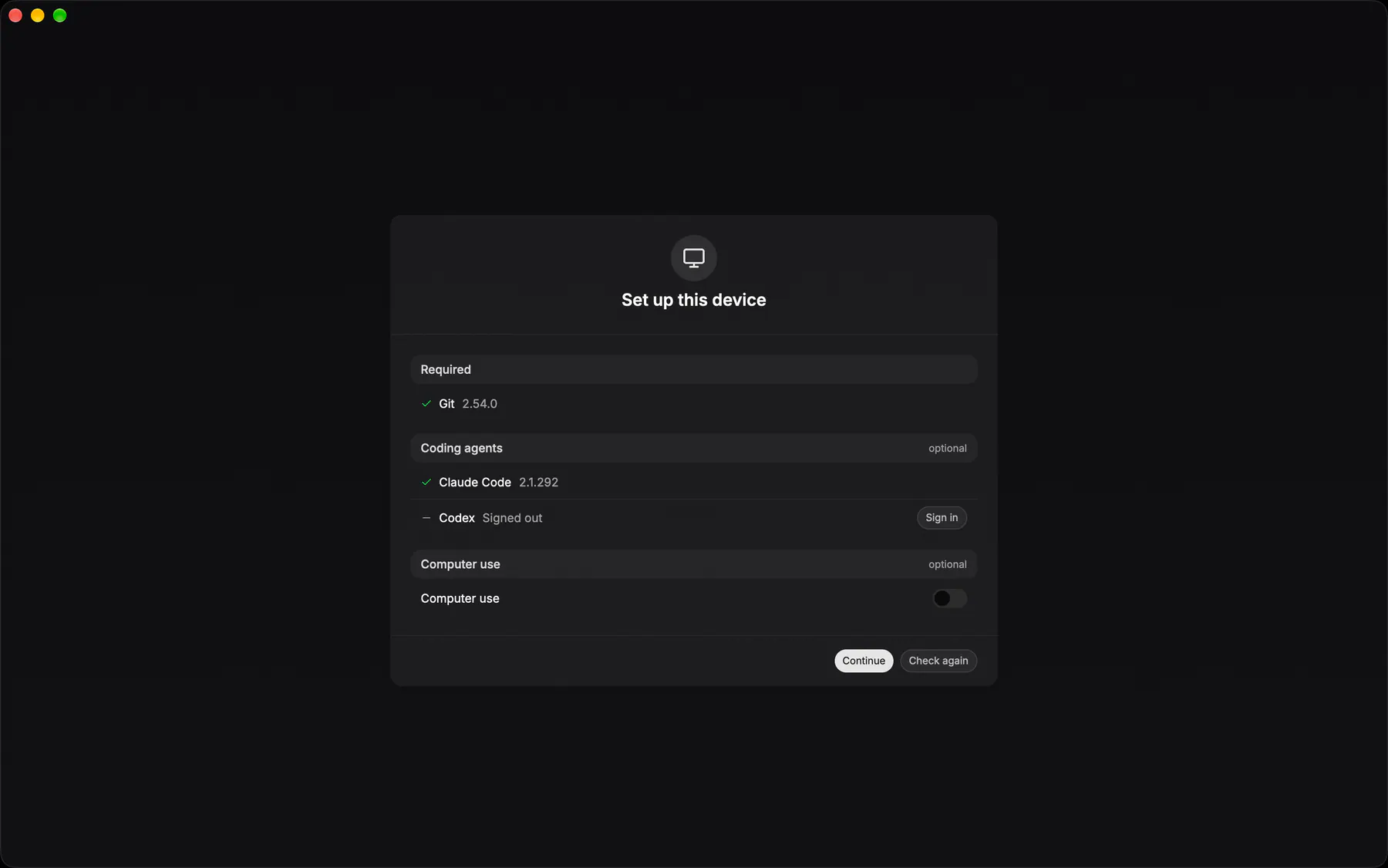
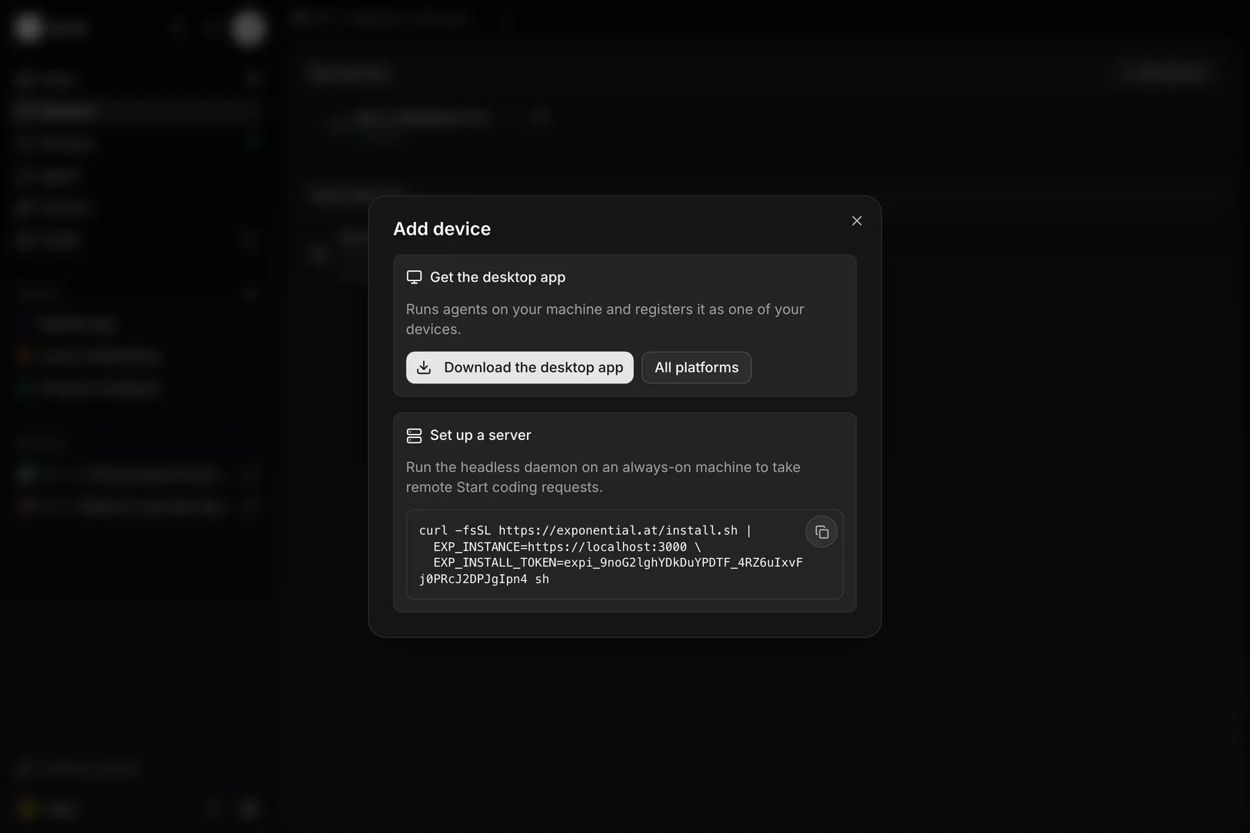
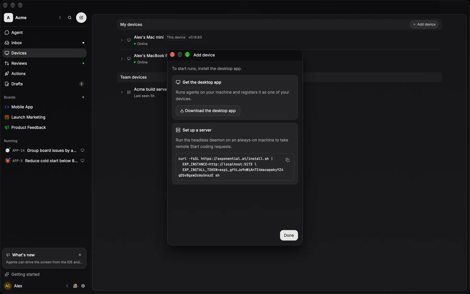
onboarding-devicesThe last wizard step, and the one step an invited teammate with no device gets after accepting: get the desktop app, copy the server install command and sign the agents in on the machines that show up. Skippable; the checklist keeps whatever was skipped.
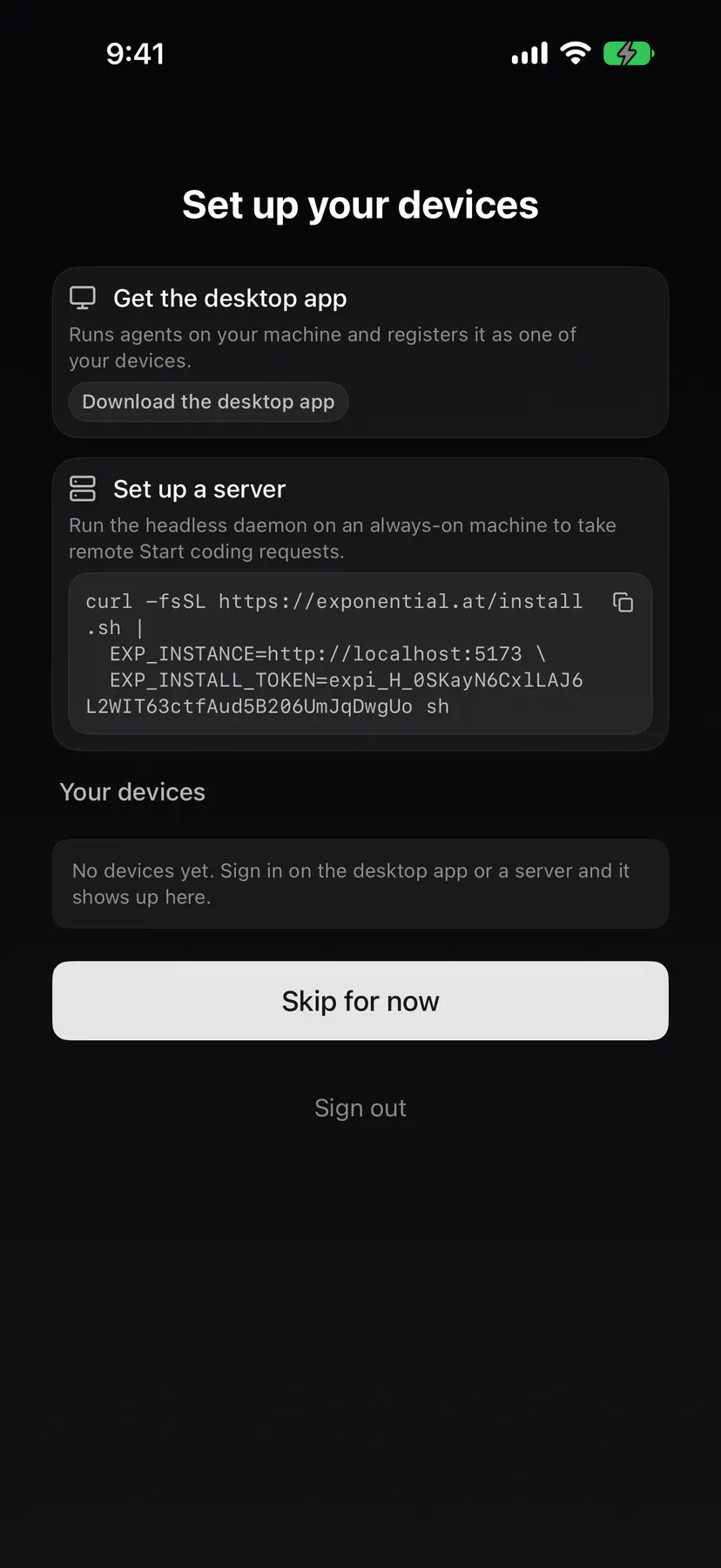
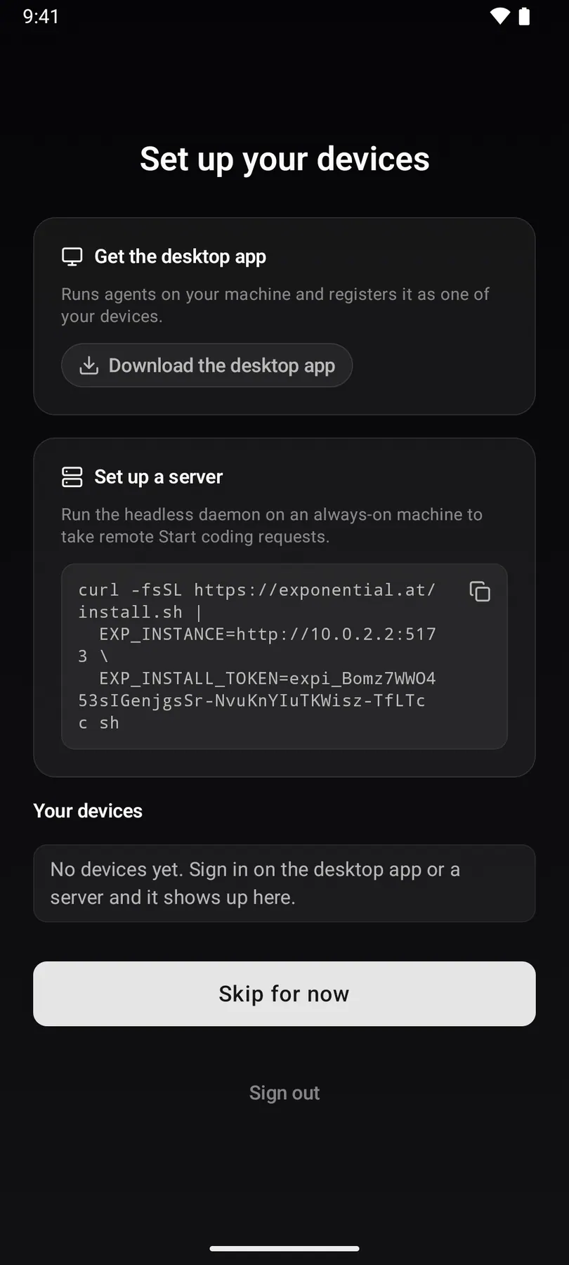
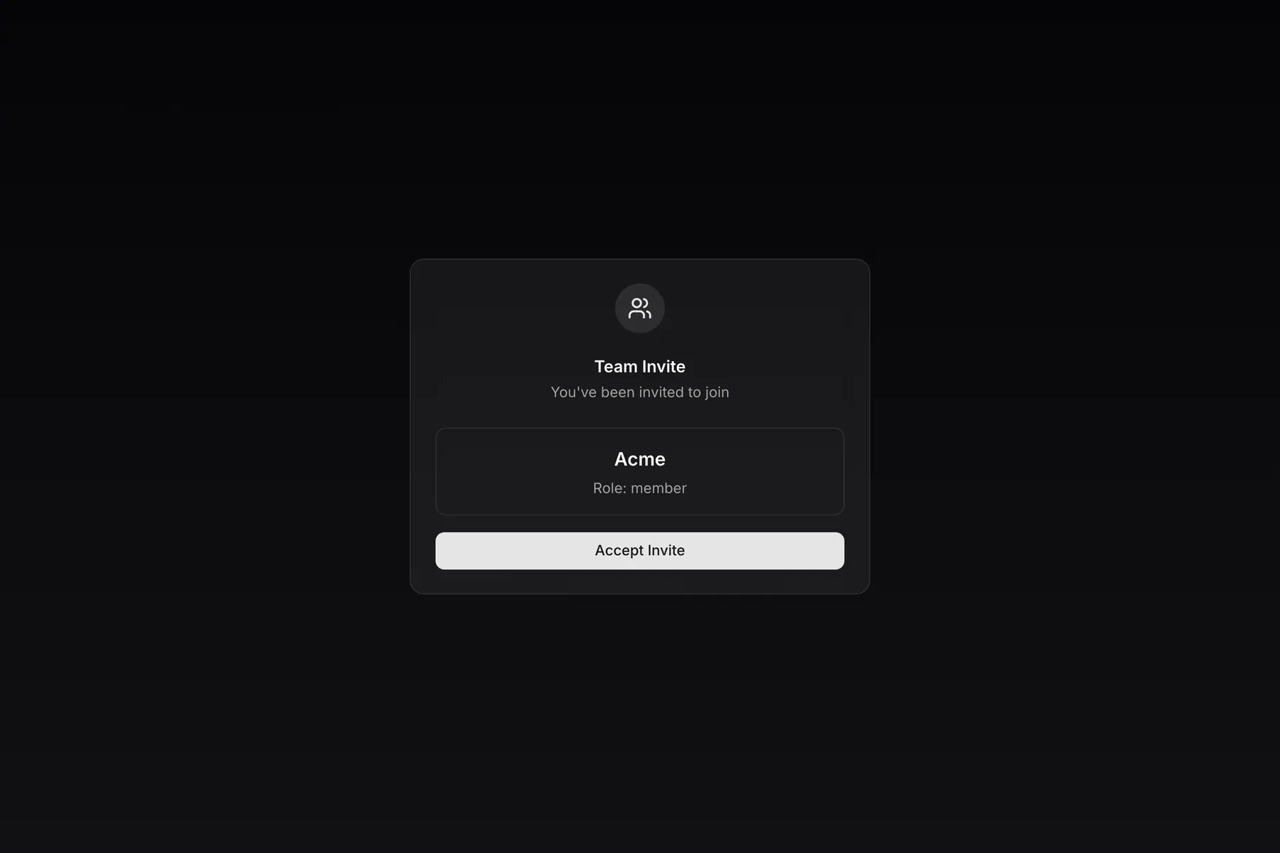
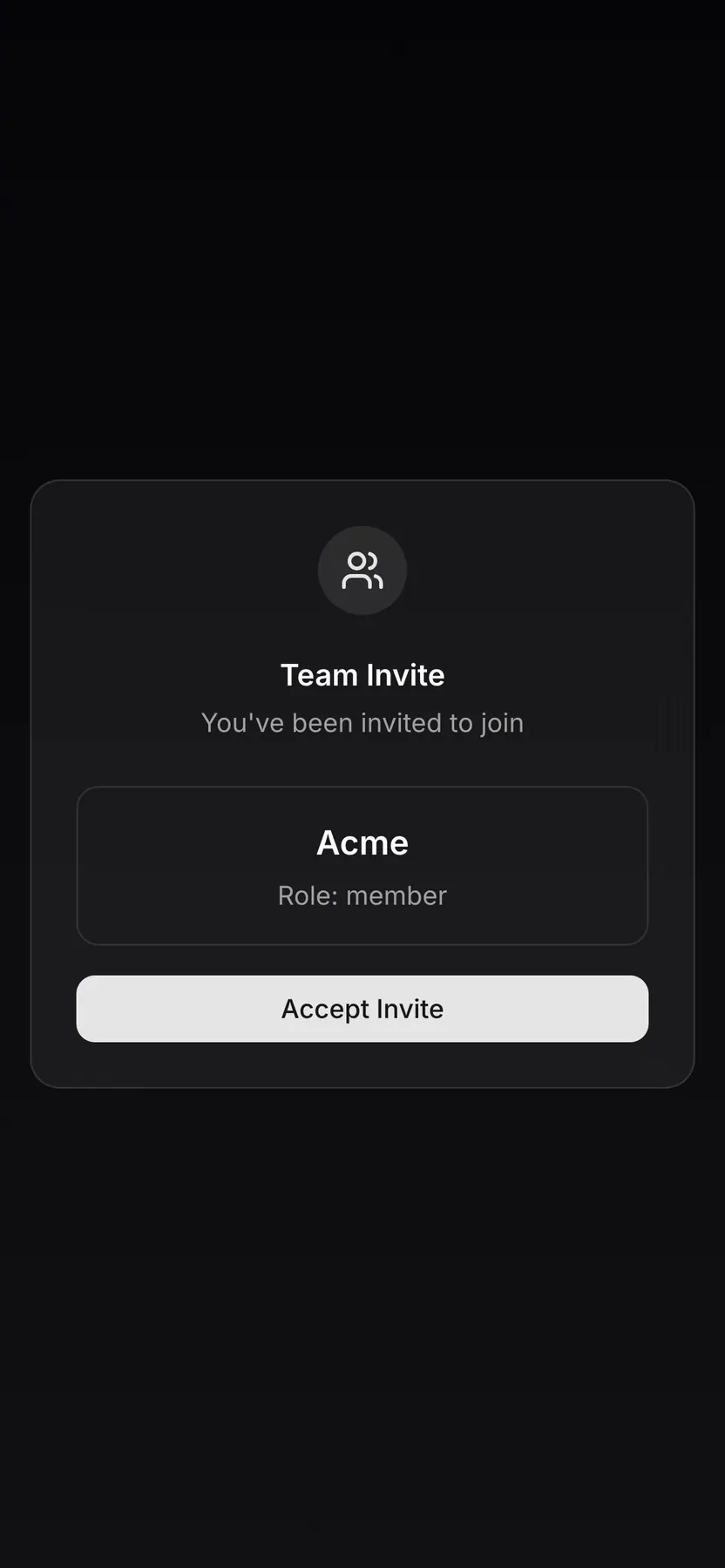
invite-acceptThe landing page a teammate opens from an invite link, with the team they were invited to and the accept button.
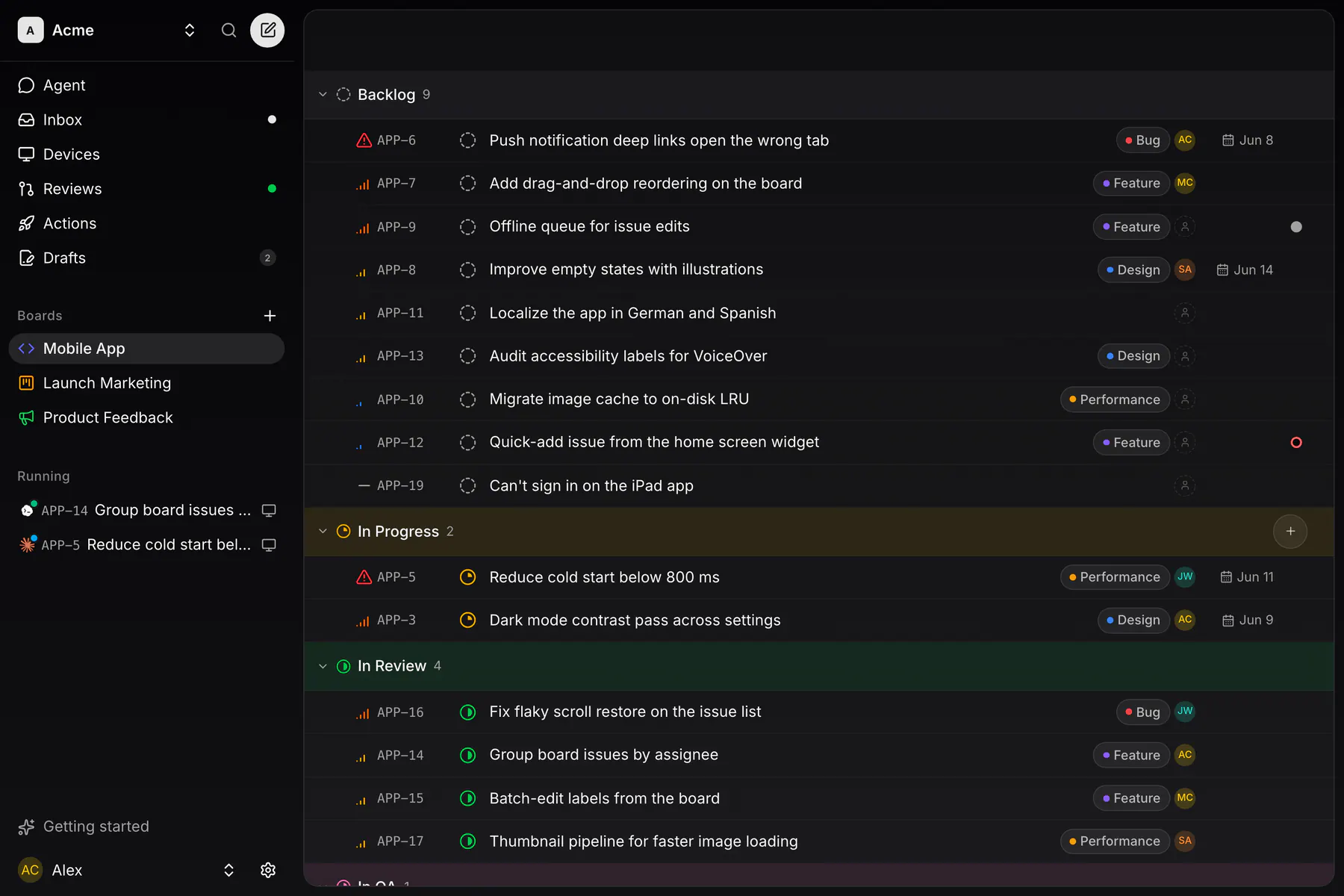
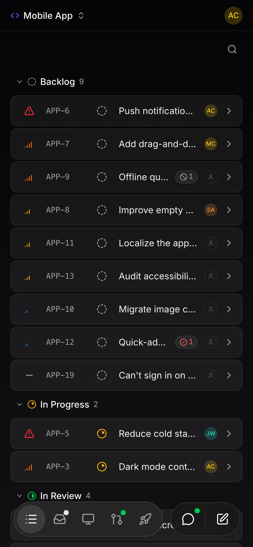
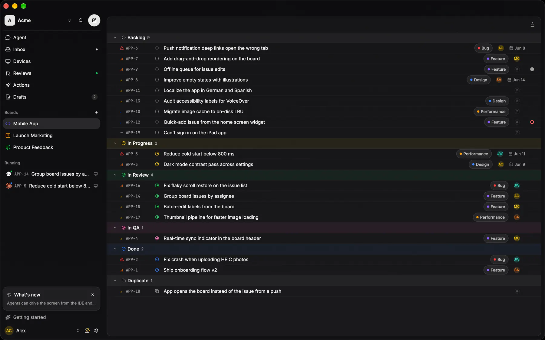
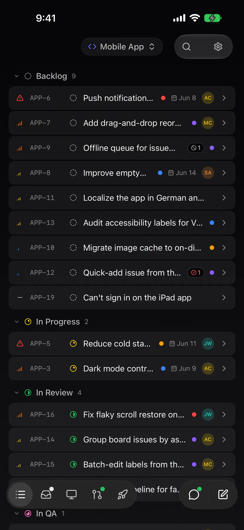
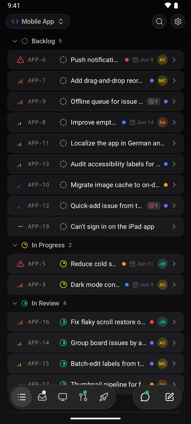
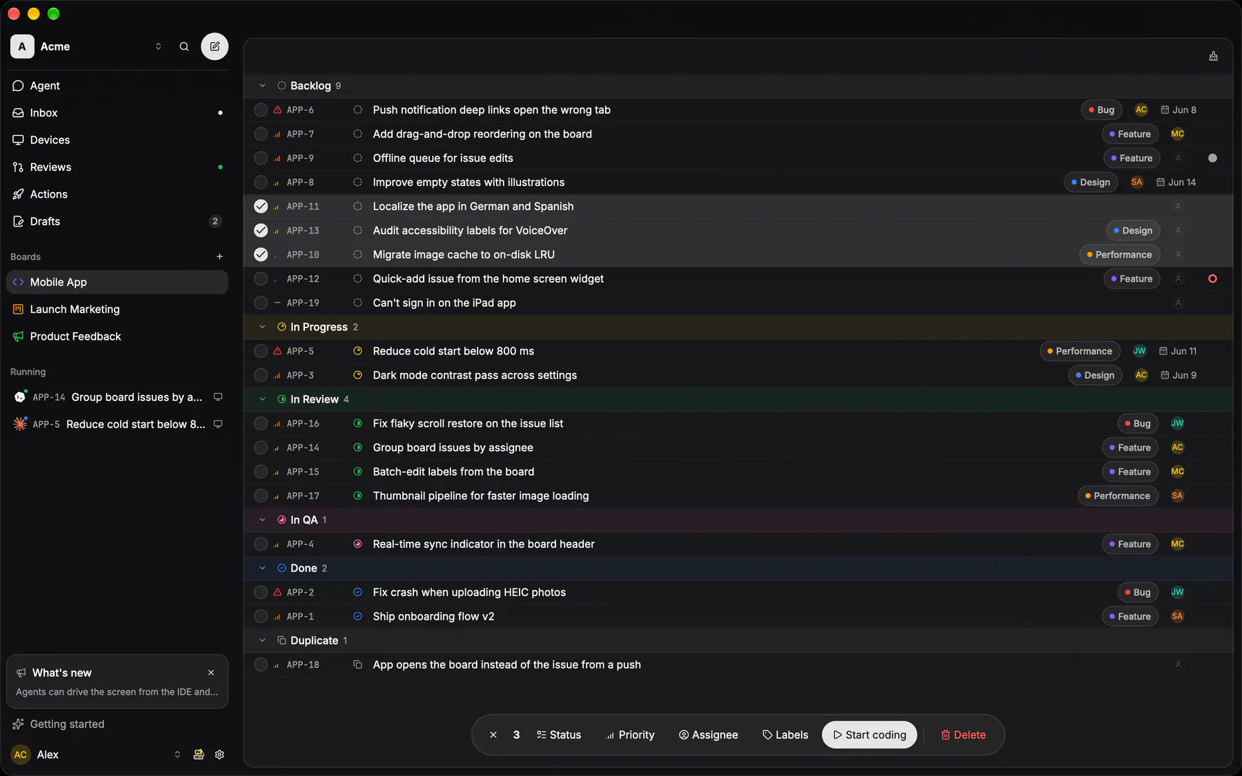
boardThe issue list grouped by status: the app's home screen and the shot everything else is judged against.
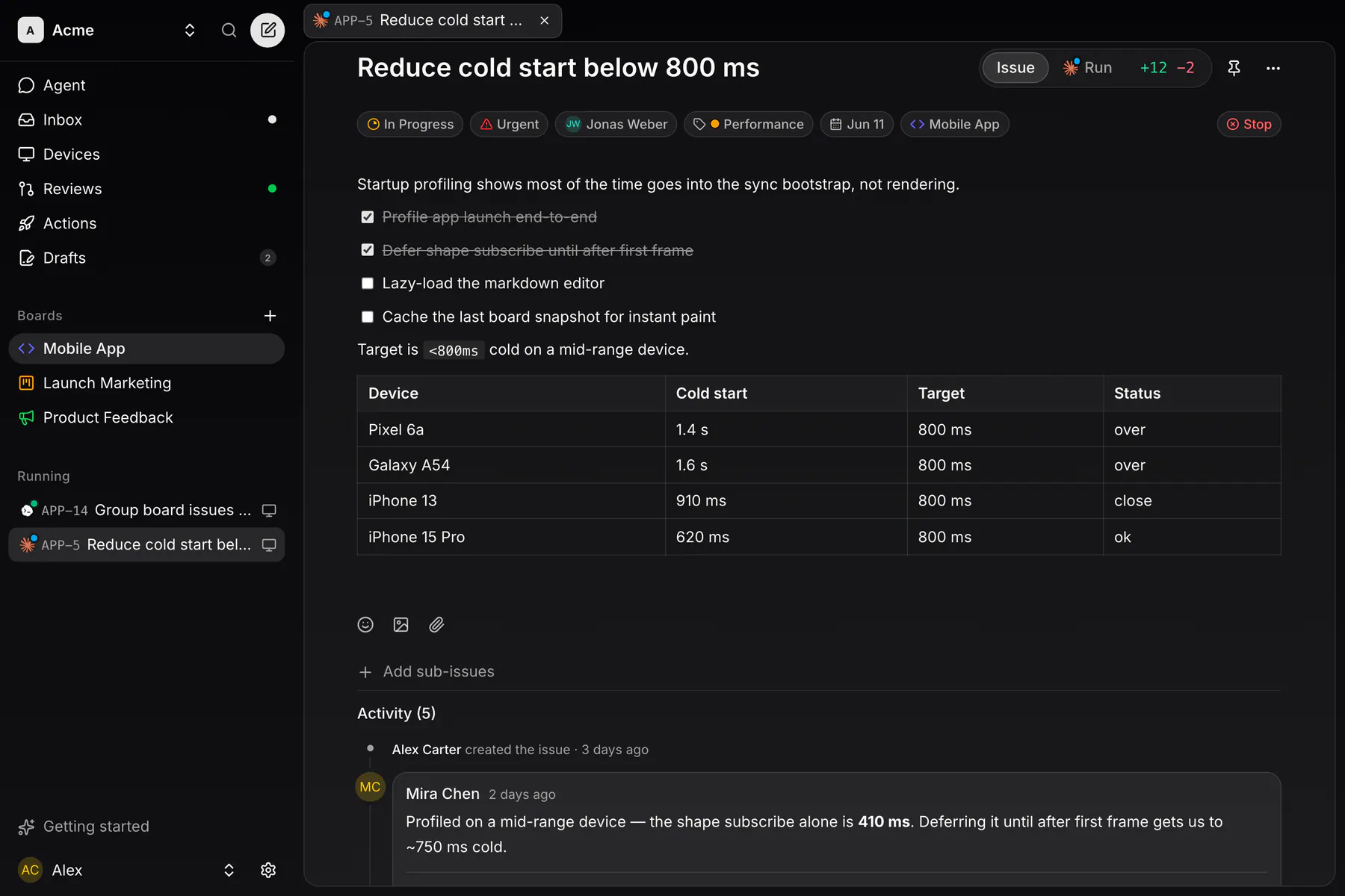
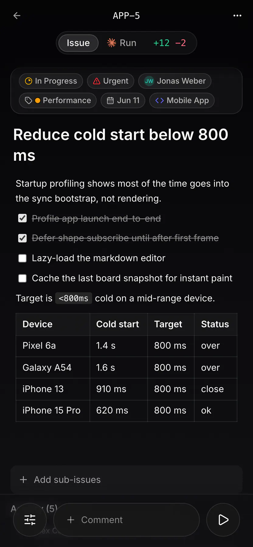
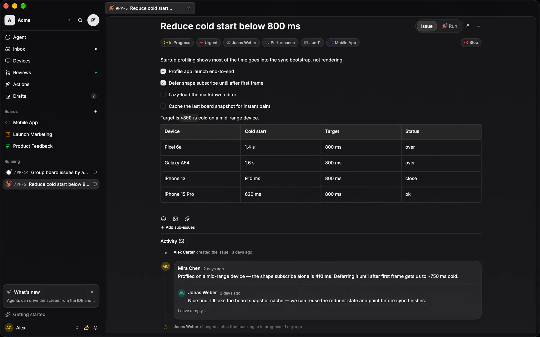
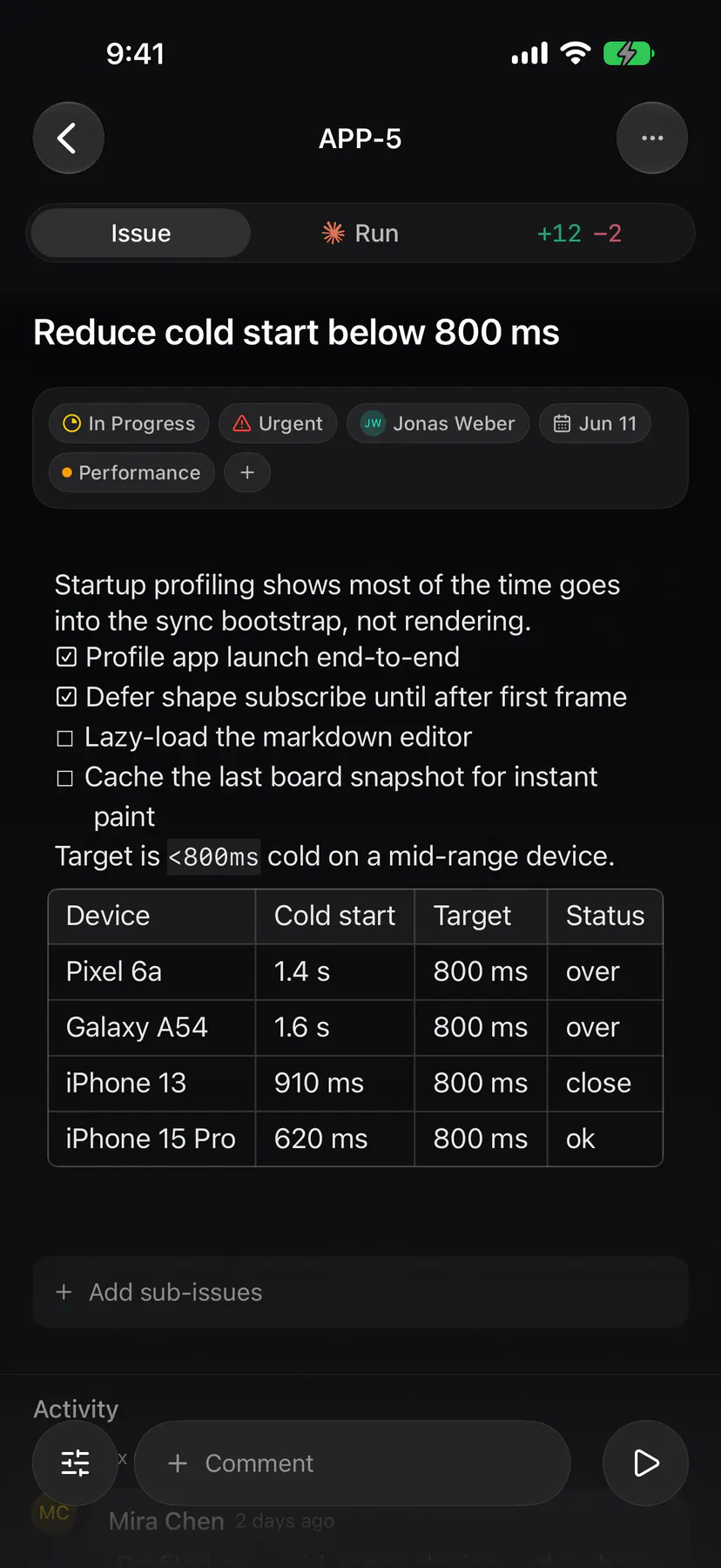
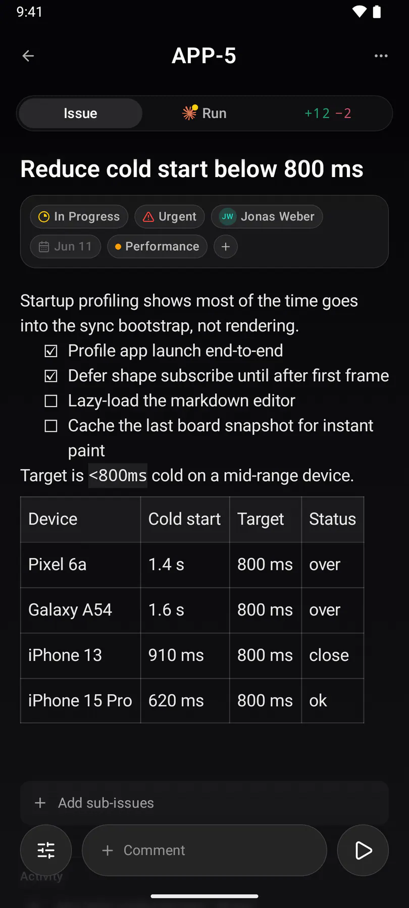
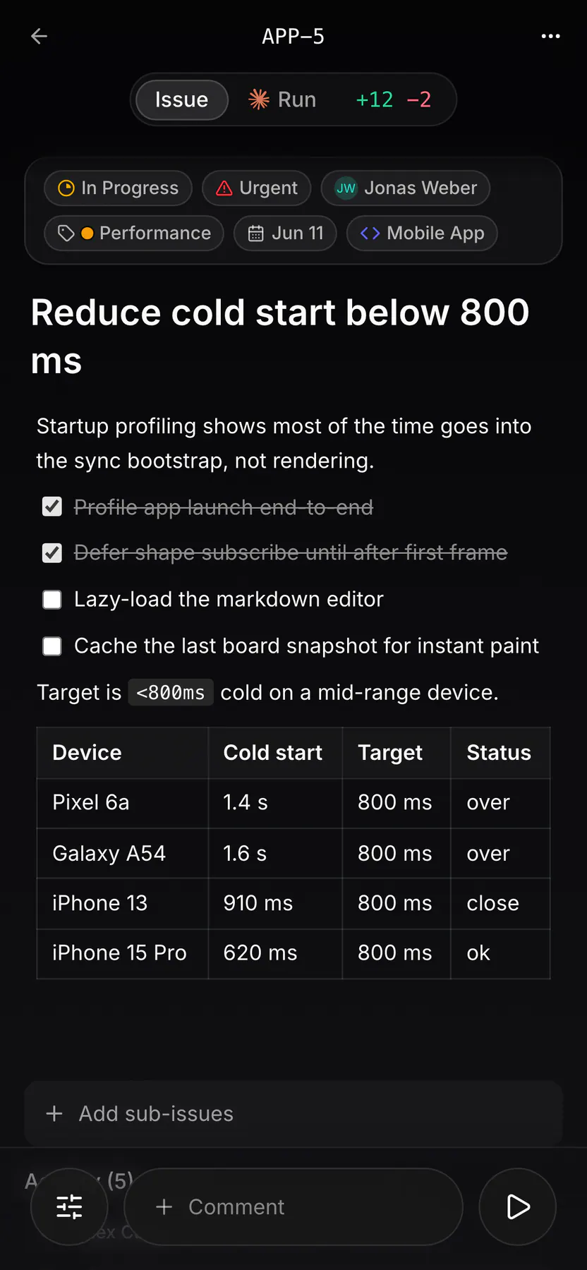
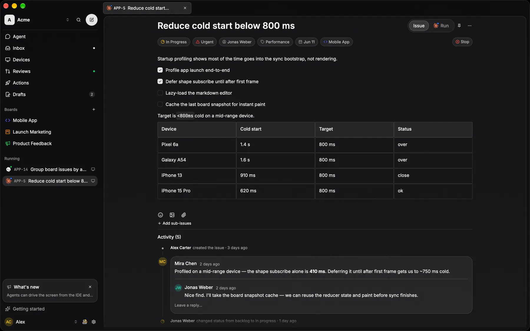
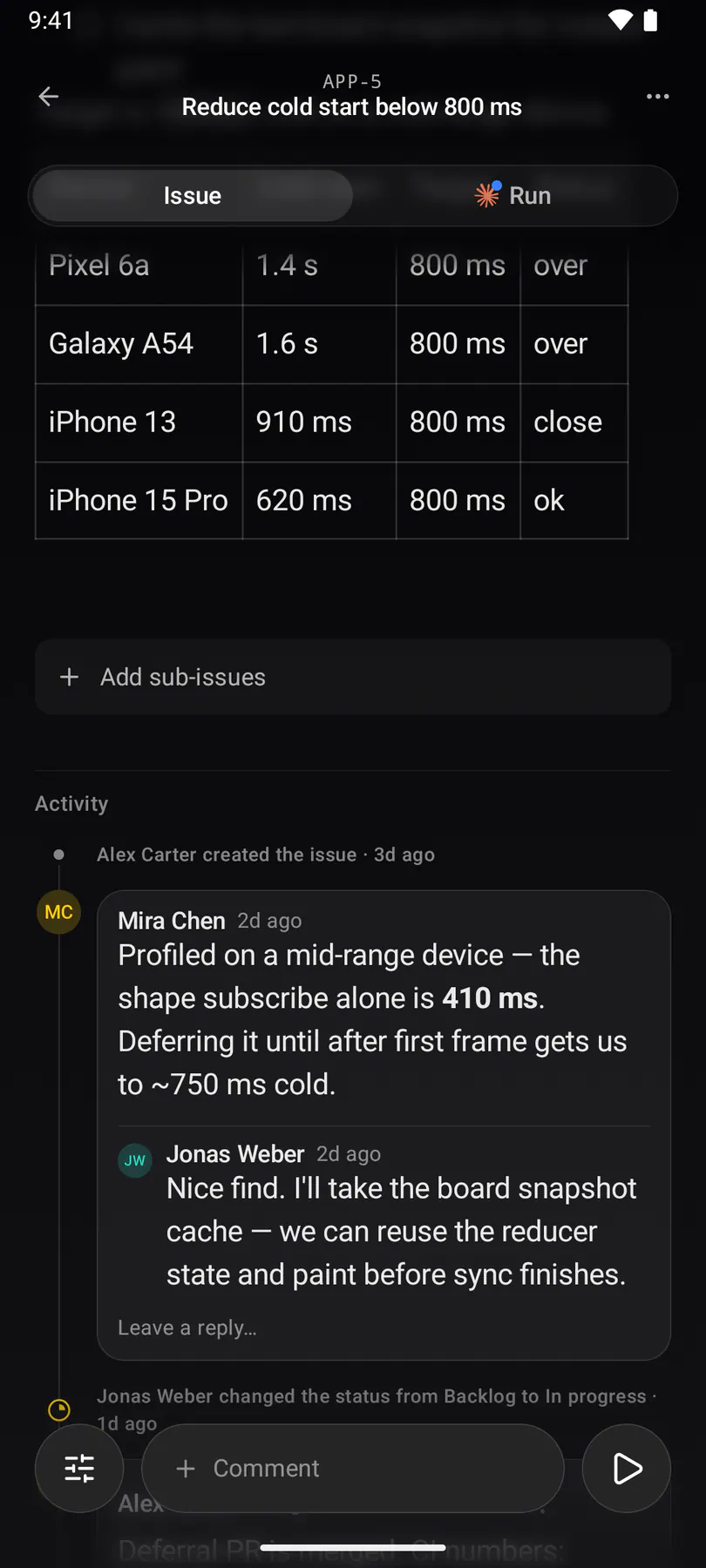
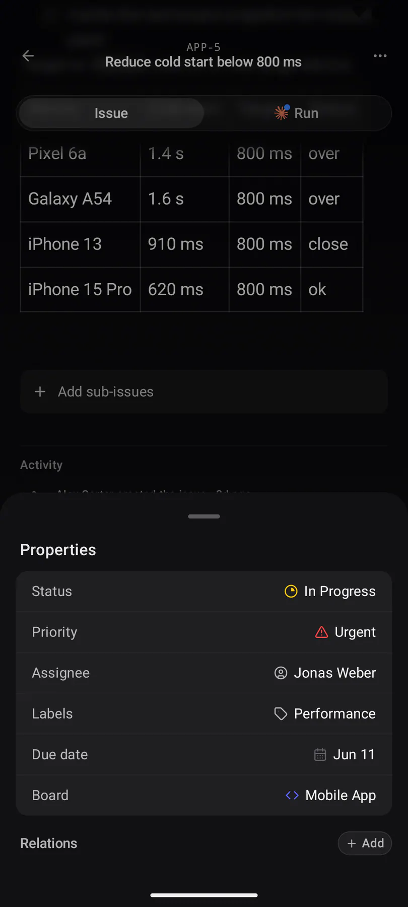
issue-detailOne issue in full: the shared work header (title, Issue | Run face toggle, properties tray ending in the one coding action), markdown description and activity.
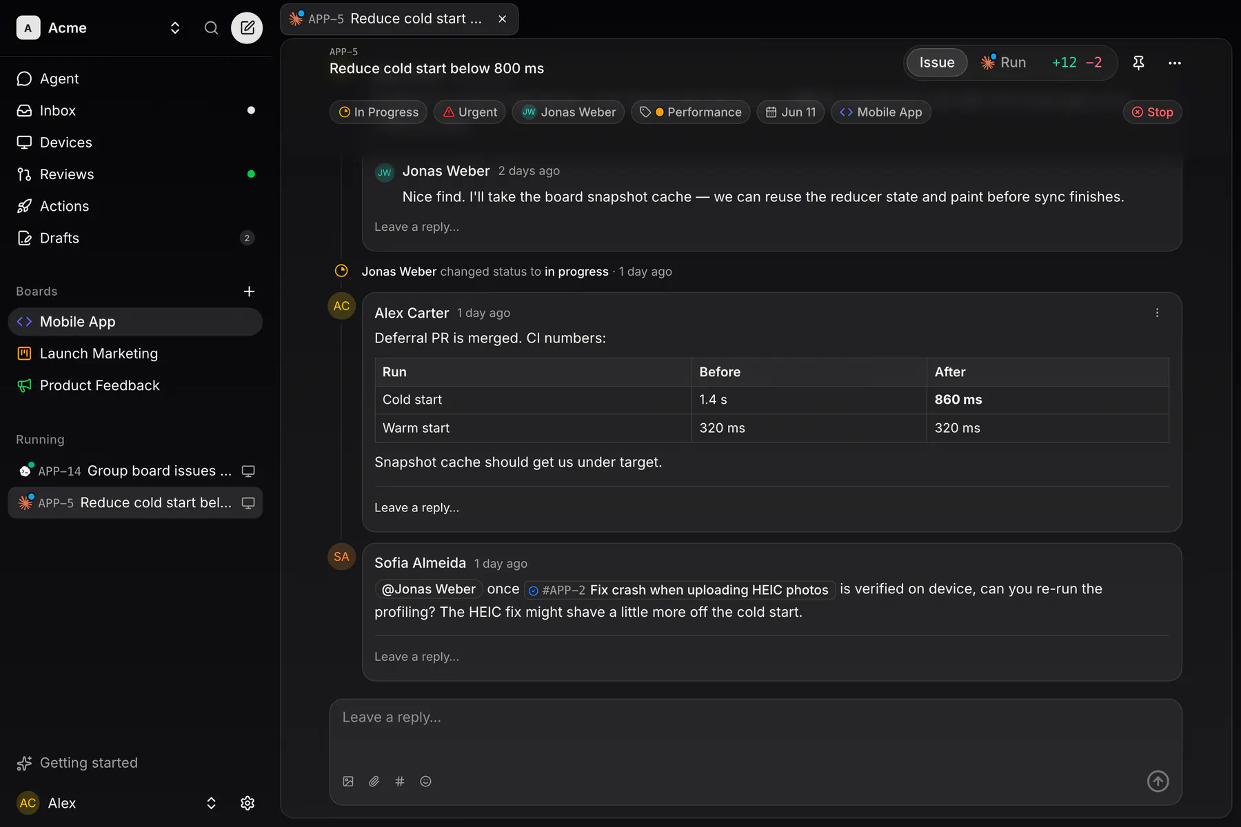
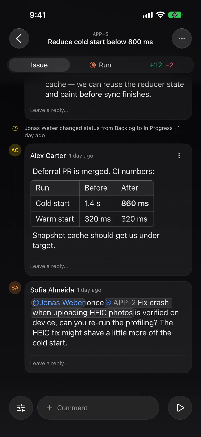
issue-commentsThe same issue scrolled to its activity feed: threaded comments, mentions and the composer.
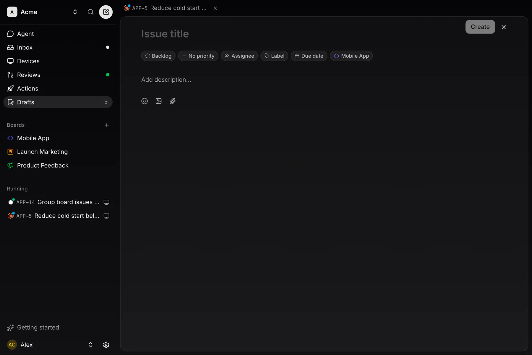
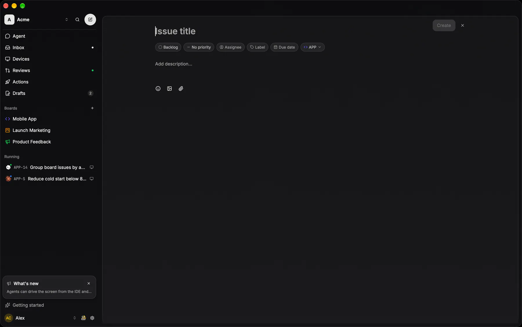
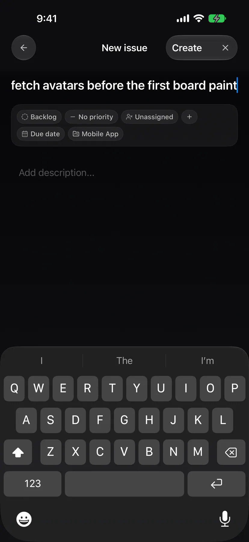
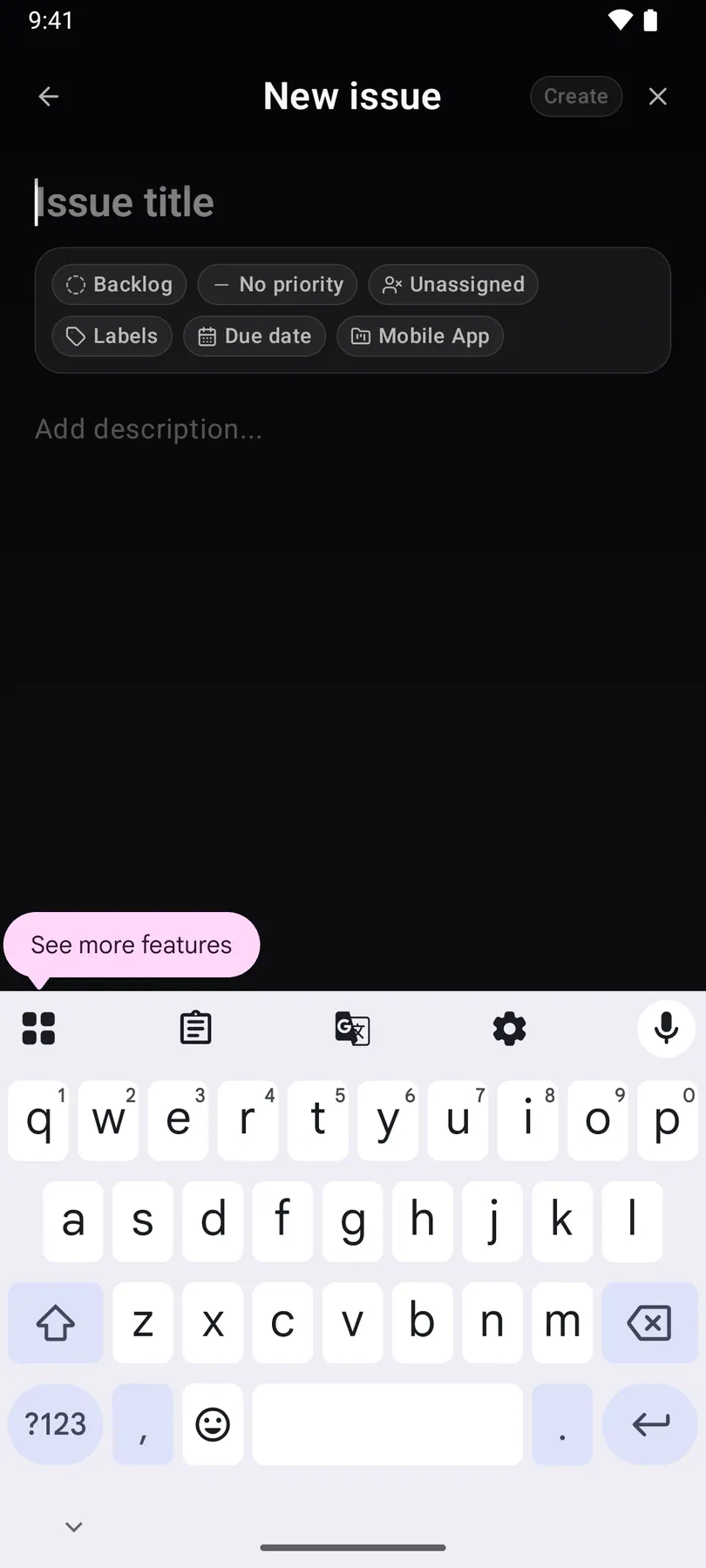
issue-createThe new-issue page: the issue detail in draft mode with title, property chips, description and files, autosaved as a draft until Create files it.

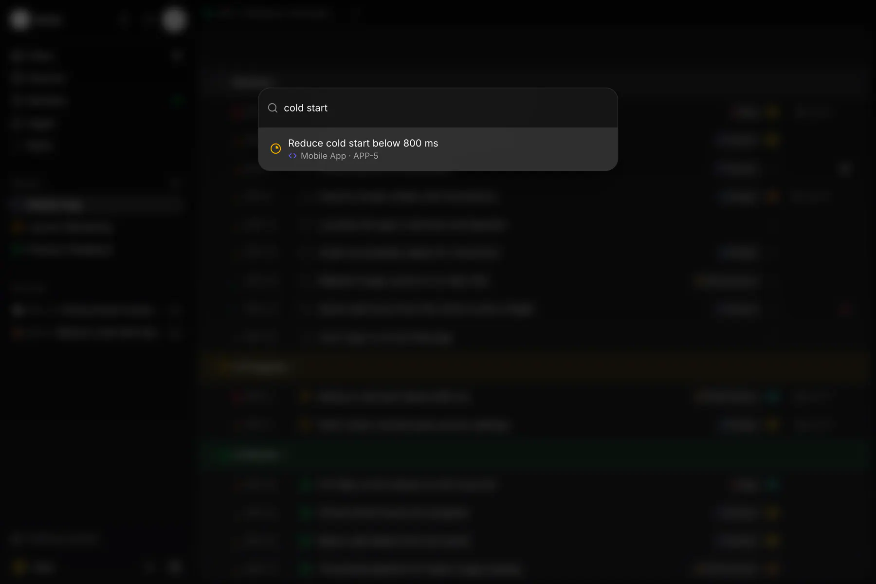
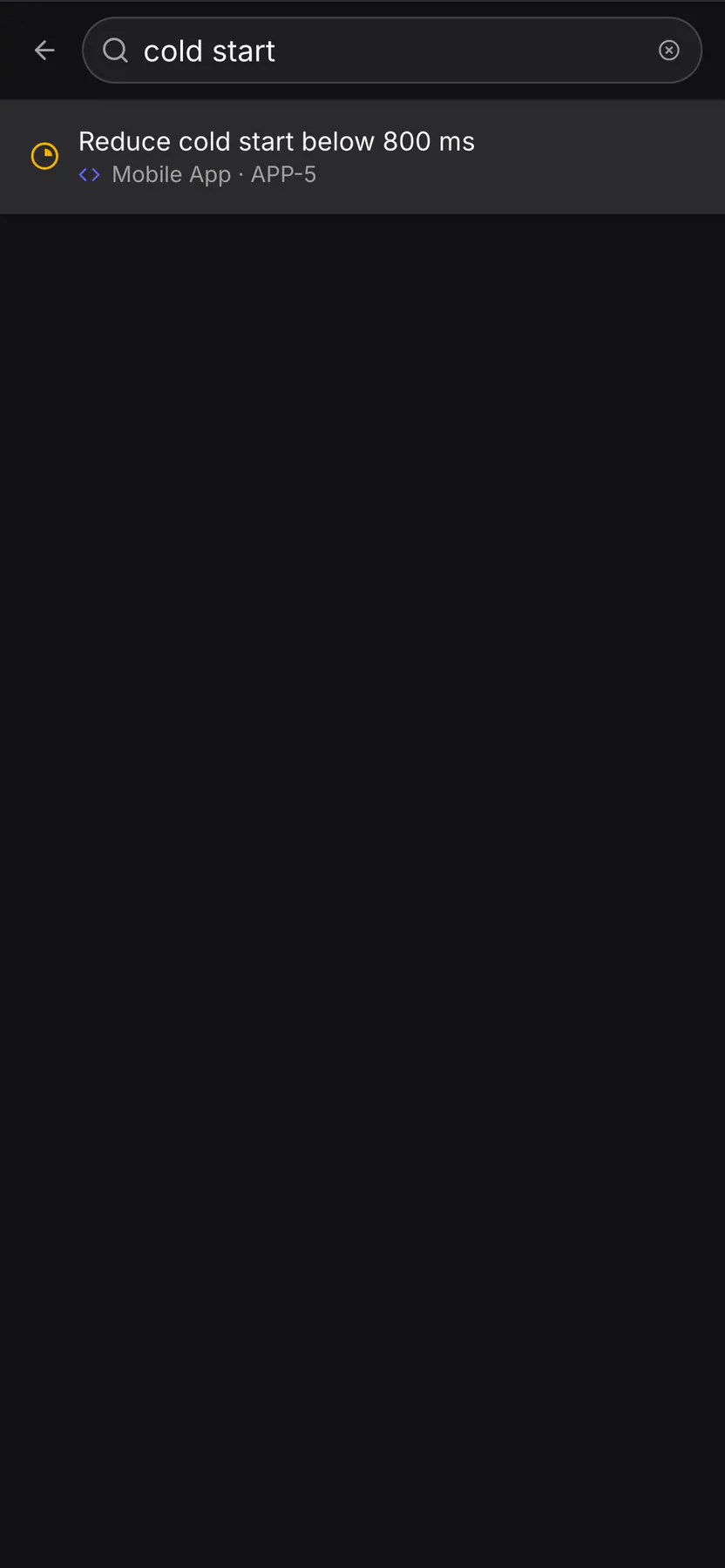
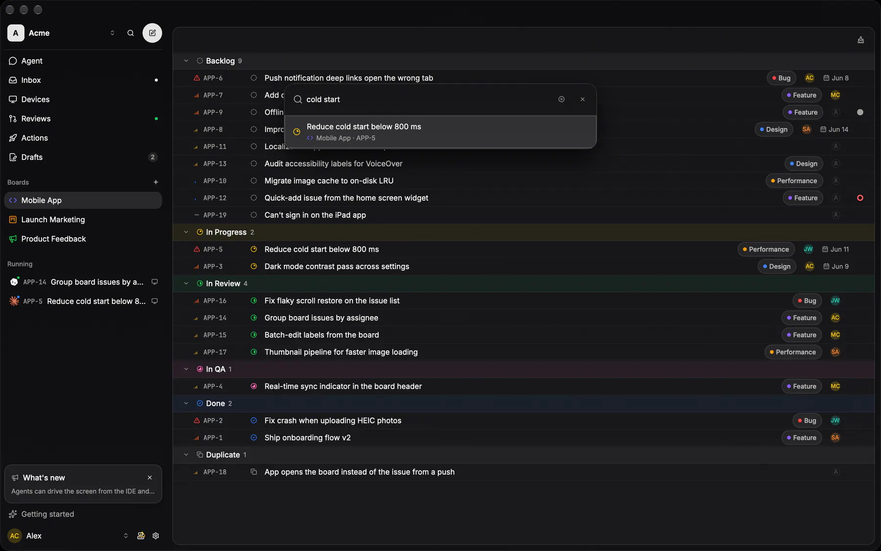
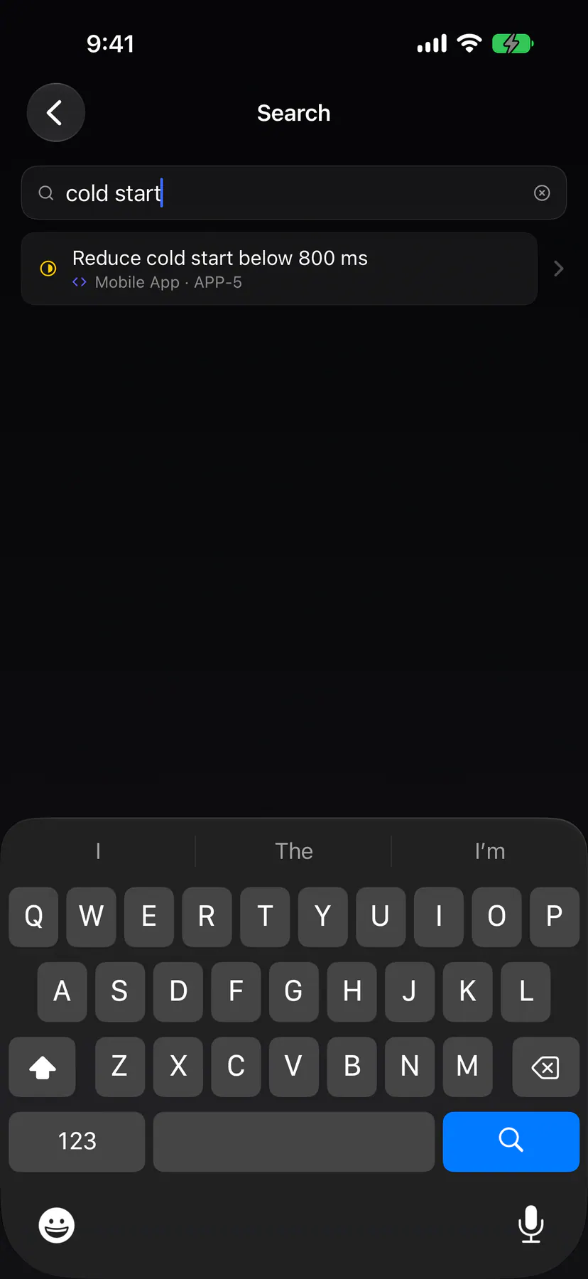
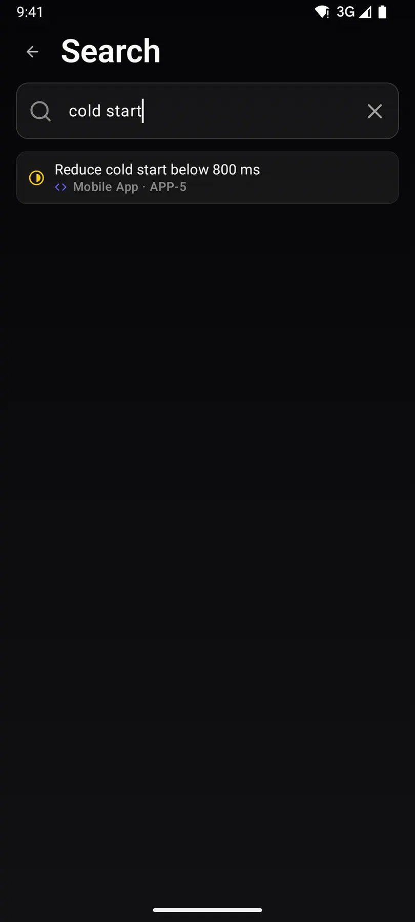
searchCross-board issue search with live results as you type.
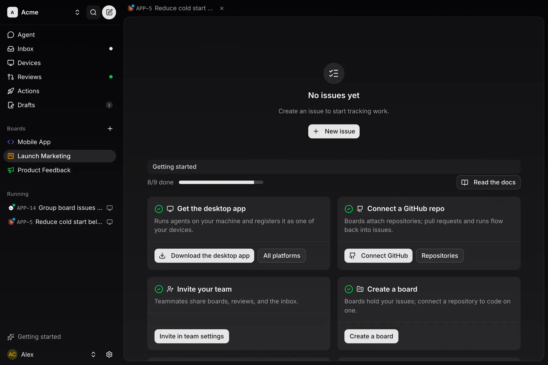
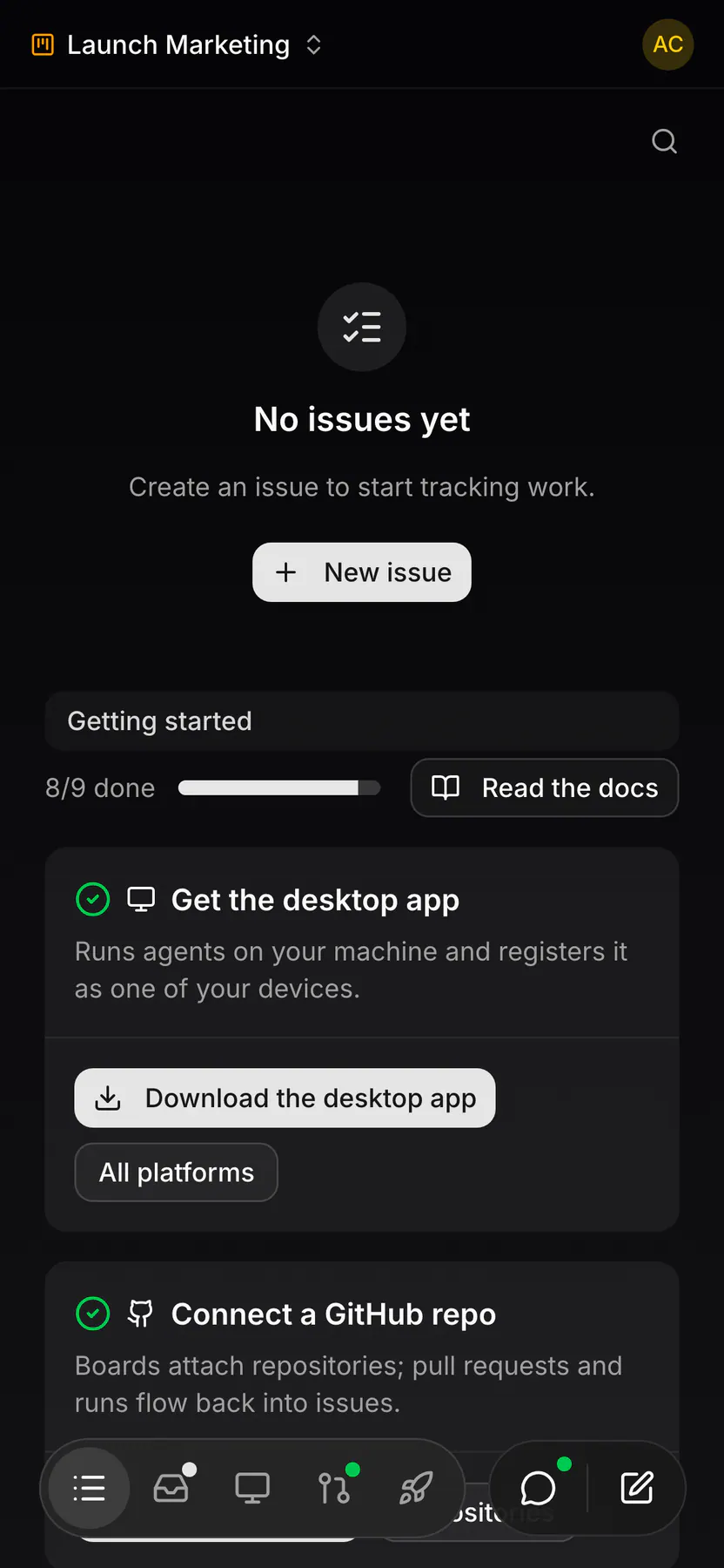
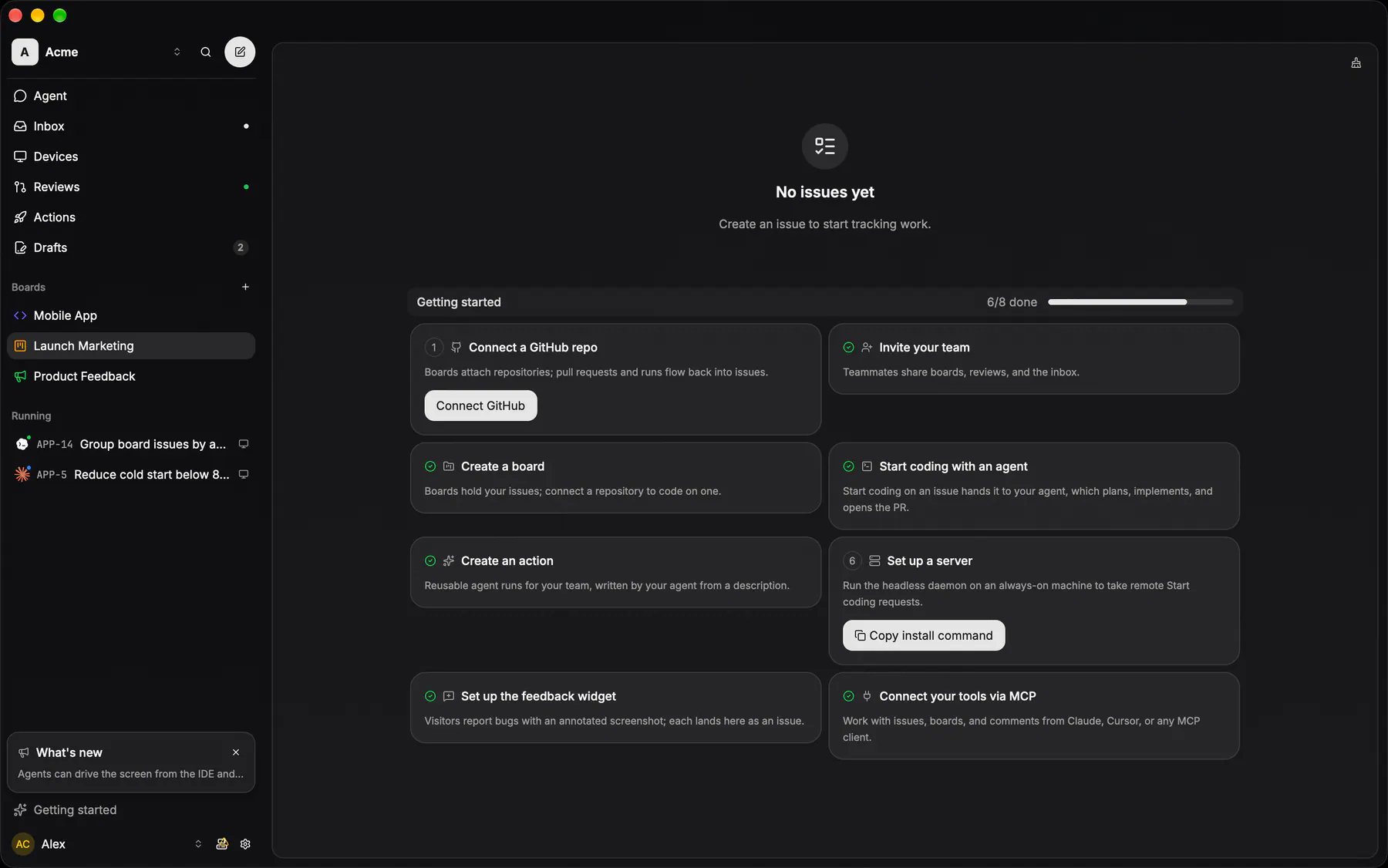
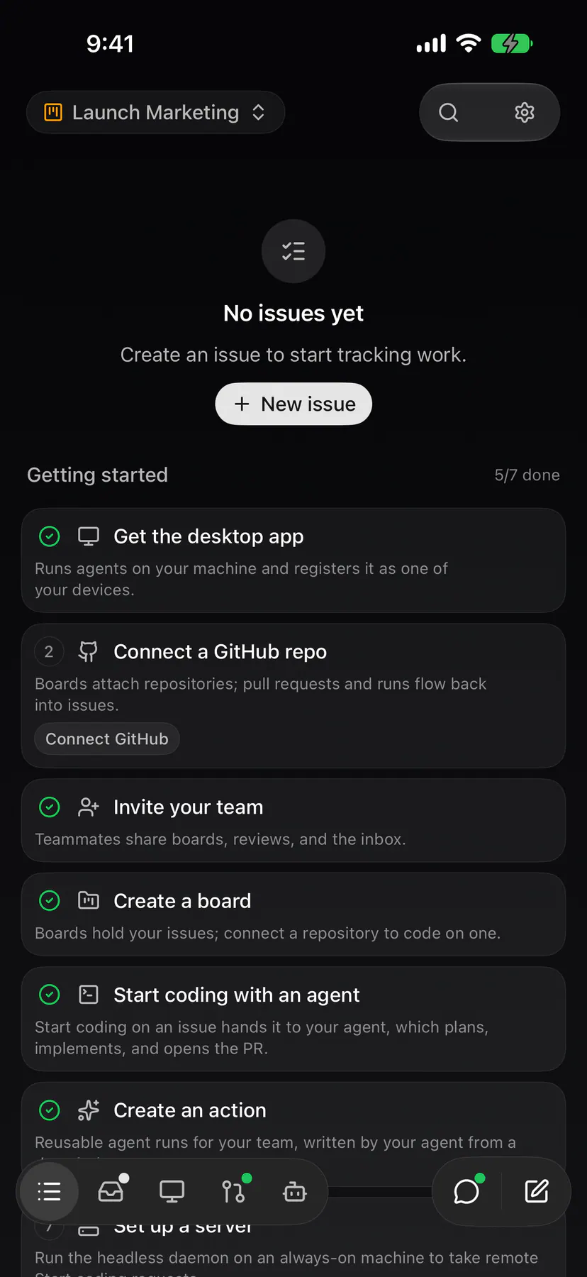
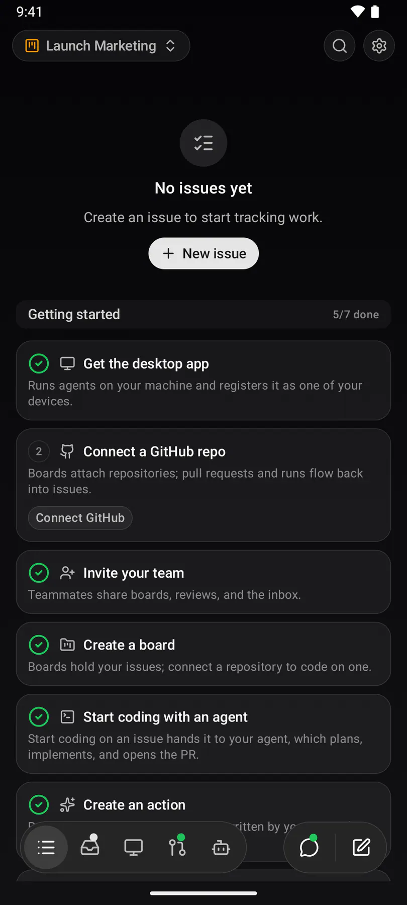
board-emptyA board with nothing on it yet: the empty state, with the getting-started cards inline underneath on every client.
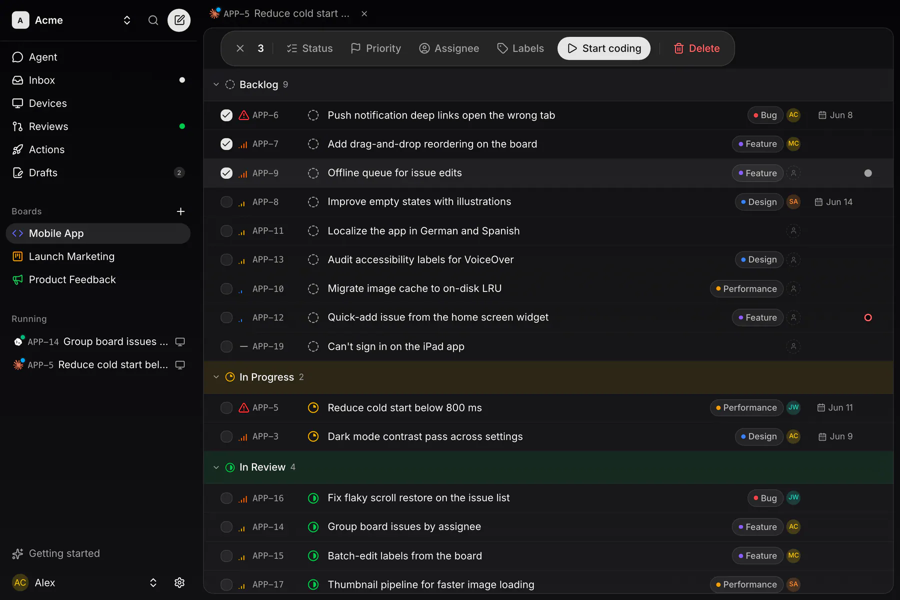
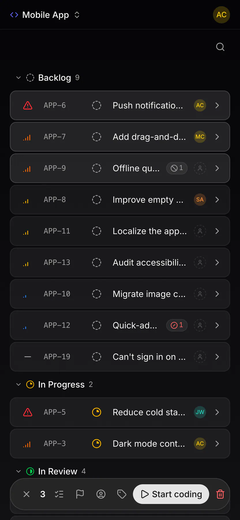
board-bulk-editSeveral issues selected at once: the action bar that re-statuses, re-assigns, re-labels or deletes the lot.
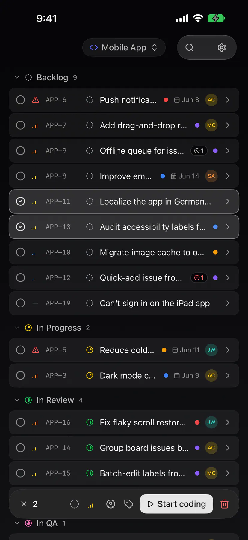
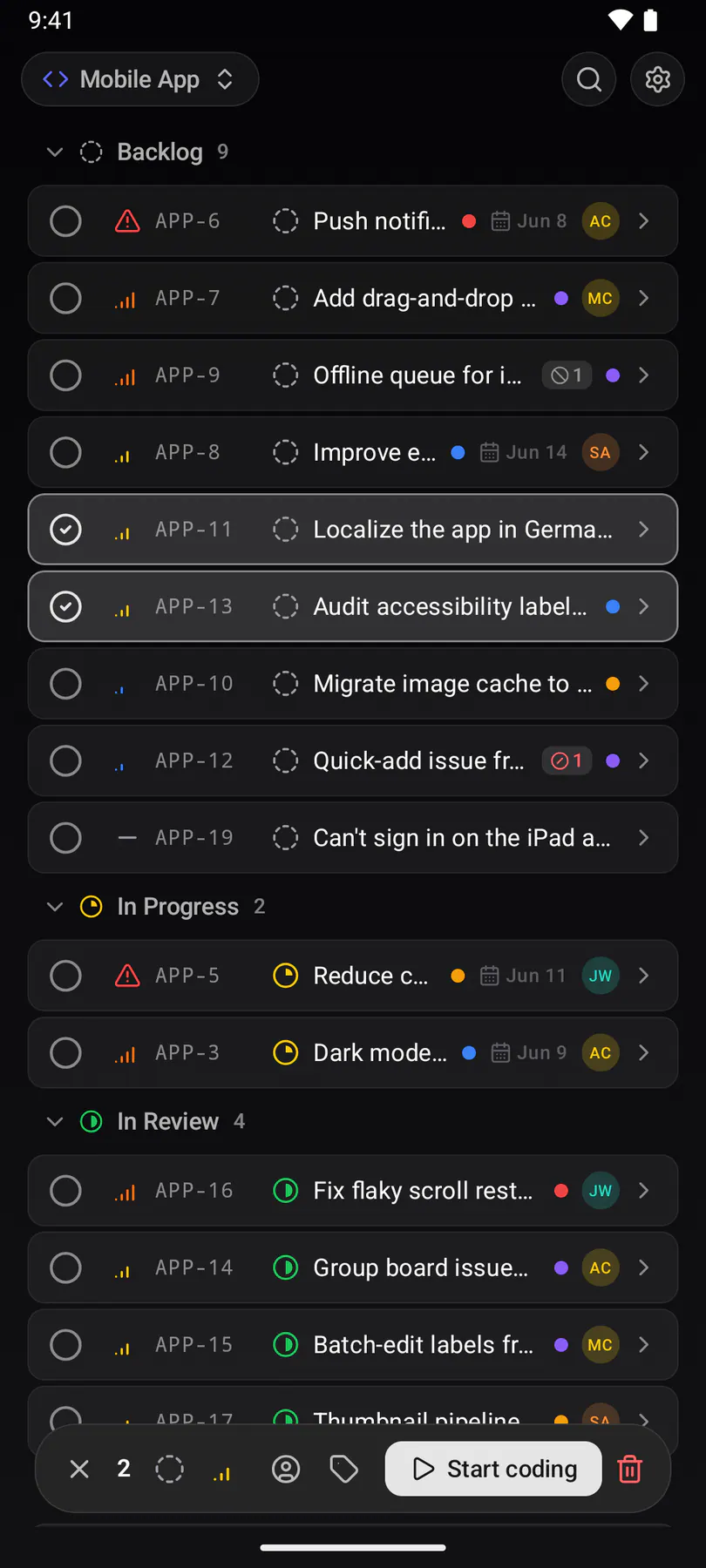
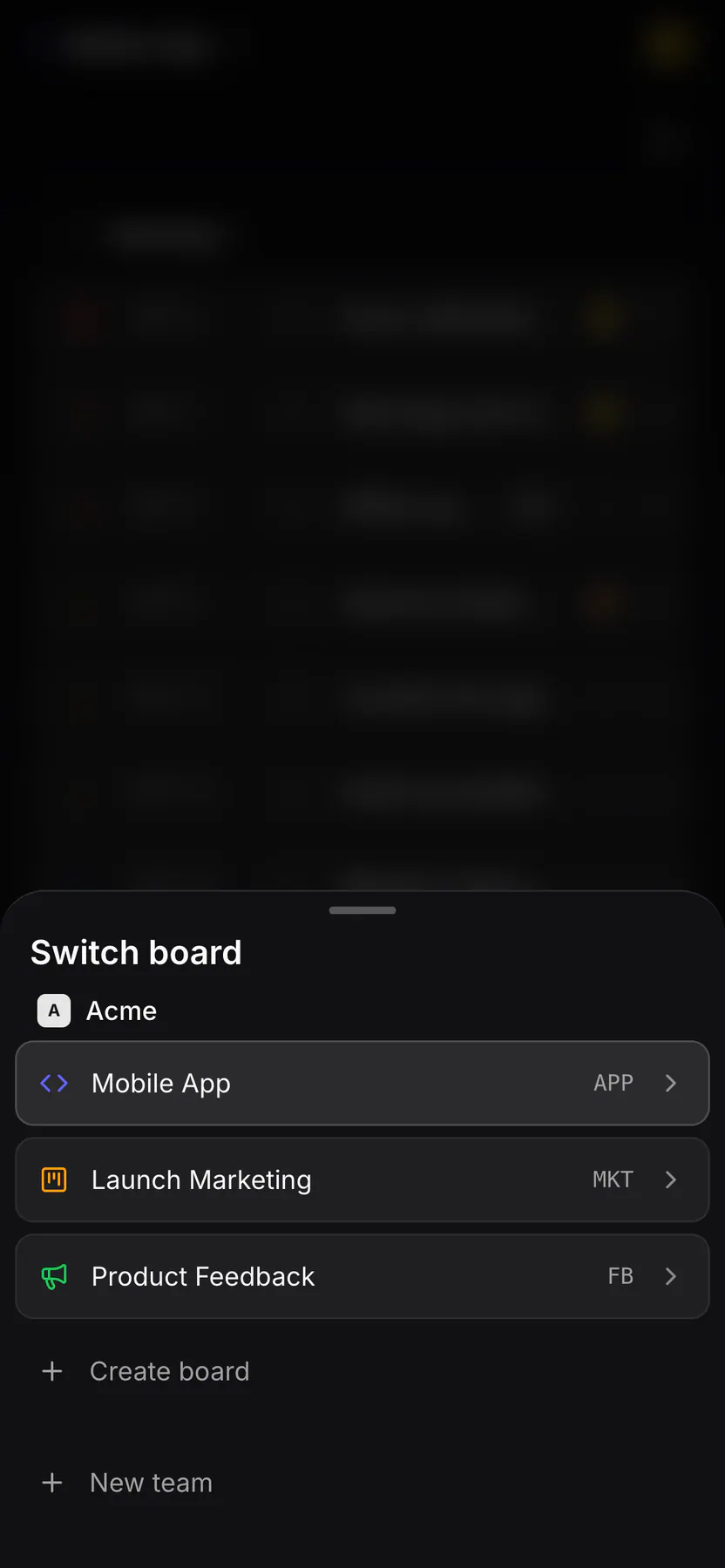
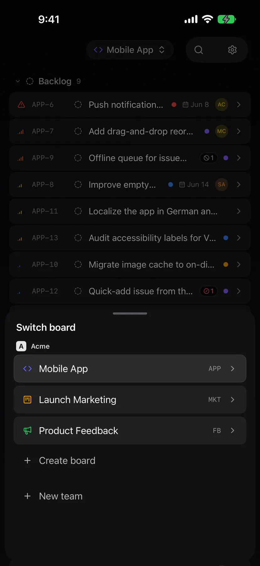
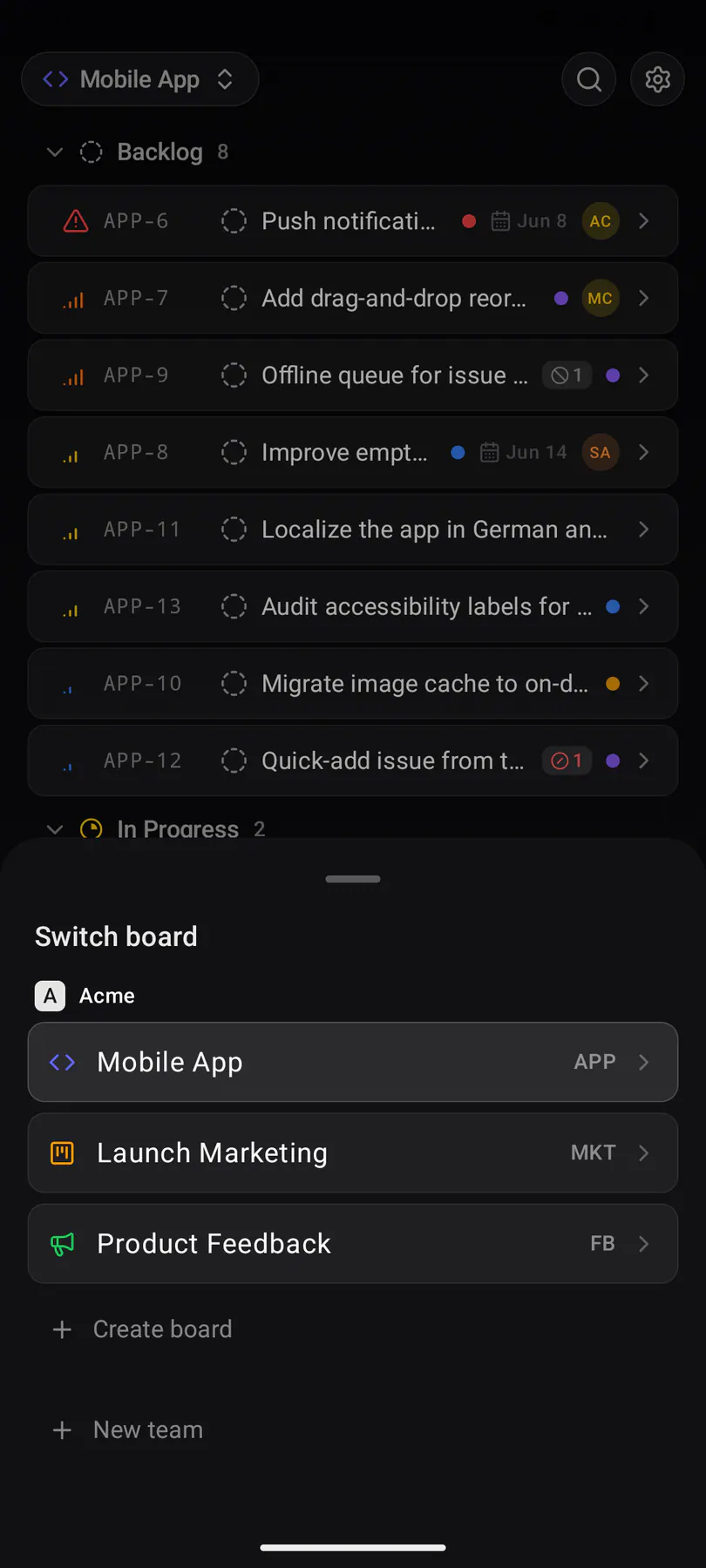
board-switcherThe phone’s way between boards: a bottom sheet listing every board in the team.
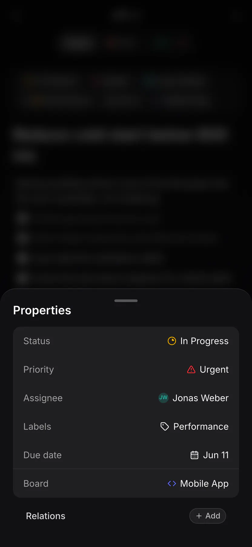
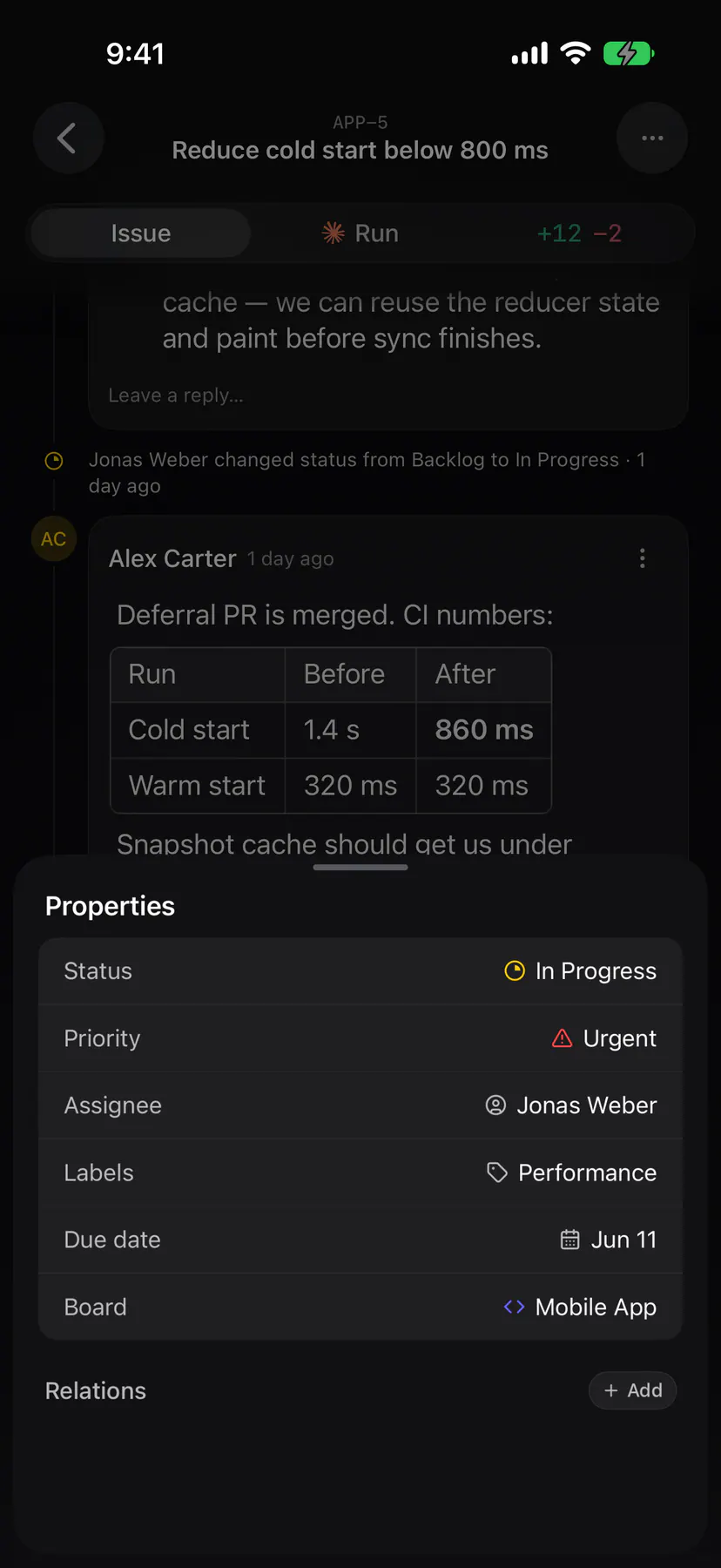
issue-propertiesThe phone’s properties sheet: status, priority, assignee, labels, due date and board, all from one pull-up.
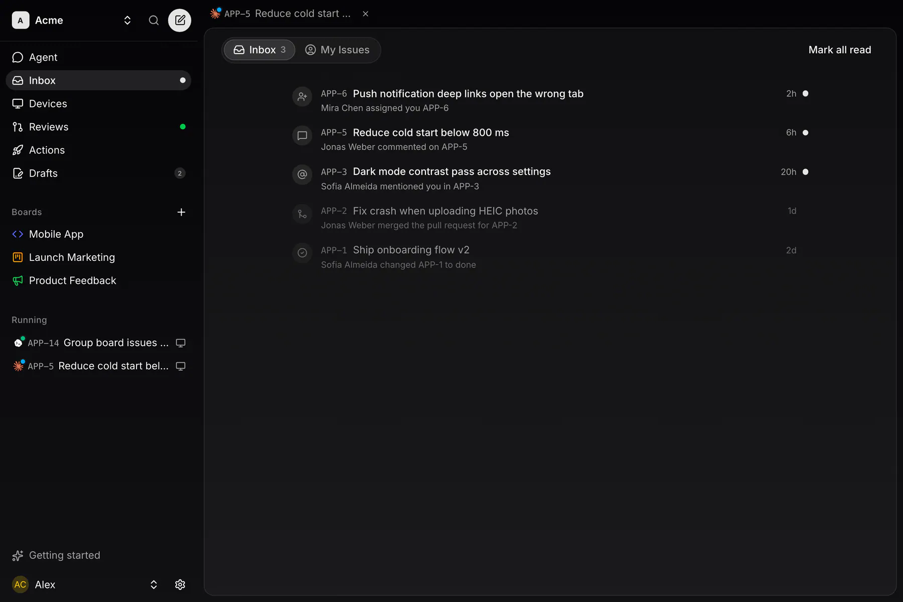
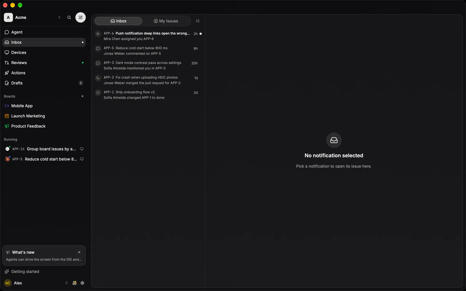
inboxThe notification stream: assignments, mentions, comments and PR events, grouped and unread-first.
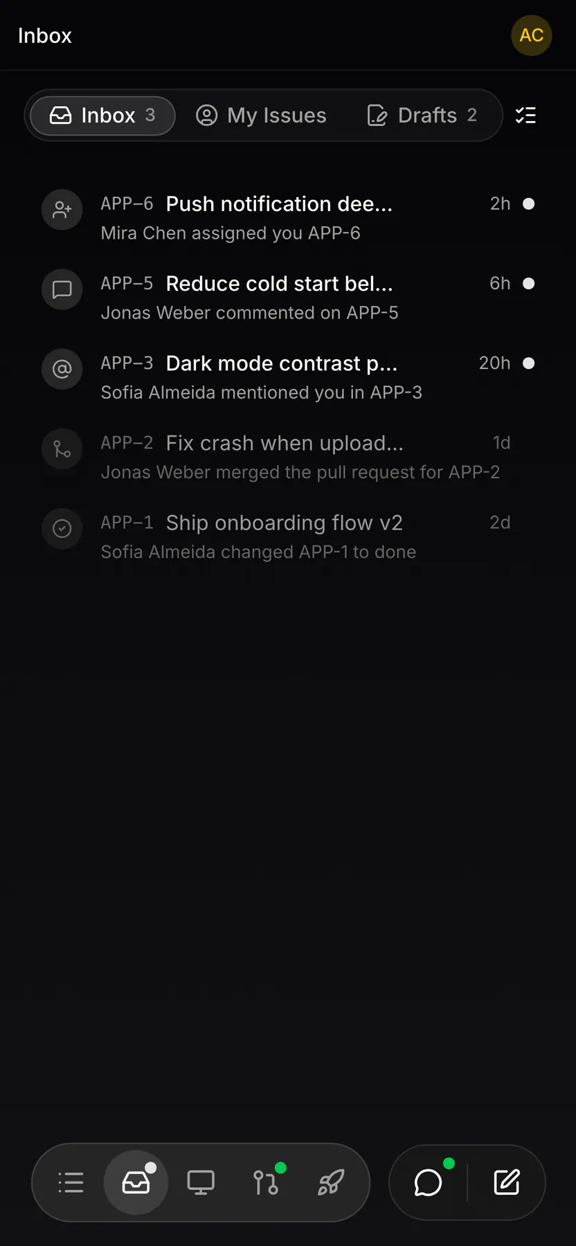
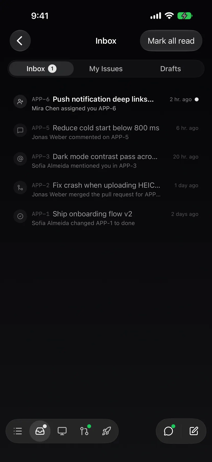
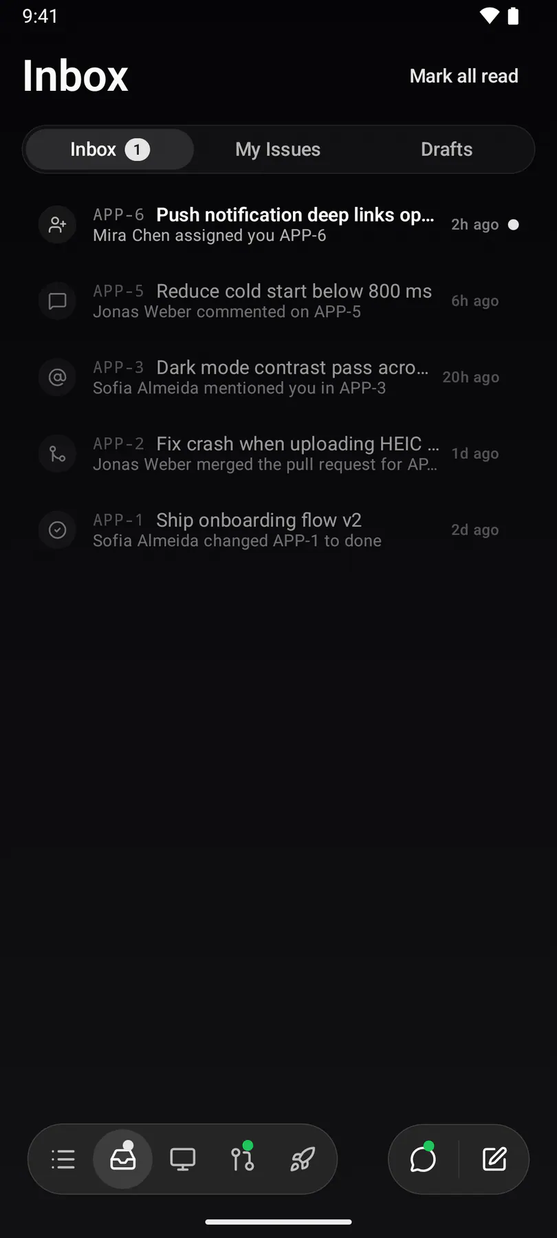
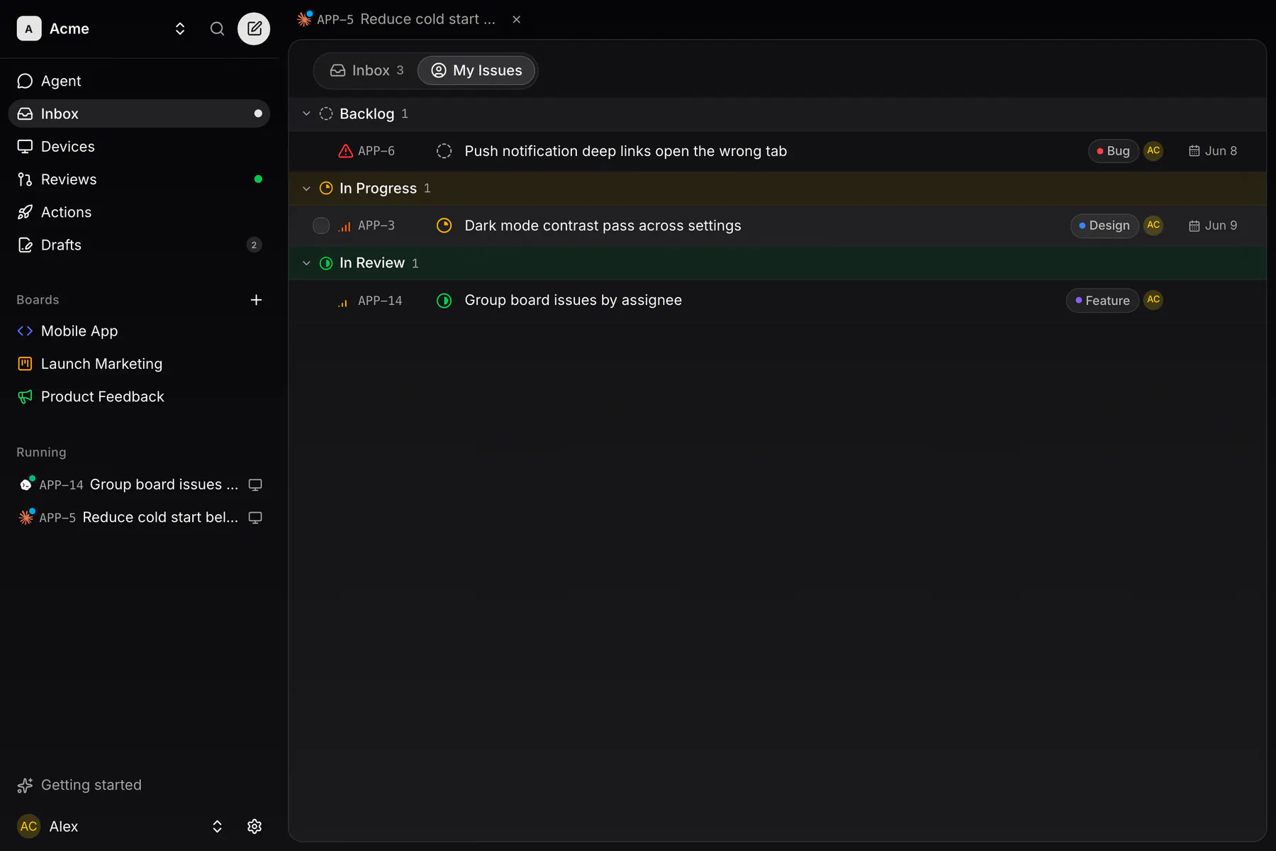
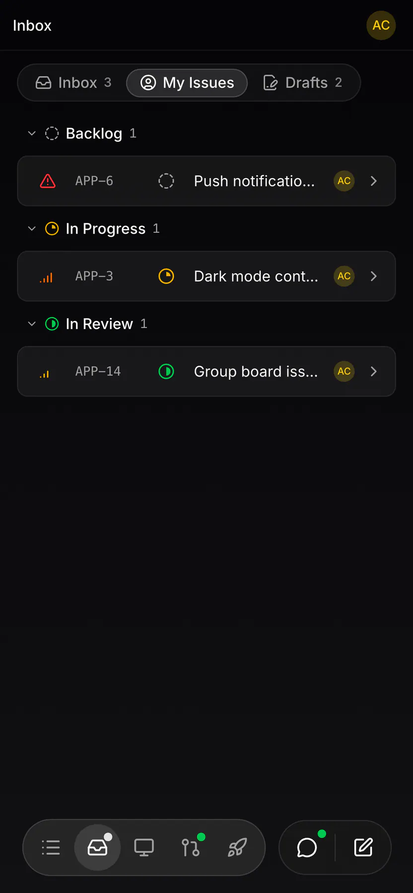
my-issuesEverything assigned to me across every board in the team. A tab on the inbox route, not a route of its own.
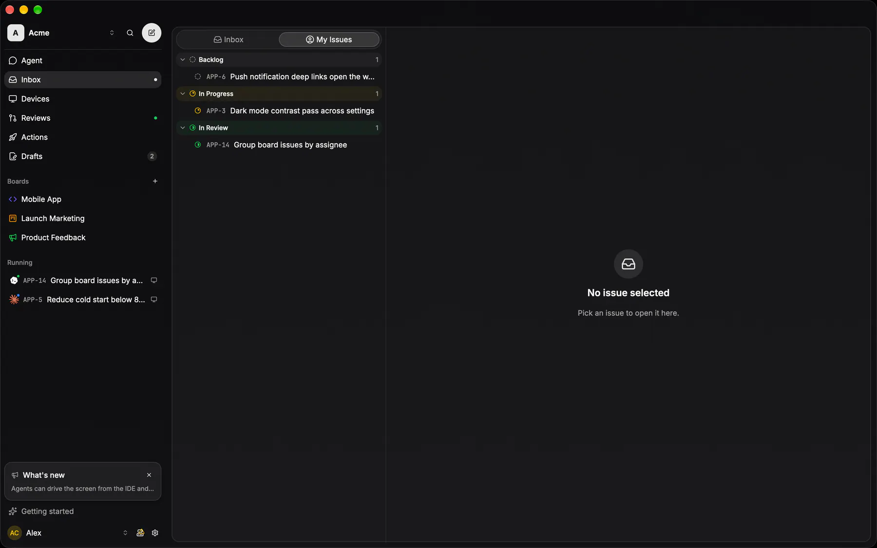
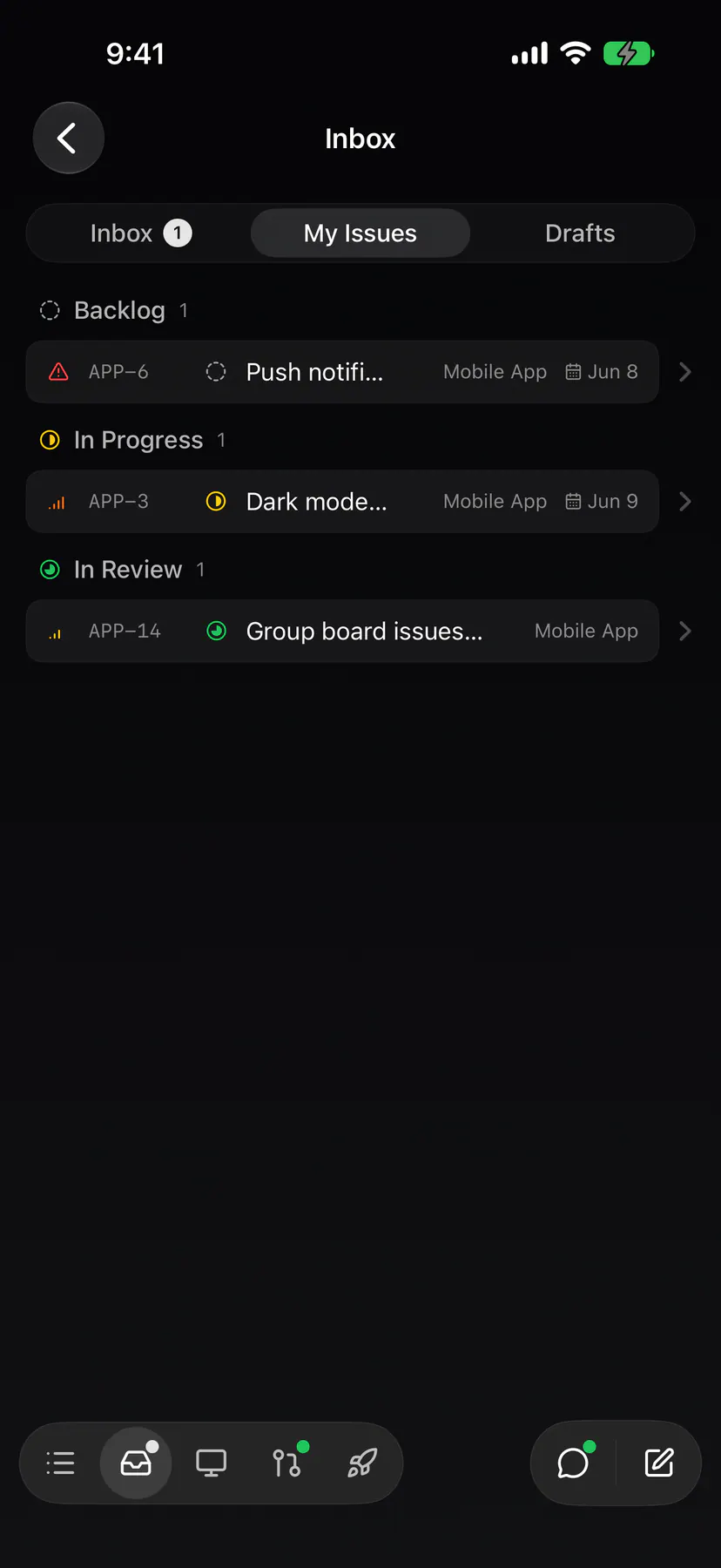
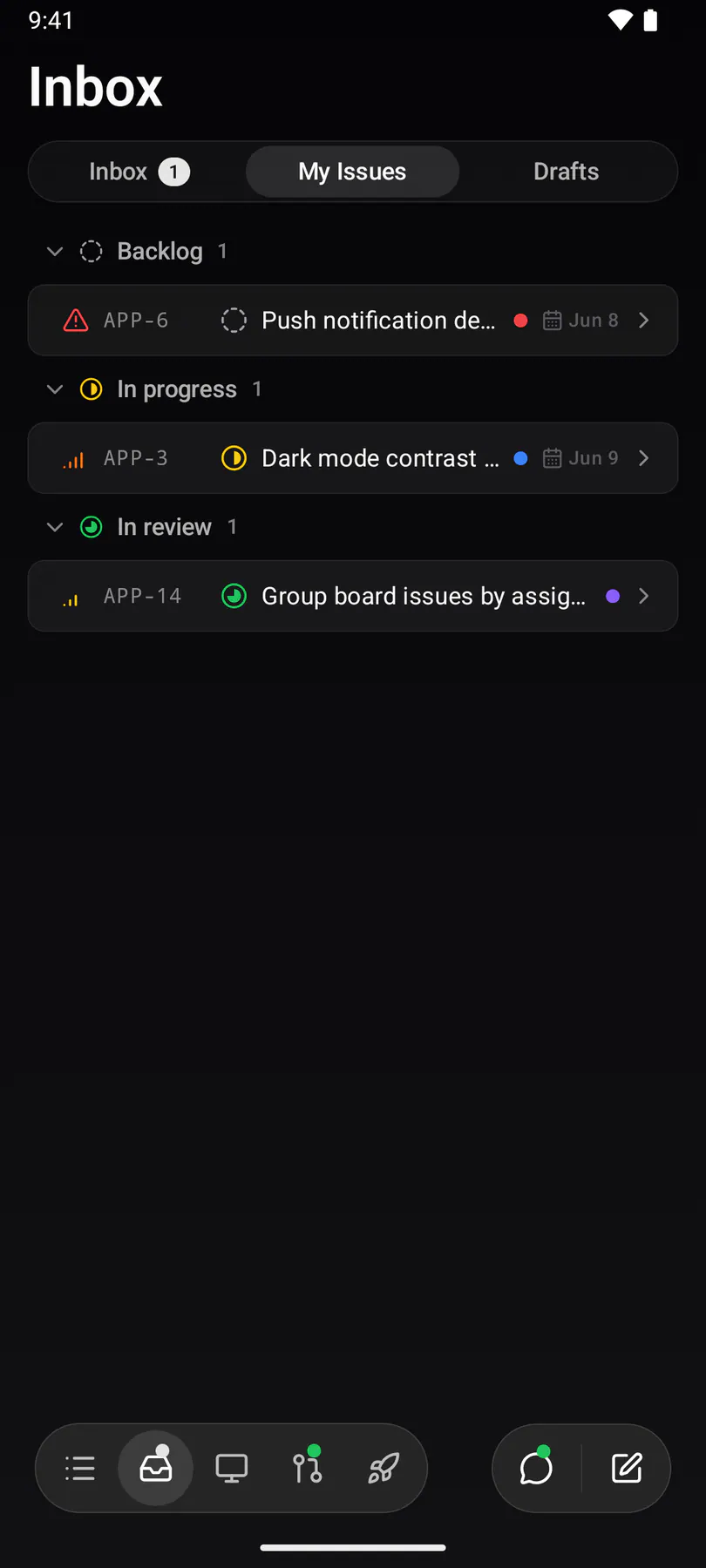
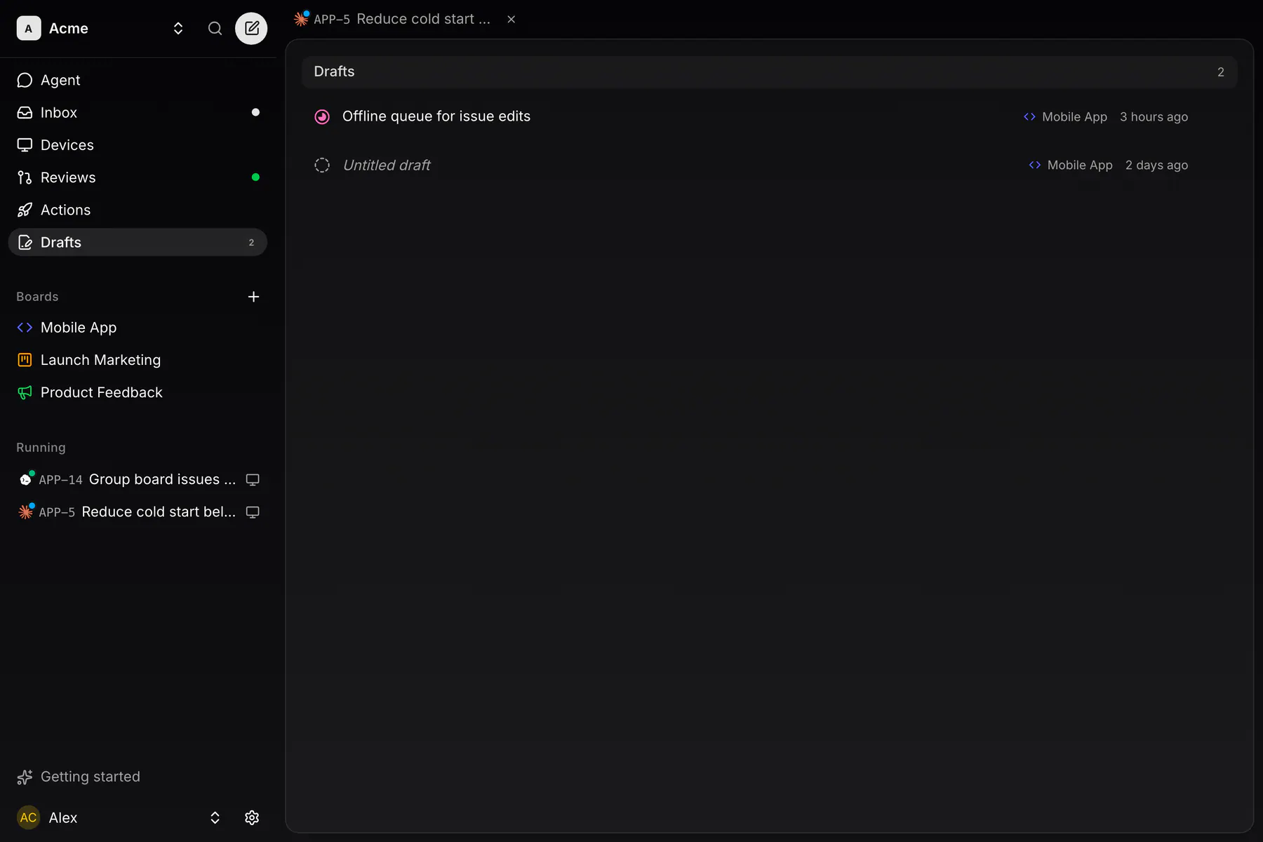
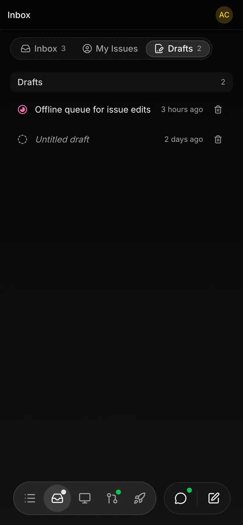
draftsIssues that were started and not filed: leaving the new-issue page with anything in it keeps a draft, and a row reopens that page on it.
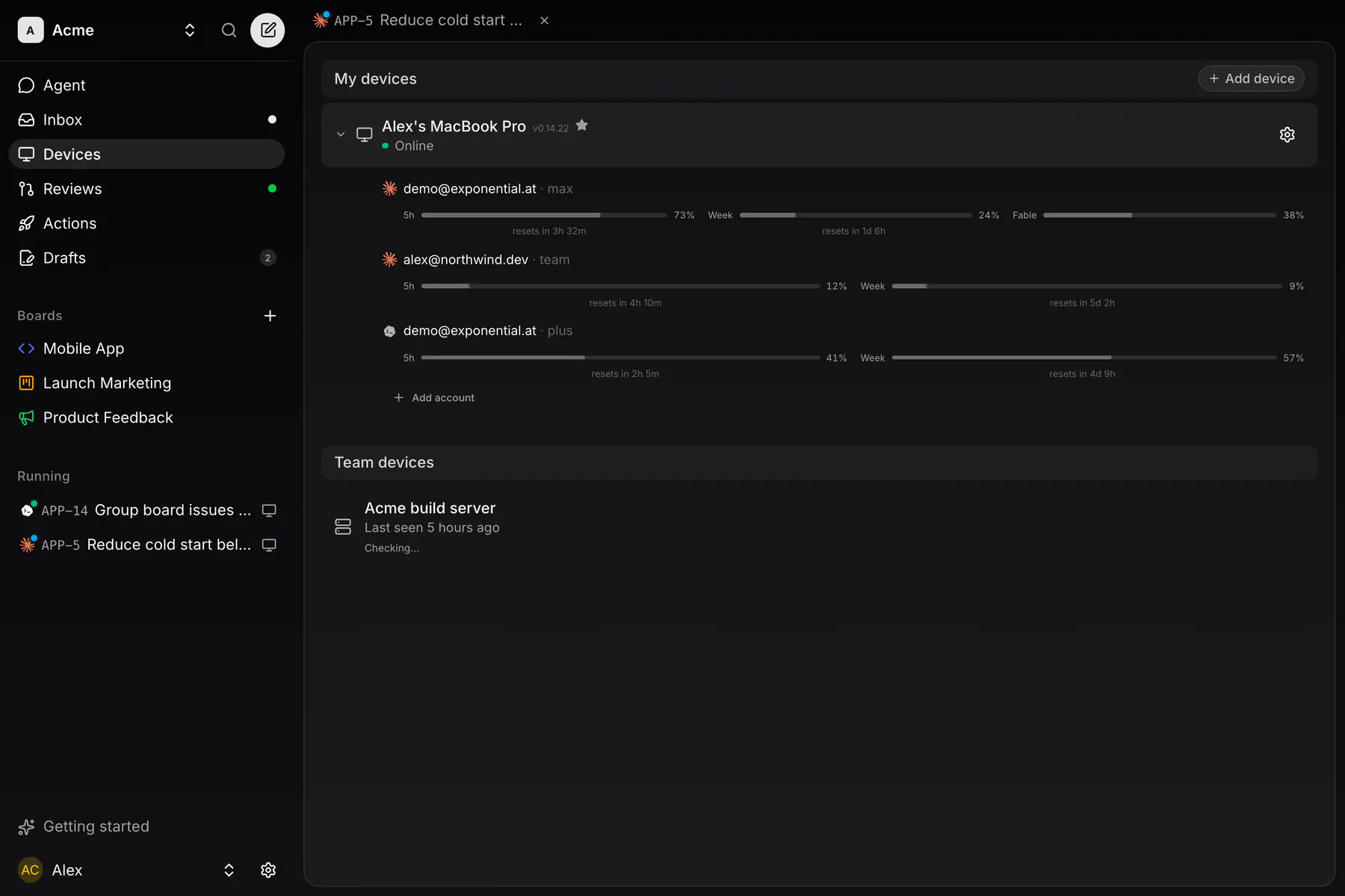
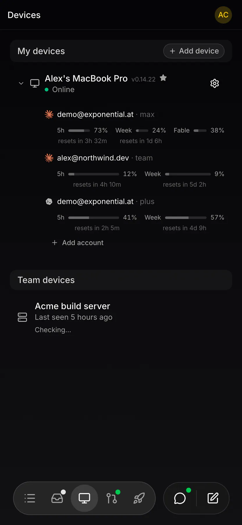
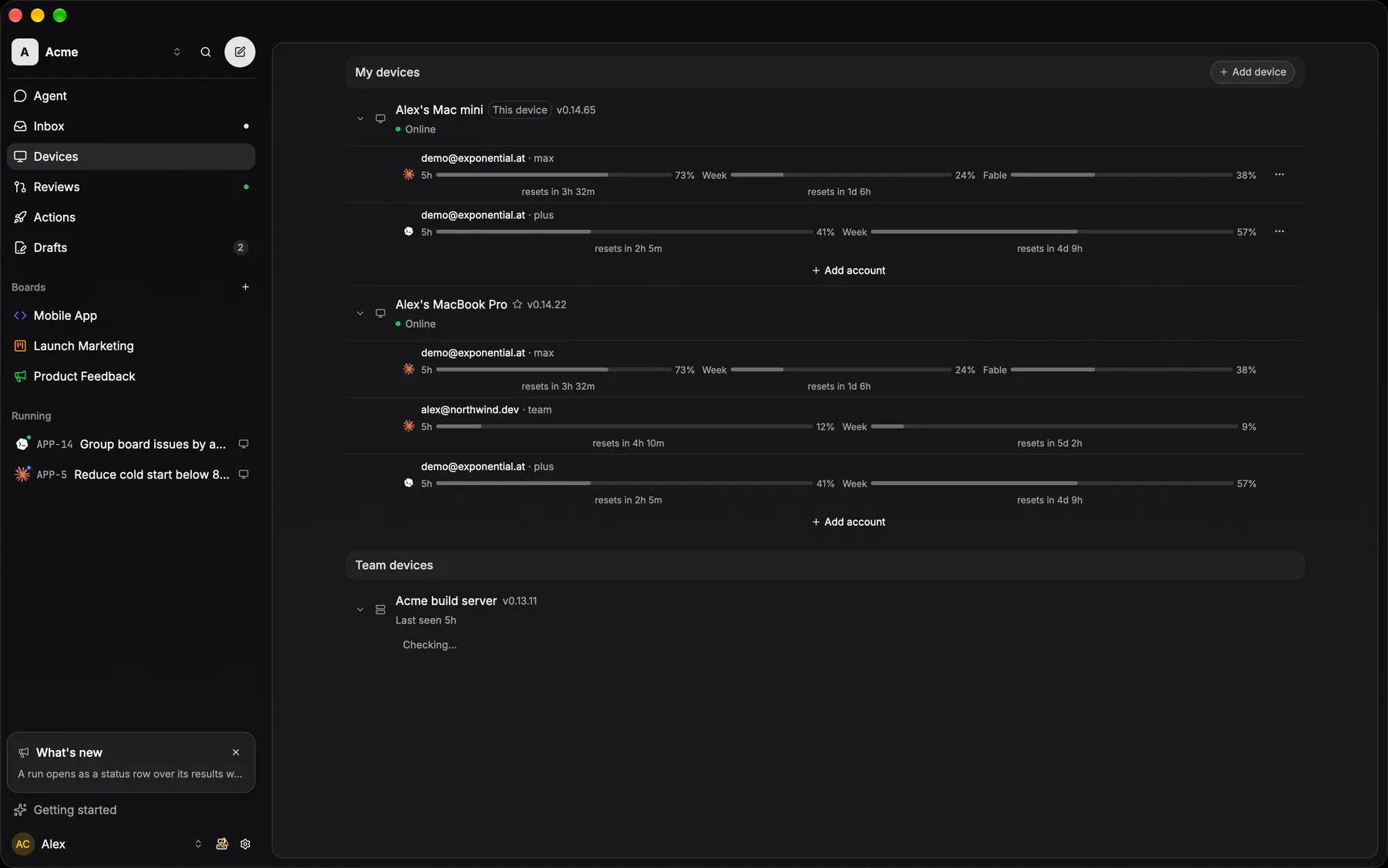
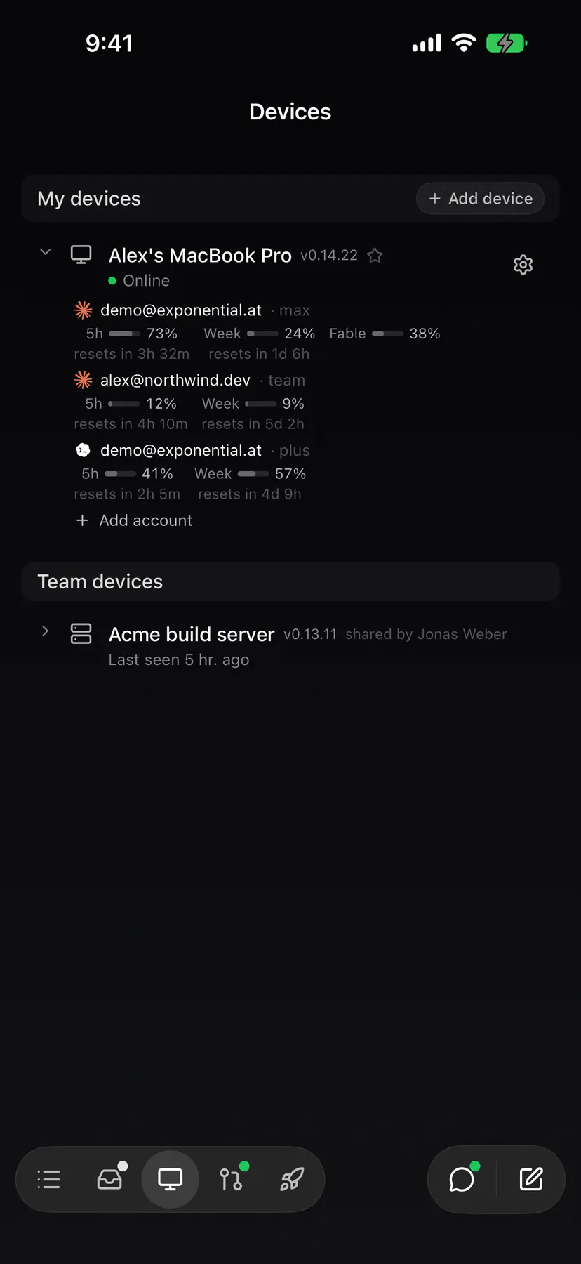
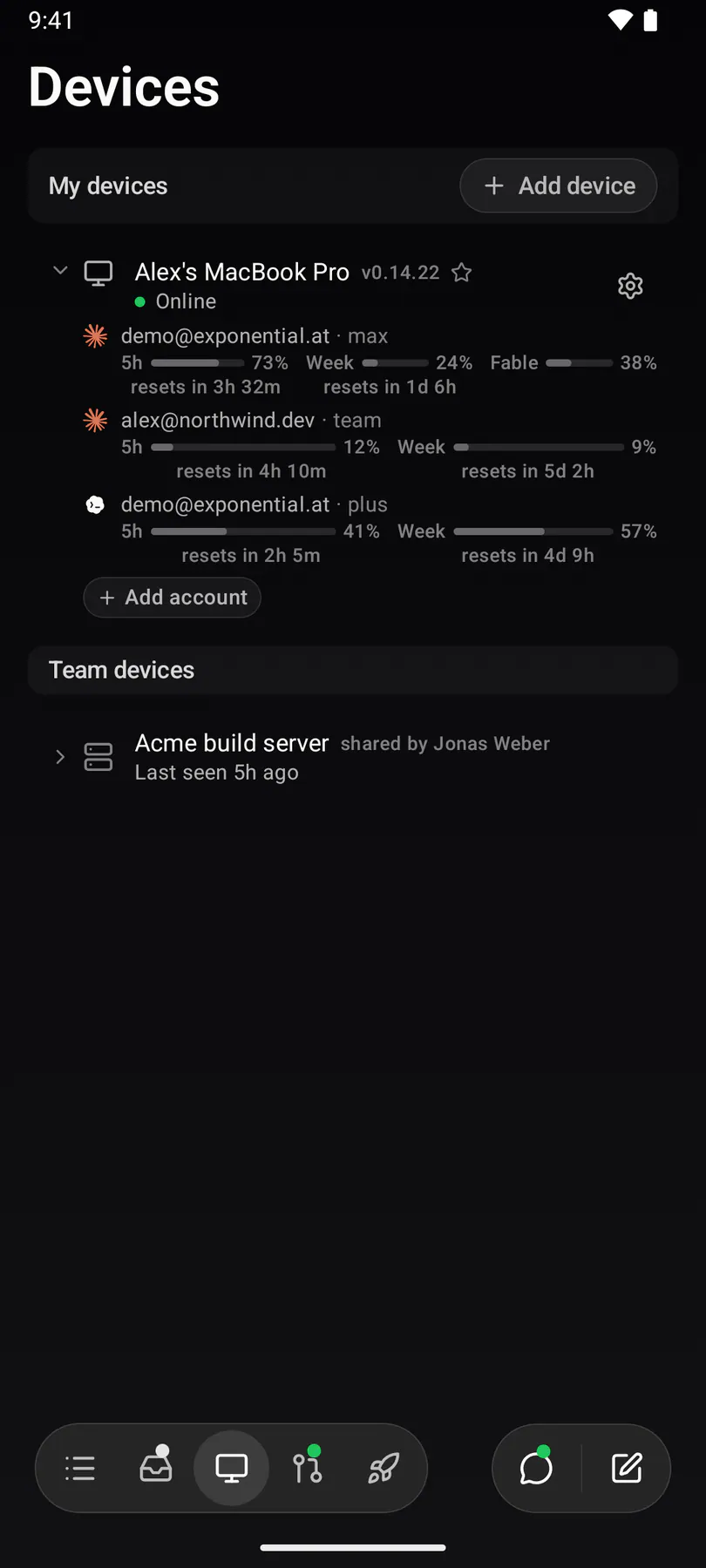
agentsThe machines that can run a coding session: the caller's desktops and headless servers, each listing the agent logins it holds — identity, health and its rate-limit numbers. A row starts nothing: its one control is a settings gear that opens Device settings.
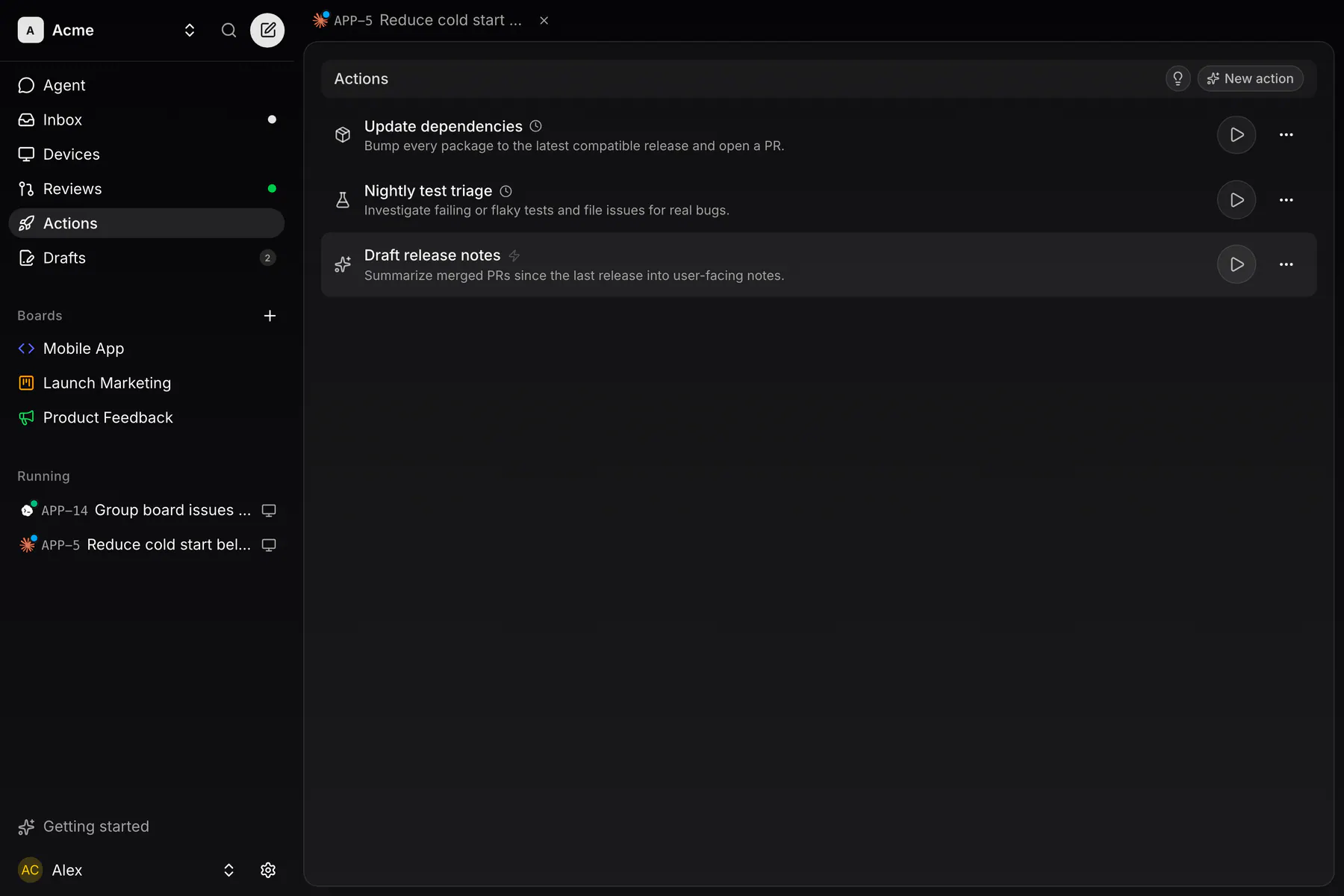
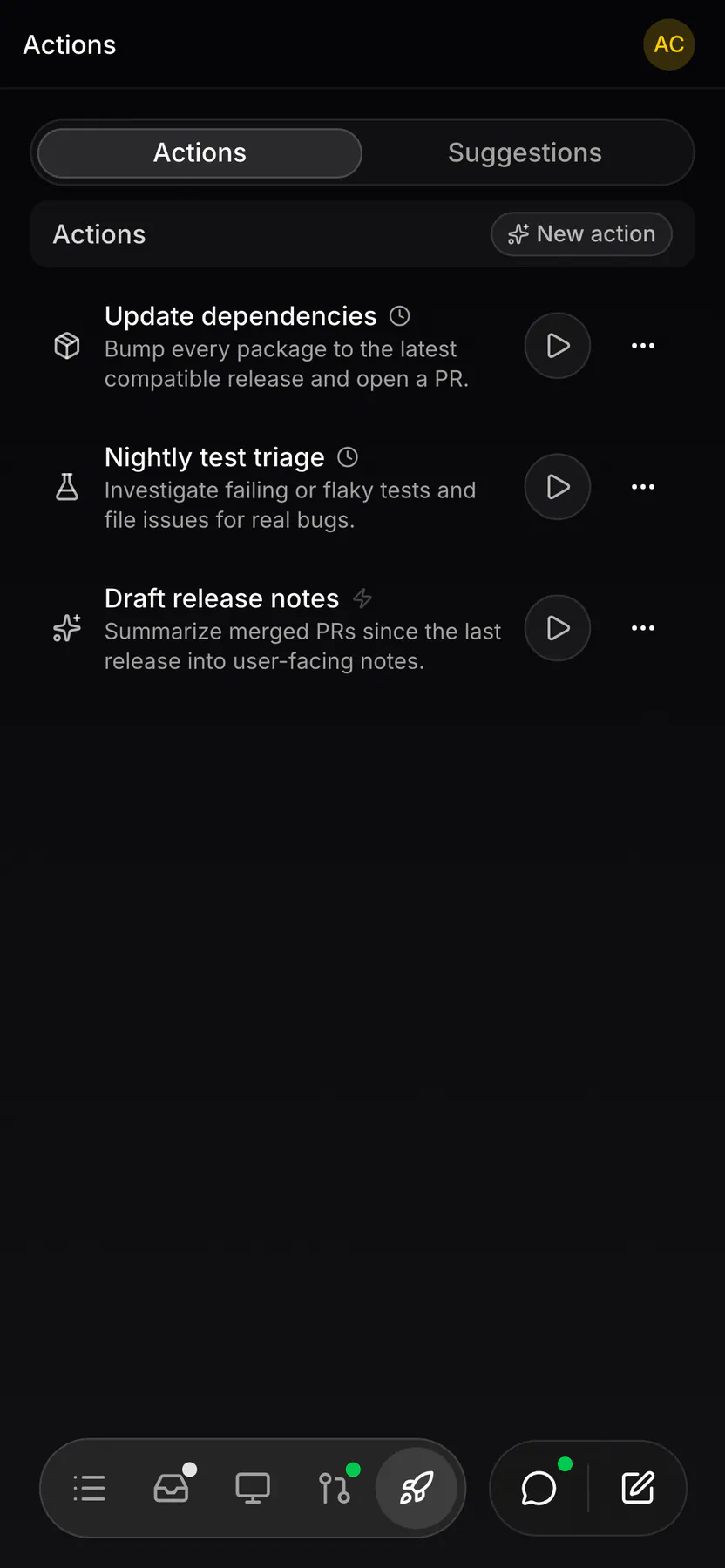
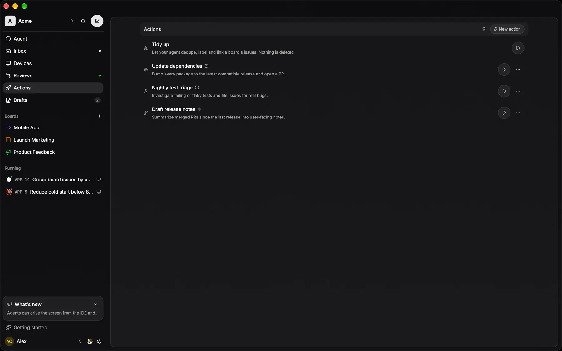
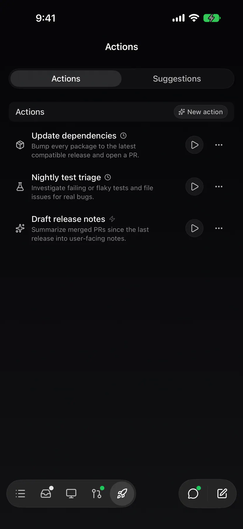
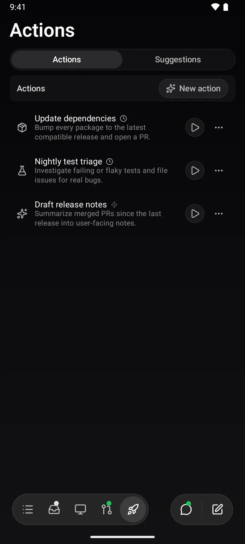
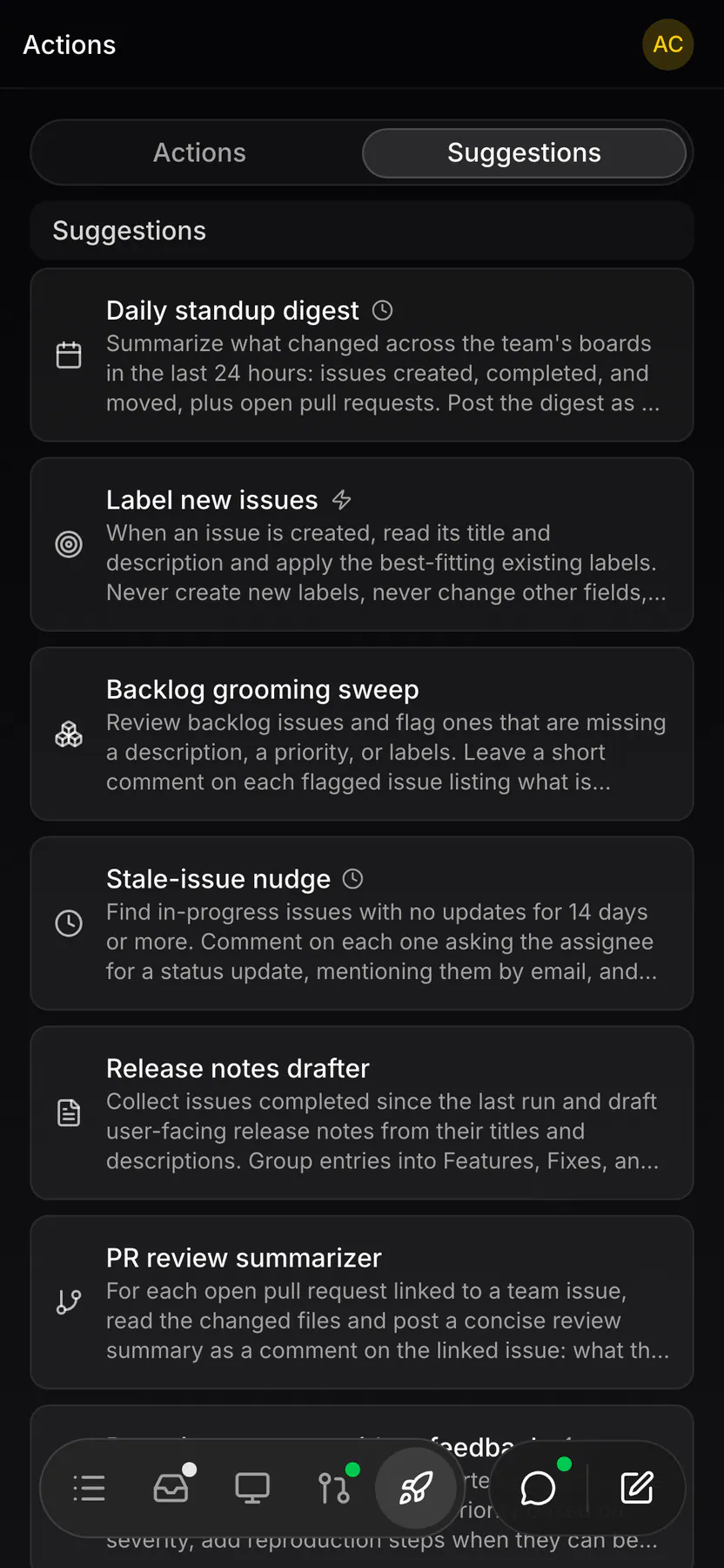
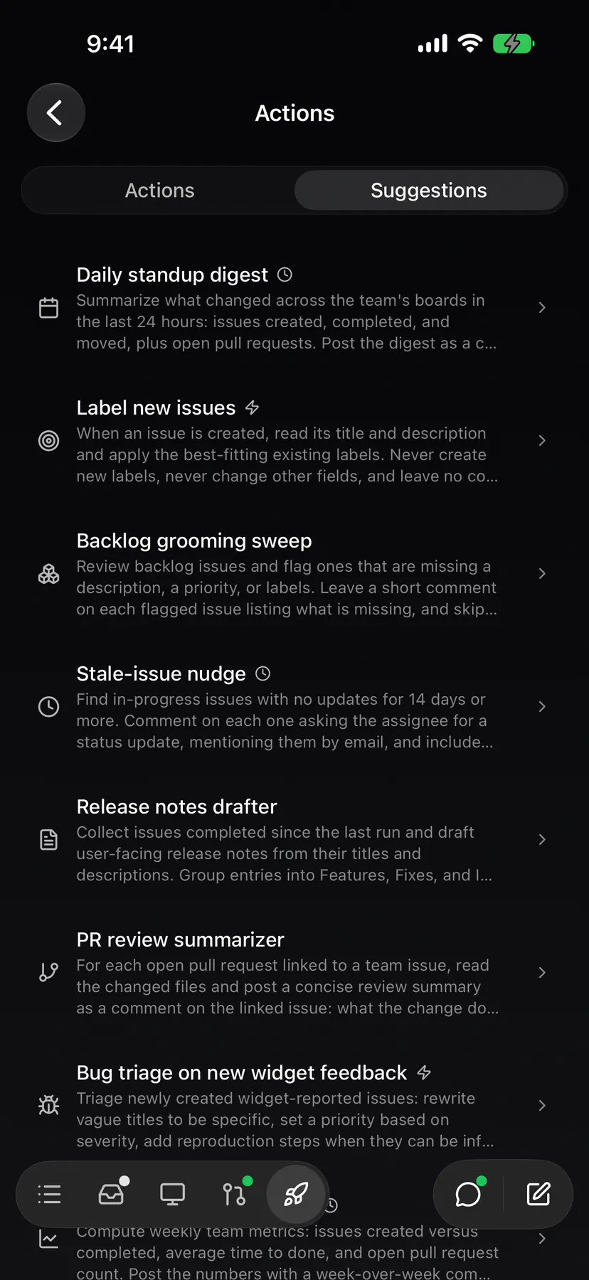
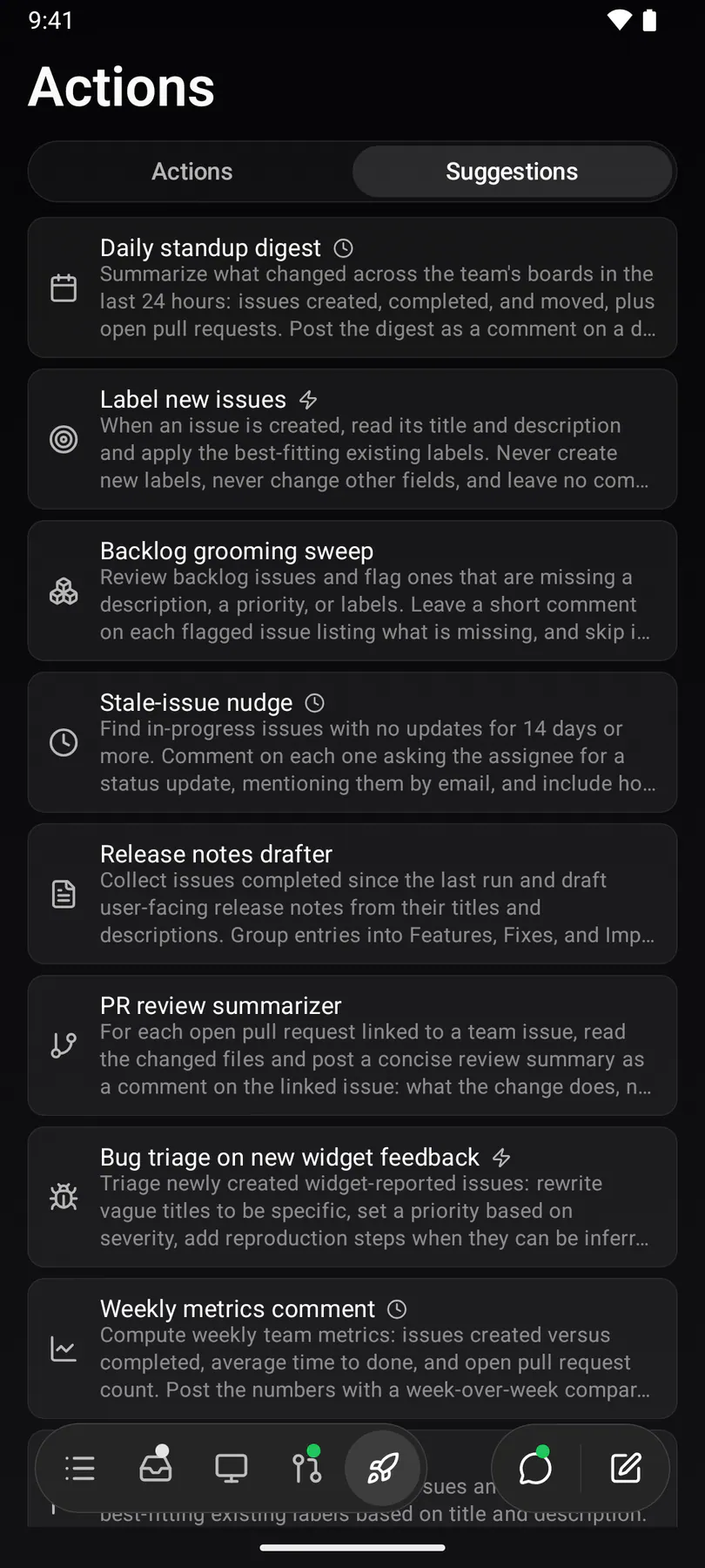
actions-mobileThe action catalog: one row per reusable agent run, each with its play button. Phones reach it through its own Actions tab and list every team's actions grouped by team (EXP-1186/1187); web md+ and desktop through the sidebar's Actions entry.
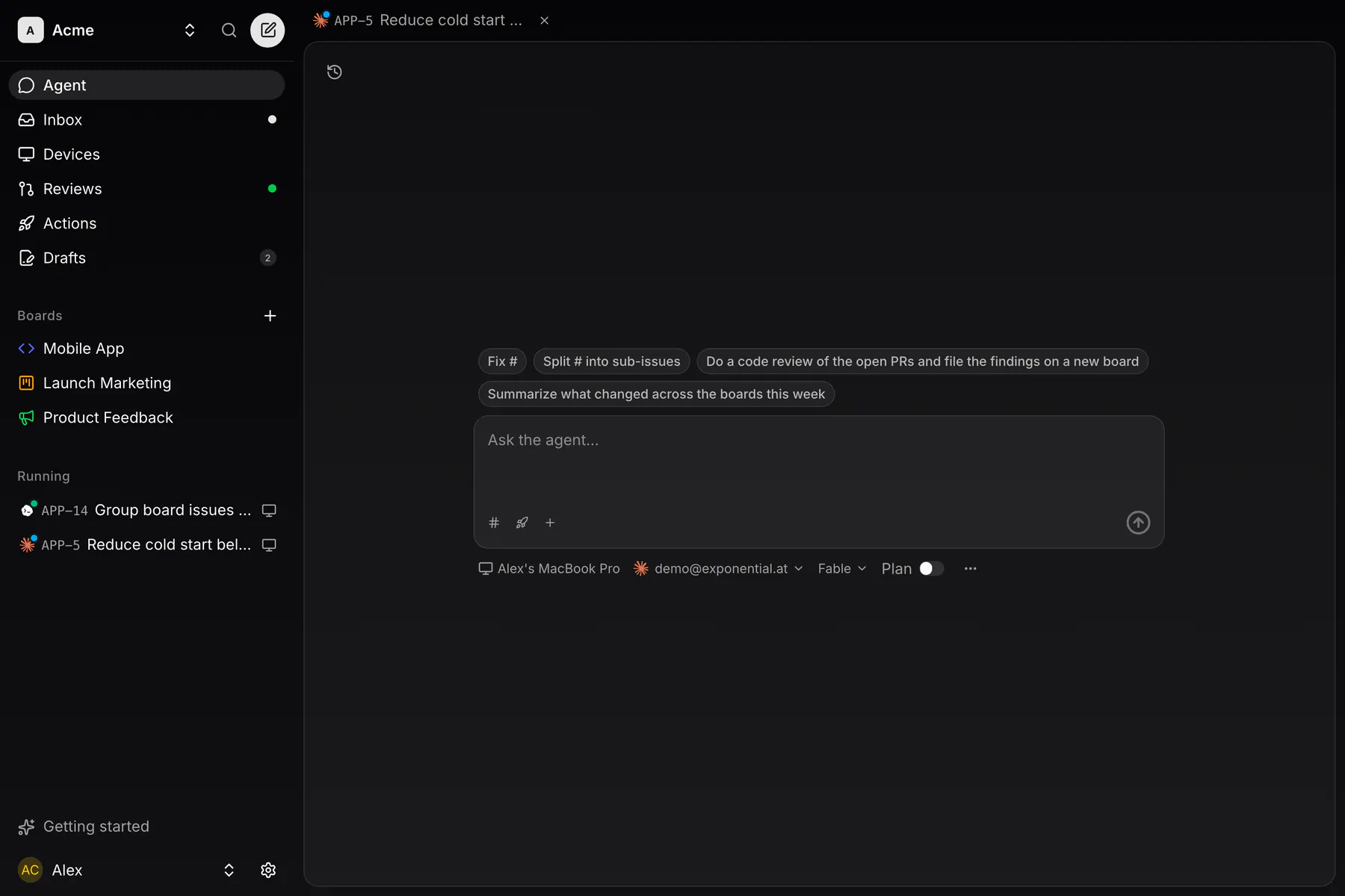
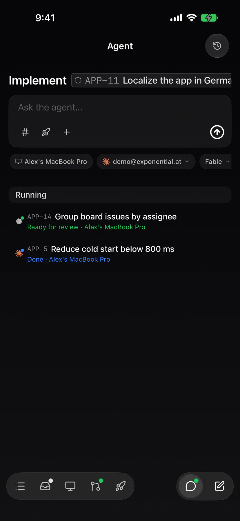
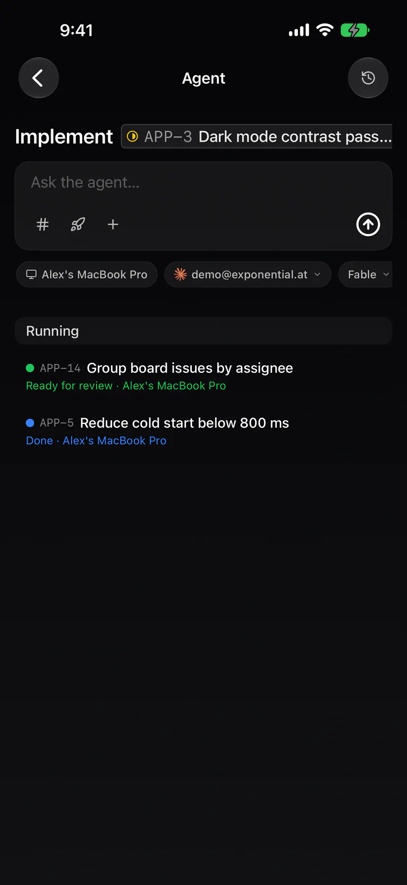
chatThe Agent page: the composer — the ONE launcher since EXP-825 — here empty: a free prompt bound to no issue that needs no repository. EXP-923 moved the runs off the page: what is RUNNING is a section of the sidebar, and the history sits behind the page's own toggle.
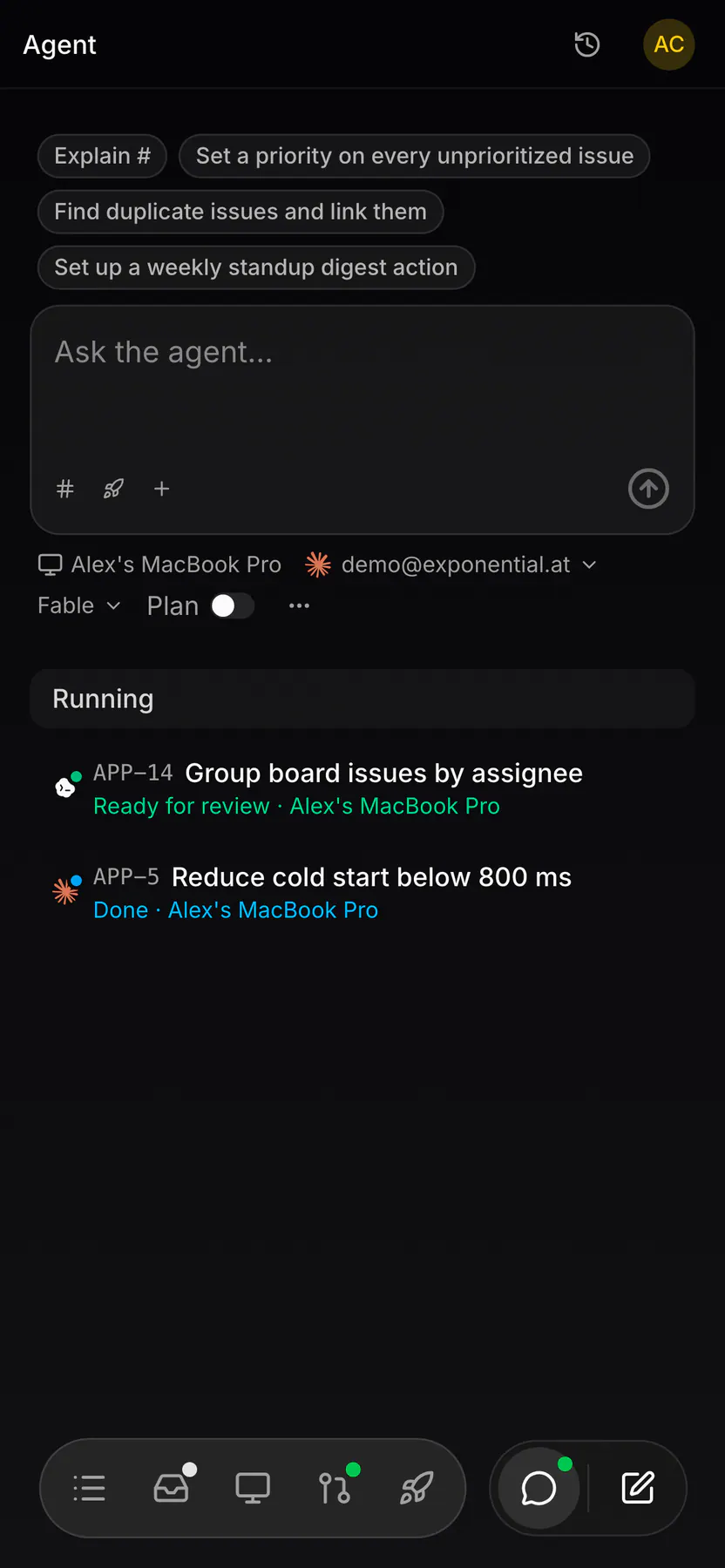
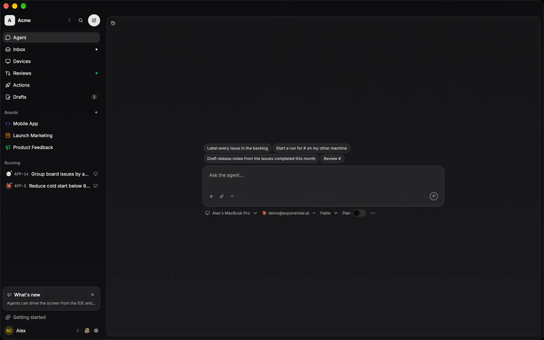
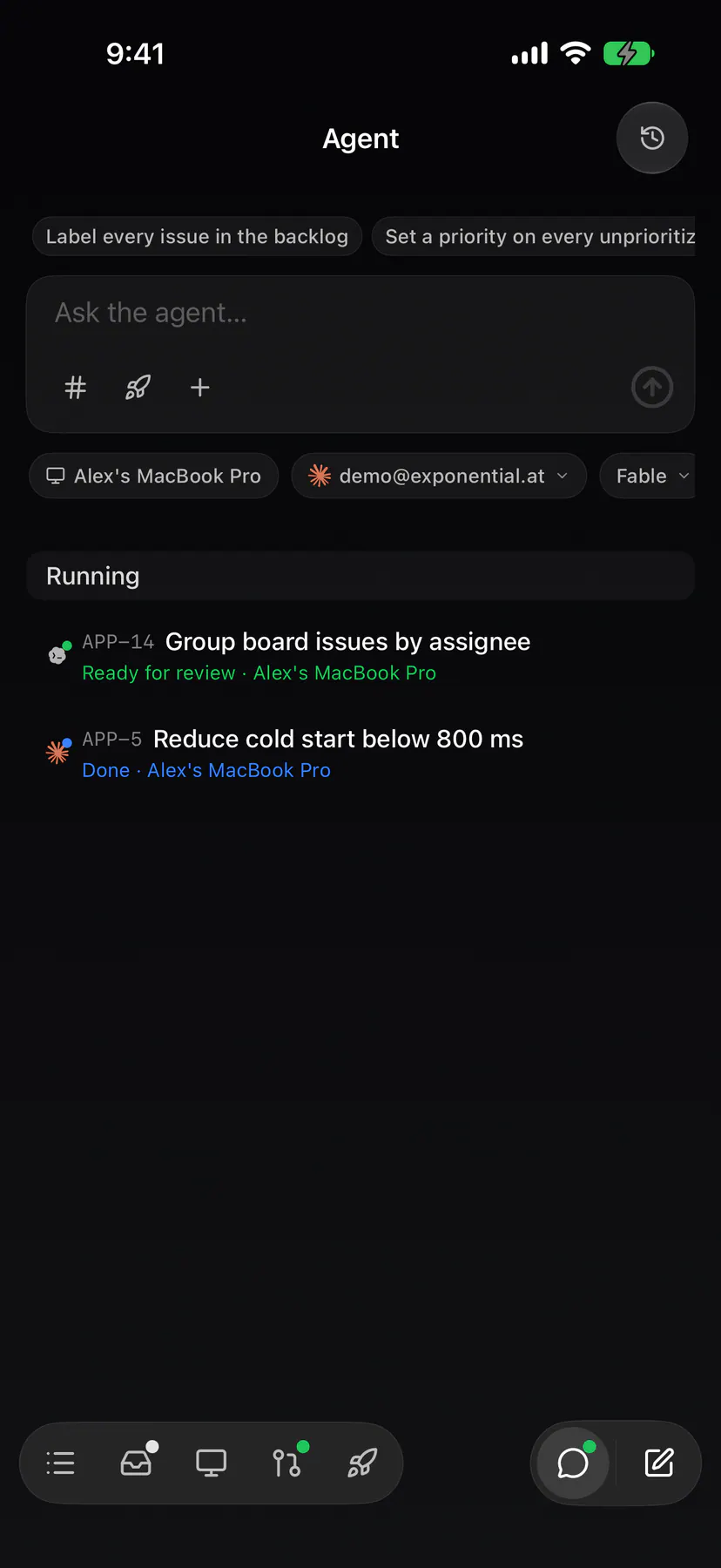
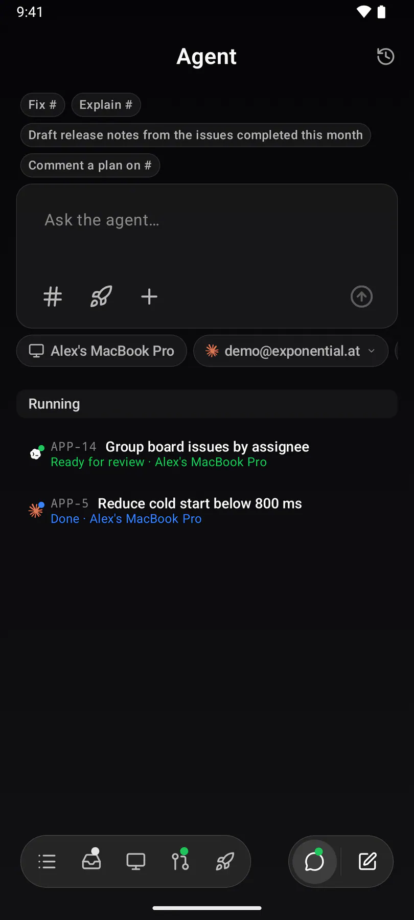
chat-issuesThe composer with work attached: one chip per picked issue above the prompt, the machine and agent pickers under it. Two issues off the board, handed to one run.
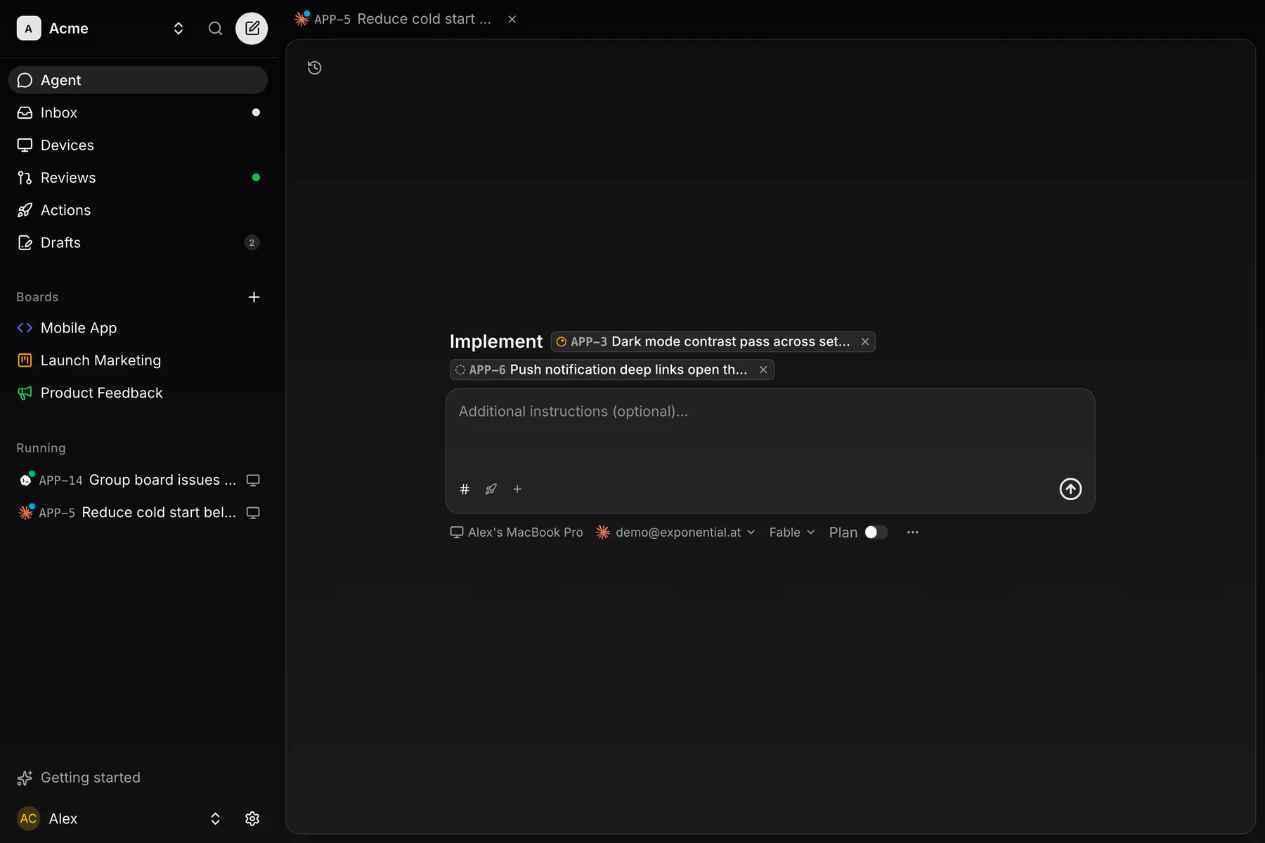
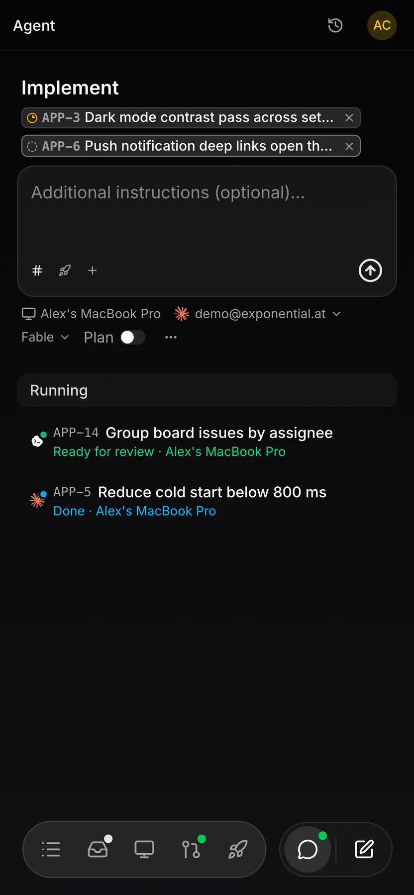
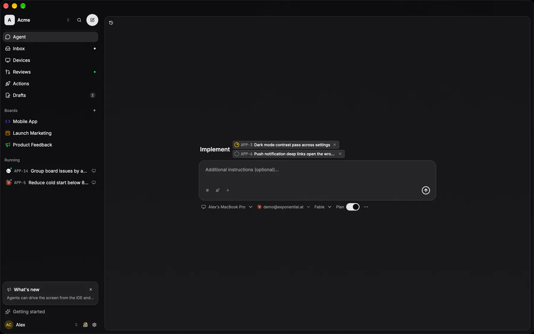
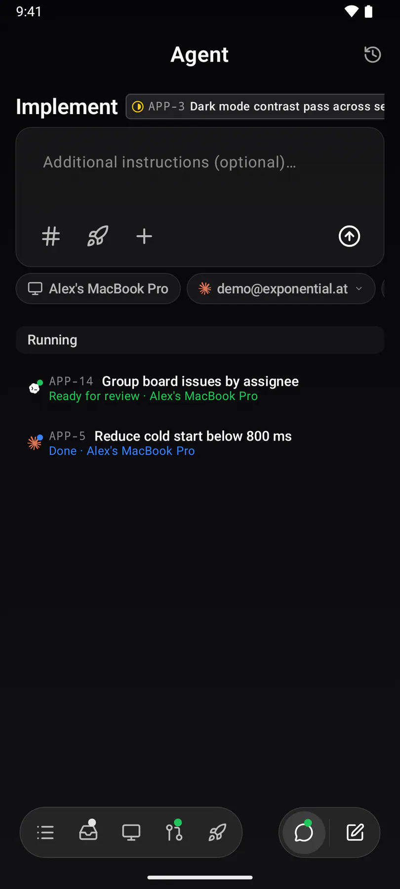
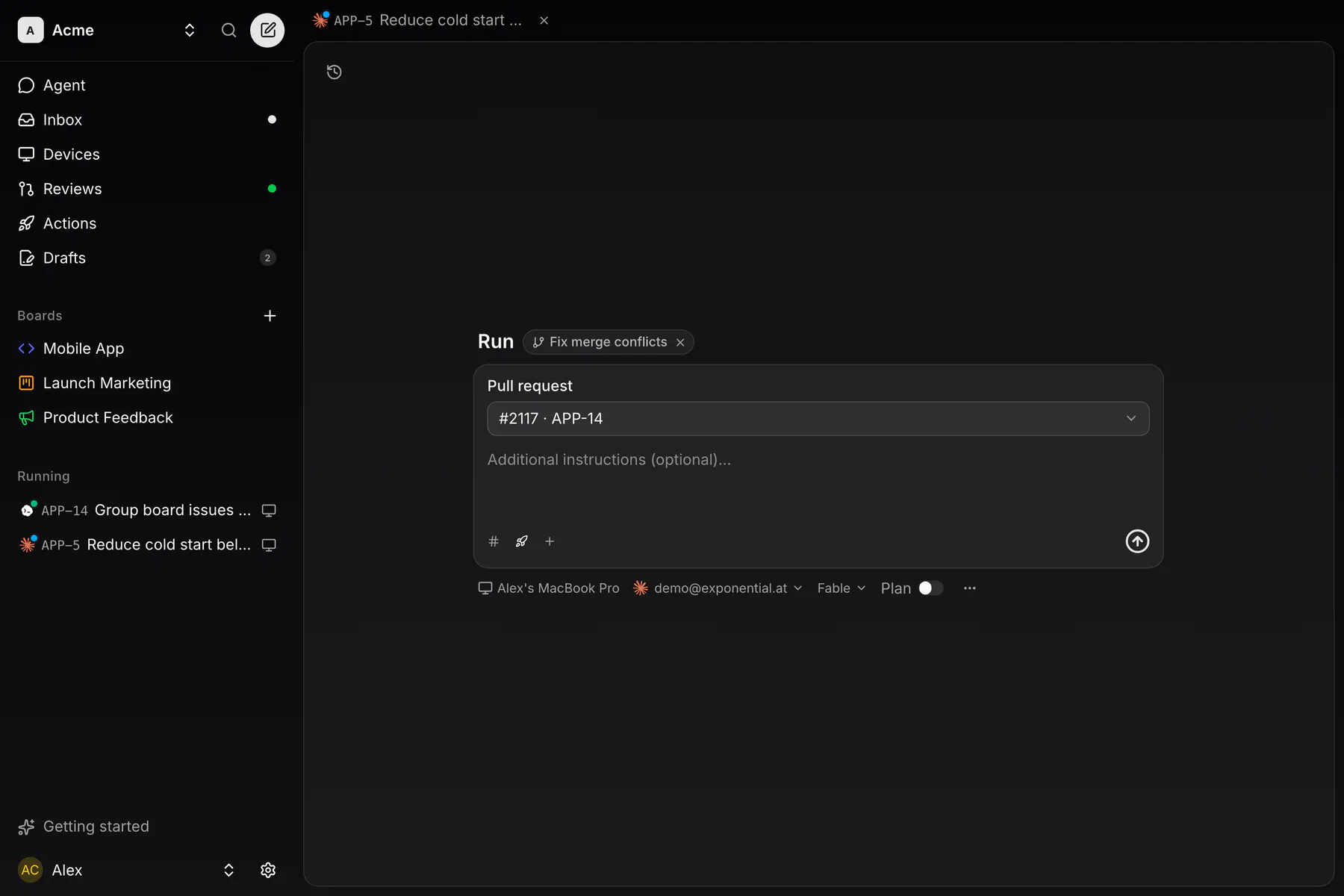
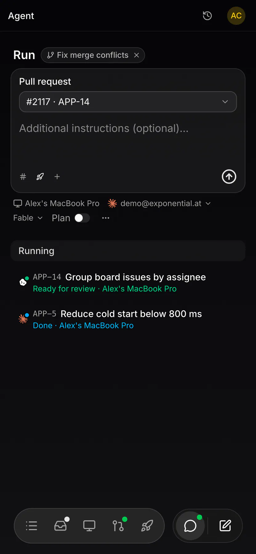
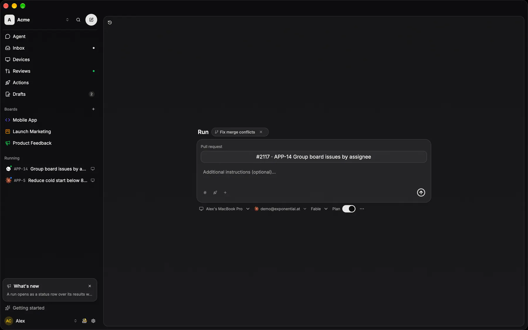
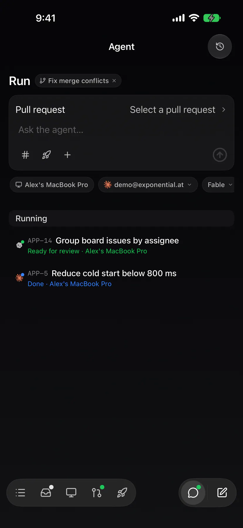
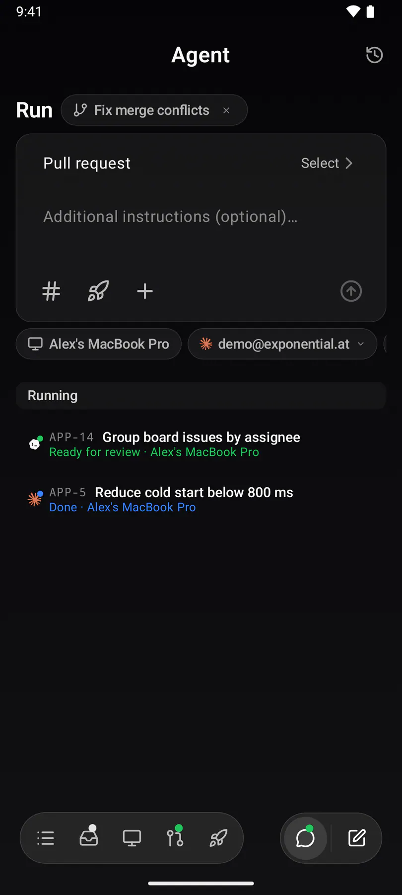
chat-actionThe composer running a saved action: the action chip above the prompt and the action's typed inputs under it — here the builtin Fix merge conflicts with an open PR already filled in.
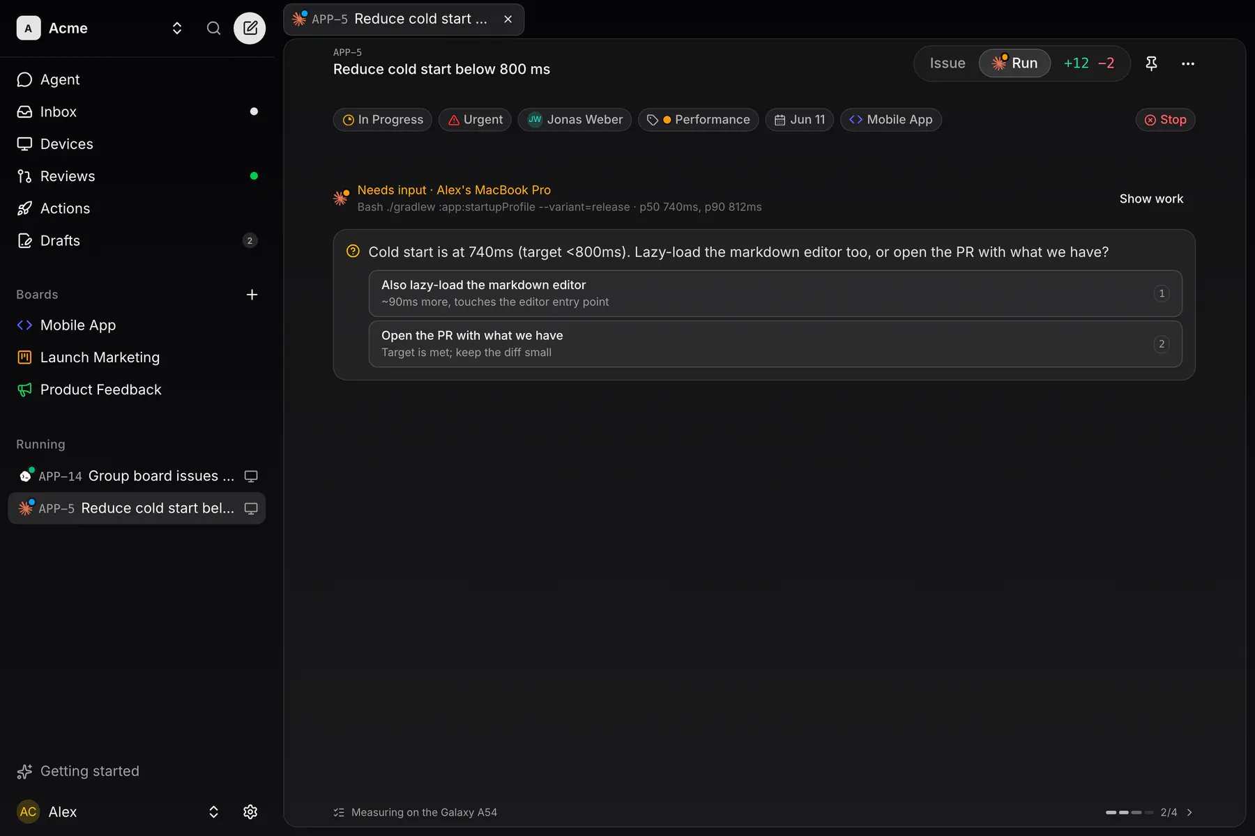
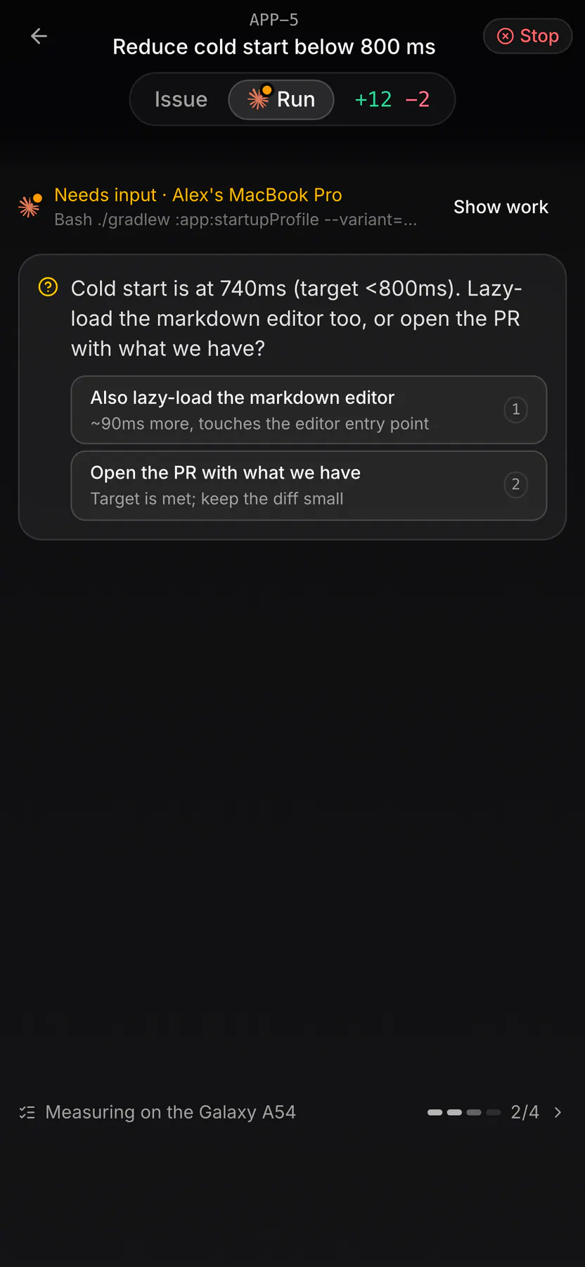
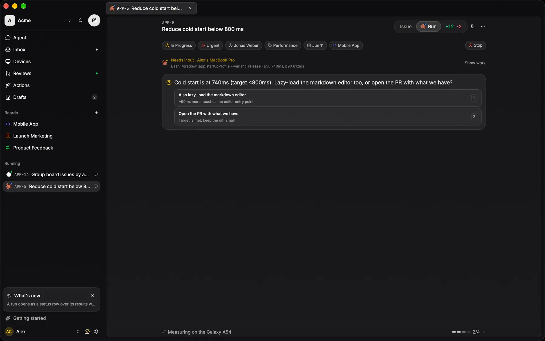
steeringOne coding session on its own page: it opens as the status row over the run's results thread with the agent's open question still in place, Show work expands the full scrubbed transcript, and the reply box answers it.
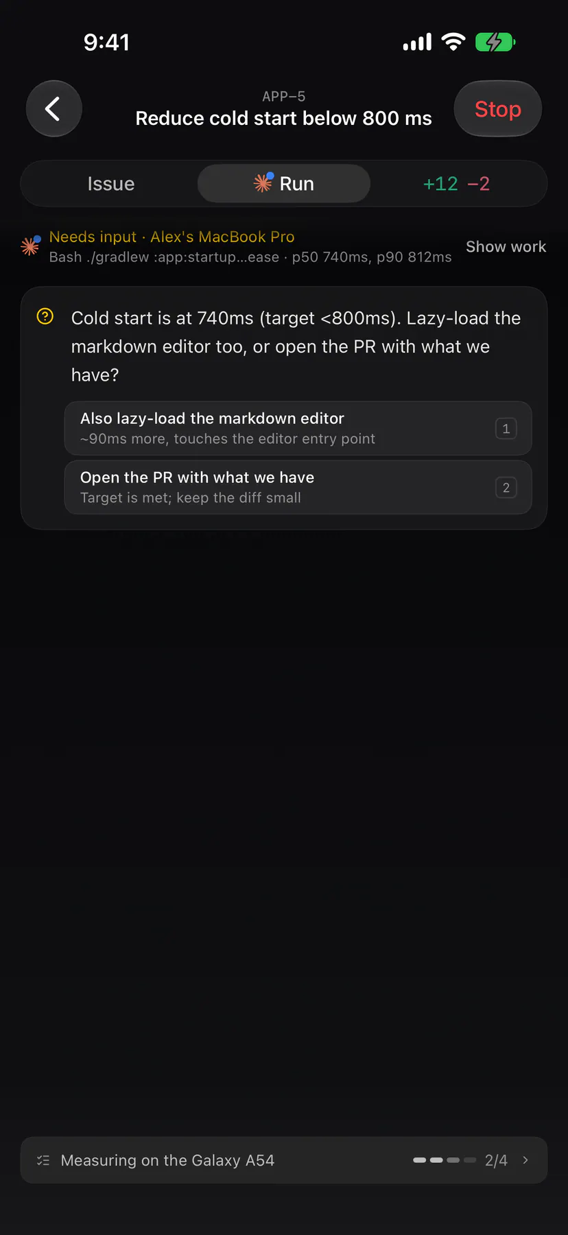
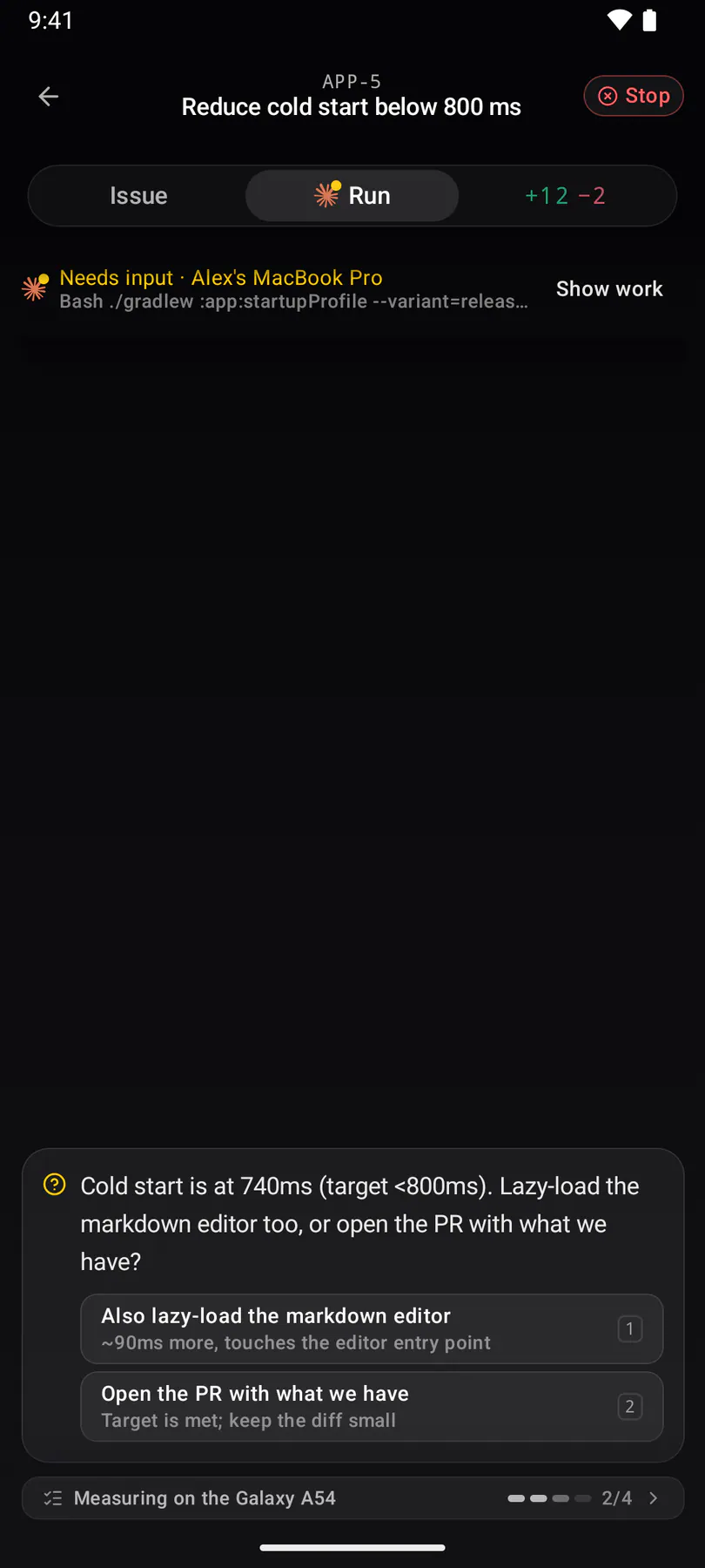
chat-from-issueThe phone's way into the composer: the issue's Start coding button lands on the Agent page with that one issue already chipped. The store slide keeps its start-coding filename.
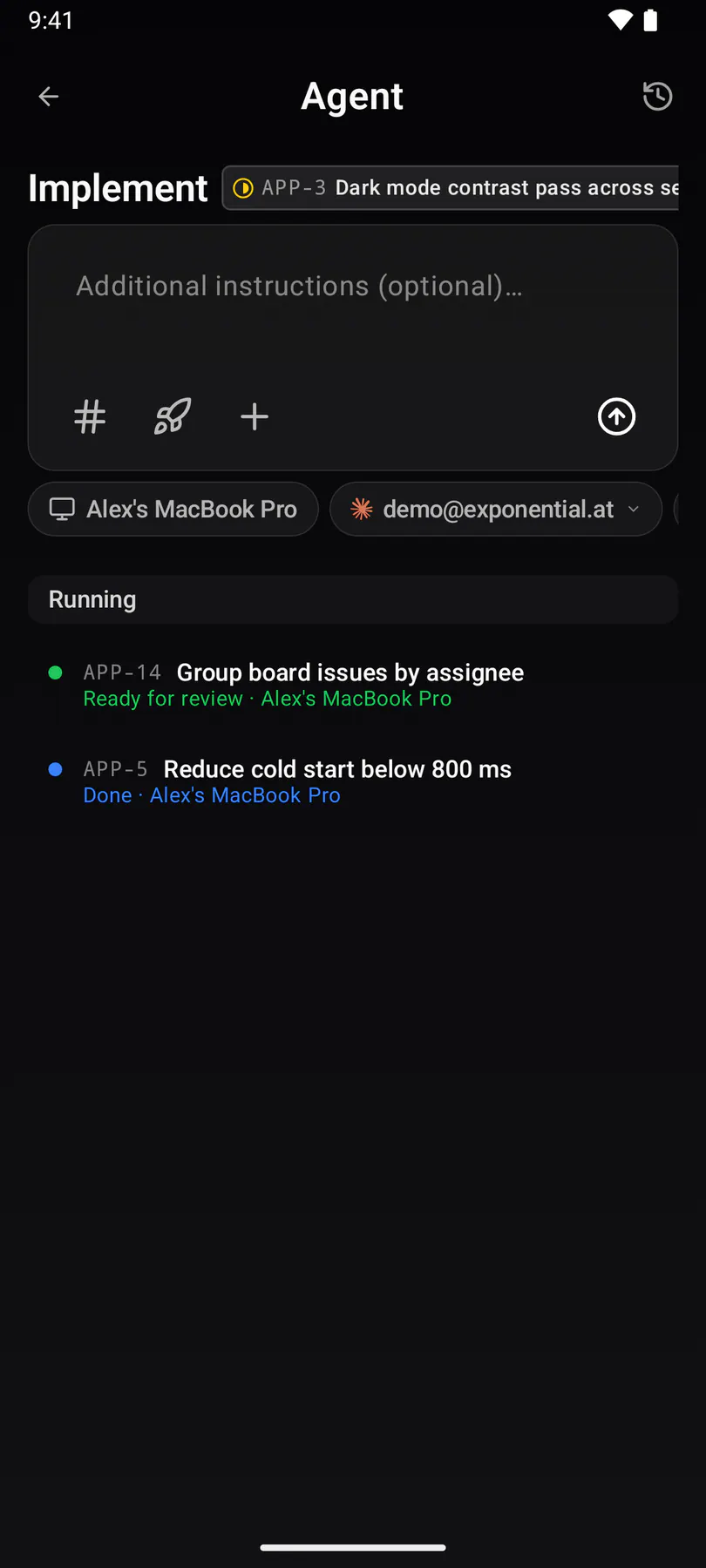
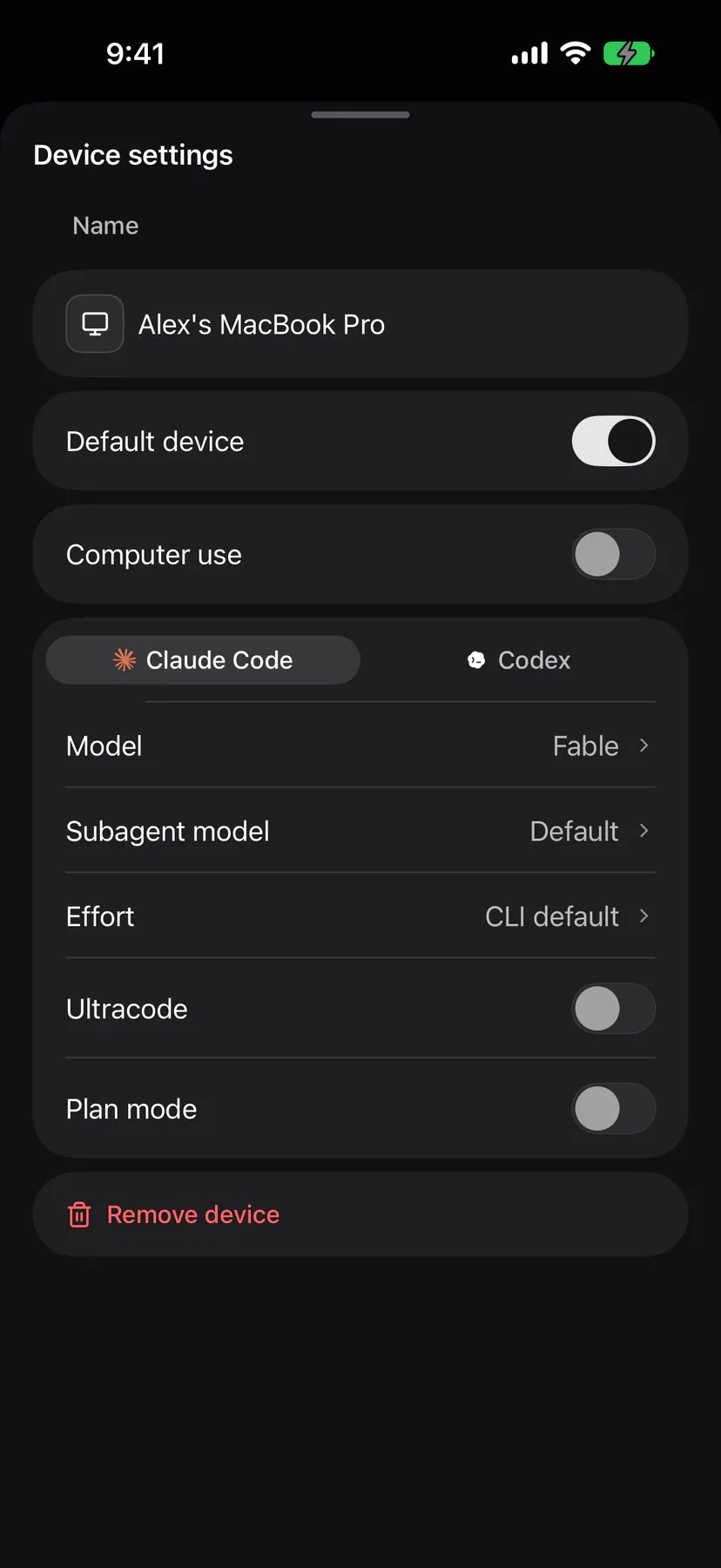
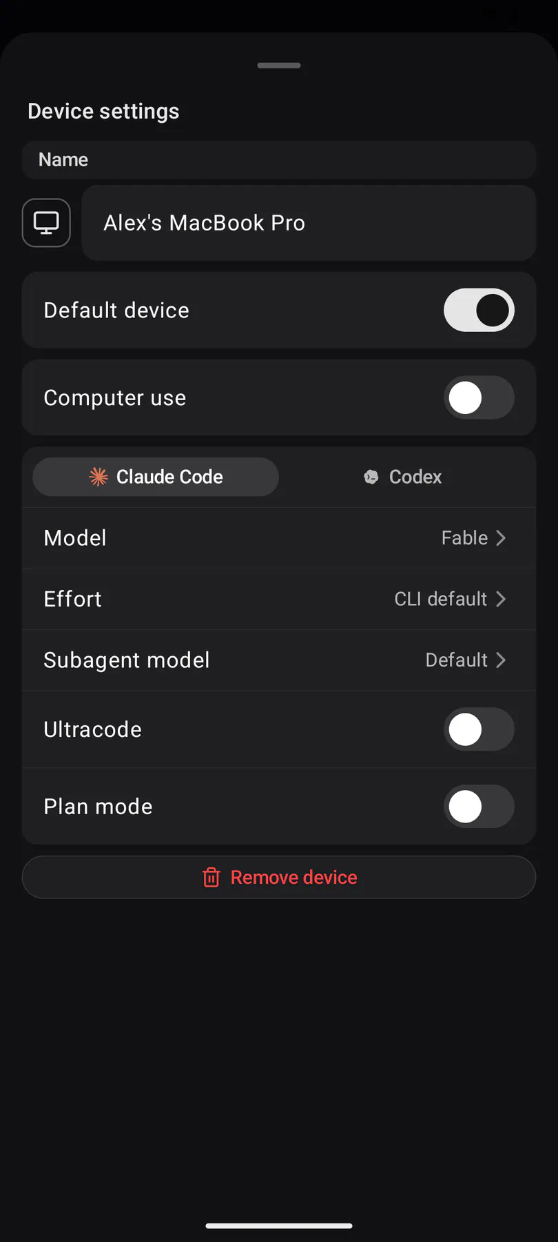
machine-settingsOne device up close, opened by the gear on its row: name, whether it is your default, what it shares with the team, its per-agent defaults, then Update and Remove device as a plain row. EXP-1020 took the worktrees out — a machine's worktrees are local, so the IDE's Settings → Worktrees owns them. EXP-862 renamed the dialog from Machine settings; the view id and the native shot names keep the old spelling so the store keeps its history.
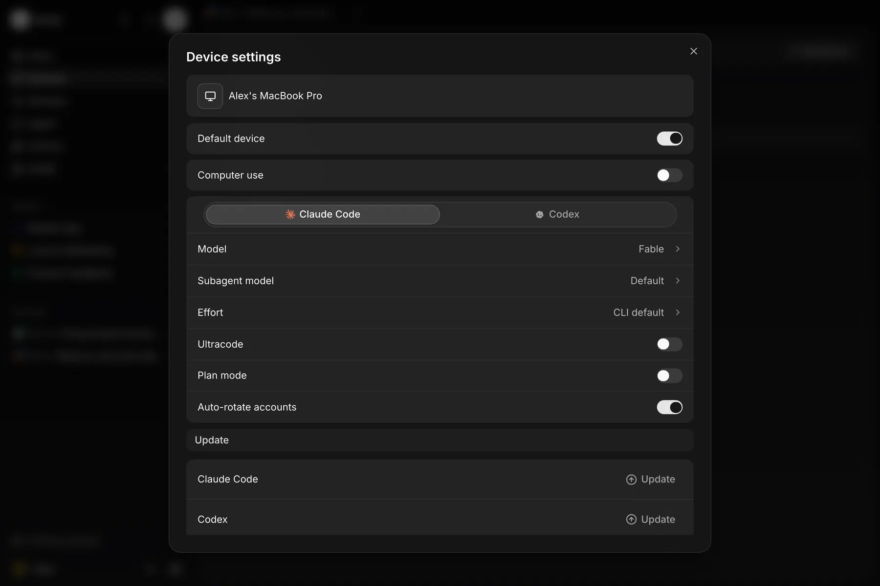
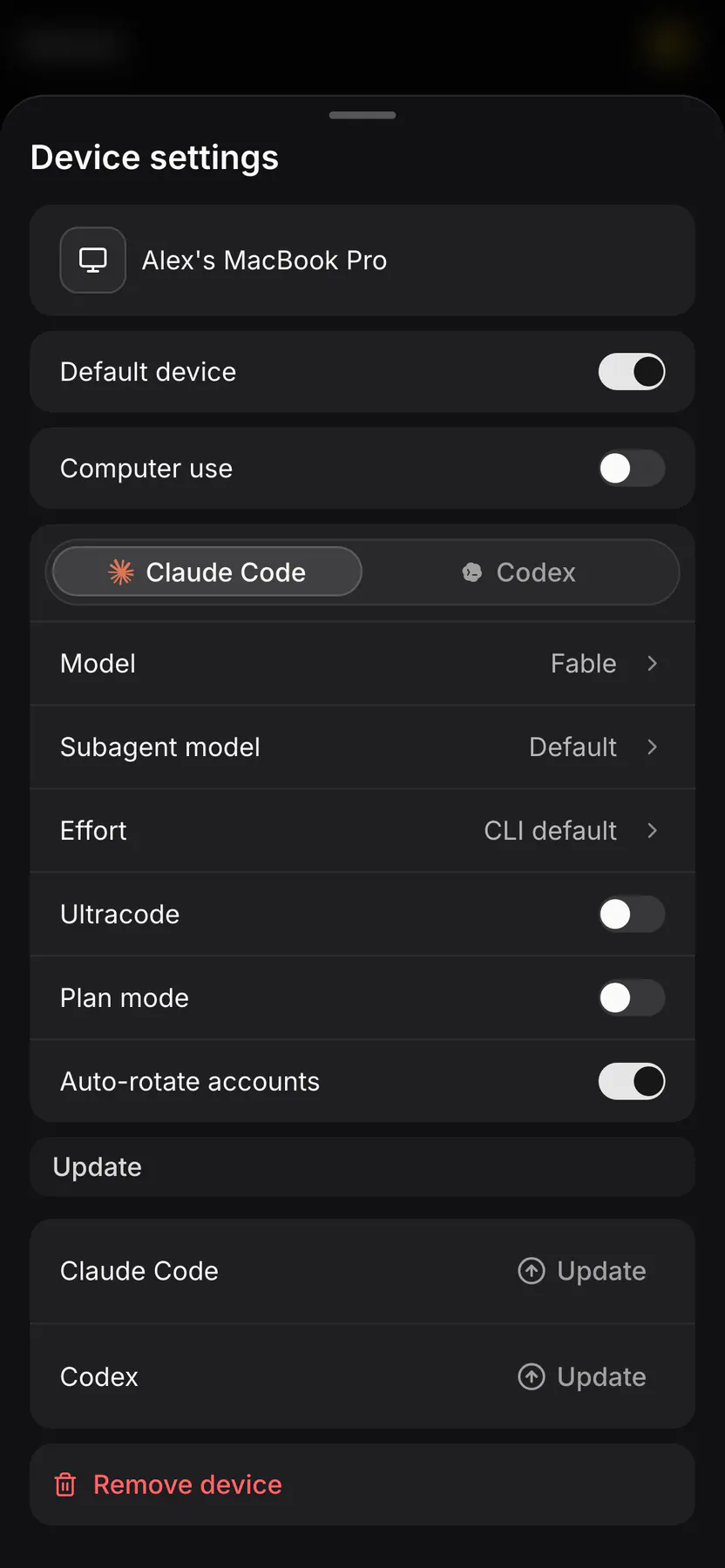
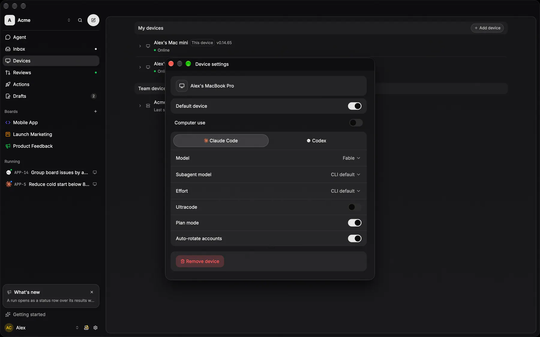
add-serverBoth ways to put a machine on the account: download the desktop app, or run the one-liner that installs the CLI daemon on a server. The same device-setup block as the onboarding step.
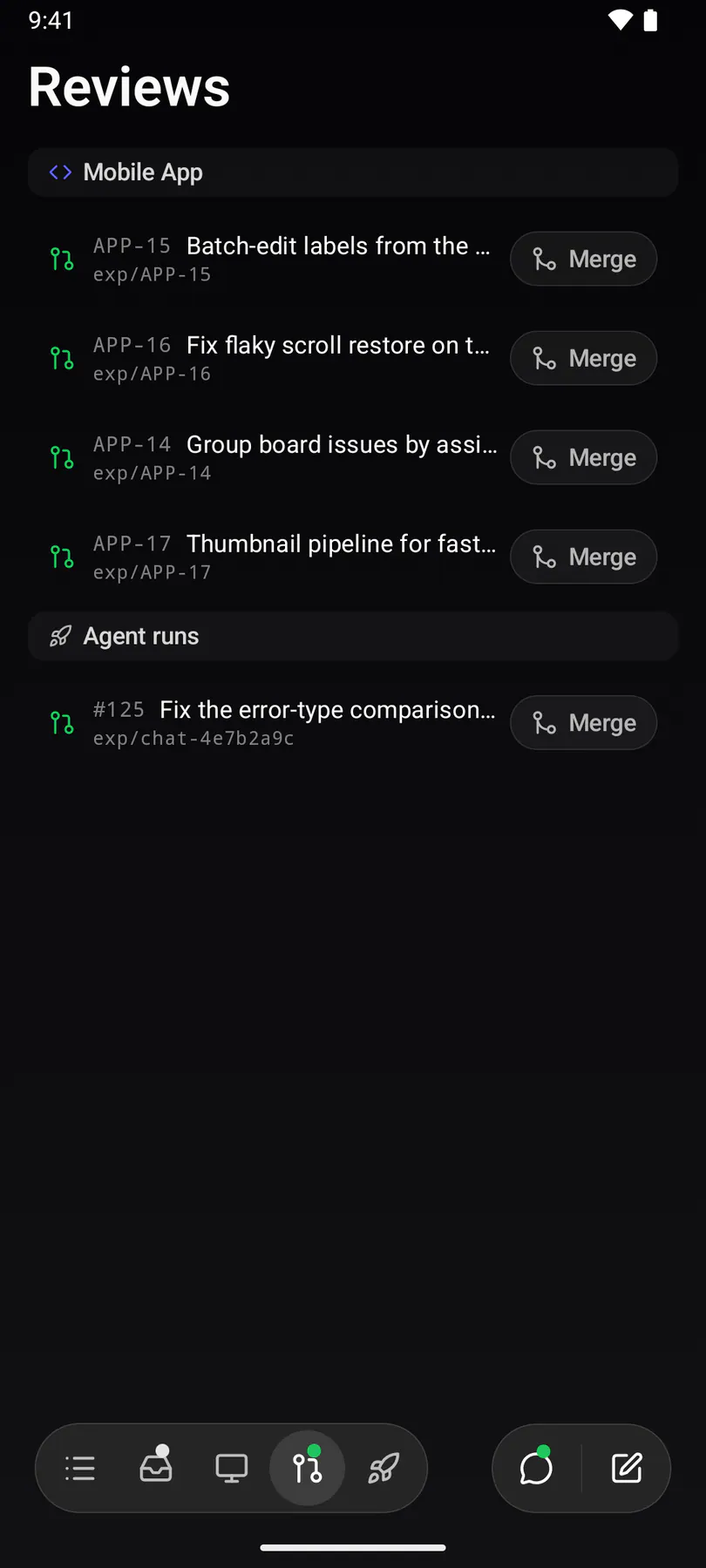
reviewsEvery open PR across the team, issue-linked ones grouped by board, each with a one-click squash merge.
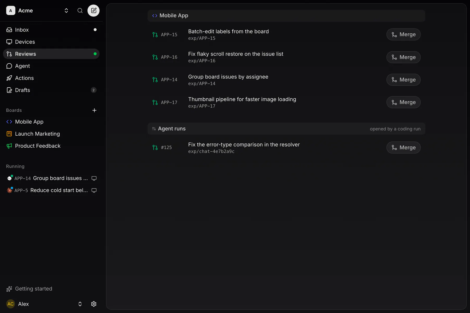
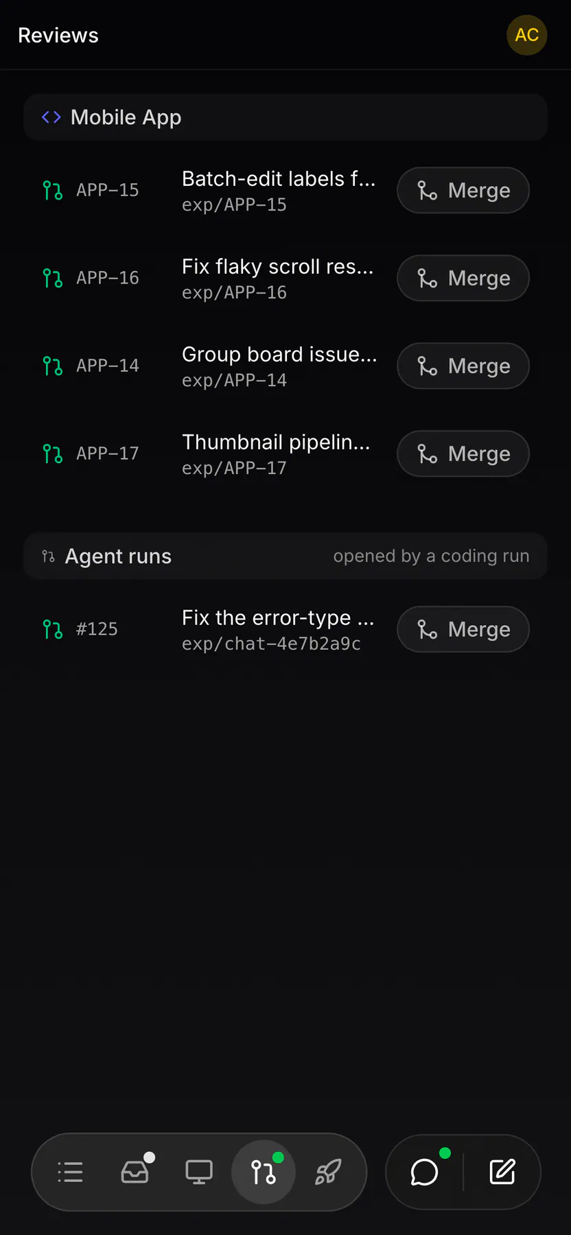
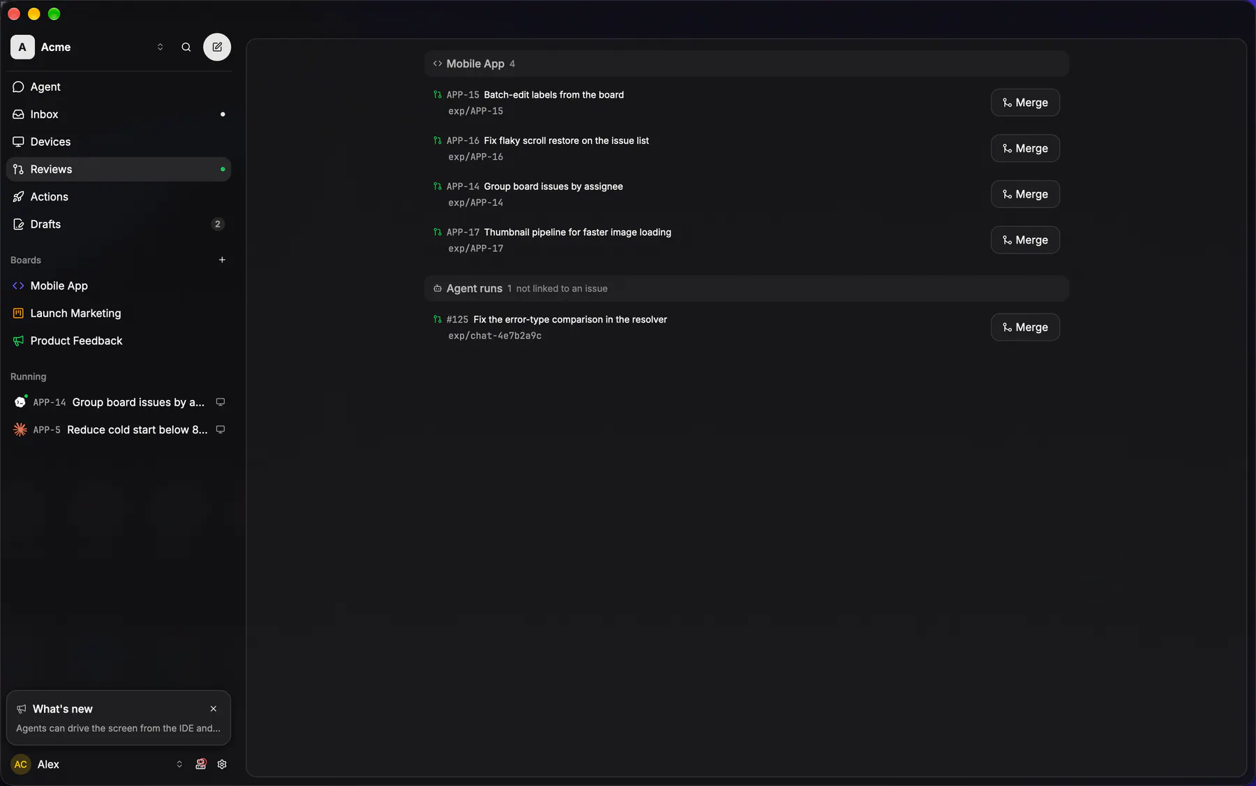
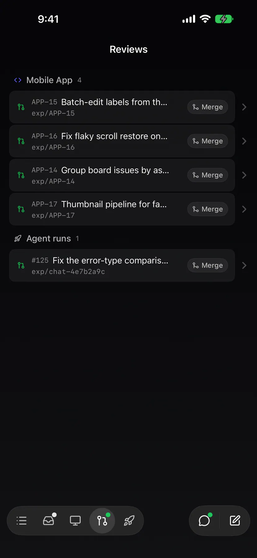
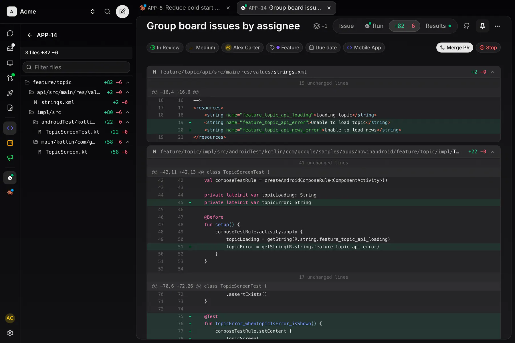
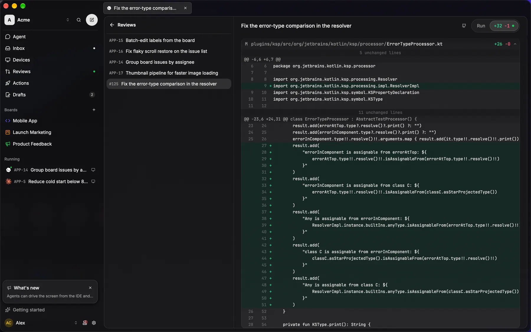
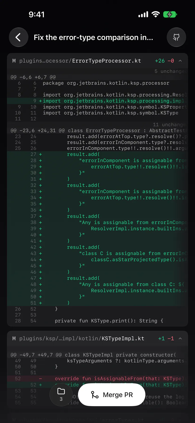
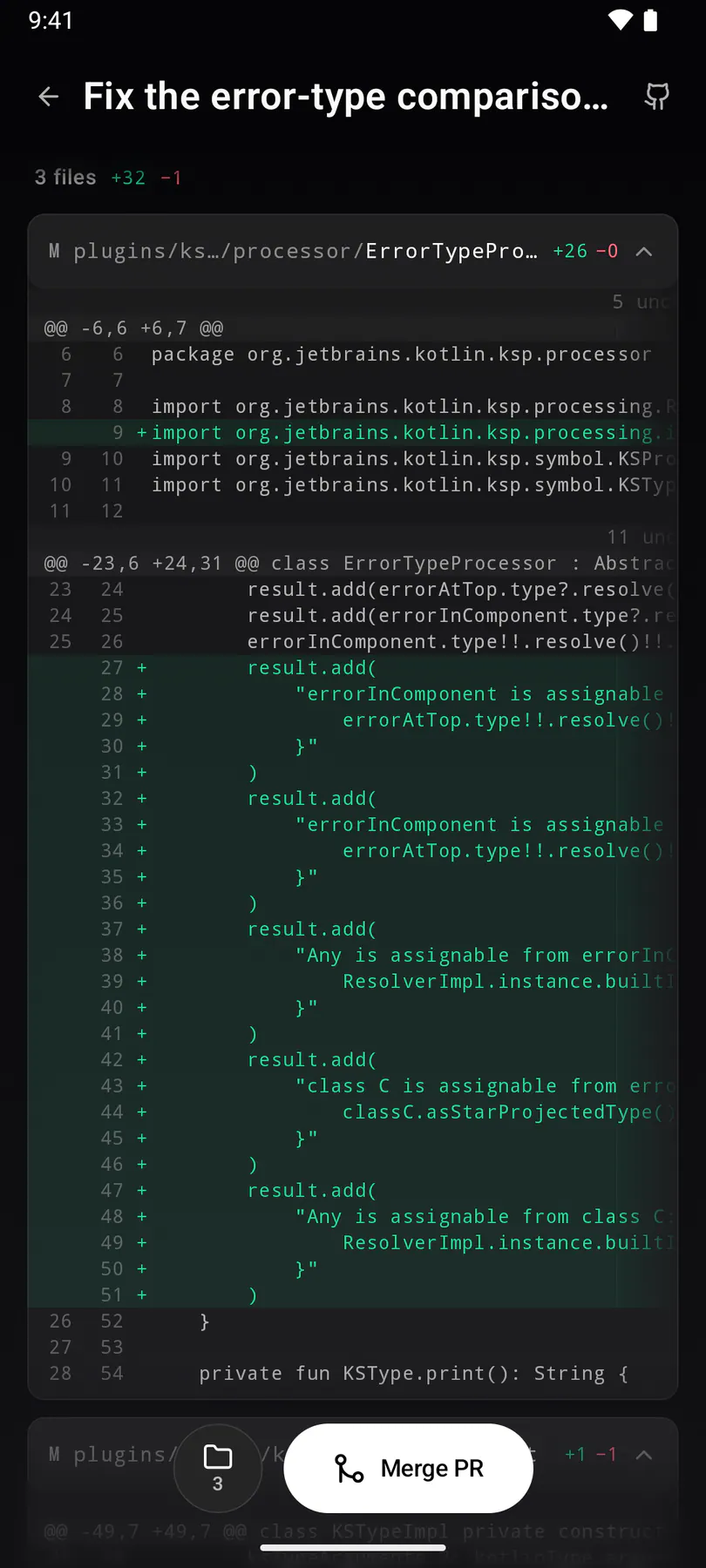
review-diffA PR's real diff on the issue's Changes face (EXP-1154: the review IS the issue's Work screen): the file TREE beside the file cards, every card open. APP-14 fetches a genuine patch from GitHub.
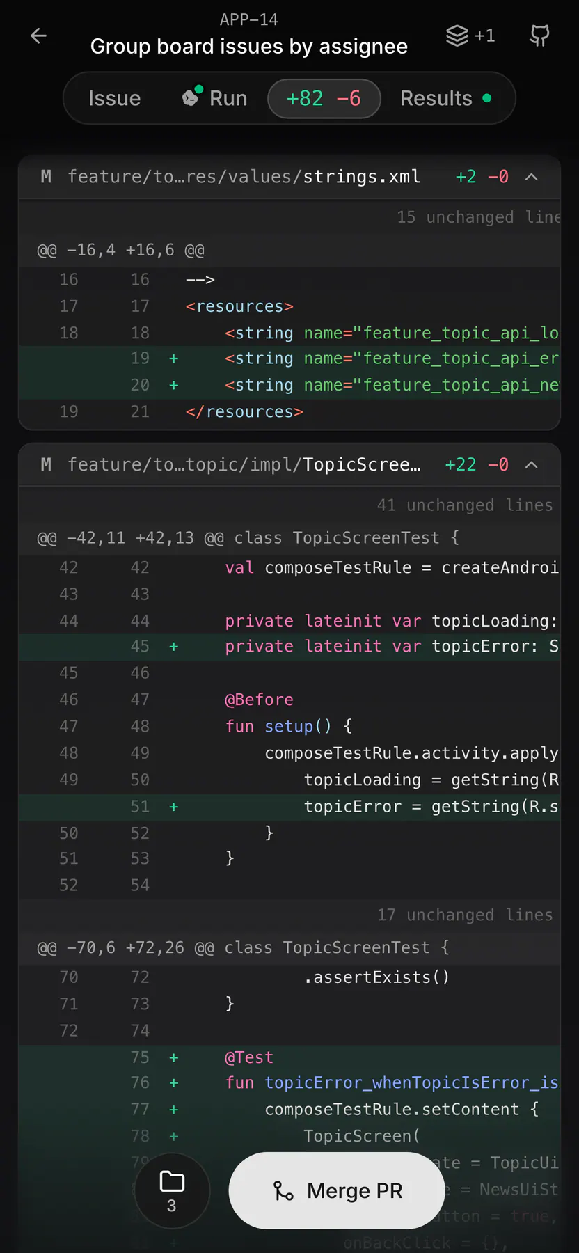
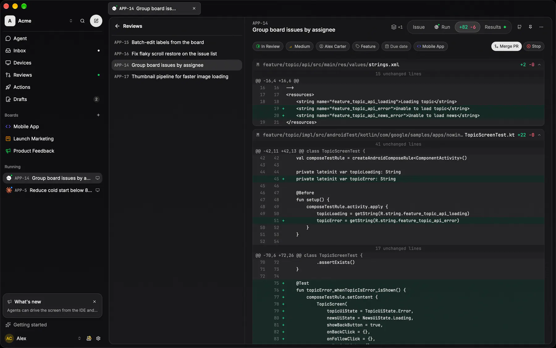
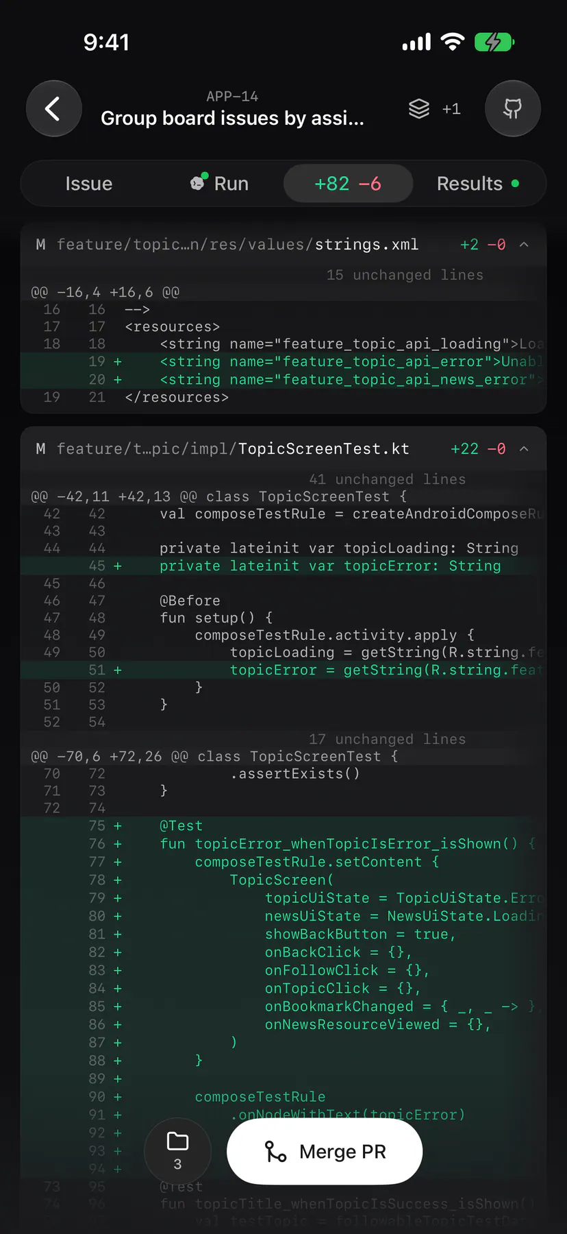
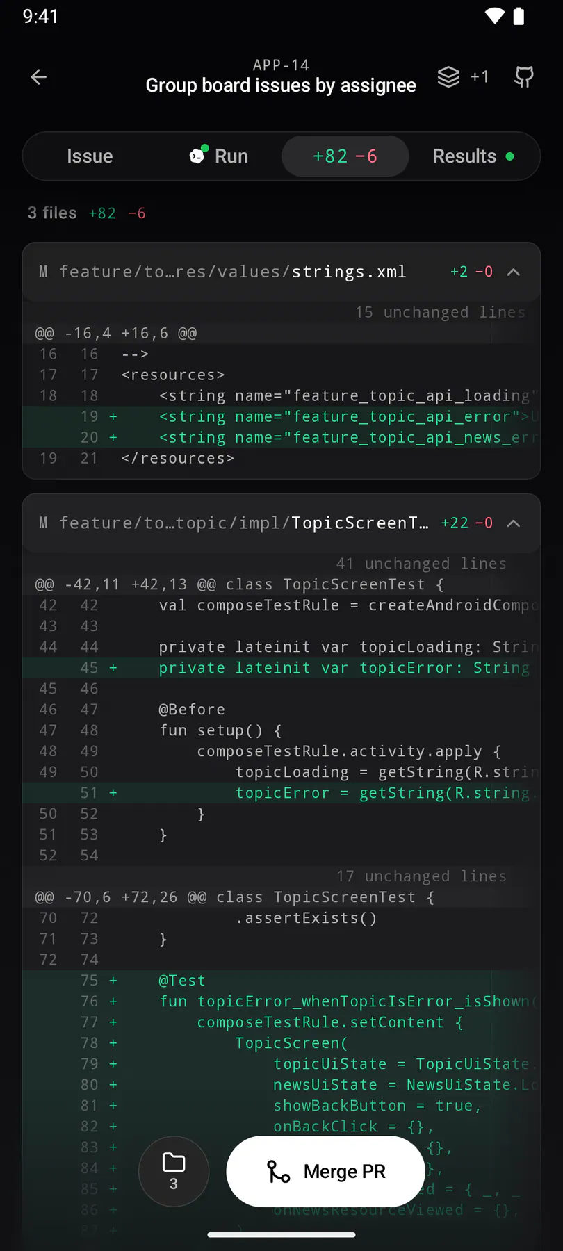
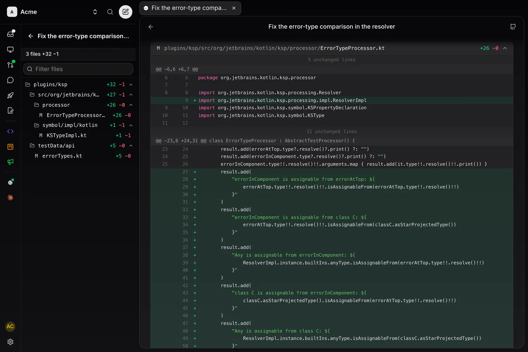
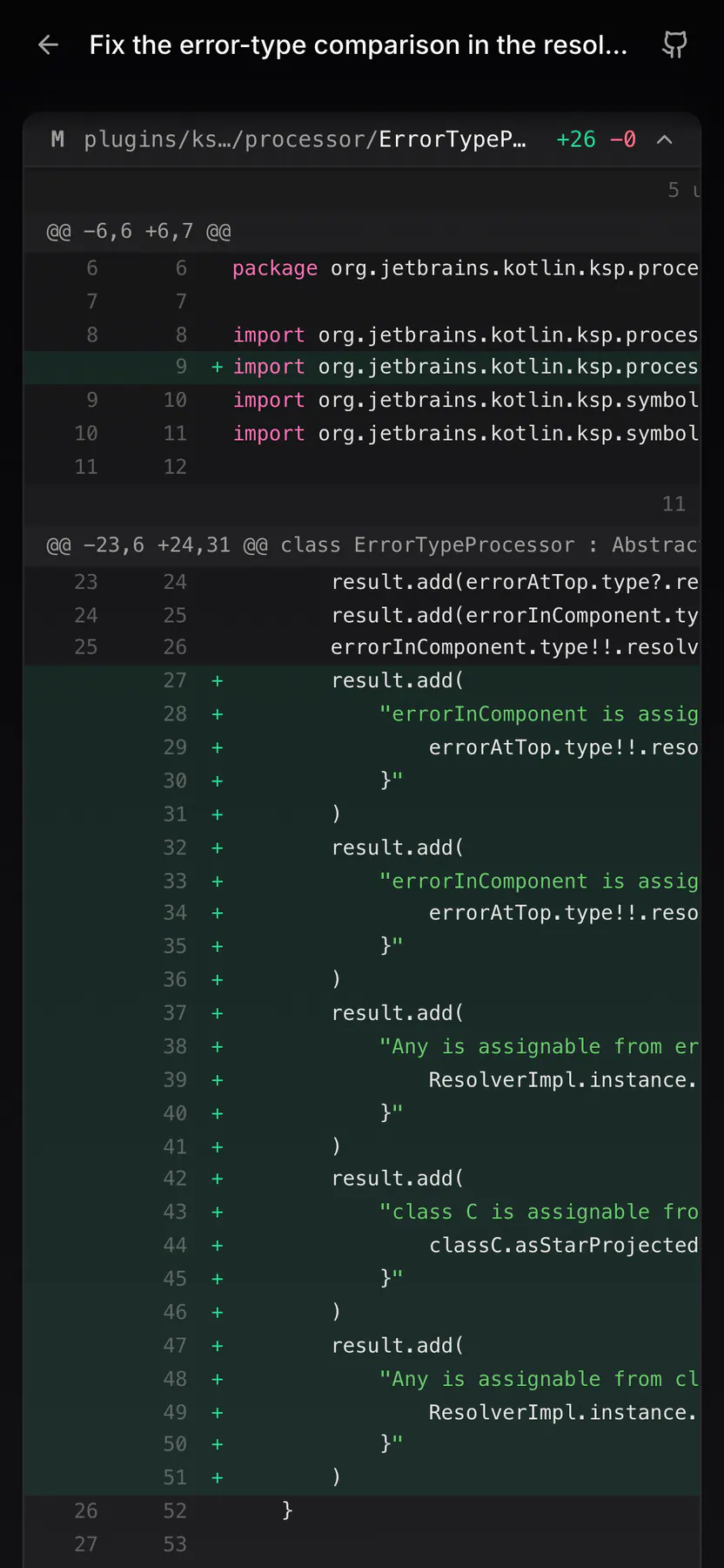
run-changesThe PR diff of an ISSUE-LESS run (a chat or action run's own pull request, EXP-1194): the same file cards as the issue's Changes face, fed by codingSessions.prFiles, opened from the Reviews "Agent runs" row. A teammate's run, so it reads read-only.
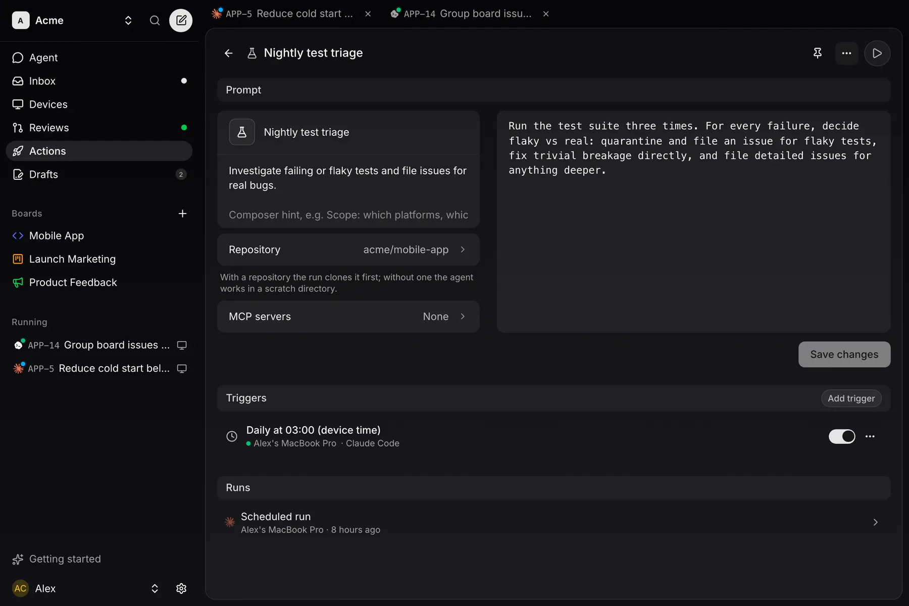
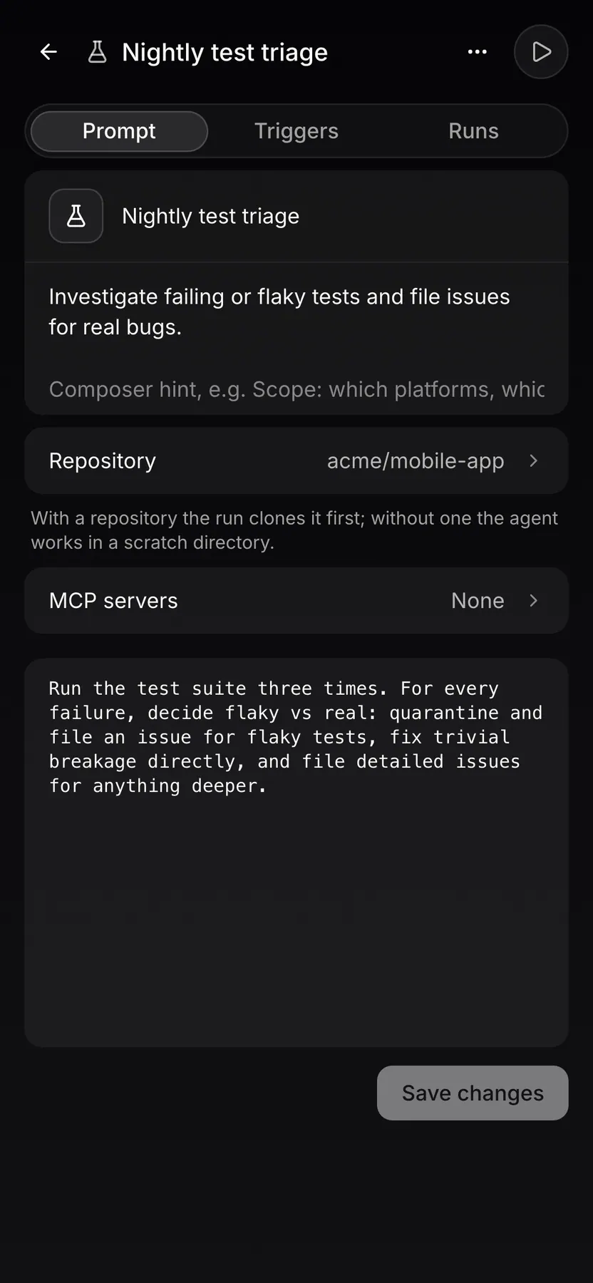
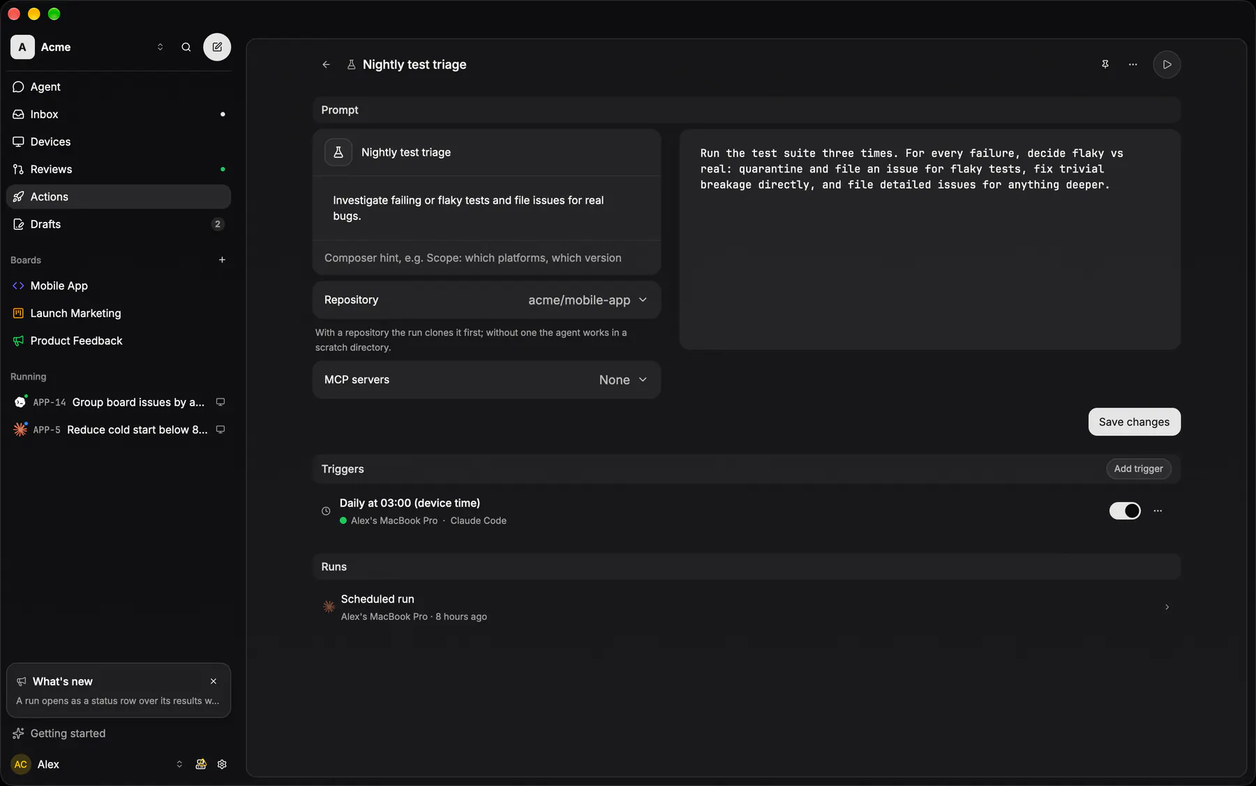
action-pageOne action as a page: its prompt (name, icon, repository, MCP servers, the markdown body the agent runs), its triggers and its runs. The MCP servers list offers only team MCPs (no sign-in, or a member's shared connection) and every run of the action uses it.
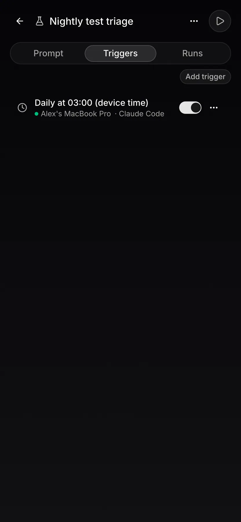
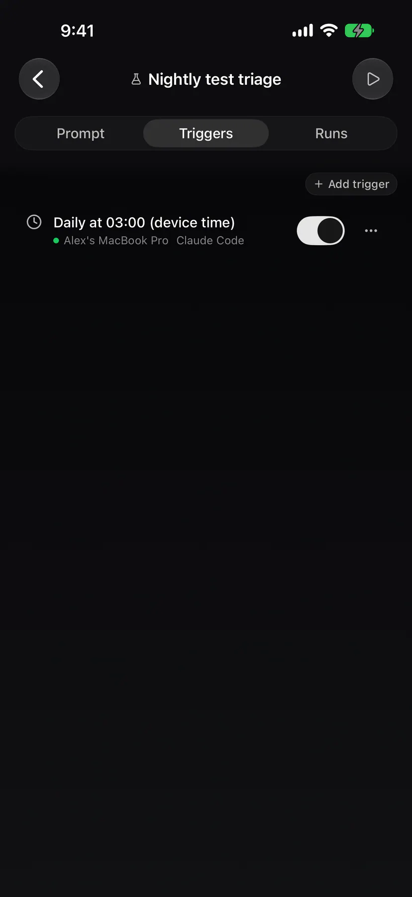
action-triggersThe Triggers tab of an action on a phone: each schedule and event watcher with its device and its switch.
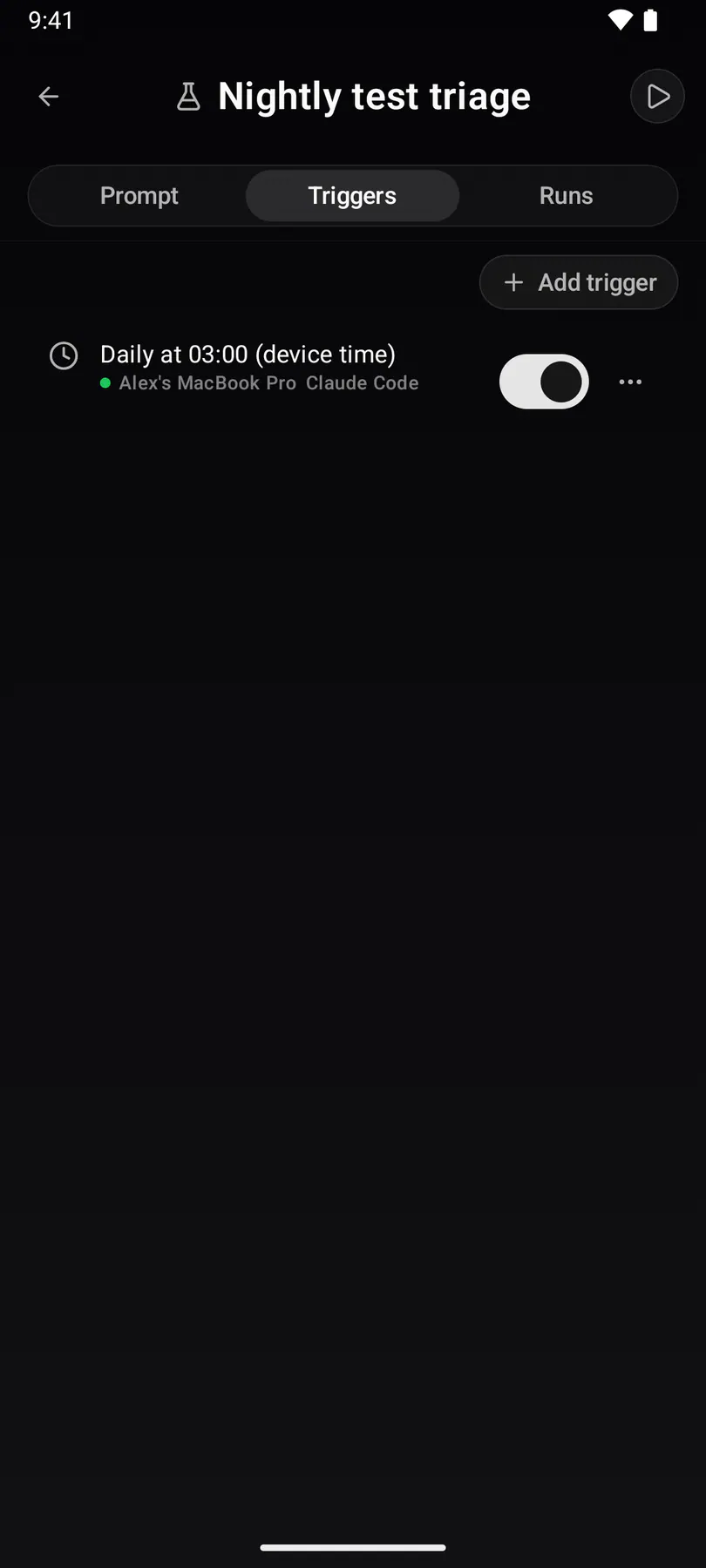
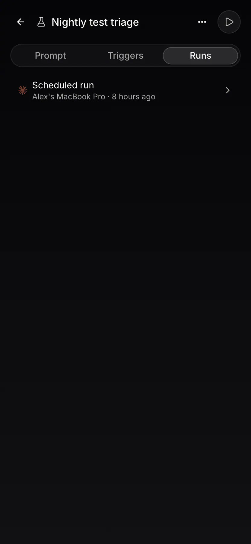
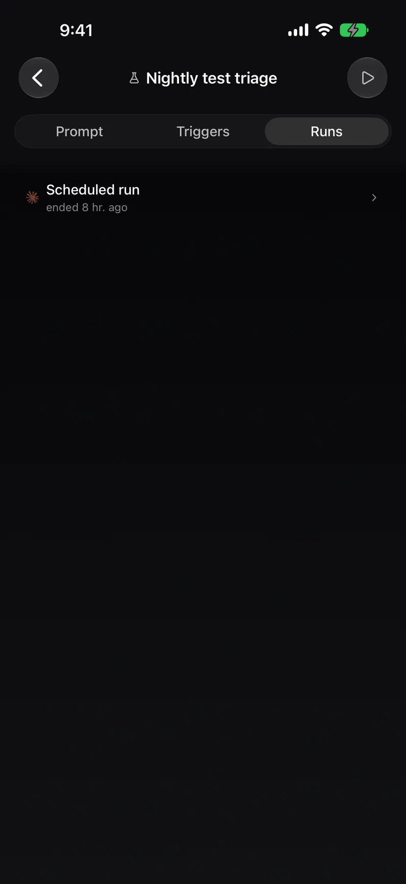
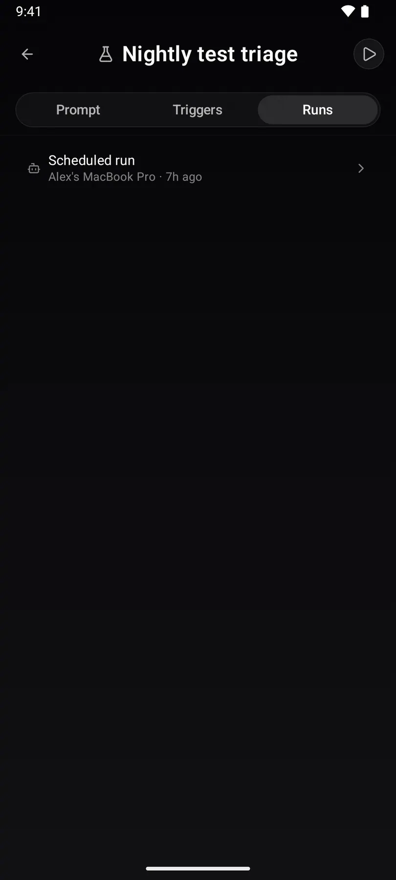
action-runsThe Runs tab of an action on a phone: every run of it, the triggered ones marked with their trigger's glyph.
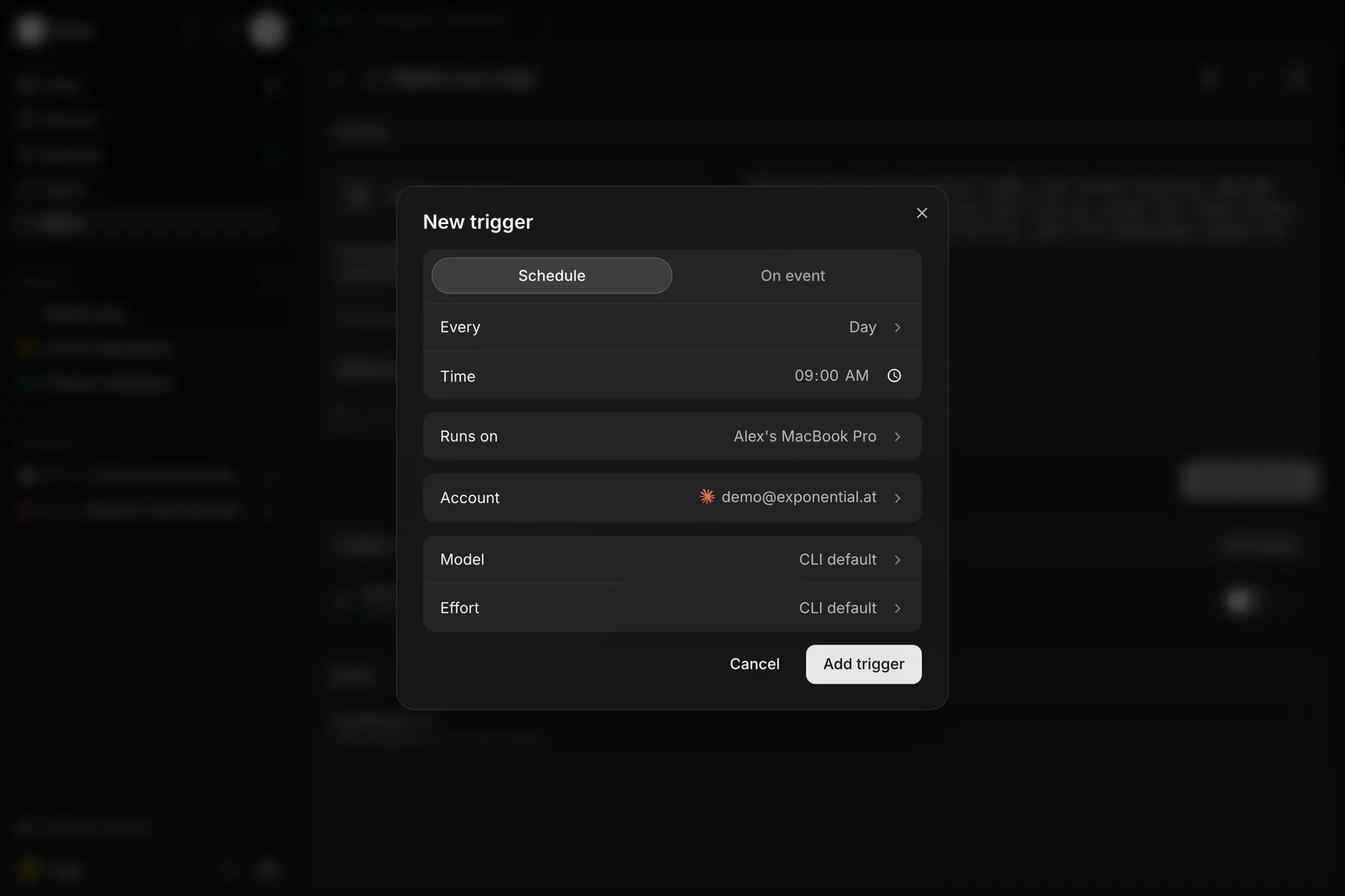
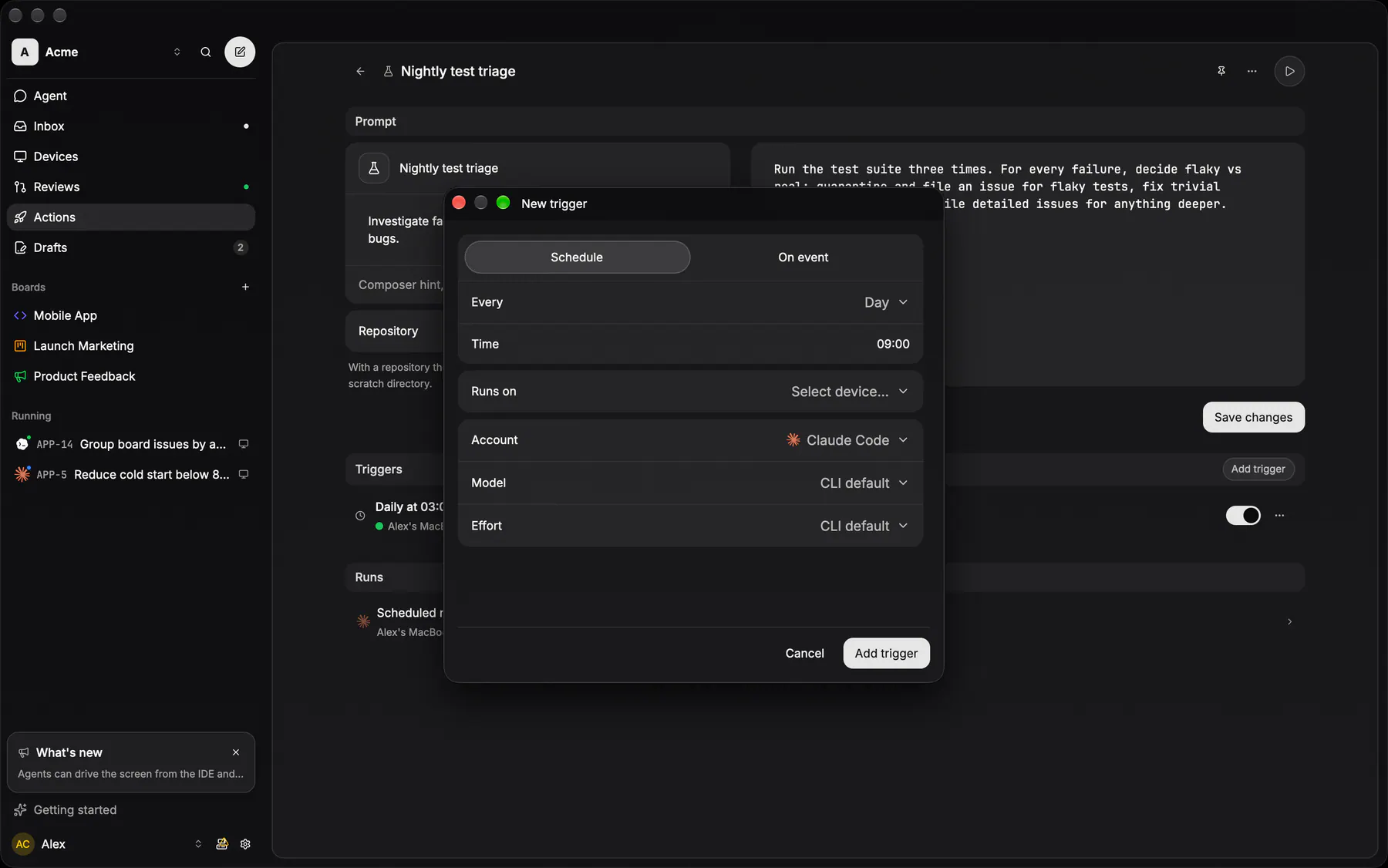
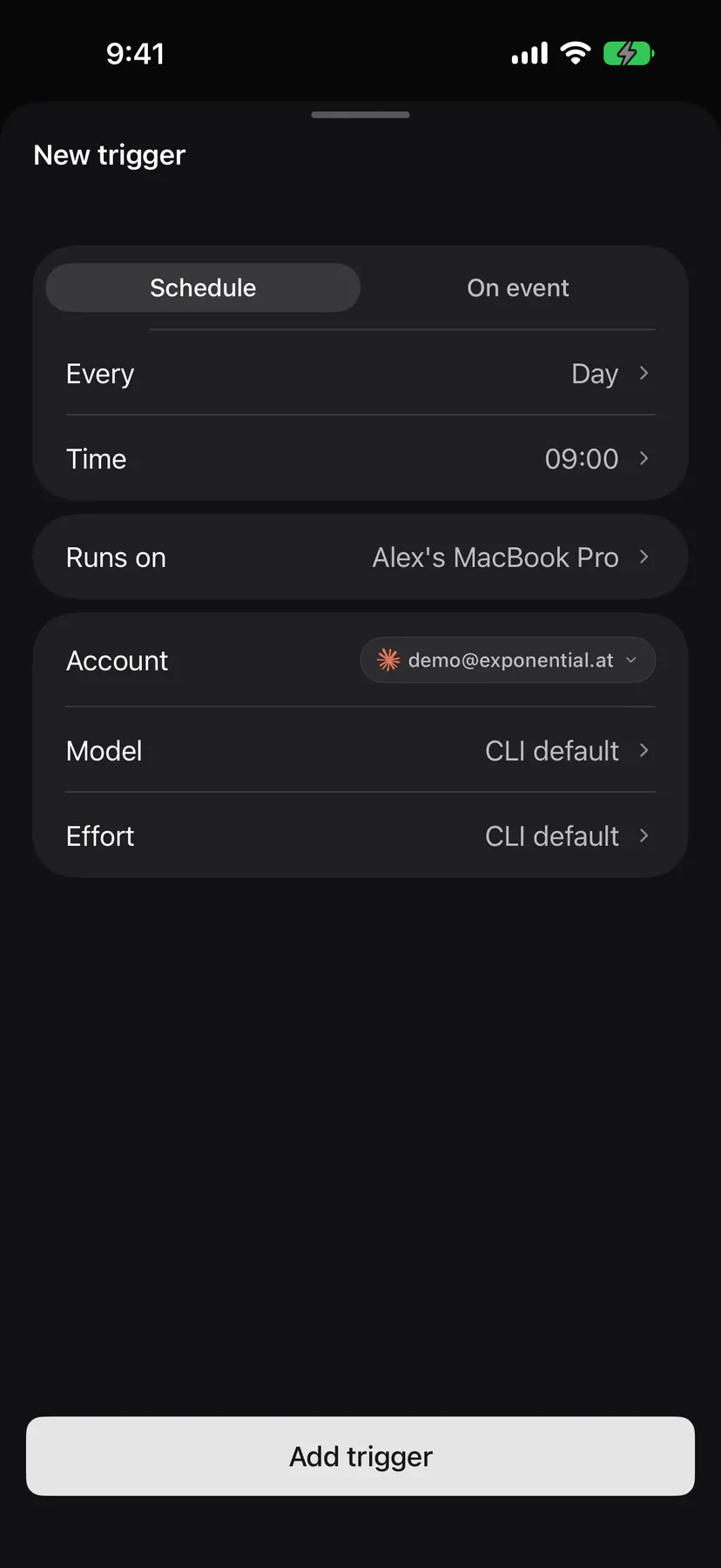
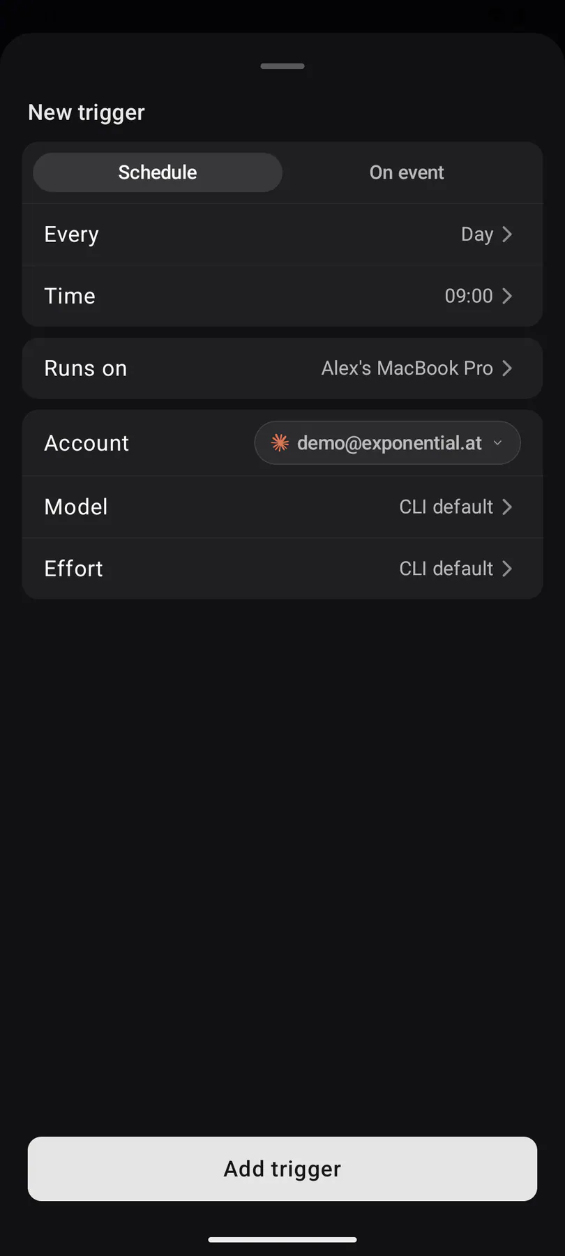
trigger-editorAdding a trigger to an action: a schedule or an event, the device that runs it and the account, model and effort it runs with.
action-createAuthoring an action by describing it: the Agent page composer with the Create action builtin picked as its chip — describe the action in the prompt and the creator run writes the definition, no form (EXP-257, EXP-825).
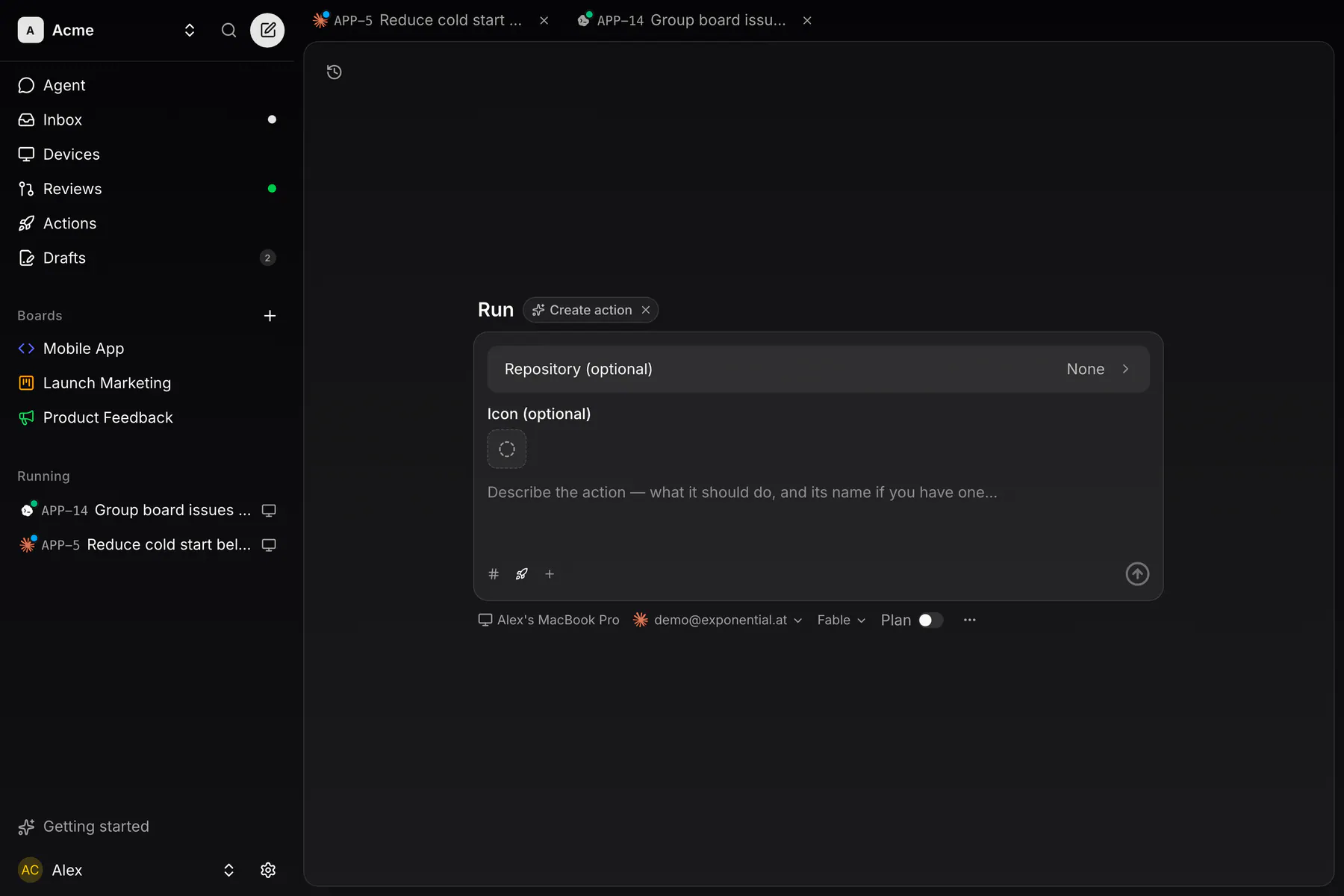
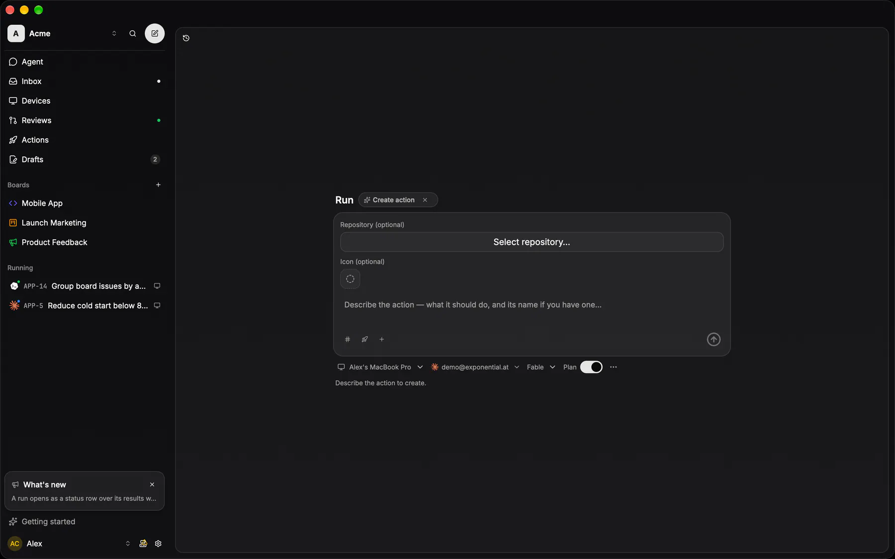
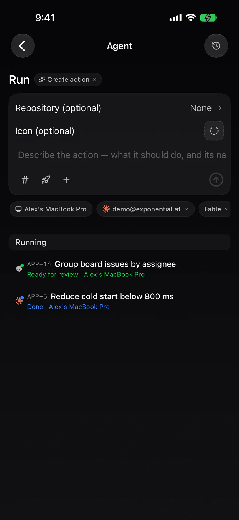
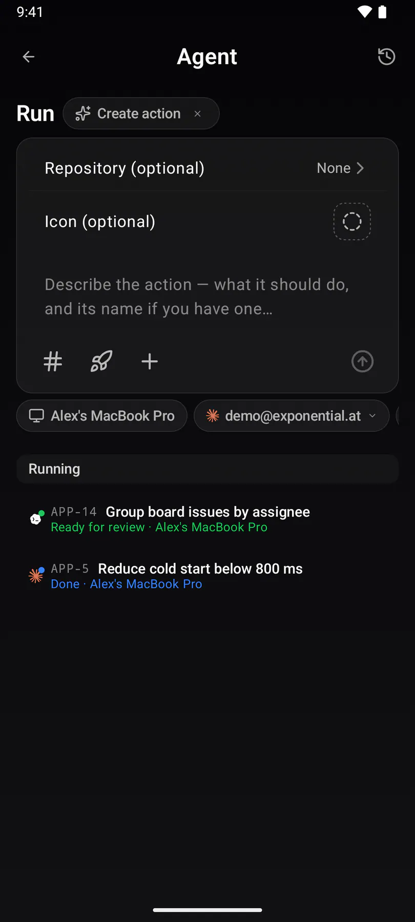
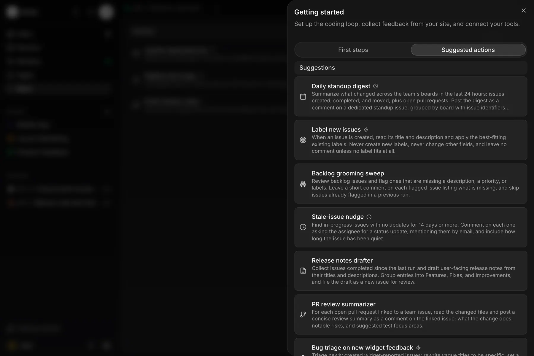
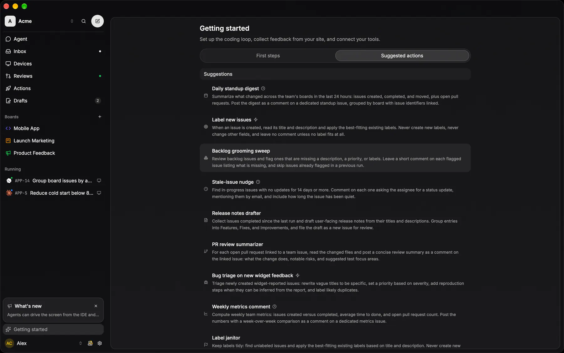
action-suggestionsThe starter catalog: curated action seeds that prefill the creator run, some setting up a trigger with them.
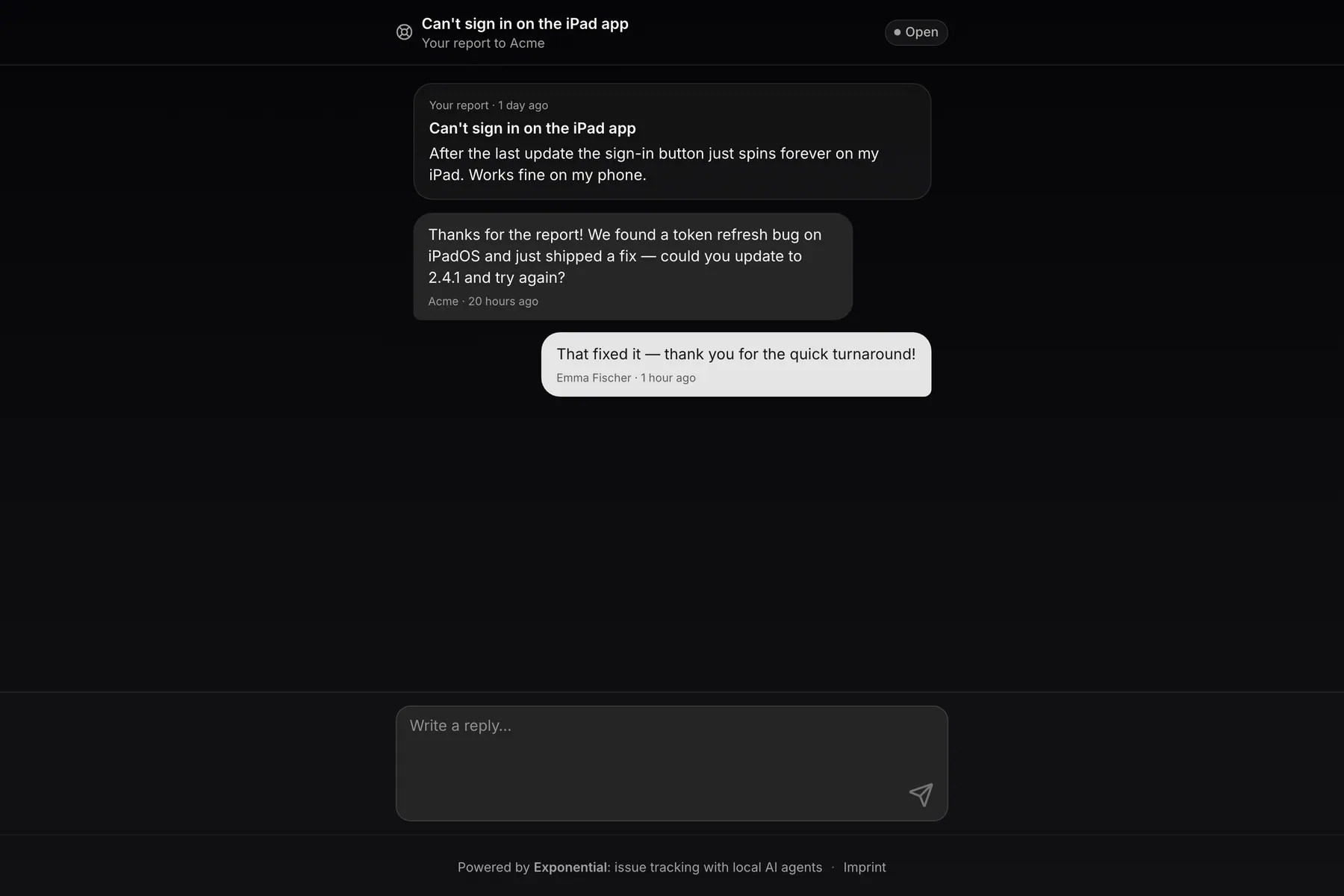
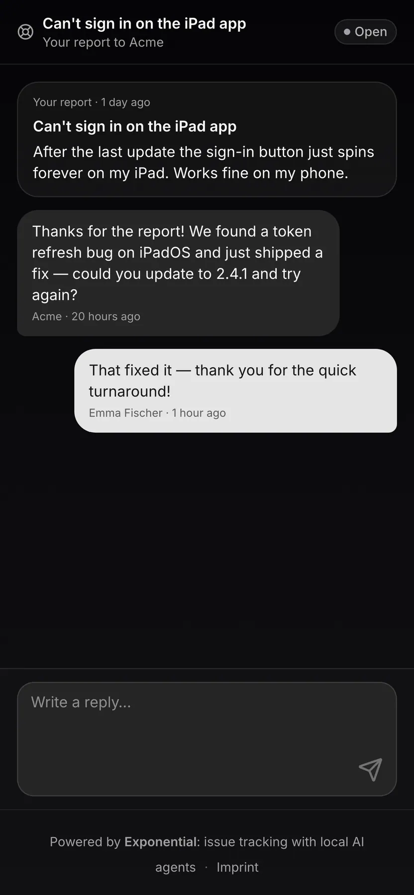
support-reporterWhat the person who filed the report sees: the magic-link page over their widget issue, with the report, their pictures, the team's replies and a reply box, with no account and no team.
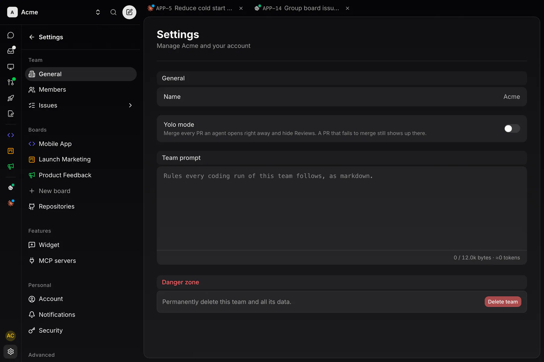
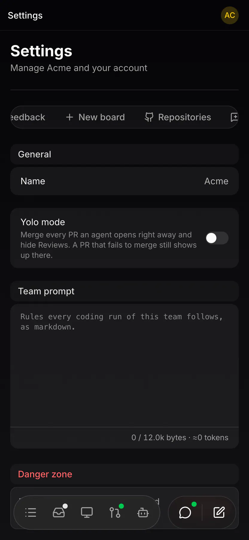
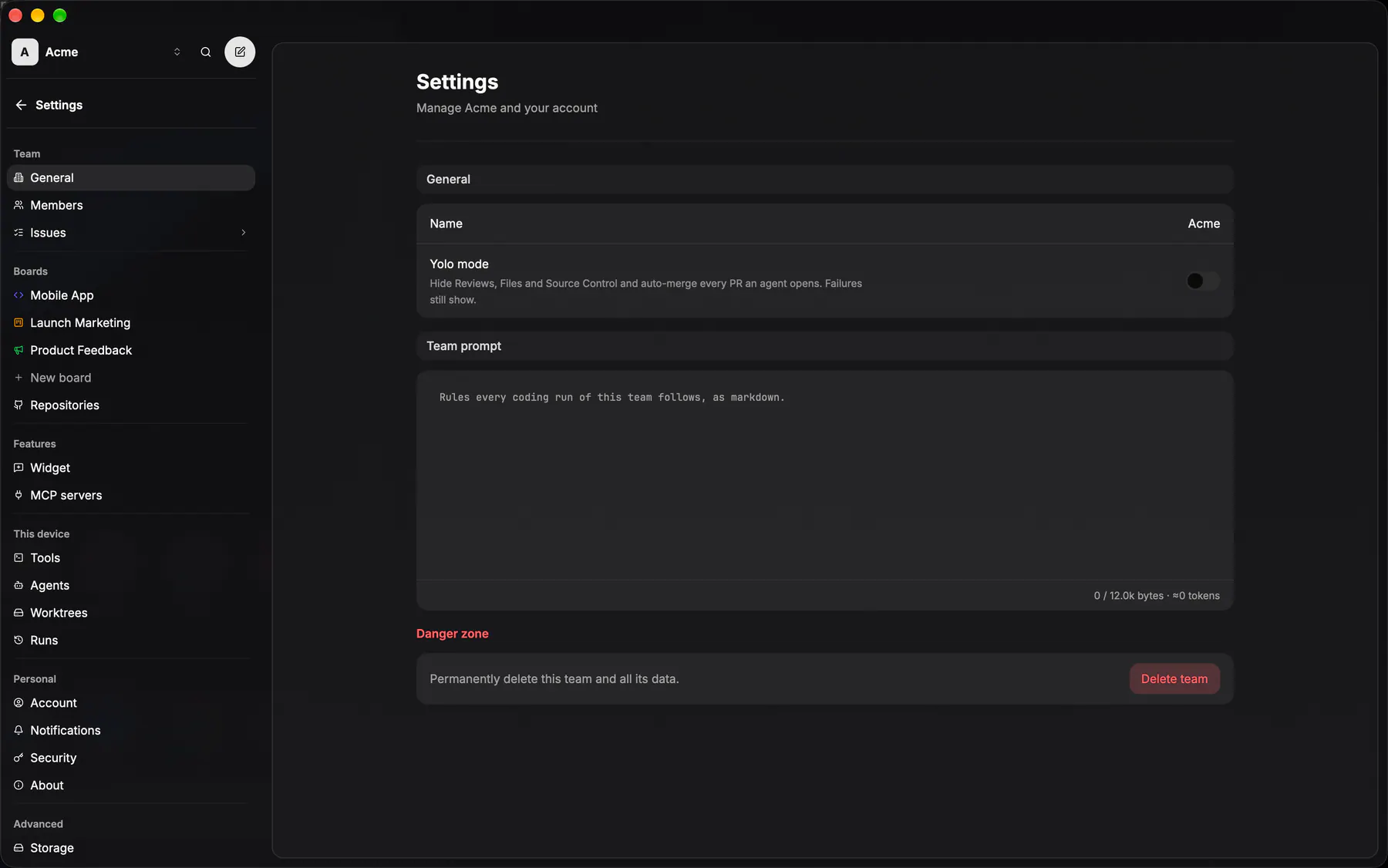
settings-generalTeam name, slug and identity. Owner-only.
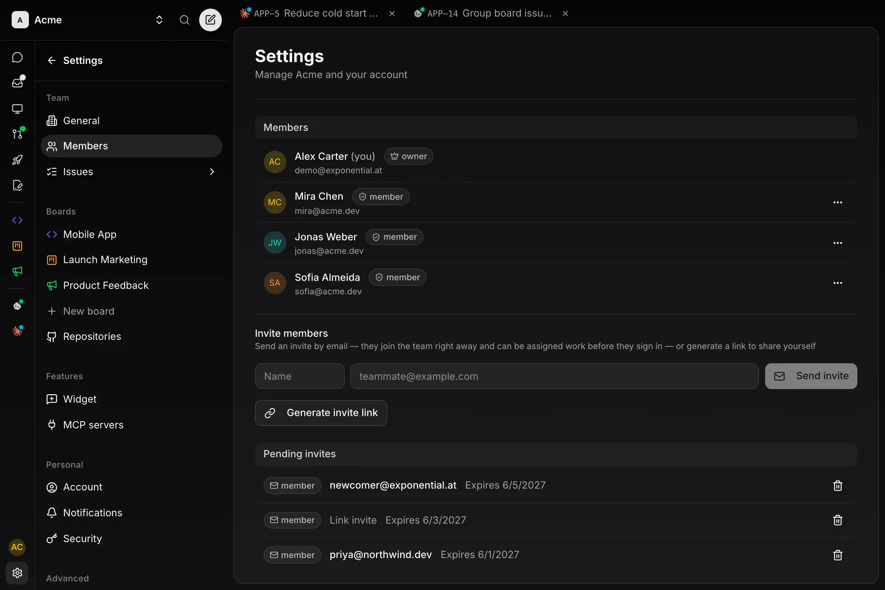
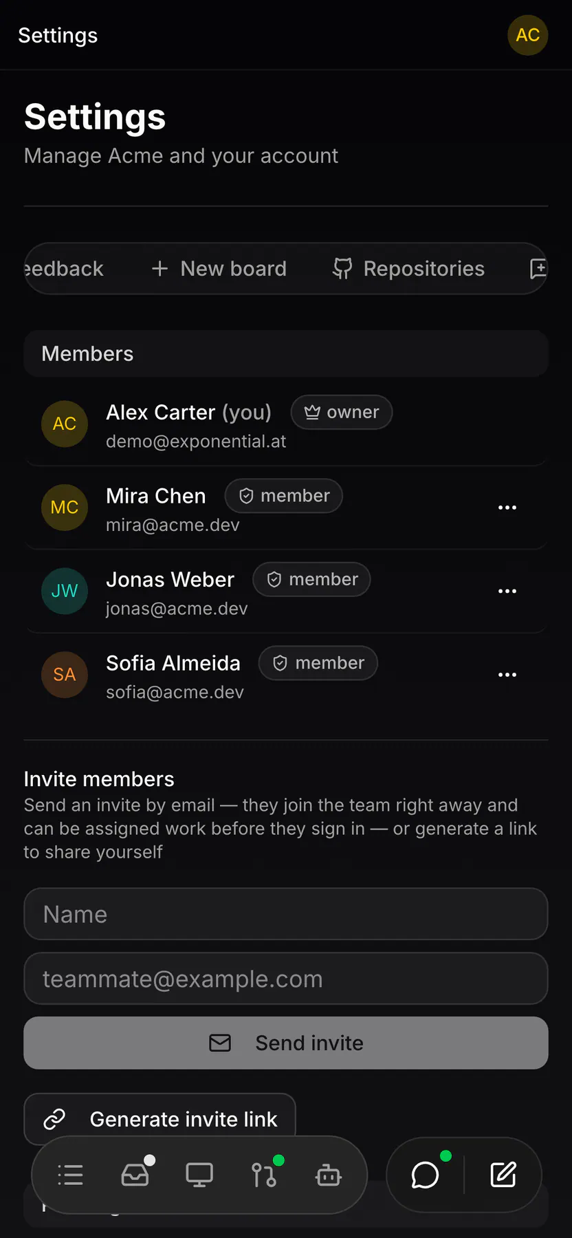
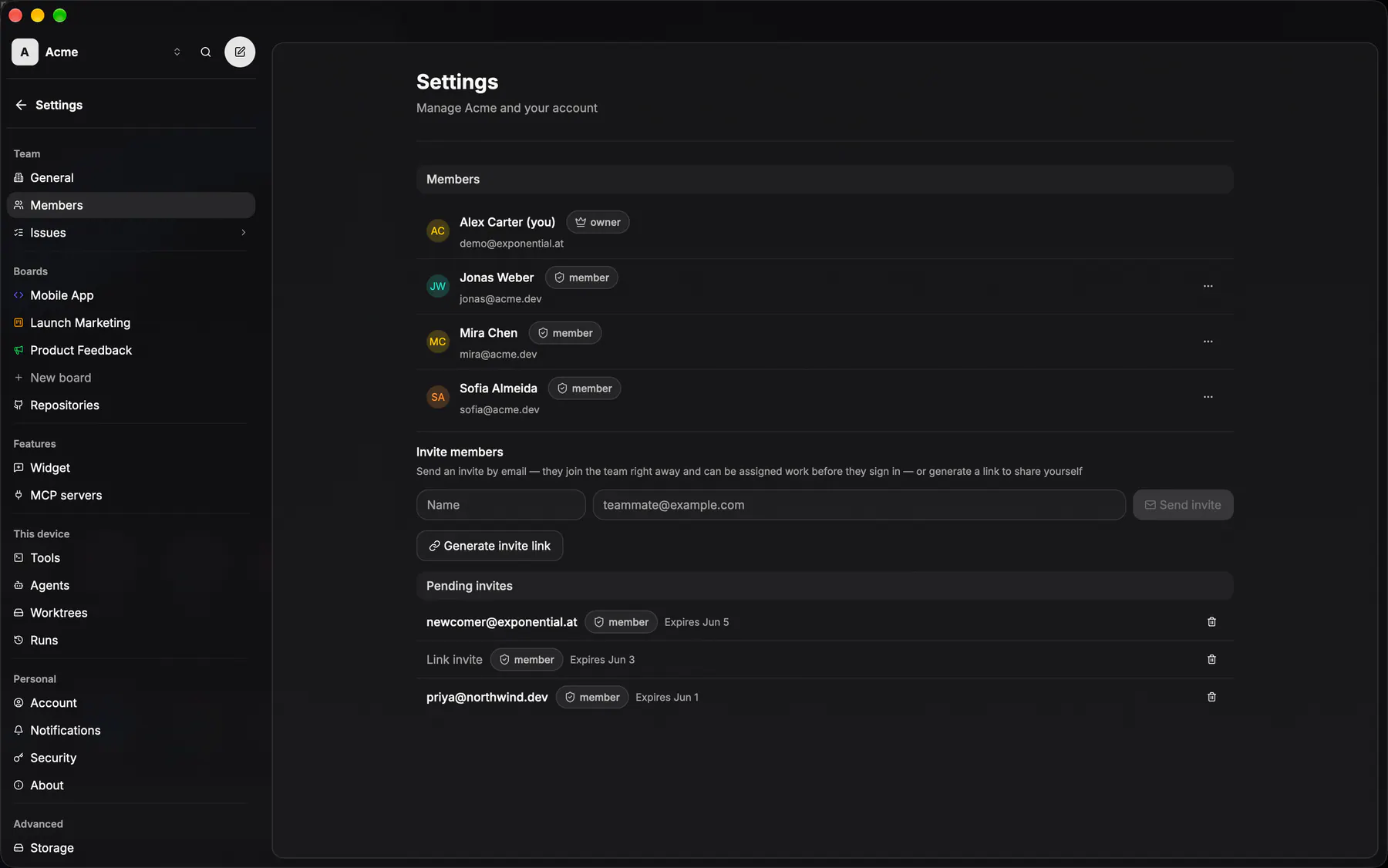
settings-membersWho is on the team, their roles, and the pending invites. The one settings section every member can see.
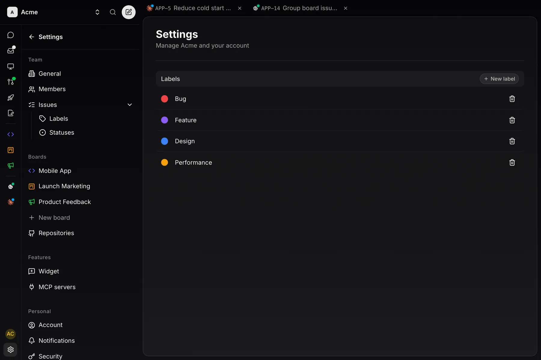
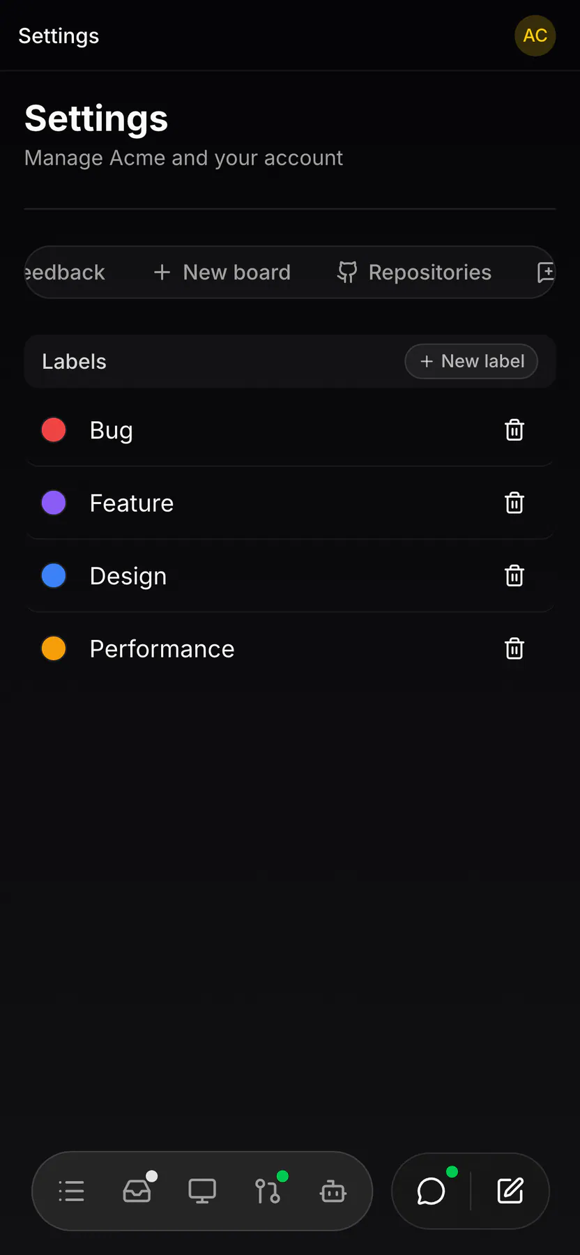
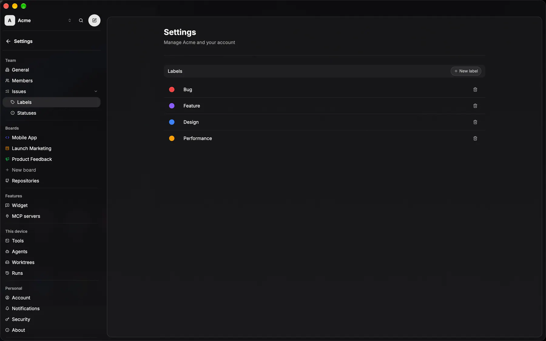
settings-labelsThe team's label palette, member-managed.
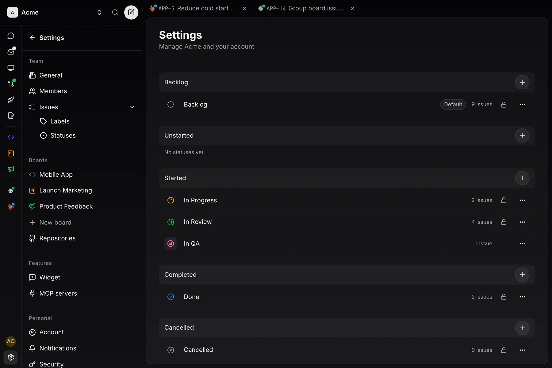
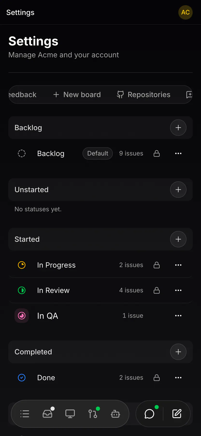
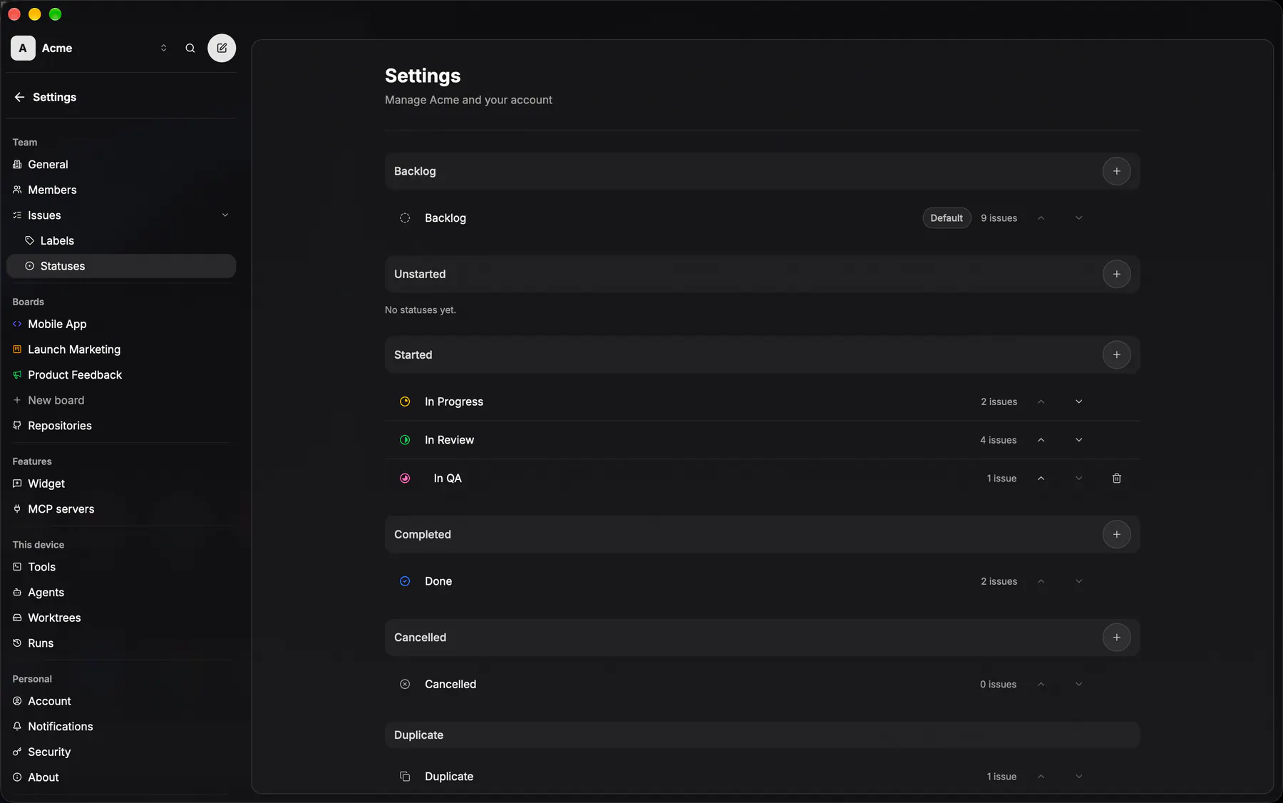
settings-statusesCustom issue statuses in their six categories, plus the PR-open and PR-merge automation targets.
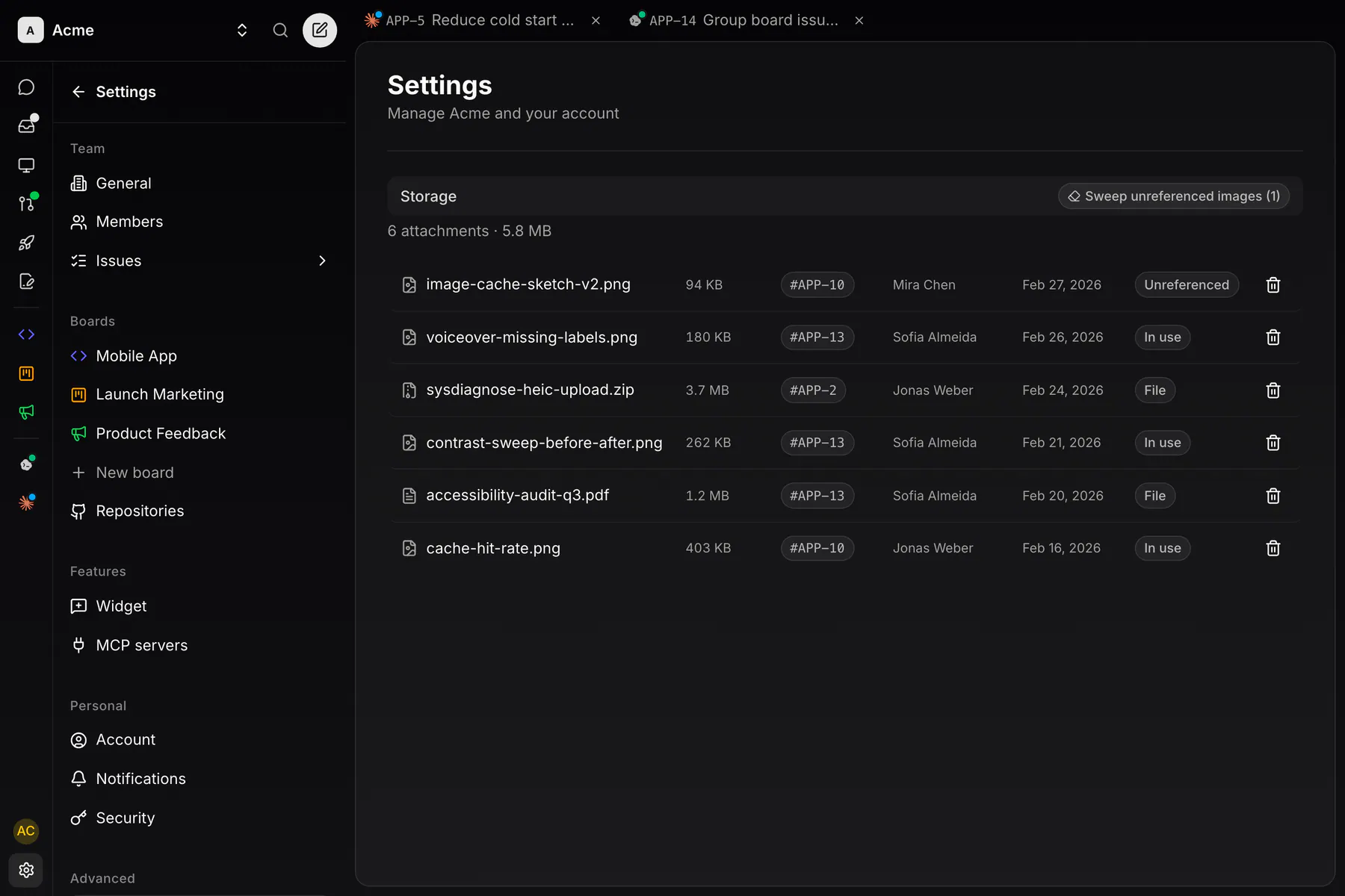
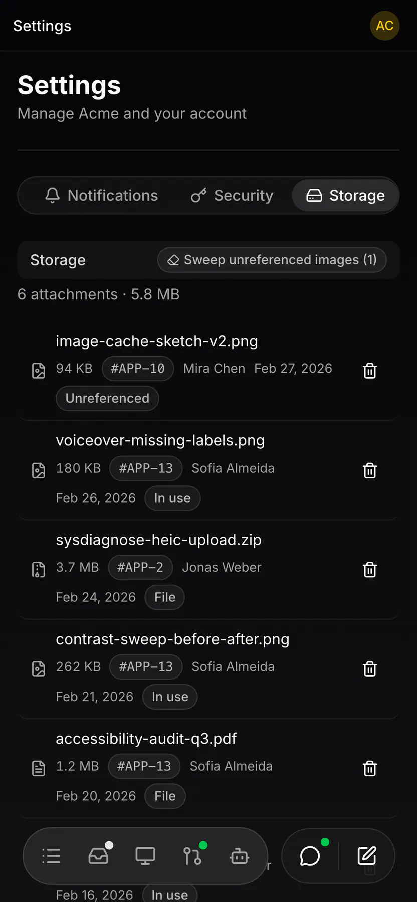
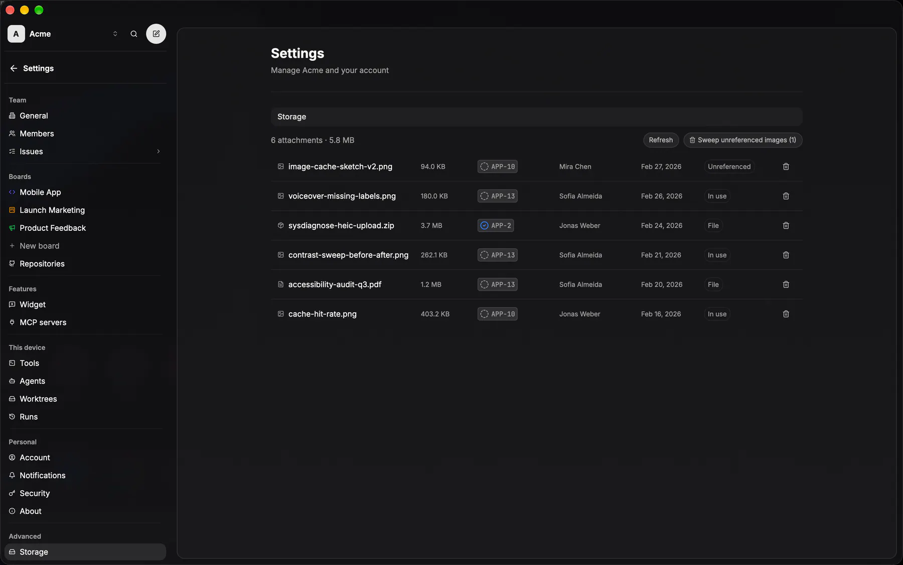
settings-storageThe team file manager: every attachment, per-file delete, and the unreferenced-image sweep. Owner-only.
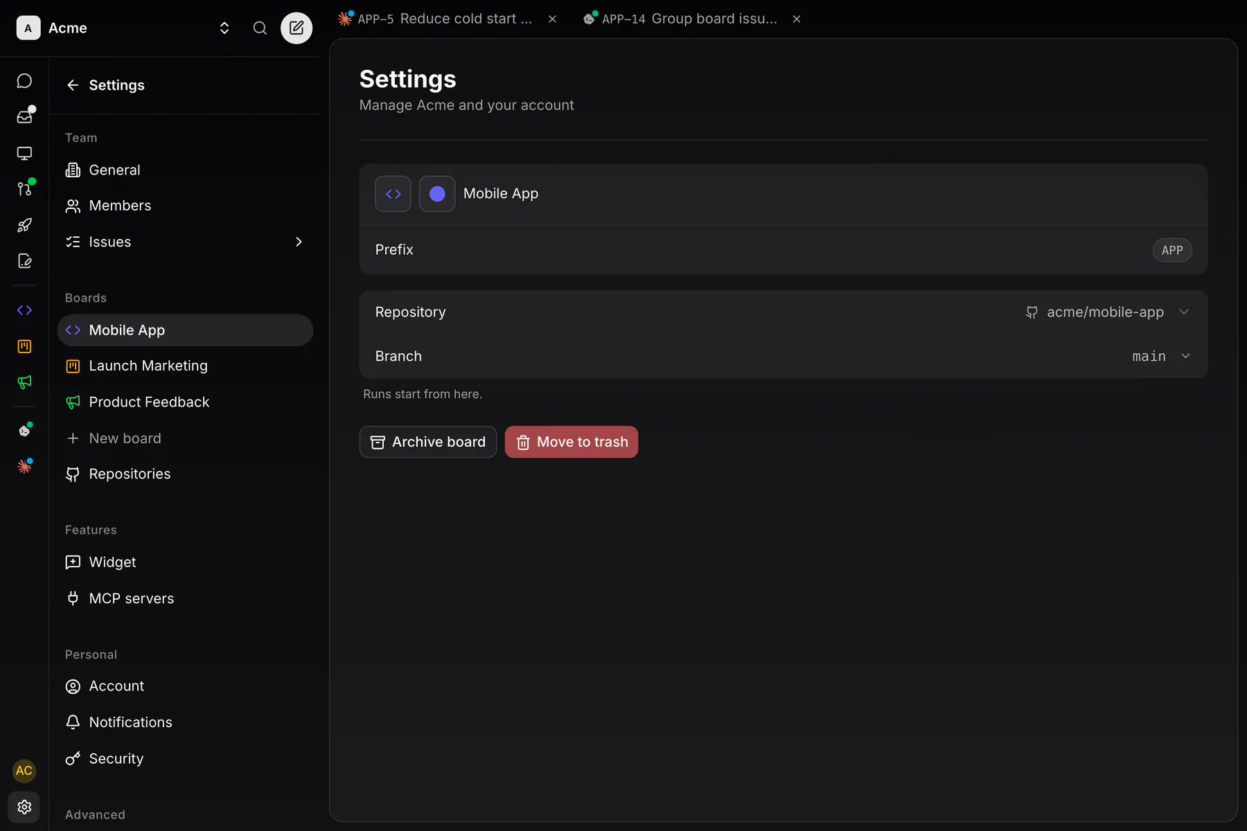
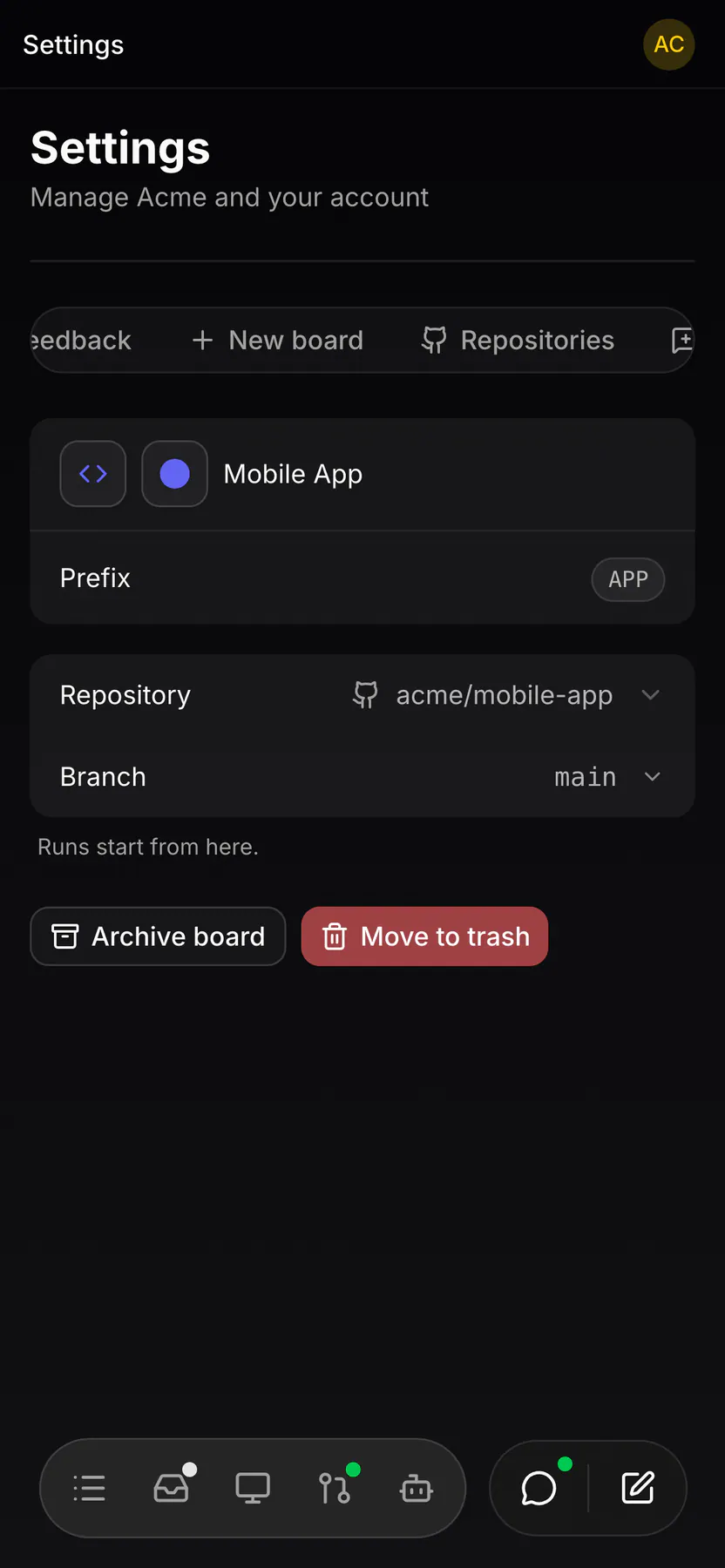
settings-boardsOne board up close: icon, colour and name in one row, then prefix, repository and default branch, with Archive and Move to trash below. Since EXP-862 the settings nav IS the board list on web as well as desktop, and the bare /settings/boards forwards to the first board. Owner-only.
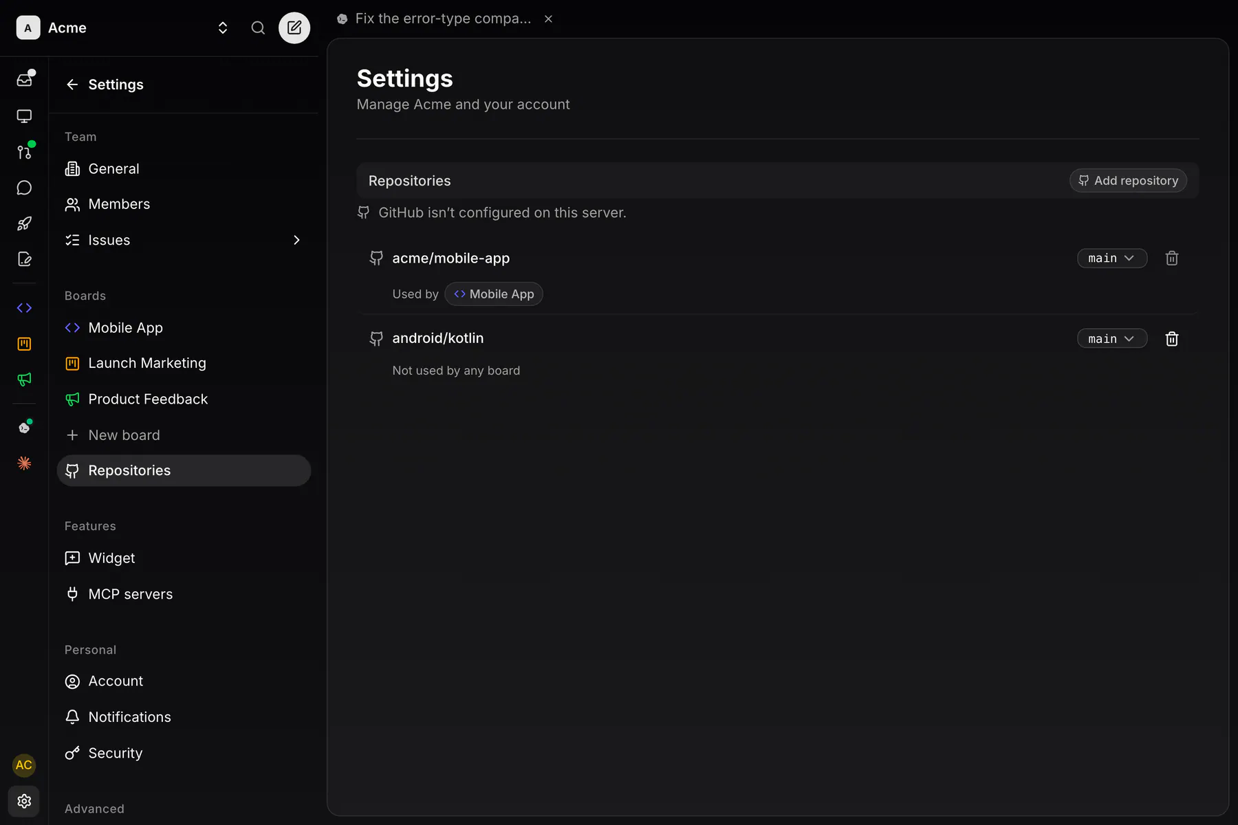
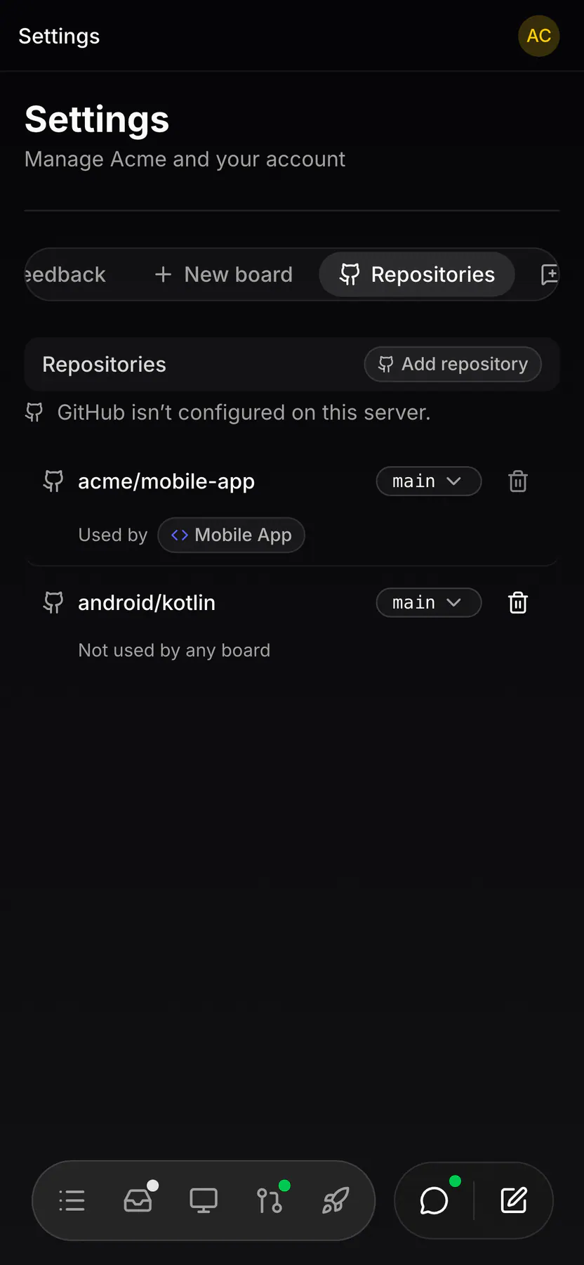
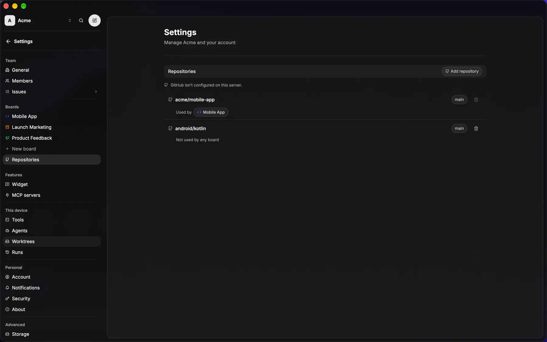
settings-repositoriesThe team's GitHub repo registry and the App connection behind it. Member-visible.
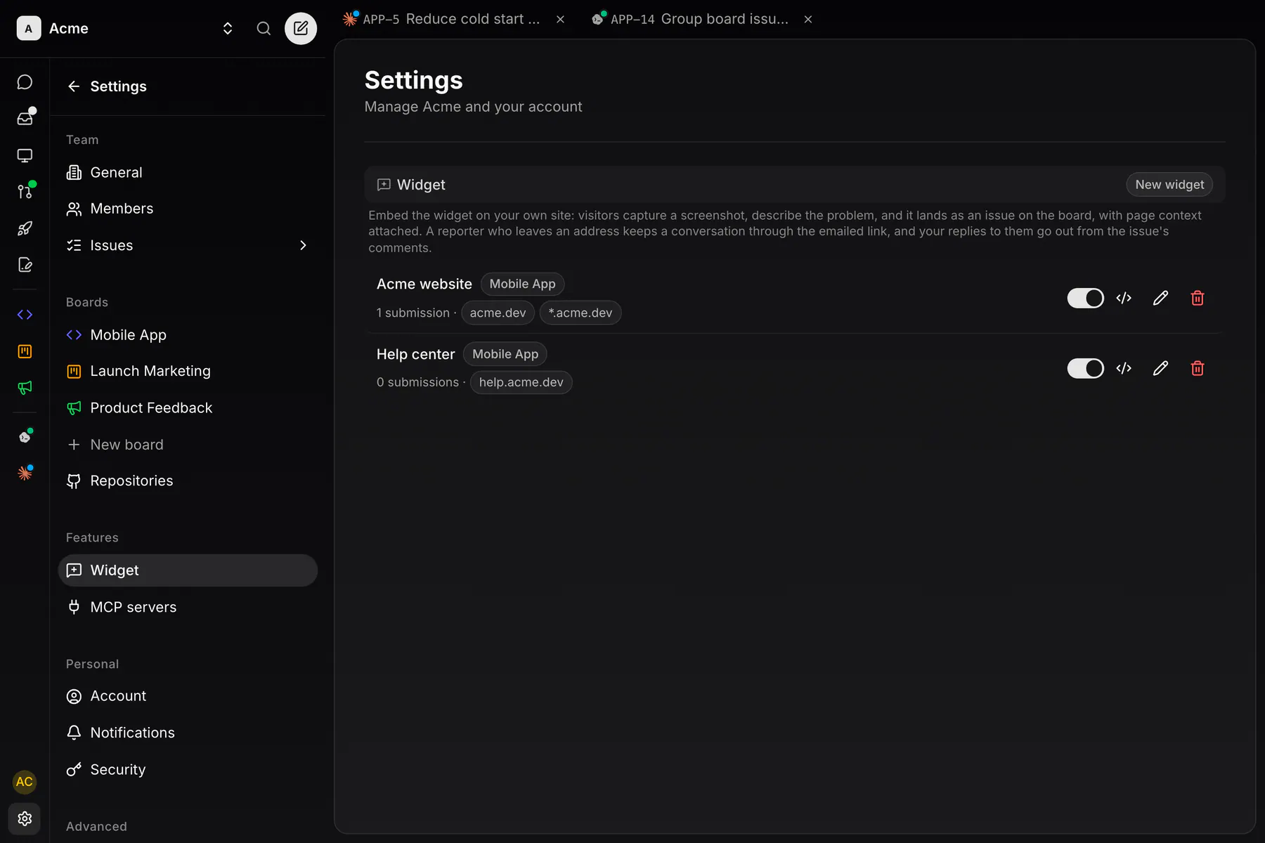
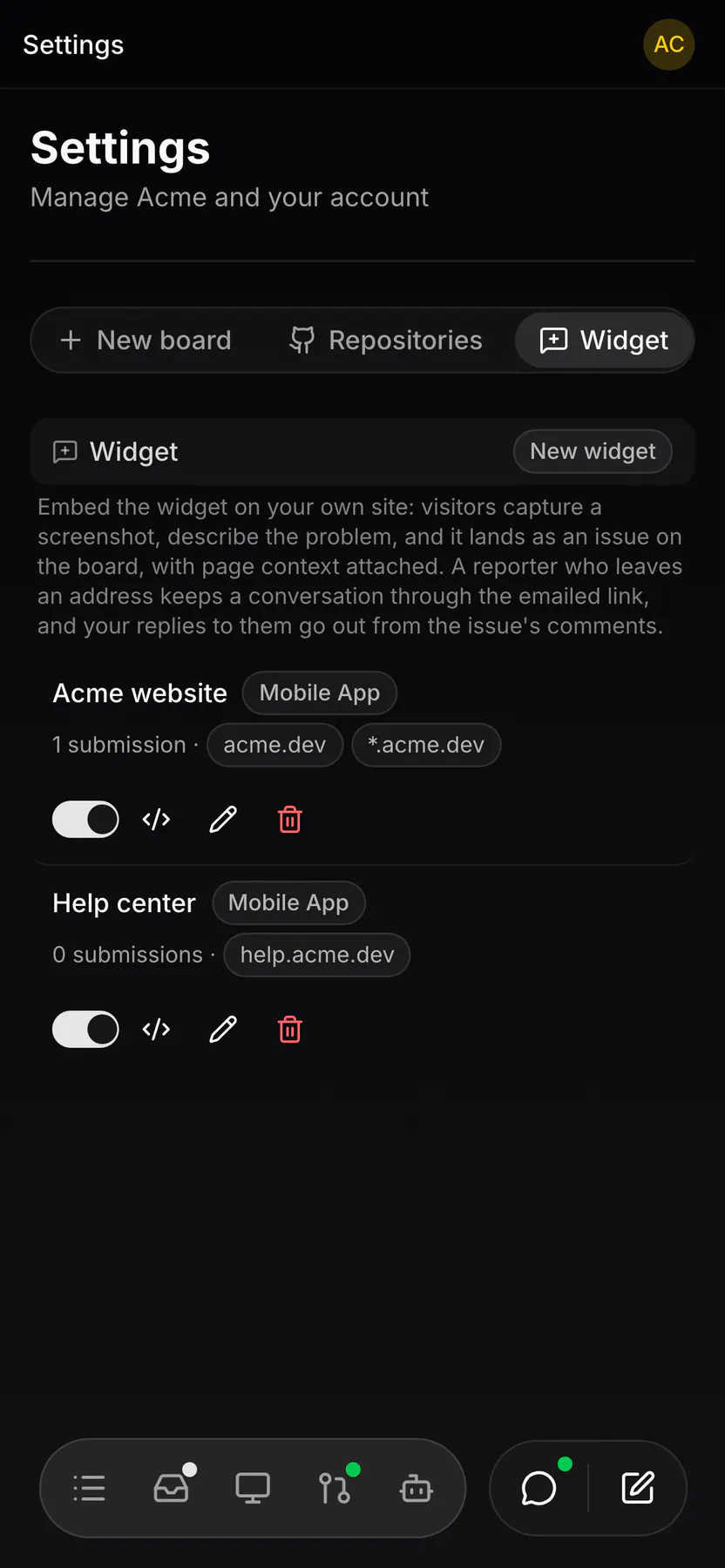
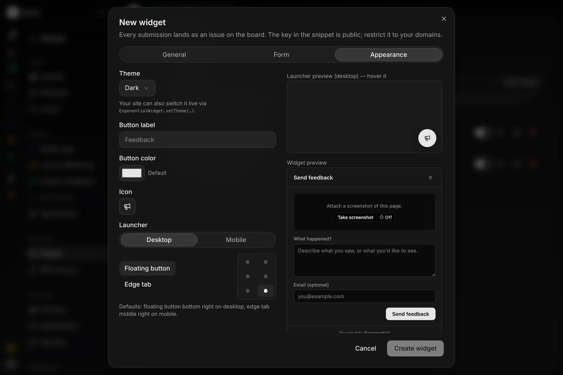
settings-widgetThe embeddable widget: key, domain allowlist, board, reporter contact, labels, theme, and the live whole-panel preview. Owner-only.
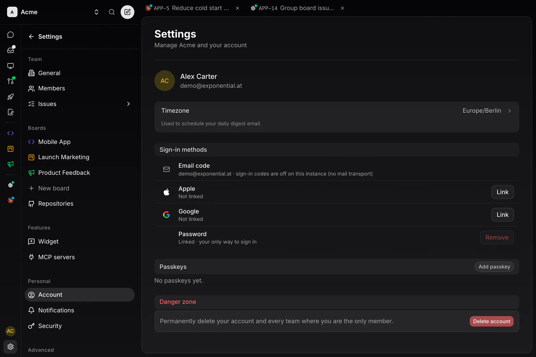
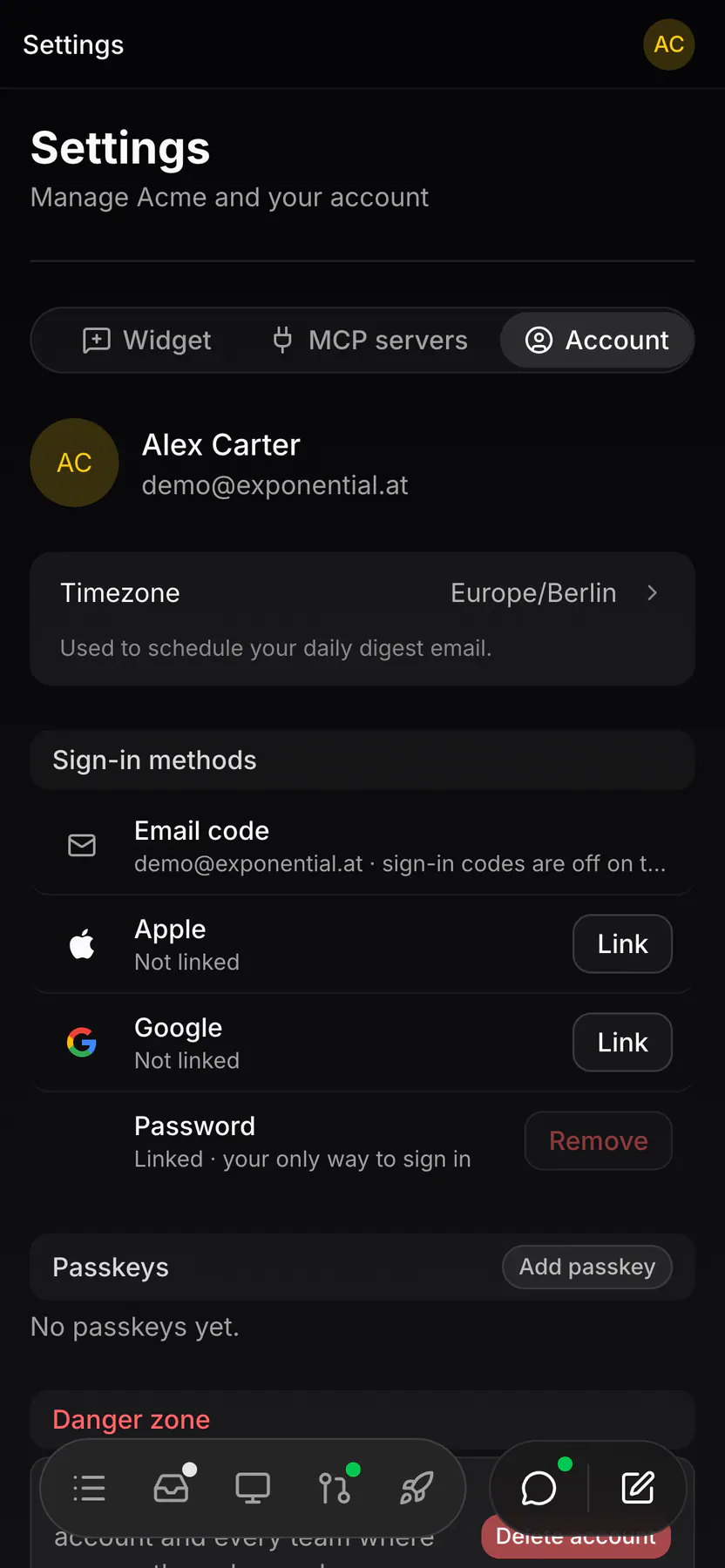
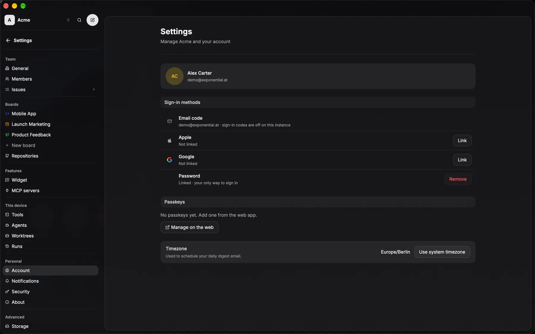
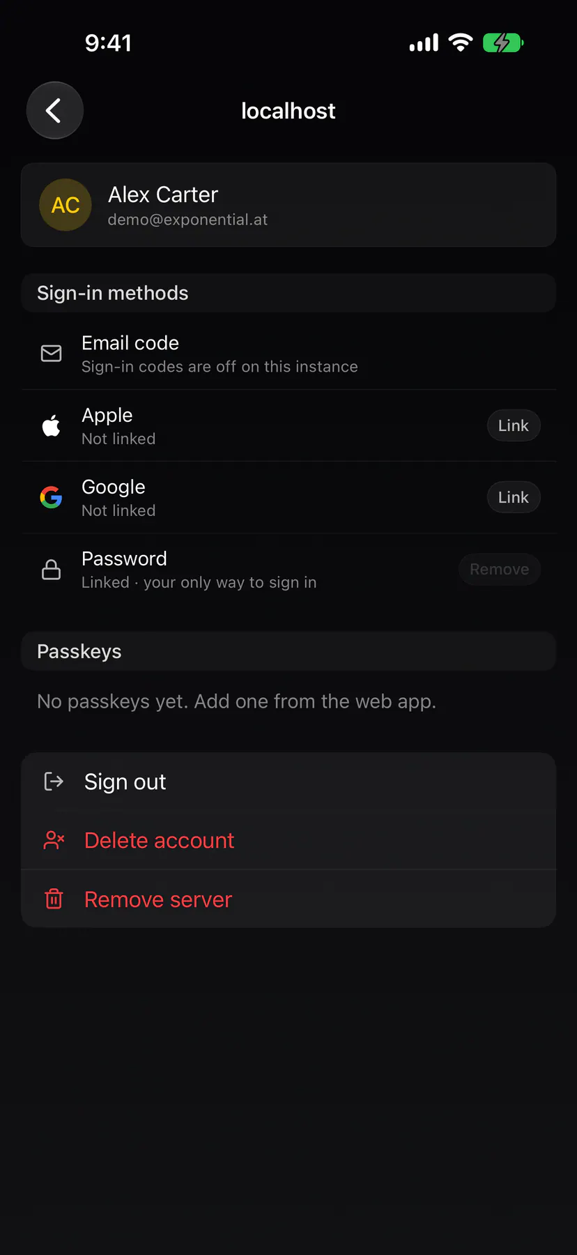
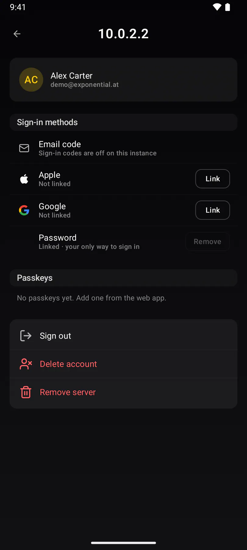
settings-accountPersonal identity, sign-in methods (a changeable primary email, Google/Apple/OIDC linking, passkeys) and timezone. Never gated.
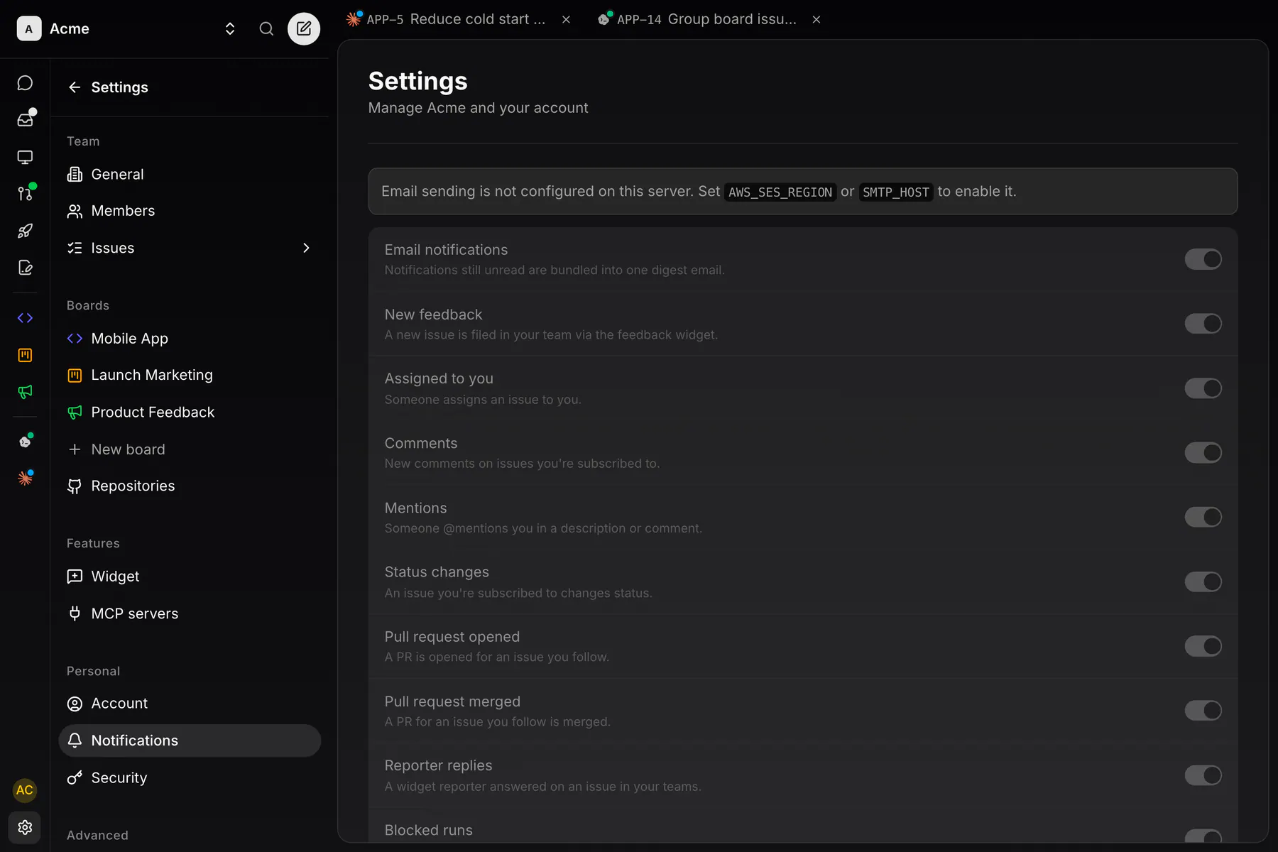
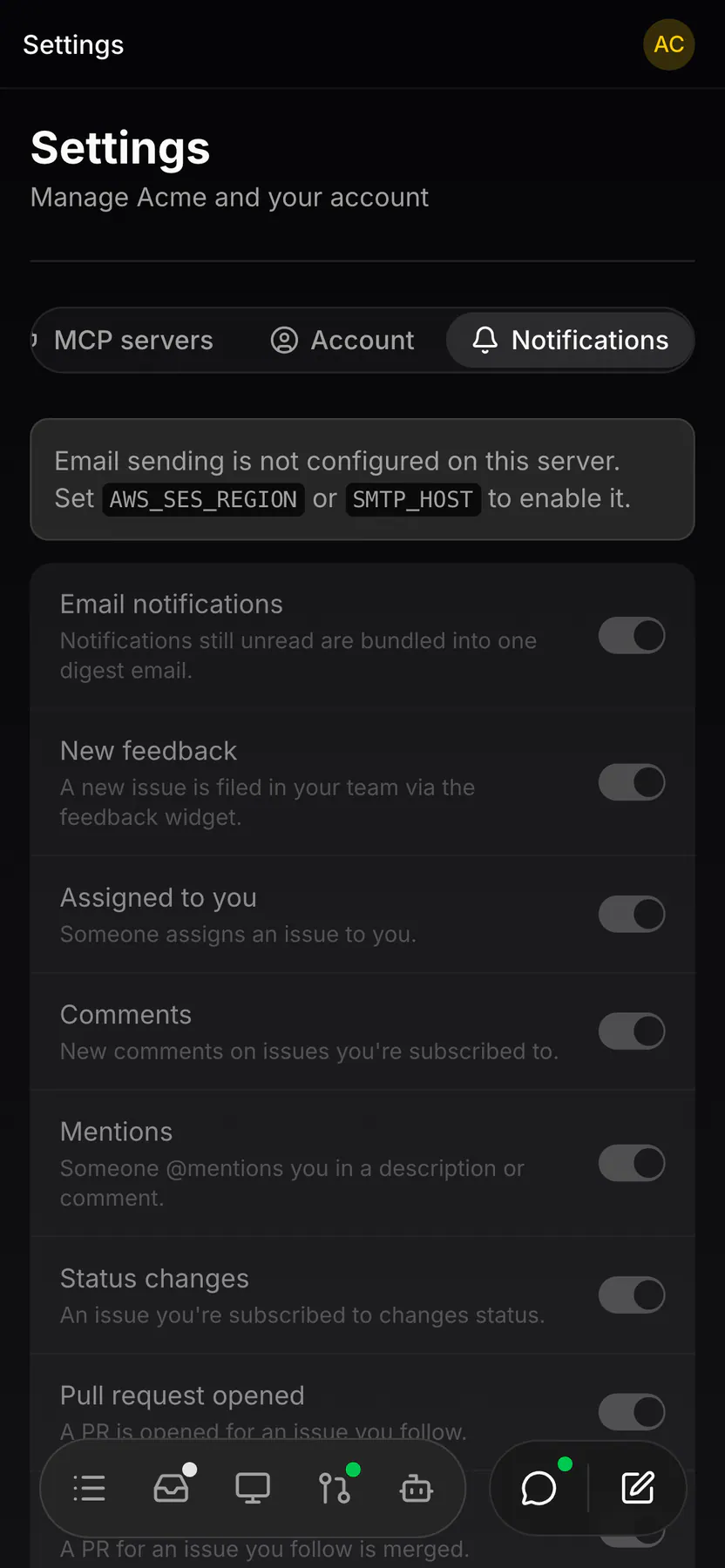
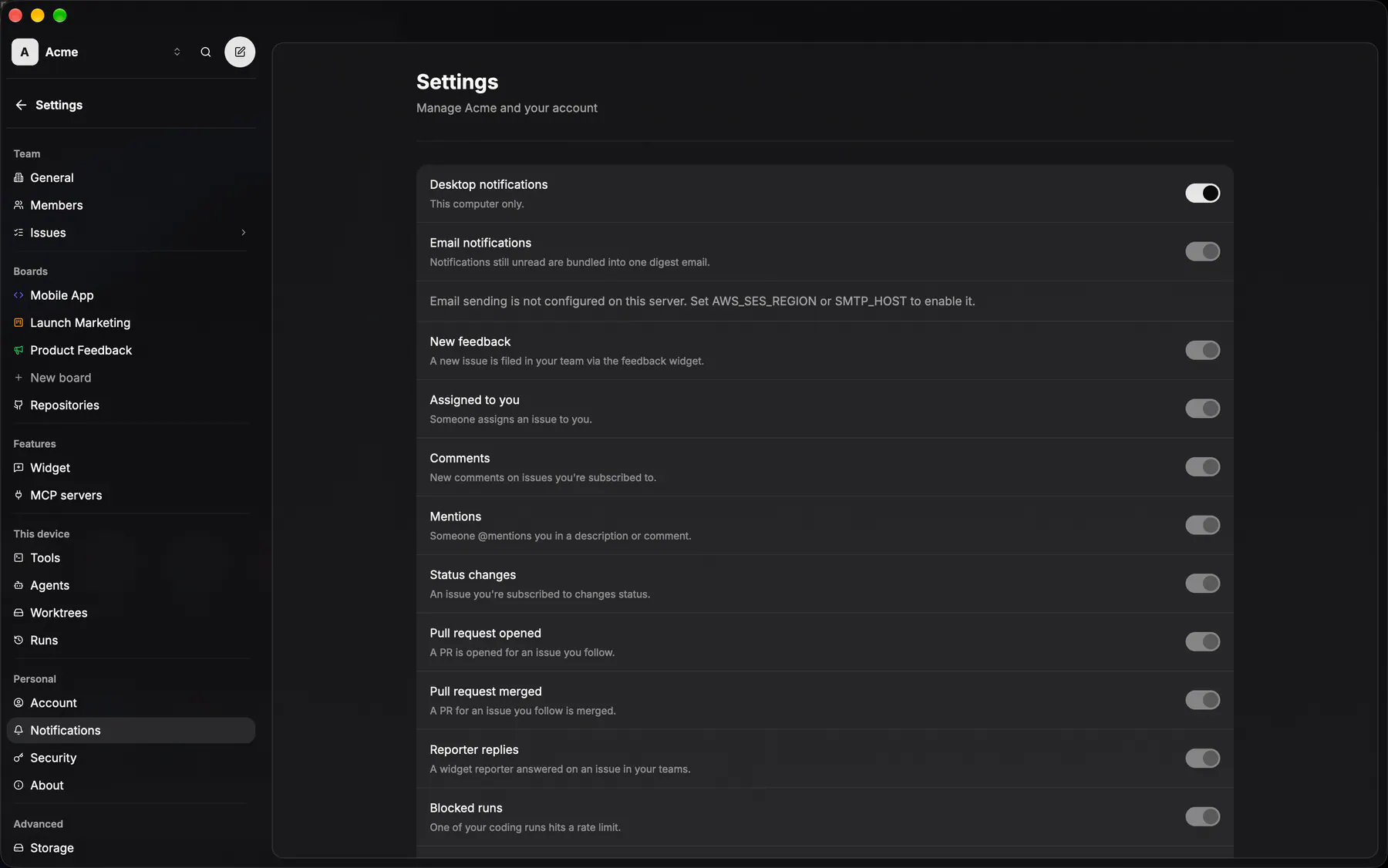
settings-notificationsEmail and push preferences, including the digest hour. Never gated.
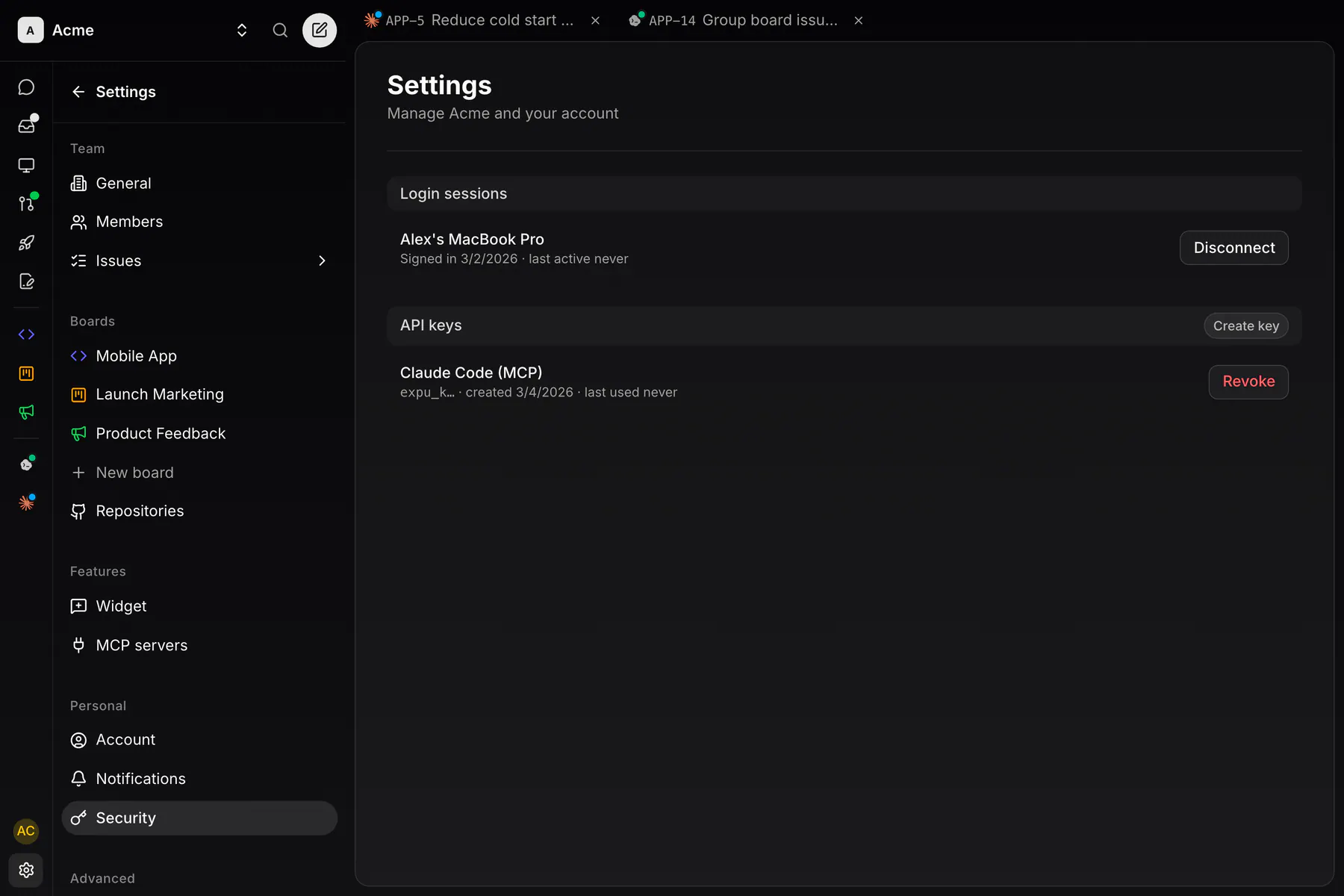
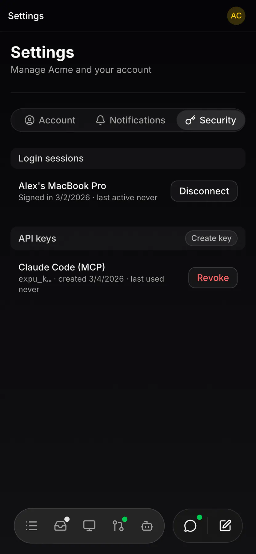
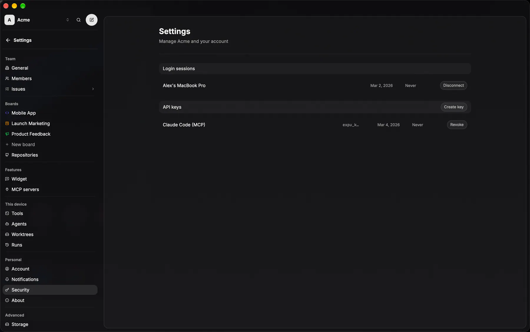
settings-api-keysLogin sessions (the devices signed in through the desktop app or CLI, each with a Log out) over the personal expu_ API keys for scripts and MCP clients: list, mint, revoke (EXP-1054). FEED-76: the mint dialog offers the consent screen's team/board scope picker; a scoped key is MCP-only and its row wears the pick as a caption. Passkeys sat here from EXP-862 until EXP-1126 moved them to Account under Sign-in methods; the section keeps the Security name.
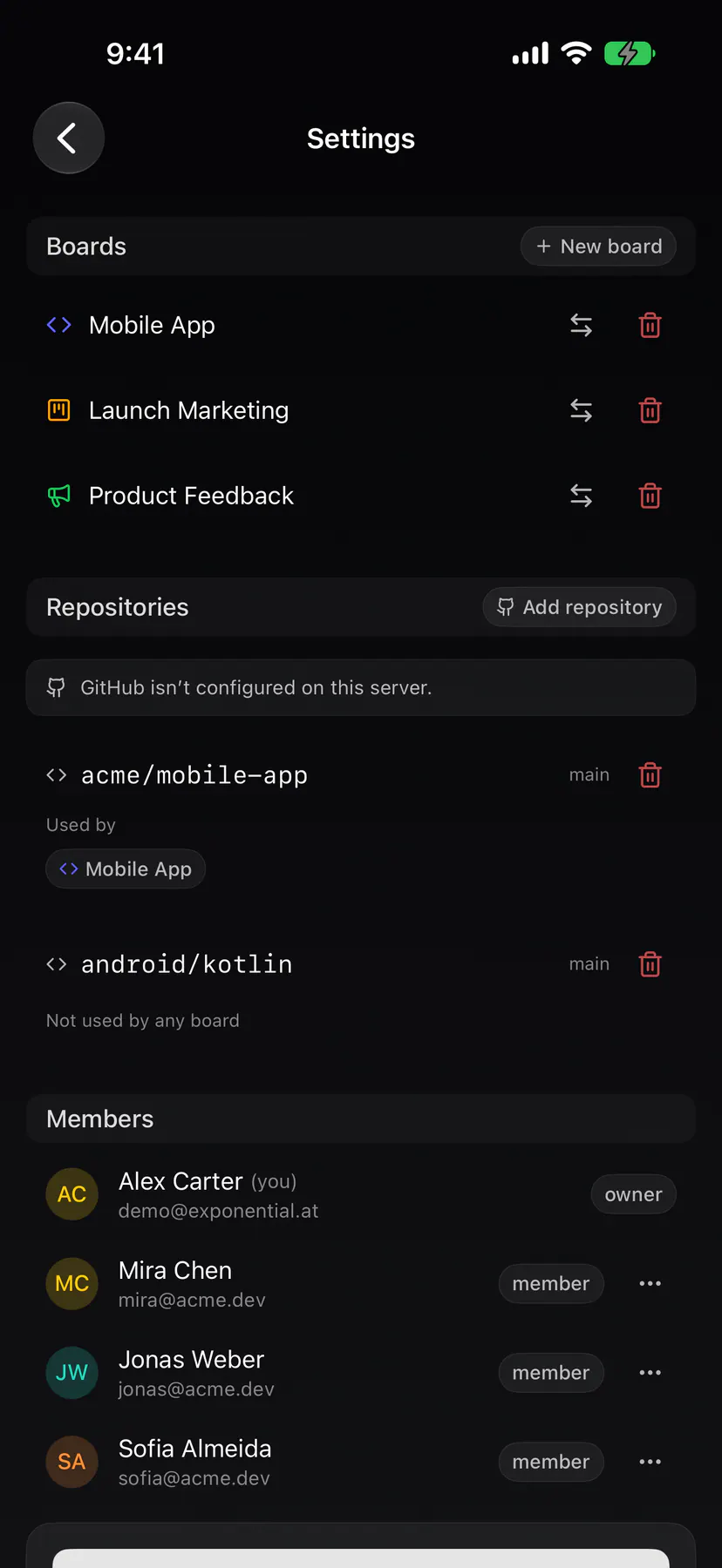
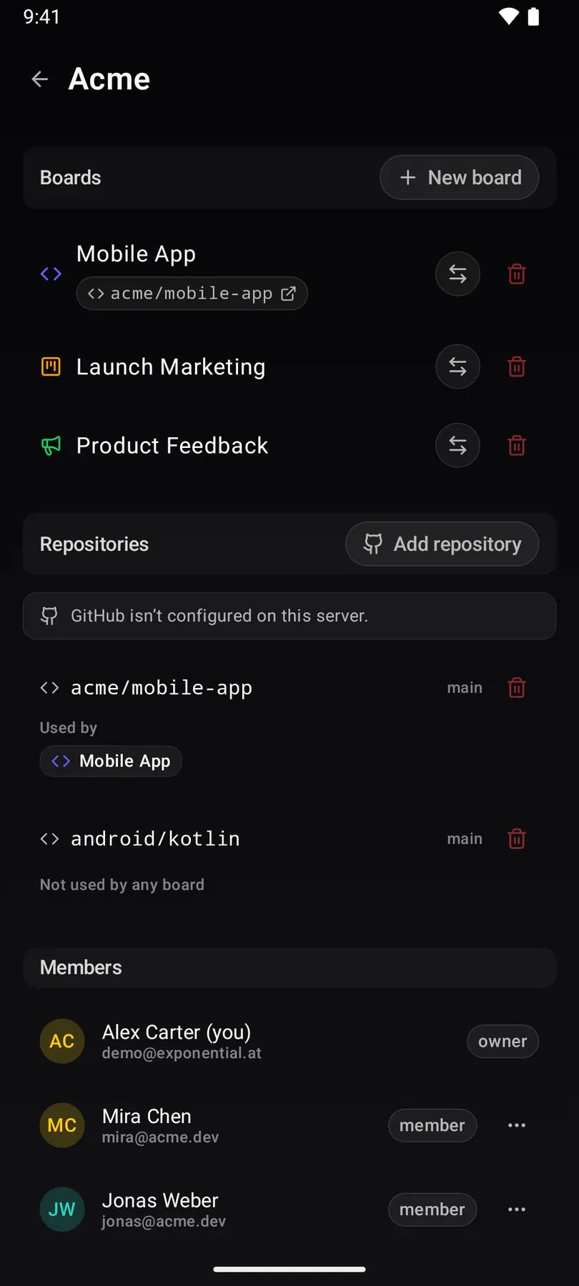
settings-teamThe condensed native team settings screen: one list covering general, members, labels, statuses, boards and repositories.
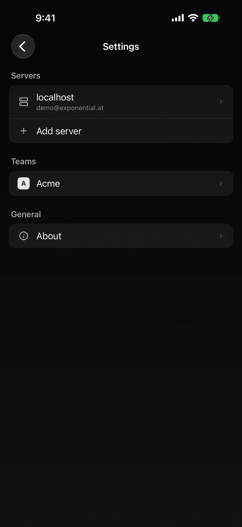
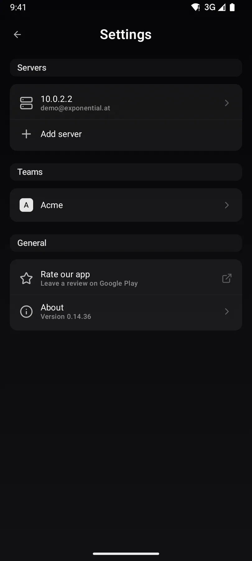
settings-rootThe native settings root: the signed-in servers, the teams under them, and the way into everything else.
settings-widget-editorOne widget’s configuration over three tabs (board and domains, reporter contact and fields, appearance), ending on the Appearance tab where the whole embeddable panel previews live.
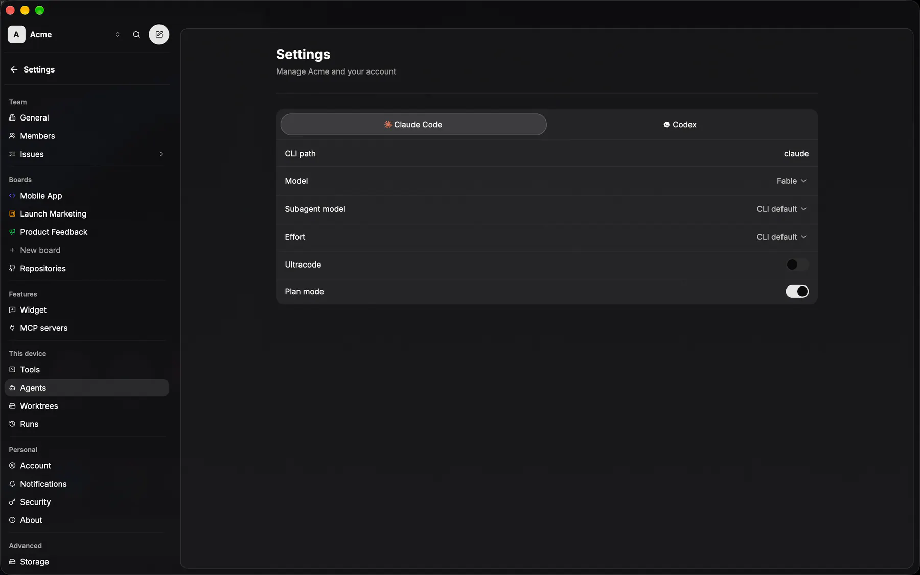
settings-agentsPer-agent CLI path, model and effort, over the doctor’s live probe of git and the three agents.
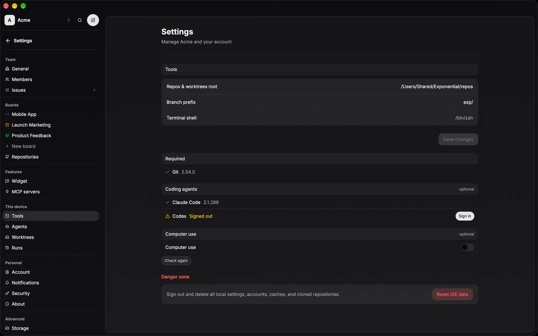
settings-toolsWhere the IDE keeps its clones: repos root, branch prefix and the shell it launches terminals with.
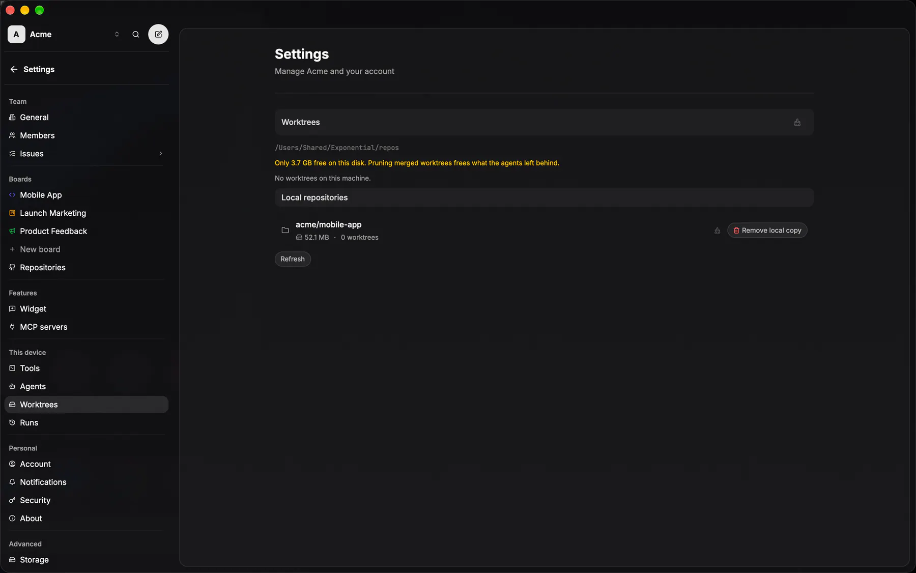
settings-worktreesEvery worktree the machine is holding, with the prune that reclaims the finished ones.
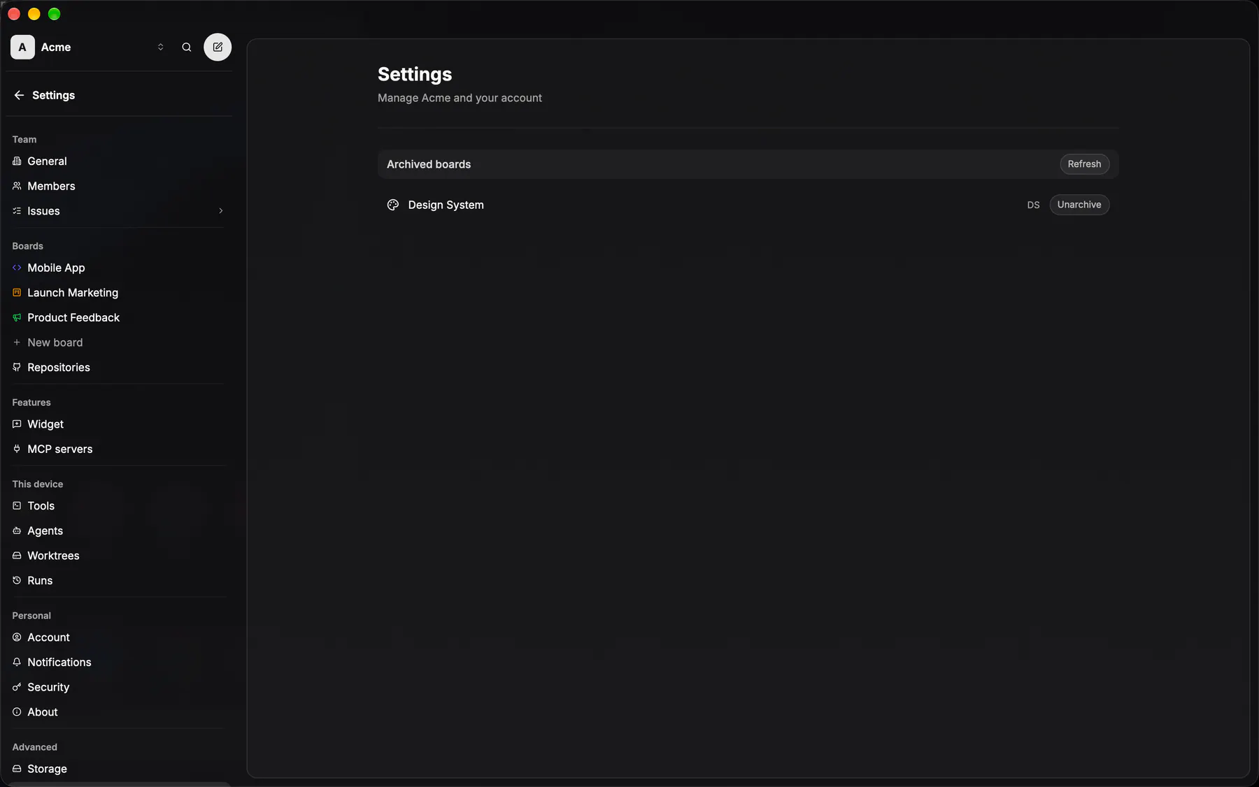
settings-boards-archivedBoards put away rather than deleted, and the way back. EXP-862 gave web its own page under the settings nav's board list; the 48h pending-deletion card joins the archived list once something is in the trash.
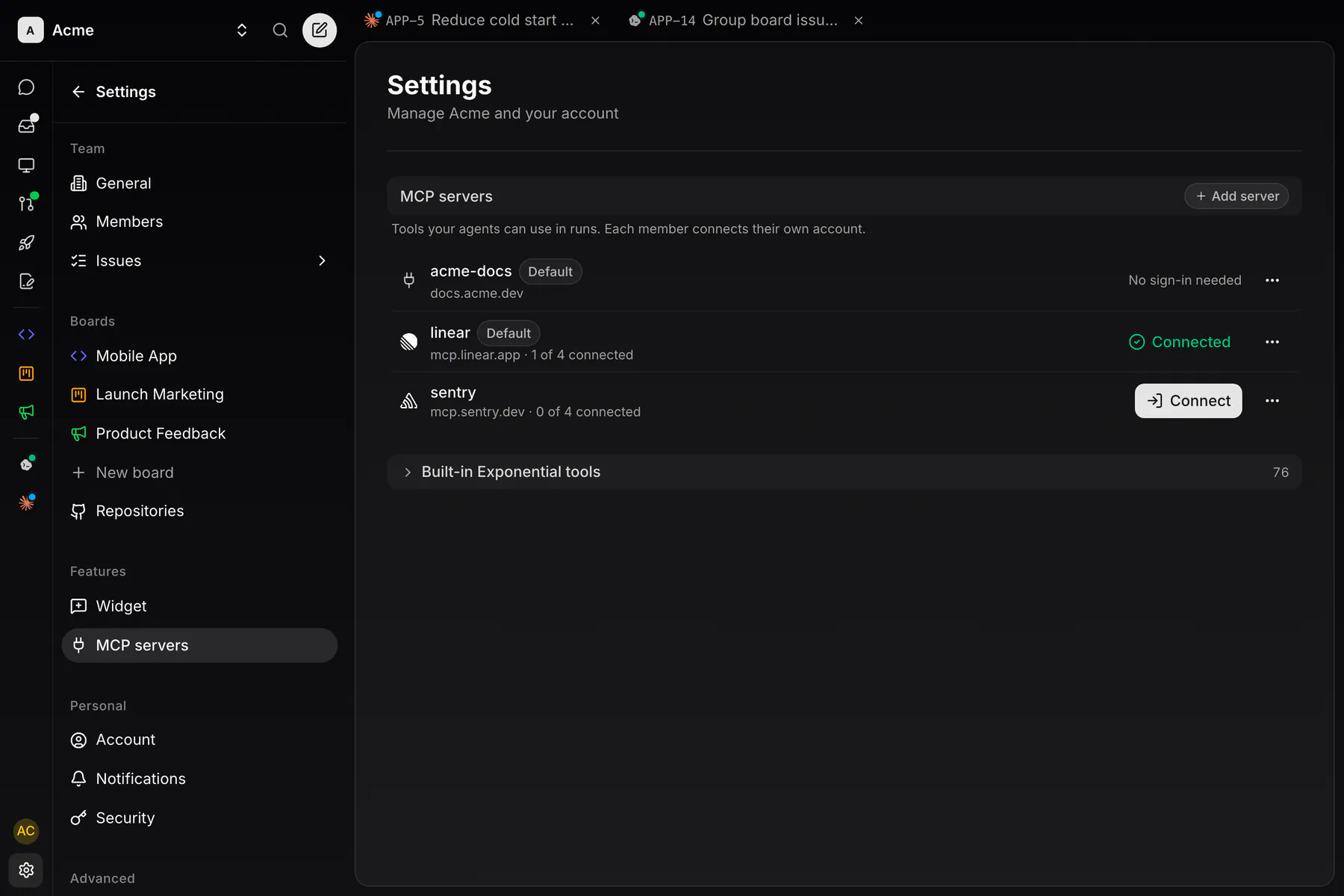
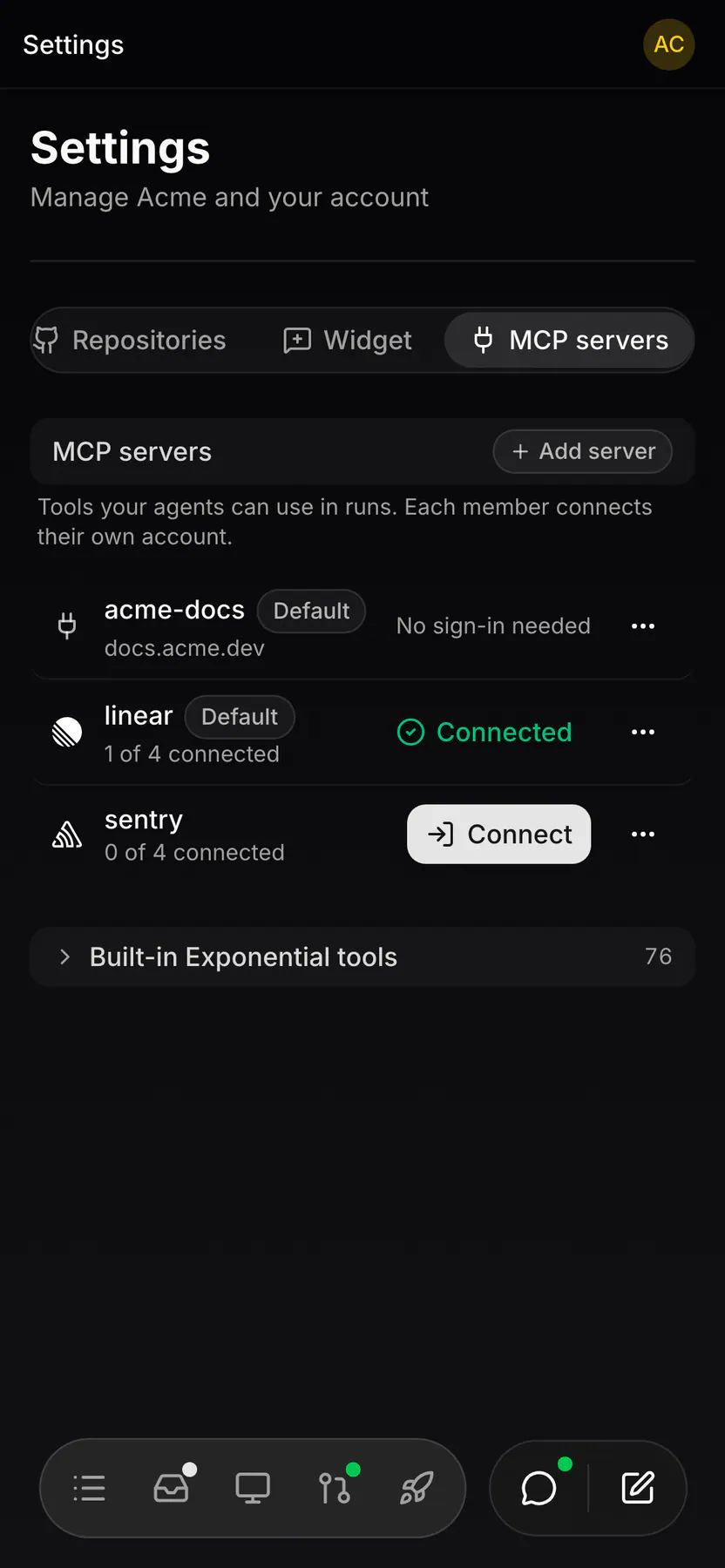
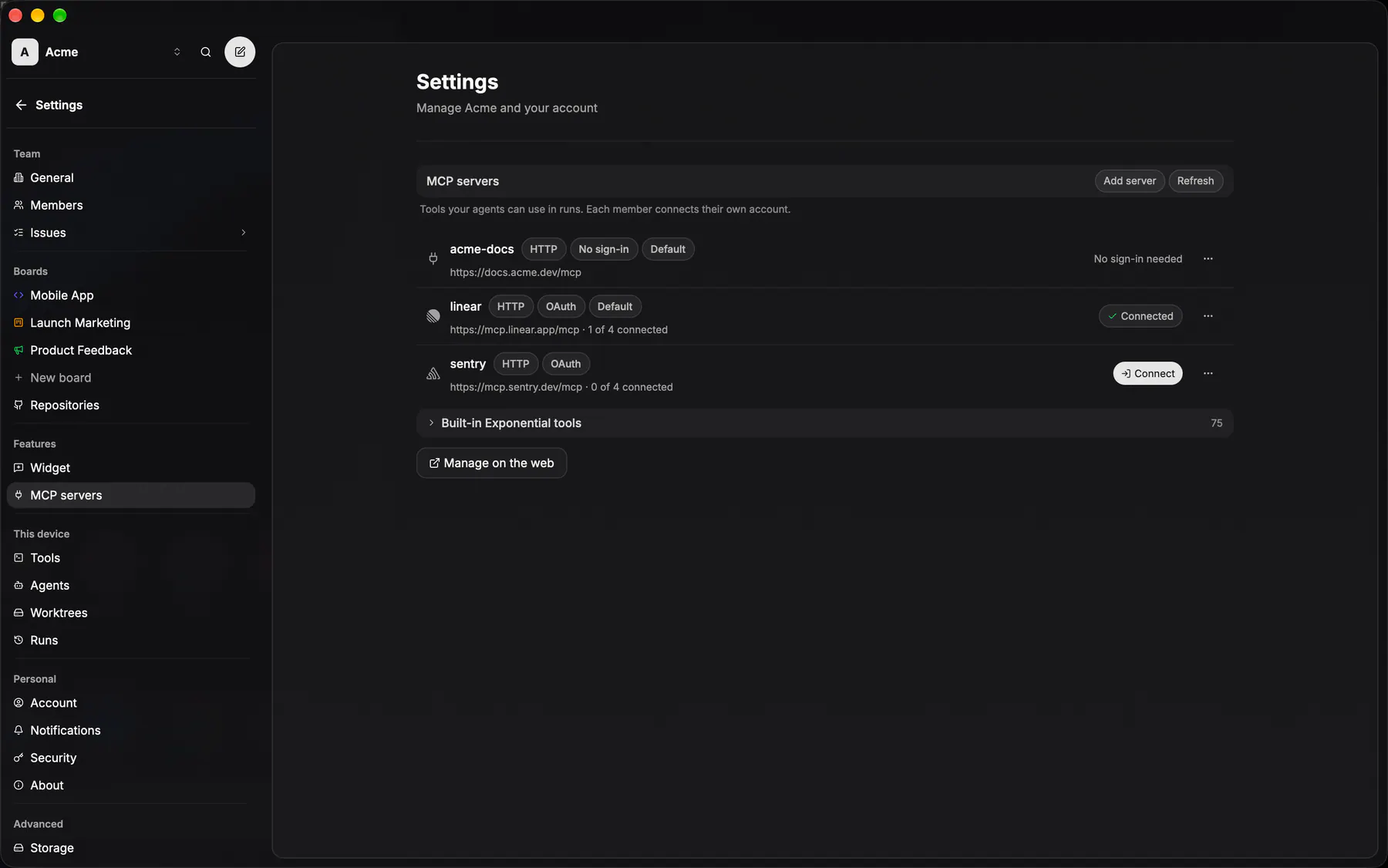
settings-mcp-serversThe team's MCP servers: one row per server with where it lives, how many members connected and shared, a Shared pill when the viewer shares theirs, and the viewer's one action (Connect, Set key, Connected with Share with team / Stop sharing, or No sign-in needed). Each member connects their own account once; the server holds the credential. Owners add from a catalog or a pasted URL, with the technical fields behind Advanced.
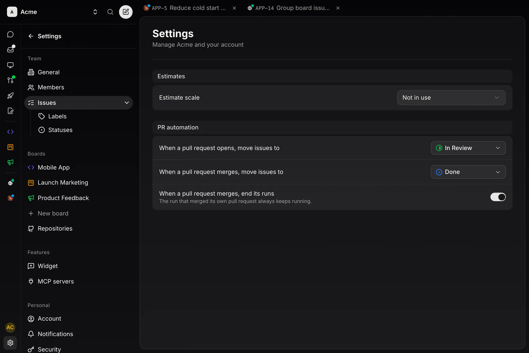
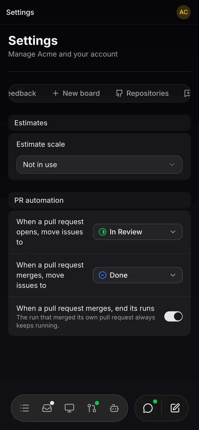
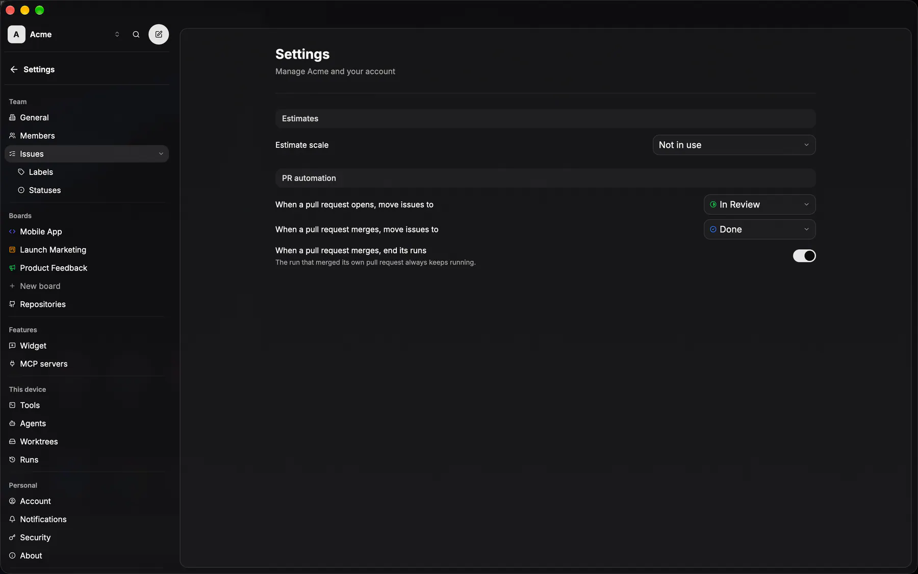
settings-issuesThe team's estimate scale and the pull request automation targets; Labels and Statuses are its sub-pages (EXP-630).
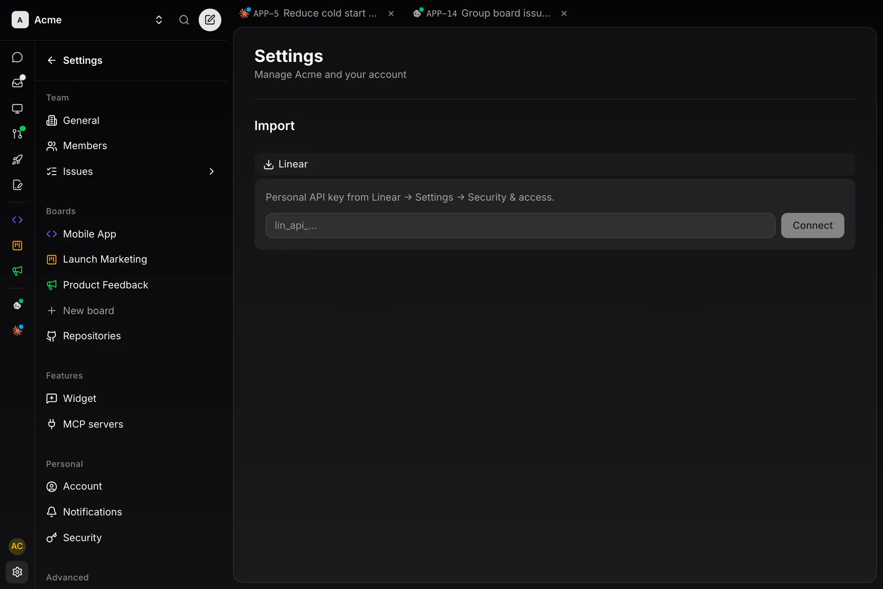
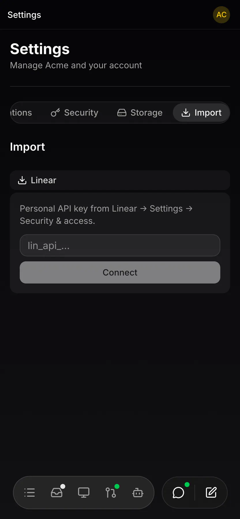
settings-importOwner-only wizard that brings a Linear workspace into the team: connect, preview, map, dry-run, import (EXP-630).
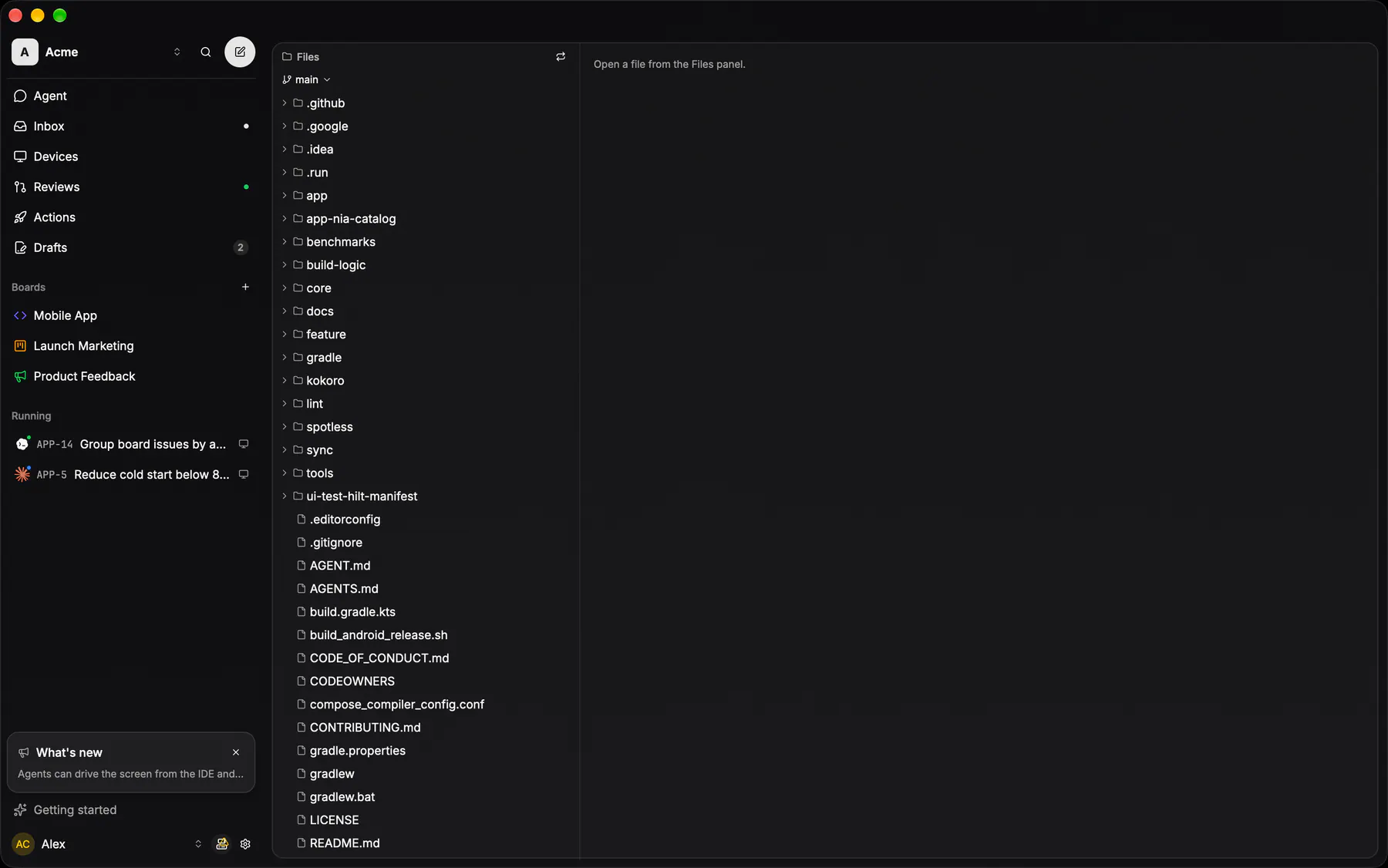
filesThe repository’s file tree beside a read-only viewer: the IDE half of the desktop app.
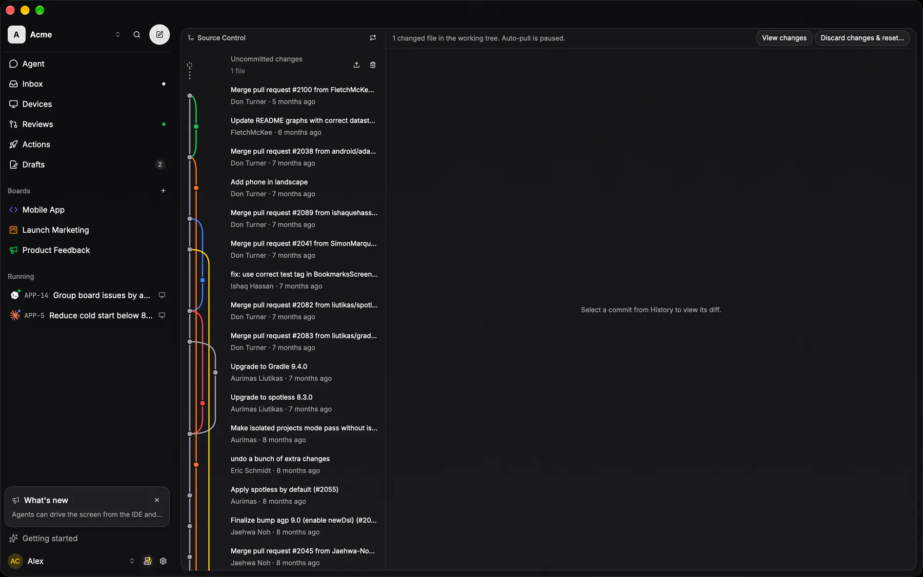
source-controlThe working tree: commit graph, diff, the trunk-sync status and the confirmed commit-and-push.
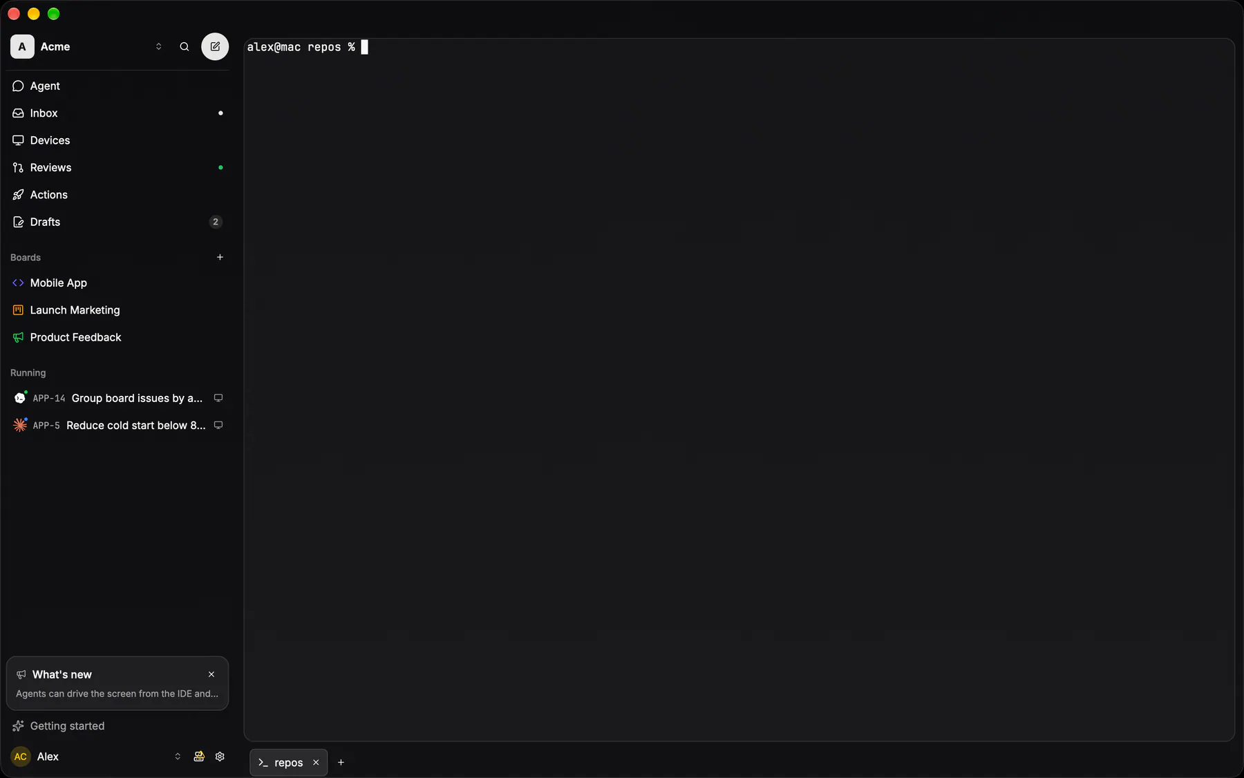
terminalA plain shell terminal: fullscreen in the content area, one tab in the bottom session bar.
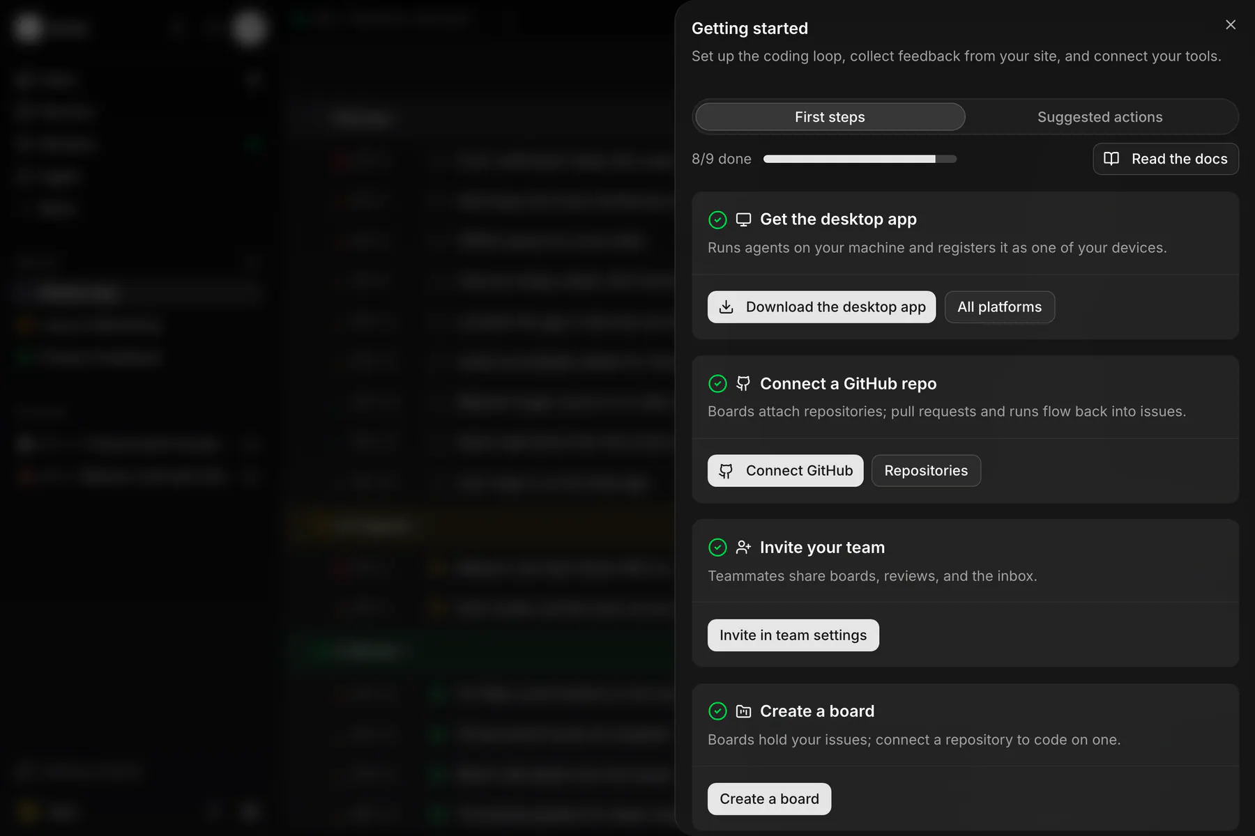
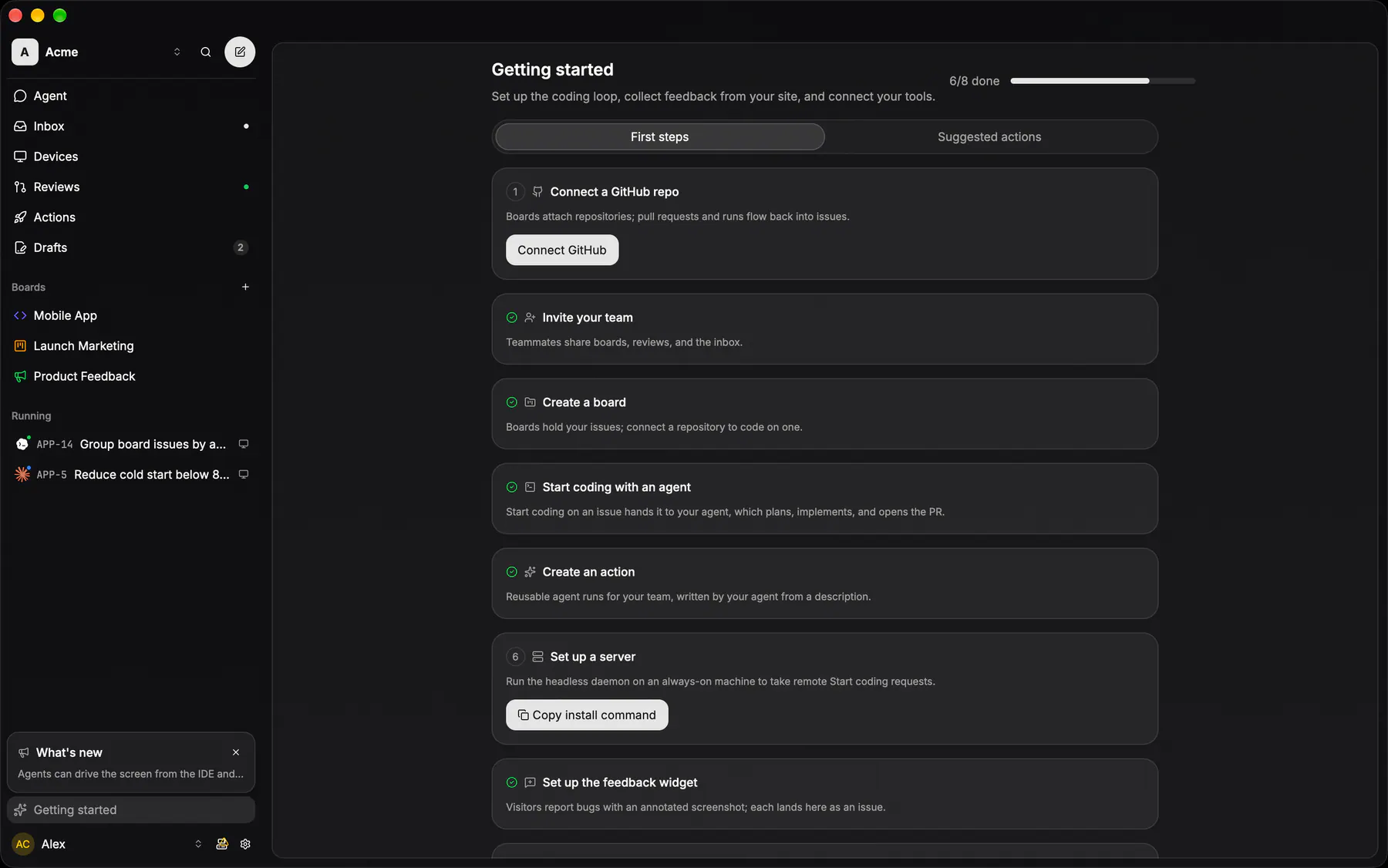
getting-startedThe setup checklist: connect a repo, install the desktop app or CLI, wire MCP, drop in the widget.
tokens-fillsThe four white-alpha fills, on the page gradient they are designed against. Section under row under card under active — never a fifth step.
| Web | --glass-fill-*packages/ui/src/styles.css |
|---|---|
| Desktop | theme::glass::FILL_*apps/desktop/crates/theme/src/tokens.generated.rs |
| iOS | GlassTokensapps/ios/ExpUI/Sources/GlassTokens.swift |
| Android | GlassTokensapps/android/app/src/main/java/com/exponential/app/ui/theme/Glass.ktaliases of DesignTokens.generated.kt |
tokens-strokesFive hairlines. Row separates, section and card enclose, strong floats, active marks a selection — pick by JOB, never by contrast.
| Web | --glass-stroke-*packages/ui/src/styles.css |
|---|---|
| Desktop | theme::glass::STROKE_*apps/desktop/crates/theme/src/tokens.generated.rs |
| iOS | GlassTokensapps/ios/ExpUI/Sources/GlassTokens.swift |
| Android | GlassTokensapps/android/app/src/main/java/com/exponential/app/ui/theme/Glass.ktaliases of DesignTokens.generated.kt |
tokens-paletteEvery colour that is not a glass fill, in three groups. The neutral SURFACE palette is the shadcn theme the whole product sits on. The SEMANTIC accents are fixed sRGB, authored once and shared, because a status hue must not drift with the surface — plus the code trio, which tints inline code in the agent CHAT feeds and nowhere else. The DIFF pair is web's own look lifted verbatim so all four clients render one unified diff: a foreground per side over a 10% wash of the same hue.
| Web | --color-* / --diff-*packages/ui/src/styles.css |
|---|---|
| Desktop | theme::{PALETTE consts} / theme::diffapps/desktop/crates/theme/src/tokens.generated.rsthe semantic accents are top-level consts (YELLOW, GREEN, …), diff its own module |
| iOS | DesignTokens.Palette / .Semantic / .Diffapps/ios/ExpUI/Sources/DesignTokens.generated.swift |
| Android | DesignTokens.Palette / .Semantic / .Diffapps/android/app/src/main/java/com/exponential/app/ui/theme/DesignTokens.generated.kt |
tokens-radiusSix steps. Row 10, group and field 12, card 16, sheet 24 — anything else is a mistake, and capsules use 9999 rather than a step. MD is also the BUTTON corner (EXP-1176: every text button, every size, every client) and the PICKER corner (EXP-771): an icon or colour picker trigger and every cell of the glyph grid take it, which is what keeps a picker from reading as a circular action button. 9999 belongs to the pill, the tabs, the badge and the phone bars.
| Web | --radiuspackages/ui/src/styles.css |
|---|---|
| Desktop | theme::radius::*apps/desktop/crates/theme/src/tokens.generated.rs |
| iOS | GlassTokensapps/ios/ExpUI/Sources/GlassTokens.swift |
| Android | GlassTokensapps/android/app/src/main/java/com/exponential/app/ui/theme/Glass.ktaliases of DesignTokens.generated.kt |
tokens-sizeThree control heights plus the field and the list row. A control that is none of these is a control nobody agreed to.
| Web | buttonVariants size-9 / Pill size md|smpackages/ui/src/button.tsx32 and 24 are the pill's md and sm, in packages/ui/src/pill.tsx |
|---|---|
| Desktop | theme::size::*apps/desktop/crates/theme/src/tokens.generated.rs |
| iOS | GlassTokensapps/ios/ExpUI/Sources/GlassTokens.swift |
| Android | GlassTokensapps/android/app/src/main/java/com/exponential/app/ui/theme/Glass.ktaliases of DesignTokens.generated.kt |
tokens-typeOne family, Inter, and the sizes the agent TRANSCRIPT is set in (EXP-787) — the only type scale the four clients share, because a run has to read the same on a phone and on a 32-inch monitor. Body 14/22 is prose and a sent message; tool 12/18 is a tool row and every other caption in the feed. 16 is the root the rem ladder is measured from. The specimens below are set in this page's own stack: Inter is not loaded here, and faking it with a fallback would make the page lie about the one thing it documents.
| Web | --font-sans / --transcript-*packages/ui/src/styles.cssthe gap ladder derives in lib/agent-feed.ts; design-tokens.test.ts guards the parity |
|---|---|
| Desktop | theme::transcriptapps/desktop/crates/theme/src/tokens.generated.rs |
| iOS | DesignTokens.Transcriptapps/ios/ExpUI/Sources/DesignTokens.generated.swift |
| Android | DesignTokens.Transcriptapps/android/app/src/main/java/com/exponential/app/ui/theme/DesignTokens.generated.kt |
tokens-motionThree durations against three easings — hover a line to run it. Fast for micro-feedback, standard for most transitions, slow for whole surfaces.
| Web | --motion-*packages/ui/src/styles.css |
|---|---|
| Desktop | theme::motion::duration / easeapps/desktop/crates/theme/src/tokens.generated.rs |
| iOS | GlassTokensapps/ios/ExpUI/Sources/GlassTokens.swift |
| Android | GlassTokensapps/android/app/src/main/java/com/exponential/app/ui/theme/Glass.ktaliases of DesignTokens.generated.kt |
tokens-iconsEvery CONCEPT the product can name, rendered from the registry itself. One icon set, Lucide, byte-identical on four clients, generated from packages/icons/icons.json into a committed output per platform — so an icon changes in one JSON and nowhere else. A multi-client surface names the concept (conceptIcon("nav-search")), never a raw glyph import, which is what lets the same screen carry the same mark on a phone, a browser and the IDE. This entry is an ISLAND of the real registry: a lookalike table would be the one place the icons could drift.
| Web | conceptIcon / ICON_COMPONENTSpackages/ui/src/icons.generated.tsthe concept → glyph map is SEMANTIC_ICONS in packages/icons/src/generated.ts |
|---|---|
| Desktop | icons::registryapps/desktop/crates/ui/src/icons.rspub mod registry include!s icons.generated.rs; concepts are consts (registry::NAV_SEARCH) |
| iOS | AppIconsapps/ios/ExpUI/Sources/AppIcons.generated.swiftasset names for the bundled imagesets, rendered through AppIcon — never Image(systemName:) |
| Android | ExpIconsapps/android/app/src/main/java/com/exponential/app/ui/icons/ExpIcons.generated.ktthe geometry itself: one lazy ImageVector per glyph, with the concepts as getters |
logoThe product's own mark — a disc with three swept curves cut OUT of it, never a glyph from the registry (the icon set is Lucide, and this is not something we may restyle). Two variants: `dark` paints the fixed brand ink for a light ground, `light` takes `currentColor` so it inherits whatever it sits in. Every client keeps its own copy of the geometry, so the entry names all four.
| Web | ExponentialLogopackages/ui/src/exponential-logo.tsx |
|---|---|
| Desktop | icons::ExpIconapps/desktop/crates/ui/src/icons.rsthe Logo variant is generated by icon_named! off assets/icons/logo.svg; logo-white.svg is the inverted arm |
| iOS | ExpLogoMarkapps/ios/Exponential/UI/Components/ExpLogoMark.swiftdrawn with a SwiftUI Canvas rather than an asset, so it scales with Dynamic Type |
| Android | ExponentialMarkapps/android/app/src/main/java/com/exponential/app/ui/components/BrandMark.ktpaints the splash drawable and scales the box around it: one size, no light/dark variant |
brand-marksThe agents' own marks, deliberately OUTSIDE the Lucide registry: a brand mark is not a glyph we may recolour or swap, so it never resolves through `conceptIcon`. Claude keeps its real path in its own orange (`CLAUDE_FILL`) on all four clients; Codex is the CLI's own mark; the OpenAI and Cursor marks are simplified silhouettes for the MCP setup tabs, which only need recognisability beside a name. `AgentBrandMark` is the resolver every run surface uses — and an agent this build ships no mark for falls back to the neutral `settings-agents` concept rather than wearing claude's, the same rule on all four.
| Web | ClaudeIcon / CodexIcon / AgentBrandMarkpackages/ui/src/brand-icons.tsxthe resolver is agent-brand-mark.tsx; the picker's AgentMark shares these paths |
|---|---|
| Desktop | coding_selects::agent_markapps/desktop/crates/ui/src/coding_selects.rsExpIcon::Claude / ExpIcon::Codex off the bundled brand SVGs (assets/icons/claude.svg, codex.svg) |
| iOS | AgentBrandMark.image(_:)apps/ios/Exponential/UI/Session/AgentBrandMark.swiftresolves Assets.xcassets/agent-<id>; an id outside contract.codingAgent gets the neutral glyph |
| Android | agentIconPainter / agentIconTintapps/android/app/src/main/java/com/exponential/app/ui/components/SheetOptionRows.ktdrawable/ic_agent_claude.xml keeps its own orange (tint Unspecified); every other mark takes content colour |
run-state-markEXP-1184: what a LIVE run is doing, one rule ×4 (contract fixture `session-display.json`, first match wins): it waits on you → the AMBER badge; the agent works → Claude's own "writing" spark, eight hand-drawn frames at 90 ms with hard cuts (vendored once as `packages/icons/agent/claude-writing.svg`, generated into every client; an agent without working art pulses its brand mark instead; reduced motion holds the static mark); idle with its pull request open → the GREEN badge (in review); idle with no open pull request, or merged → the BLUE badge (done). A follow-up turn on a run in review reads working again; the session row and the issue status never change for it. The amber needs-input badge beats every other state (the red needs-you badge is gone), a paused run wears the bare mark. EXP-1208: every session LIST row ×4 leads with this mark too (running and ended rows, the action Runs list; no more state dots), and a FINISHED run's row wears the ENDED mark: the brand mark at half opacity with no badge. Where a surface still draws a dot (tab chips), the dot takes the state's tone and gives way to the same working mark.
| Web | AgentRunMark / AgentWorkingMark / ClaudeSpinnerpackages/ui/src/agent-brand-mark.tsxthe derivation is apps/web/src/lib/coding-session-display.ts; the spark steps a CSS steps(8) sprite (claude-spinner.tsx) |
|---|---|
| Desktop | coding_selects::run_leadapps/desktop/crates/ui/src/coding_selects.rsassets/icons/claude-writing-{0..7}.svg; the derivation is queries::coding_session_display |
| iOS | AgentRunMark / ClaudeSparkSpinnerapps/ios/Exponential/UI/Session/AgentRunMark.swiftAssets.xcassets/agent-claude-writing-{0..7}; the derivation is ExpCore CodingSessionDisplay.swift |
| Android | AgentRunMark / ClaudeSparkSpinnerapps/android/app/src/main/java/com/exponential/app/ui/components/AgentRunMark.ktdrawable/ic_agent_claude_writing_{0..7}.xml; the derivation is domain/CodingSessionDisplay.kt |
segmentedThe standalone capsule: 36 tall, padding 3, the section fill under a section stroke. Segments share the embedded row's geometry — EXP-941 made that second form a prop rather than a second component, so the settings strips and the free-floating ones are one control. Eight strips wired their own Tabs + TabsList + N triggers by hand before, and drifted in padding and in whether a segment carried a glyph; the class recipe still lives in tabs.tsx, which other surfaces read directly.
| Web | SegmentedControlpackages/ui/src/segmented-control.tsxthe SEGMENTED_* class constants stay in tabs.tsx byte-identical; this renders the strip from an option array |
|---|---|
| Desktop | controls::segmentedapps/desktop/crates/ui/src/controls.rs |
| iOS | GlassSegmentedControlapps/ios/ExpUI/Sources/GlassSegmentedControl.swift |
| Android | GlassSegmentedControlapps/android/app/src/main/java/com/exponential/app/ui/components/GlassSegmentedControl.kt |
work-face-tabsEXP-1152: the ONE strip every Work screen wears (the md+ work header, the phone's header band, the desktop IDE, iOS, Android): Issue · Run/Runs · +N −M · Results in that fixed order, the segmented capsule above. The Changes segment wears the diff's counts once its files are known and the word Changes until then (the desktop FaceToggle::diff rule); the Runs segment carries a caret to the run menu with several runs; an unavailable face is HIDDEN, never disabled, and the strip is absent under two faces. On phones the body under it is a PAGER: iOS FacePager, Android TabPager (HorizontalPager), and on the web useFaceSwipe moves the face's body with the finger and slides the next one in (the header band and the bar never move). EXP-1190: EVERY top tab strip on a phone pages with the same pager (My Work Inbox · My Issues · Drafts, Actions · Suggestions, the action page's Prompt · Triggers · Runs); a tap pages too. EXP-1162 (contract `detail-chrome.json` face marks): the tabs carry the STATE, the header title never does. The Run tab wears the run's mark while it is live (the sidebar Running row's `AgentRunMark`, leading the label: Claude's working spark while the agent works, else the brand mark with its run-state badge), never a dot; an open pull request puts a 6px dot on Results, or on Changes when there is no Results face. EXP-1154: on phones the strip sits centred, nothing beside it (Merge rides the floating bar), and an issue's Changes segment is the review of its pull request (the Reviews detail screen is gone).
| Web | WorkFaceStrippackages/ui/src/work-face-strip.tsxWorkFaceToggle + MobileFaceTabs in apps/web plug the run menu and the phone pager |
|---|---|
| Desktop | work_header::FaceToggleapps/desktop/crates/ui/src/work_header.rs |
| iOS | WorkFaceTabsapps/ios/Exponential/UI/Work/WorkFaceTabs.swift |
| Android | WorkFaceTabsapps/android/app/src/main/java/com/exponential/app/ui/work/FaceTabs.kt |
icon-pickerThe one surface that picks a glyph, and the one exception to the circle (EXP-771): a circle is the primary ACTION, ROUNDED SQUARE is a picker. The trigger is a square at the radius ladder's MD step over card fill, sized to the field it sits beside (web h-9, desktop and the natives the 32px control rung) — a card hairline once something is picked, a DASHED one under the placeholder glyph while it is empty — and the cells of the grid it opens wear that same corner, the picked one taking the active fill under the active stroke. It offers one of TWO sets from the one registry (EXP-924): the 96 board and action glyphs, or the six device glyphs (monitor, server, laptop and the Apple, Windows and Linux marks) beside a device's name, where the short set hugs its cells. EXP-862 gave the colour picker the SAME trigger, so the board form reads as one control repeated; the swatches inside it are the counter-example: a colour has no shape to read, so those stay circles.
| Web | IconPickerpackages/ui/src/icon-picker.tsxthe grid is icon-swatch-grid.tsx, rendered inside the trigger's popover |
|---|---|
| Desktop | board_form::icon_pickerapps/desktop/crates/ui/src/board_form.rsicon_swatch_grid is the grid in the same file |
| iOS | IconPickerapps/ios/ExpUI/Sources/IconPicker.swiftthe grid is ExpUI/Sources/IconSwatchGrid.swift |
| Android | IconPickerapps/android/app/src/main/java/com/exponential/app/ui/components/IconPicker.ktthe grid is ui/components/IconSwatchGrid.kt |
text-field36 tall, padding 0/12, radius 12, card fill under a card stroke; focus swaps the stroke to active — no ring. Placeholder at 50%.
| Web | Inputpackages/ui/src/input.tsx |
|---|---|
| Desktop | controls::glass_inputapps/desktop/crates/ui/src/controls.rsfocus swaps the stroke to strokeActive, no ring (EXP-720); the corner is radius.lg (EXP-963) |
| iOS | GlassTextFieldapps/ios/ExpUI/Sources/GlassControls.swift |
| Android | GlassTextFieldapps/android/app/src/main/java/com/exponential/app/ui/components/GlassTextField.kt |
textareaThe field's own recipe, grown: radius 12, card fill under a card stroke, focus swaps the stroke to active — no ring. Padding 8/12, three rows tall, and it GROWS with content; the drag handle is off everywhere. Inside a group it goes borderless, because the row is already the chrome.
| Web | Textareapackages/ui/src/textarea.tsx |
|---|---|
| Desktop | controls::web_textareaapps/desktop/crates/ui/src/controls.rs |
| iOS | GlassTextField(lines:)apps/ios/ExpUI/Sources/GlassControls.swift |
| Android | GlassTextField(minLines/maxLines)apps/android/app/src/main/java/com/exponential/app/ui/components/GlassTextField.kt |
checkboxA 16px rounded square that holds a TABLE's selection — the bulk-select column of an issue list and nothing else. It is deliberately NOT the multi-select affordance in a picker: every option row on all four clients marks itself with the leading circle pair (ui-selected / ui-unselected), so a checkbox inside a picker would make web the only client drawing selection twice. Checked takes the primary fill under the primary foreground; indeterminate is the same box with a minus.
| Web | Checkboxpackages/ui/src/checkbox.tsx |
|---|---|
| Desktop | controls::checkboxapps/desktop/crates/ui/src/controls.rsglass box (row fill, strong stroke, radius SM), primary when checked, ui-check / ui-minus; bulk-select + checklist rows |
| iOS | n/ano checkbox exists: a multi-select row draws the ui-selected / ui-unselected circle pair |
| Android | n/asame as iOS — the sheet's option rows carry the circle glyph pair, never a box |
switchThe 36×20 capsule that flips a setting the moment it is pressed — there is no Save beside one. Off is the active fill under the foreground knob, on the primary fill under the primary-foreground knob, and the travel is one fast duration. It almost always rides a toggle ROW, which owns the label and the description; this is the bare control.
| Web | Switchpackages/ui/src/switch.tsx |
|---|---|
| Desktop | controls::web_switchapps/desktop/crates/ui/src/controls.rsa lint (only_controls_constructs_switches) refuses Switch::new anywhere else |
| iOS | GlassToggleStyleapps/ios/ExpUI/Sources/GlassControls.swiftapplied app-wide as .toggleStyle(.glass), so call sites keep the stock Toggle |
| Android | glassSwitchColors()apps/android/app/src/main/java/com/exponential/app/ui/components/SheetOptionRows.ktthe tokens for the stock M3 Switch; there is no GlassSwitch composable |
selectThe closed single-select: a field-height trigger of card fill under a card hairline, the value left and a chevron right, focus swapping the stroke to active. Only the PLACEHOLDER arm can be photographed — SelectValue resolves against items that live inside the portalled list, so a valued trigger renders empty until the browser opens it (see @exp/ui's island limits). On the natives there is no free-standing select at all: the closed trigger is always a picker ROW opening a sheet.
| Web | Select / SelectTriggerpackages/ui/src/select.tsx |
|---|---|
| Desktop | surface::glass_picker_selectapps/desktop/crates/ui/src/surface.rs |
| iOS | n/ano free-standing select: the closed single-select is a GlassPickerRow opening a sheet (see picker row) |
| Android | n/asame as iOS — PickerRow (SheetOptionRows.kt) is the closed arm, and the sheet is the list |
color-pickerEXP-862 made this the icon picker's TWIN, so the board form's two triggers read as one control repeated: the same rounded square at the radius ladder's MD step, a card hairline once something is picked and a DASHED one while it is empty, opening the same 8-column grid. The swatches are the counter-example to the shape rule — a colour has no shape to read, so a cell stays a circle, and the picked one wears a ring instead of a fill.
| Web | ColorPickerpackages/ui/src/color-picker.tsxthe grid is color-swatch-grid.tsx, rendered inside the trigger's popover |
|---|---|
| Desktop | board_form::color_pickerapps/desktop/crates/ui/src/board_form.rscolor_swatch_grid is the grid in the same file |
| iOS | ColorSwatchPickerapps/ios/ExpUI/Sources/ColorSwatchGrid.swiftthe grid is ColorSwatchGrid in the same file |
| Android | ColorPickerapps/android/app/src/main/java/com/exponential/app/ui/components/ColorPicker.kt |
labelThe 14px medium line that names a field, tied to it by htmlFor so the label is part of the hit box, and dimmed with the field when it is disabled. It exists on the WEB only: every native lays a field out as a ROW that already carries its name on the left, so a label above the control there would say the same thing twice.
| Web | Labelpackages/ui/src/label.tsx |
|---|---|
| Desktop | n/aa field's name is the glass row's own leading text — see input row |
| iOS | n/asame — the name is the row title inside GlassTextField / GlassPickerRow |
| Android | n/asame — TextFieldRow / PickerRow carry the label themselves |
comboboxThe ONE searchable picker. Its shell — MobilePopover over Command — was copy-pasted about twelve times, and every copy re-decided four things a reader can see: what a picked row LOOKS like, what value= carries, how wide the popover is, and what "nothing picked" is called. Selection is now fixed and matches both natives: SINGLE select marks the picked row with a trailing ui-check, MULTI marks EVERY row with the leading ui-selected / ui-unselected circle pair (iOS AgentIssuePickerSheet.swift, Android AgentIssuePickerSheet.kt) — never a checkbox, which would make web the odd client out. value is the IDENTITY and keywords the search text, so two boards may share a name; noneLabel renders a row that reports null, which retires six sentinel strings. Single closes on pick, a multi stays open because a batch is several picks. EXP-957 added the third arm, ComboboxMenuItems: the same rows as items INSIDE a Radix context or dropdown menu, for the issue row's right-click submenus and the bulk bar, which retires the menu's own radio dot and checkbox tick; and a bulk edit over rows that disagree draws ui-indeterminate (circle-minus) on a multi row, or marks nothing at all on a single. EXP-958 folded the last two closed single-selects onto it — the status and priority menu, whose desktop arm marked no row at all, and the settings picker row, which was a Select on desktop and a hand-rolled sheet on the phone — as searchable={false} pickers with two more triggers: row (the glass form ladder's picker row, label leading, value trailing) and inline (one word of the muted sentence under the composer, which collapses to plain text with a single option). The demo shows the four triggers beside the bare ComboboxList, since a closed portal renders nothing — and a menu arm cannot render outside its menu at all. EXP-1021 added selectionStyle: the circle pair above is the glyph arm, still what every Combobox call site draws, while the Picker primitive built on these surfaces passes highlight and marks a multi pick by the row's own wash. The four triggers moved to picker/picker-trigger.tsx so both arms draw ONE set.
CLI default
| Web | Combobox / ComboboxList / ComboboxMenuItemspackages/ui/src/combobox.tsxPickerOption is the row shape; ComboboxList the body without the popover; ComboboxMenuItems the rows inside a Radix menu |
|---|---|
| Desktop | picker::Pickerapps/desktop/crates/ui/src/picker/mod.rsEXP-1021 retired searchable_picker; the primitive owns its query + cursor, so a host holds no picker entities |
| iOS | GlassPickerSheetapps/ios/ExpUI/Sources/GlassSheet.swiftEXP-1021 built the generic picker (GlassPicker, its own entry); this keeps the picks outside the ten typed subjects |
| Android | GlassSheetRowapps/android/app/src/main/java/com/exponential/app/ui/components/GlassSheet.ktEXP-1021 built the generic picker (Picker, its own entry); this row is what the sheets outside the ten assemble |
search-fieldThe ONE "filter this list" field: the text field with the search glyph INSIDE it and a ghost clear that appears only once there is something to clear — and puts the caret back in the field, so typing continues. Eight of them existed at five heights, most a bare Input re-dressed by hand and none with either affordance, while both natives had drawn exactly this for years. Two rungs: md is the stock 36 field, sm the 28 one dense columns use — the Changes file tree's filter, a sidebar filter. It is an Input, not a new box: every chrome decision still comes from there.
| Web | SearchFieldpackages/ui/src/search-field.tsx |
|---|---|
| Desktop | controls::search_fieldapps/desktop/crates/ui/src/controls.rsEXP-963: SearchFieldSize::Md 36 / Sm 28; the diff pane filter, every picker query and the search dialog draw it |
| iOS | GlassSheetSearchFieldapps/ios/ExpUI/Sources/GlassControls.swift |
| Android | GlassSheetSearchFieldapps/android/app/src/main/java/com/exponential/app/ui/components/GlassSheet.kt |
date-pickerThe ONE date picker. Popover + Calendar was inlined three times — the properties panel, the editor chips, the mobile tray — and each copy converted between a Date and the wire's YYYY-MM-DD its own way, two of them through new Date(value), which the spec parses as UTC and which therefore shows the PREVIOUS day west of Greenwich. This one speaks the wire format on both sides and converts in exactly one place. A due date is a DATE, never an instant (REV2-49), so there is no time arm; the trigger is a Pill showing the short form, and Clear is a row under the grid rather than a second control beside it.
| Web | DatePickerpackages/ui/src/date-picker.tsxparseDateValue / formatDateLabel are the only place the wire date becomes a Date |
|---|---|
| Desktop | pickers::due_date_popoverapps/desktop/crates/ui/src/pickers.rs |
| iOS | DueDateSheetapps/ios/Exponential/UI/Issue/Sheets/DueDateSheet.swiftCreateIssueView keeps a second unfoldable form, UI/Issue/DueDatePicker.swift |
| Android | DueDateSheetapps/android/app/src/main/java/com/exponential/app/ui/issue/DueDateSheet.ktthe grid itself is IssueDatePickerDialog.kt |
typeaheadThe menu that follows what someone is TYPING — @ mentions, # issue refs, : emoji, / commands — as opposed to the combobox, which owns its own field. Three copies existed, each re-implementing the same active index, the same wrap and the same above/below flip, and only one of them told its host whether it had handled the key: the other two signalled it by NOT calling the host's handler, which is how a menu ends up swallowing a send shortcut. One hook owns the keys now: arrows move and wrap, a plain Enter or Tab accepts, Enter with Cmd or Ctrl is the composer's send and passes straight through untouched, Escape dismisses, and with no items nothing is handled at all. The menu has two arms: absolute under a textarea, or anchored to a caret rect in the editor, where it portals to the body at fixed coordinates and flips above the caret when the room below runs out.
| Web | useTypeahead / TypeaheadMenu / TypeaheadRowpackages/ui/src/typeahead.tsxhandleKeyDown returns true when the menu ate the key; the editor's caret menu is the anchored arm (EXP-959) |
|---|---|
| Desktop | controls::typeahead_menu / typeahead_rowapps/desktop/crates/ui/src/controls.rsthe row stays completion_row_content; the anchored arm flips above the caret when room runs out, the slash menu inline |
| iOS | EditorAutocompleteMenuapps/ios/Exponential/UI/Markdown/EditorAutocompleteMenu.swiftthe slash menu is separate: UI/Session/SlashCommandMenu.swift |
| Android | AutocompleteMenuapps/android/app/src/main/java/com/exponential/app/ui/markdown/AutocompleteMenu.ktthe rows are AutocompleteRows in the same file |
password-inputThe auth pages' masked field: the stock Input with a ghost eye hung inside its right gutter, which flips the type between `password` and `text`. It is the one field a typo cannot be proof-read in, so the reveal is not optional chrome. The eye pair stays a RAW lucide import on purpose — no native client draws it and the shared registry has no eye-off concept to name. EXP-961 moved it into @exp/ui with the rest of the auth surface.
| Web | PasswordInputpackages/ui/src/password-input.tsx |
|---|---|
| Desktop | login::render_email_stepapps/desktop/crates/ui/src/login.rsthe only other client with the reveal: it wires gpui-component's mask_toggle onto the shared glass_input |
| iOS | GlassTextField(isSecure: true)apps/ios/ExpUI/Sources/GlassControls.swifta bare SecureField arm — no reveal, so a mistyped password can only be fixed by clearing the field |
| Android | GlassTextField(visualTransformation = …)apps/android/app/src/main/java/com/exponential/app/ui/components/GlassTextField.ktLoginScreen passes PasswordVisualTransformation() inline and draws no trailing eye |
account-pickerEXP-872: ONE account picker per platform, replacing the agent picker + the account picker on every launch surface (the composer's options line, the automation editor's Account row, the workflow runner). The list is every signed-in login the machine reports across both agents, flattened (`flattenAccounts`): the row and the chip read as the agent's brand mark + the login's EMAIL — never a profile name, never the word "default"; the last used login is simply first, and a dead credential rides a muted hint. Picking a login implies its agent. One login collapses the inline word to plain text. EXP-992: on a pointer platform hovering a row shows a very small preview right of it — three 4px bars labelled 5h / week / <model> off the login's limits; on touch the same bars sit inline under the email in the sheet row. The menu is a portal, so the specimen is the closed trigger at both variants beside the bars block.
| Web | AccountPicker / AccountLimitBarspackages/ui/src/account-picker.tsxvariant inline = the composer word, row = the glass form ladder's picker row |
|---|---|
| Desktop | coding_selects::account_pickerapps/desktop/crates/ui/src/coding_selects.rsthe hover preview is an anchored overlay right of the menu row |
| iOS | AccountPickerMenuapps/ios/ExpUI/Sources/AccountPicker.swifttouch: the three bars sit inline in the menu row |
| Android | AccountPickerPillapps/android/app/src/main/java/com/exponential/app/ui/components/AccountPickerPill.kttouch: the three bars sit inline in the menu row |
agent-pickerEXP-862: ONE agent picker per platform, so the trigger can never drift into a per-surface copy again. EXP-872 took it OUT of every launch surface — the composer, the device settings default row and the workflow runner pick an ACCOUNT now (the entry above), which implies the agent — so what is left picks an agent where there is no login yet: the Add-account sheet, and the per-agent defaults strip (`AgentPickerTabs`, the same picker as a segmented STRIP). The trigger is ICON-ONLY: the brand mark plus a chevron, with the name in the menu rows and in the tooltip, which doubles as its accessible name. The menu is a portal, so the specimen is the closed trigger at both rungs.
| Web | AgentPicker / AgentPickerTabspackages/ui/src/agent-picker.tsxAgentMenuItems is exported on its own for a row's "…" menu; agentLabel names an id this build does not ship |
|---|---|
| Desktop | coding_selects::agent_pickerapps/desktop/crates/ui/src/coding_selects.rsagent_menu_items is the shared row set, exactly like the web arm |
| iOS | AgentPickerMenuapps/ios/ExpUI/Sources/GlassMenu.swiftAgentOptionsRow (UI/Agent/AgentOptionsRow.swift) is the composer's host |
| Android | n/aEXP-872 retired AgentPickerPill: Add account picks its agent with a PickerRow; every launch surface picks an account. |
emoji-pickerEXP-551: the picker the description toolbar and the comment composer share — a search field, a Recent row, then the dataset's groups. A pick hands the caller the UNICODE to insert, never a `:shortcode:`, and always the BASE record (EXP-600 dropped the skin-tone row on every client). The 36px cell IS the ghost icon button stretched across its grid column: only the colour-emoji face and the glyph size are the picker's own. The DATA is passed in — the app lazy-loads the generated dataset and keeps the per-device recents — and the ranked search is the shared rule the three natives mirror by hand. Category headers are the one surface that stays uppercase.
| Web | EmojiPicker / EmojiPickerPopoverpackages/ui/src/emoji-picker.tsxEmoji picker category headers stay uppercase on purpose (shared exception). |
|---|---|
| Desktop | emoji_picker::EmojiPickerapps/desktop/crates/ui/src/emoji_picker.rsemoji_picker_popover is the shared trigger; the grid is 8 cells wide, the popover's width driver |
| iOS | EmojiPickerSheetapps/ios/Exponential/UI/Markdown/EmojiPickerSheet.swiftthe index and recents live in ExpUI/Sources/EmojiCatalog.swift |
| Android | EmojiPickerSheetapps/android/app/src/main/java/com/exponential/app/ui/emoji/EmojiPickerSheet.ktrememberEmojiData / rememberEmojiPrefs are its dataset and recents halves |
pickerTHE picker primitive: one surface per platform (a popover at the trigger on a pointer, a bottom sheet of plain rows on a phone), single or multi, optional search. Presentation belongs to the primitive, never to the caller — a row is a glyph or a dot, a label and a muted second line, and it is never a card. The selection language is the whole point of EXP-1021: a single pick wears a trailing check, a MULTI pick reads as the row's own highlight, never a leading circle, so the picker that links a relation and the picker that batches issues finally look like one thing. The trigger is the caller's (four shapes: pill, field, row, inline); the surface, the search field and the keys are the primitive's.
Single: one pick, a trailing check, the surface closes.
Multi: the picked rows are the highlighted ones — no circles, nothing in the gutter.
| Web | Pickerpackages/ui/src/picker/picker.tsx |
|---|---|
| Desktop | picker::Pickerapps/desktop/crates/ui/src/picker/mod.rs |
| iOS | GlassPickerapps/ios/ExpUI/Sources/Picker/Picker.swiftSwiftUI owns the bare name Picker, so the primitive is GlassPicker; the ten typed ones keep theirs. |
| Android | Pickerapps/android/app/src/main/java/com/exponential/app/ui/components/picker/Picker.kt |
picker-boardBoards by icon and colour, everywhere a board is picked: the create-issue dialog's prefix chip, move-to-board (the issue detail, the list row's context menu, the phone properties sheet) and the automation trigger's board filter, which is the same picker in its multi arm. A board with no icon of its own is never a bare colour dot — a repo-backed board draws the repo glyph, everything else the default board glyph (EXP-449), decided once in `boardPickerItems`.
The multi arm is the same rows, capped, for an automation's board filter.
| Web | BoardPickerpackages/ui/src/picker/board-picker.tsx |
|---|---|
| Desktop | picker::board_pickerapps/desktop/crates/ui/src/picker/board_picker.rs |
| iOS | BoardPickerapps/ios/ExpUI/Sources/Picker/BoardPicker.swift |
| Android | BoardPickerapps/android/app/src/main/java/com/exponential/app/ui/components/picker/BoardPicker.kt |
picker-issueIssues by identifier and title, single or multi. Single is the relations linker (sub-issue, blocks, duplicate — the surface this whole issue was measured against), the mark-as-duplicate flow and the stack dialog; multi is the composer picking a batch. Over a big board the ranking is the shared engine's (`useIssueSearchResults`, EXP-892) and the picker renders what it is handed, verbatim — so `shouldFilter` goes off and the top row stays selected as results arrive.
Multi (a batch): the picked rows are highlighted and the surface stays open.
| Web | IssuePickerpackages/ui/src/picker/issue-picker.tsx |
|---|---|
| Desktop | picker::issue_pickerapps/desktop/crates/ui/src/picker/issue_picker.rs |
| iOS | IssuePickerapps/ios/ExpUI/Sources/Picker/IssuePicker.swift |
| Android | IssuePickerapps/android/app/src/main/java/com/exponential/app/ui/components/picker/IssuePicker.kt |
picker-actionThe team's actions (and the two listed builtins) by curated icon and name — the Agent composer's action chip and the automation editor's "Action" row. An action whose inputs are required is rendered and disabled in the automation arm, because an automated run has nobody to fill them in; a row with no icon of its own draws the default action glyph rather than nothing.
| Web | ActionPickerpackages/ui/src/picker/action-picker.tsx |
|---|---|
| Desktop | picker::action_pickerapps/desktop/crates/ui/src/picker/action_picker.rs |
| iOS | ActionPickerapps/ios/ExpUI/Sources/Picker/ActionPicker.swift |
| Android | ActionPickerapps/android/app/src/main/java/com/exponential/app/ui/components/picker/ActionPicker.kt |
picker-accountEXP-872: ONE picker for the agent AND its login — there is no separate agent pick. The list is every signed-in login the machine reports across both agents, each row the agent's brand mark beside the login's EMAIL (never the profile name, never the word "default": the last used login is simply the first row), and picking one implies its agent. A dead credential rides as a muted hint. EXP-992 adds the rate-limit preview — three small bars (5h / week / the model window) off the option's fractions, right of the row on a pointer, inline under the email in the sheet.
| Web | AccountPickerpackages/ui/src/picker/account-picker.tsx |
|---|---|
| Desktop | picker::account_pickerapps/desktop/crates/ui/src/picker/account_picker.rs |
| iOS | AccountPickerapps/ios/ExpUI/Sources/Picker/SharedAccountPicker.swift |
| Android | AccountPickerapps/android/app/src/main/java/com/exponential/app/ui/components/picker/AccountPicker.kt |
picker-deviceThe machines a run may start on, each by its device glyph and name — the Agent composer and an action trigger's "Runs on" row. A machine that cannot take the run is rendered DISABLED with the reason as its muted second line, never dropped: a list that silently shrinks reads as a bug on the machine the user was looking for. A device with no icon of its own falls back to its kind (a server glyph for a server).
| Web | DevicePickerpackages/ui/src/picker/device-picker.tsx |
|---|---|
| Desktop | picker::device_pickerapps/desktop/crates/ui/src/picker/device_picker.rs |
| iOS | DevicePickerapps/ios/ExpUI/Sources/Picker/DevicePicker.swift |
| Android | DevicePickerapps/android/app/src/main/java/com/exponential/app/ui/components/picker/DevicePicker.kt |
picker-assigneeThe team's members by AVATAR, name and email — the issue properties, the create-issue dialog, the list row's context menu and the bulk bar. The avatar is the one row body the primitive does not draw itself (a picker glyph is an icon, never a photo), and the email is both the muted second line and a search term. `Unassigned` is a row like any other and reports `null`: no `__unassign__` sentinel exists anywhere. On a solo team the control is hidden entirely — there is nobody to assign to.
| Web | AssigneePickerpackages/ui/src/picker/assignee-picker.tsx |
|---|---|
| Desktop | picker::assignee_pickerapps/desktop/crates/ui/src/picker/assignee_picker.rs |
| iOS | AssigneePickerapps/ios/ExpUI/Sources/Picker/AssigneePicker.swift |
| Android | AssigneePickerapps/android/app/src/main/java/com/exponential/app/ui/components/picker/AssigneePicker.kt |
picker-iconEXP-575/EXP-924: the one icon picker, and the SET is a parameter — the curated board icons unless a surface names another (the device set). It is the primitive with a `panel`: the swatch grid REPLACES the search field and the rows, so the surface, its sheet and its trigger stay the picker's while the body is a grid of squares. The trigger is that shape rule: an icon-only ACTION is a circle, an icon PICKER is a rounded square, because it previews a swatch. Both sets are APPEND-ONLY (contract `boardIcon` / `deviceIcon`): reordering orphans rows.
| Web | IconPickerpackages/ui/src/picker/icon-picker.tsx |
|---|---|
| Desktop | picker::icon_pickerapps/desktop/crates/ui/src/picker/icon_picker.rs |
| iOS | IconPickerapps/ios/ExpUI/Sources/Picker/SharedIconPicker.swift |
| Android | IconPickerapps/android/app/src/main/java/com/exponential/app/ui/components/picker/IconPicker.kt |
picker-statusThe team's own `issue_statuses` rows (EXP-314) in display order, each by its glyph in its colour — the issue header chip, the create dialog, the phone properties row, the list row's context menu, the bulk bar and the PR-automation target. Six builtins are LOCKED (never renamed, recoloured or deleted) and a custom row is name + colour; the picker takes the RESOLVED row, so the builtin's token class and the custom's hex reach it through one slot. The duplicate CATEGORY is never offered here: picking it opens the canonical-issue picker instead.
The last row is a CUSTOM status: its hex tints the glyph exactly as a builtin's token does.
| Web | StatusPickerpackages/ui/src/picker/status-picker.tsx |
|---|---|
| Desktop | picker::status_pickerapps/desktop/crates/ui/src/picker/status_picker.rs |
| iOS | StatusPickerapps/ios/ExpUI/Sources/Picker/StatusPicker.swift |
| Android | StatusPickerapps/android/app/src/main/java/com/exponential/app/ui/components/picker/StatusPicker.kt |
picker-priorityThe contract's five priorities in display order, each by its glyph in its tone — the issue's priority chip and button, the create dialog, the phone properties row, the context menu, the bulk bar and the automation trigger's priority filter (the same picker, multi, capped). No search: five fixed rows are a menu, not a list. The TABLE is the app's, beside the enum — the picker is handed rows and never owns the vocabulary, which is why the trigger draws the RESOLVED config rather than a matched row (an unknown forward-compat value falls back instead of rendering blank).
| Web | PriorityPickerpackages/ui/src/picker/priority-picker.tsx |
|---|---|
| Desktop | picker::priority_pickerapps/desktop/crates/ui/src/picker/priority_picker.rs |
| iOS | PriorityPickerapps/ios/ExpUI/Sources/Picker/PriorityPicker.swift |
| Android | PriorityPickerapps/android/app/src/main/java/com/exponential/app/ui/components/picker/PriorityPicker.kt |
picker-labelALWAYS multi, always searchable, each row its colour dot and name — the issue properties, the create dialog, the context menu, the bulk bar, the widget's default labels and the automation trigger's label filter. This is the picker the multi selection language was designed on: the surface stays open across toggles (a batch is several picks) and every picked row reads as the row's OWN highlight, never a leading circle or a checkbox. Two primitive slots carry the rest: "Create label" is the `footer`, and the create form is the `panel` that replaces the search field and the rows while it is up.
A bulk edit adds a third state: a label on SOME of the selection is marked `indeterminate`.
| Web | LabelPickerpackages/ui/src/picker/label-picker.tsx |
|---|---|
| Desktop | picker::label_pickerapps/desktop/crates/ui/src/picker/label_picker.rs |
| iOS | LabelPickerapps/ios/ExpUI/Sources/Picker/LabelPicker.swift |
| Android | LabelPickerapps/android/app/src/main/java/com/exponential/app/ui/components/picker/LabelPicker.kt |
picker-mcpThe team's MCP servers a run connects to — the Agent composer's "MCP servers" row (multi) and, as the same rows in a PickerList, the Add dialog's one search box over the well-known servers (type a name, or paste any URL and pick its "Use …" row). A server whose host is in the catalog (contract mcpCatalog) wears the REAL brand mark of its service, one of the vendored selfh.st light SVGs in packages/icons brand, reproduced as-is and never recoloured; a command server the terminal, anything else the plug. One the member has not connected renders with "Connect first" as its second line rather than vanishing.
| Web | McpServerPickerpackages/ui/src/picker/mcp-server-picker.tsx |
|---|---|
| Desktop | picker::mcp_server_pickerapps/desktop/crates/ui/src/picker/mcp_server_picker.rs |
| iOS | n/aThe native composer has no MCP row yet; its runs connect none. |
| Android | n/aThe native composer has no MCP row yet; its runs connect none. |
picker-repositoryThe repositories a board can code against, as owner/name rows with the GitHub glyph (SLOP-7). A private repo carries a lock; a trailing tag says why a row sits where it does — "matches board" in green ranks first, "used by Website" (muted) names the first OTHER board it already backs. One search field on top; the footer row leaves for GitHub to add another. Ranking and words are the fixture-locked coding-readiness.json picker cases ×4.
| Web | RepositoryPickerListpackages/ui/src/repository-picker.tsx |
|---|---|
| Desktop | AddRepositoryDialogViewapps/desktop/crates/ui/src/settings/add_repository_dialog.rsThe readiness popover's inline picker ranks with coding_readiness::picker_rows. |
| iOS | GithubRepoPickerapps/ios/Exponential/UI/Settings/GithubRepoPicker.swift |
| Android | GithubRepoPickerSheetapps/android/app/src/main/java/com/exponential/app/ui/onboarding/GithubRepoPickerSheet.kt |
scope-pickerWhat a credential may touch: an "Everything" switch (all teams and boards, including ones created later) over the member's teams, each a whole-team checkbox with its boards indented beneath — a board under a ticked team reads checked and disabled because the team covers it. The MCP OAuth consent screen and the Create-API-key dialog show the same control; a scoped API key is MCP-only and the key row wears the pick as "Scoped to Acme, Web (WEB)".
All teams and boards, including ones created later.
| Web | ScopePickerpackages/ui/src/scope-picker.tsx |
|---|---|
| Desktop | ScopePickerapps/desktop/crates/ui/src/scope_picker.rsThe Create-key alert's Access block; the key row carries the scope caption (users.rs scope_caption). |
| iOS | n/aNo key or consent UI on iOS; the consent page is web-only mid-authorize. |
| Android | n/aNo key or consent UI on Android; the consent page is web-only mid-authorize. |
rich-tabThe STRIP tab — the desktop's top tab strip and session bar, the web agent dock. 32 tall, radius 6, capped at 240, padding left 8 and right 4 (the short side is the 24px ghost X beside it; 8 on a chip that carries none), gap 6; no chrome at rest, hover and active both take the active fill and full foreground, active adds the card hairline. ONE 14px lead box holds either a 14px status glyph or the 8px liveness dot, so a run chip's title lines up with an issue chip's; the mono identifier is text-xs, the title truncates at 180, an exit code rides a small badge. Never a pill: pills carry a label, this carries a state. EXP-923: every chip closes again and the strip is a flat list of them — the live agent CLUSTERS are gone with the live tabs, which are rail rows now.
| Web | RichTabpackages/ui/src/rich-tab.tsx |
|---|---|
| Desktop | surface::rich_tabapps/desktop/crates/ui/src/surface.rs |
| iOS | n/ano terminal or top tab strips |
| Android | n/ano terminal or top tab strips |
icon-buttonA 32px circle of card fill under a card stroke, glyph 16px at 70% foreground; hover fills to active and the glyph goes full strength. The SHAPE is the meaning (EXP-771, narrowed by EXP-862): a circle marks the PRIMARY action and nothing else wears one. That is play / start, send, the rail's New issue and Search, a mobile FAB, and the "+" that adds. Every other icon-only control is the ghost icon button. The remaining exception is a picker TRIGGER, which is a rounded square: see icon picker.
| Web | buttonVariants variant="glass" size="icon-sm"packages/ui/src/button.tsx |
|---|---|
| Desktop | controls::glass_icon_buttonapps/desktop/crates/ui/src/controls.rs |
| iOS | CircleIconButtonapps/ios/ExpUI/Sources/GlassControls.swift |
| Android | CircleIconButtonapps/android/app/src/main/java/com/exponential/app/ui/components/CircleIconButton.kt |
ghost-icon-buttonThe SECONDARY icon button (EXP-862): the same 32px box and the same 16px glyph at 70% foreground, with no circle, no fill and no border at rest. Hover is the only paint it carries, the row wash under the MD corner, and the glyph goes full strength; a toggle that is ON says so with aria-pressed and keeps that wash (the editor rail's marks, EXP-960). Everything that is not the primary action wears this one: the "…" overflow, close, the folder and file-list toggles, the chevrons (back, fold, reorder), trash and remove, refresh. Put a circle here and the surface ends up with three things asking to be pressed and no way to tell which one it wants.
| Web | buttonVariants variant="ghost" size="icon-sm"packages/ui/src/button.tsx |
|---|---|
| Desktop | controls::ghost_icon_buttonapps/desktop/crates/ui/src/controls.rs |
| iOS | GhostIconButtonapps/ios/ExpUI/Sources/GlassControls.swift |
| Android | CircleIconButton(borderless = true)apps/android/app/src/main/java/com/exponential/app/ui/components/CircleIconButton.ktone composable, two shapes: borderless drops the circle and the stroke and keeps the hover fill |
fab-buttonThe third circle, and the only one that FLOATS: 52px of the floating chrome around a 20px glyph, pressed down to the active wash. EXP-962 made it a component — three files had restated the circle, one of them spelling 52px as 3.25rem — so the tab bar's FAB, the issue bar's coding circle and every slot of the Work bar are now one button. Its glyph rides at the SECONDARY emphasis, 70% white, because a bar of equal circles has no hierarchy to spend; the one slot that IS the bar's call to action says `emphasis="primary"` and goes full white. The 32px icon button above lives in a row; this one hangs over the content, and only a phone has one. `FAB_CIRCLE_CLASS` is the same shape for the two slots that are not buttons (the usage ring, the capsule).
| Web | FabButton / FAB_CIRCLE_CLASSpackages/ui/src/fab-chrome.tsxMOBILE_WORK_CIRCLE_CLASS in mobile-work-bar.tsx is an alias of the class |
|---|---|
| Desktop | n/ano floating phone bar: the IDE's bottom edge is the terminal session bar |
| iOS | FloatingBarCircleapps/ios/ExpUI/Sources/FloatingBottomBar.swiftthe glyph's emphasis rides the caller's tint rather than a parameter |
| Android | Fabapps/android/app/src/main/java/com/exponential/app/ui/components/BottomNavBar.ktthe tab bar's FAB paints its 52dp circle inline: opaque fill, strong hairline, a full-white glyph |
button-primaryFull width, padding 14/16, radius 10, solid primary. Disabled drops to card fill with a card stroke and 50% foreground. EXP-1176: ONE shape on every client — the specimen is the web's own Button, a radius-10 rectangle like the mobile sheet submit and desktop web_md. A text button is never a capsule; the capsule is the pill.
| Web | Button (variant default)packages/ui/src/button.tsxthe same radius-10 rectangle on every client since EXP-1176; the mobile sheet submit is the full-width form of it |
|---|---|
| Desktop | surface::glass_pill_button_primaryapps/desktop/crates/ui/src/surface.rs |
| iOS | GlassSubmitButtonapps/ios/ExpUI/Sources/GlassControls.swift |
| Android | GlassSubmitButtonapps/android/app/src/main/java/com/exponential/app/ui/components/GlassSubmitButton.kt |
text-buttonEXP-962: a control made of WORDS — `size="inline"`, 12px, no box, no height of its own, sitting in the run of muted text around it. Two variants, and the difference is what happens when it is pressed: `text` is muted, brightens under the pointer and never underlines, because it toggles something IN PLACE (a fold's Show more / Show less, "Back to the current step"); `link` takes the primary colour and underlines on hover, because it GOES somewhere (a session band's "Continues in a newer run", a stack band's `↓ #APP-14`). Anything that wants a box is the pill or the primary submit — four call sites hand-drew one of these two shapes before.
| Web | Button variant="text" / variant="link", size="inline"packages/ui/src/button.tsx |
|---|---|
| Desktop | controls::text_button (TextButtonVariant::Text)apps/desktop/crates/ui/src/controls.rsEXP-963: the output card's and the body's Show more, the edited-files footer ride it |
| iOS | Button("Show more").buttonStyle(.plain)apps/ios/Exponential/UI/Session/AgentSessionView.swiftinlined twice with its own caption2 font and tertiary opacity; no shared text button exists |
| Android | ShowMoreToggleapps/android/app/src/main/java/com/exponential/app/ui/session/AgentSessionScreen.kta private clickable Text on the session screen; nothing else may reach it |
pillThe ONE capsule, a 2×3 matrix: size md 32 or sm 24, mode action / select / readonly, plus a primary PAINT flag that crosses all six. Card fill under a card stroke, label at 70% — action and select go active on hover, a selected one also takes the active stroke, readonly is metadata and never a target. There is no chip and no header button: those WERE this, under a second name. A conversation or subagent tab is sm select; a members-list role chip is sm readonly, 12px from its neighbours in a row. A bare COUNT is none of the six: a number with no word beside it is the 16px `Badge` below.
| Web | Pillpackages/ui/src/pill.tsx |
|---|---|
| Desktop | surface::glass_pillapps/desktop/crates/ui/src/surface.rs |
| iOS | GlassPillapps/ios/ExpUI/Sources/GlassPill.swift |
| Android | GlassPillapps/android/app/src/main/java/com/exponential/app/ui/components/GlassPill.kt |
badgeEXP-962: the smallest chip there is — a 16px capsule carrying a NUMBER and nothing else, 10px semibold and tabular so a count can climb without the box twitching. `muted` is a count you parked (the rail's drafts), `primary` one that wants you (unread). Zero renders NOTHING, because a badge is a signal and an empty signal is noise, and past `max` it reads `99+`. PLACEMENT stays at the call site — a row's trailing edge, a nav glyph's corner — so the badge owns only its shape. A `Pill size="sm"` is 24 tall and carries a word; this carries a quantity.
| Web | Badgepackages/ui/src/badge.tsx |
|---|---|
| Desktop | surface::count_badgeapps/desktop/crates/ui/src/surface.rsEXP-963: RailBadge::Count hangs it on the rail's Drafts entry |
| iOS | GlassSegmentedControlapps/ios/ExpUI/Sources/GlassSegmentedControl.swiftthe one count capsule is inlined in a segment; the tab bar's unread mark is a FloatingBarBadgeDot |
| Android | GlassSegmentedControlapps/android/app/src/main/java/com/exponential/app/ui/components/GlassSegmentedControl.ktthe same inline capsule (BadgeFill) inside a segment, reachable by nothing else |
issue-chipThe ONE badge that names an issue inline. A small rounded RECT — 6px on web, 4 on desktop, 5 on iOS, 5dp on Android — and never a capsule: a capsule is the pill, which carries a label, not a subject. A hairline border over the accent fill (the fill barely clears the surface, so the border is what makes the chip legible), then status glyph · mono muted identifier · the title in the foreground at medium weight, truncated. The left padding is tighter than the right because the glyph carries its own gap. The ✕ sits INSIDE the chip and exists for COMPOSERS only — nothing else hands a badge a control — and it takes the trailing padding down to its own hit box. Inside a markdown editor the identical box is a DECORATION painted over the bare `#IDENT` token, so the document text round-trips untouched and the two cannot drift. SLOP-15: the SMALL mode (`size="sm"`) is the same box without the title — glyph · identifier — for the surfaces that name many issues at a glance (the hover graph's nodes, the work header's badge on a phone, the badge overlay's rows); the title rides in the tooltip and the preview card.
| Web | IssueChippackages/ui/src/issue-chip.tsxThe app's components/issue-chip.tsx is the binding that resolves the status and adds the hover preview. |
|---|---|
| Desktop | issue_chipapps/desktop/crates/ui/src/issue_chip.rs |
| iOS | IssueChipapps/ios/ExpUI/Sources/IssueChip.swift |
| Android | IssueChipapps/android/app/src/main/java/com/exponential/app/ui/components/IssueChip.kt |
entity-chipThe issue chip's box, opened to every kind an Exponential MCP answer can name (EXP-920): a settled tool row in a run transcript draws ONE chip per entity it touched — board, action, comment, run, label, status, workflow, device, member… — as a glyph and a short label in the SAME rounded rect the issue chip owns (the issue chip now renders THROUGH it, so the two cannot drift by a pixel). An issue keeps its three parts (status glyph · mono identifier · title); every other kind draws its icon CONCEPT (`entityRefIcon`) and its name; a LIST answer folds into one chip that counts its members in the product noun (`3 issues`, `1 run`) and never navigates — its card lists them. Label, detail and grouping are the contract's (`@exp/domain-contract/entity-preview`, fixture-locked ×4). A row the viewer has not synced draws the same chip muted with no target and no card.
| Web | EntityChippackages/ui/src/entity-chip.tsxThe app's components/entity-preview/ resolves the row, the target and the hover card per kind. |
|---|---|
| Desktop | entity_chipapps/desktop/crates/ui/src/entity_chip.rs |
| iOS | EntityChipapps/ios/ExpUI/Sources/EntityChip.swift |
| Android | EntityChipapps/android/app/src/main/java/com/exponential/app/ui/components/EntityChip.kt |
avatarPicture first: a circle filled edge to edge by the person's image. Without one the initials sit on THEIR hue — one of eight token colours picked by fnv1a32(utf8(userId)) % 8 — as a 20% fill under the glyph at full strength, no stroke. The hash is byte-identical on all four clients, so one person is one colour everywhere; a subject with no id at all (a bot, an unresolved reporter) keeps the muted fallback.
| Web | UserAvatarpackages/ui/src/user-avatar.tsxAvatarFallback (./avatar.tsx) paints the hue; UserAvatar is the composition every site renders. |
|---|---|
| Desktop | user_avatar::avatar_elementapps/desktop/crates/ui/src/user_avatar.rs |
| iOS | UserAvatarapps/ios/ExpUI/Sources/UserAvatar.swift |
| Android | UserAvatarapps/android/app/src/main/java/com/exponential/app/ui/components/Avatars.kt |
icon-discA 48px circle holding a 24px glyph. It is a HEADING, not a control — it never takes a click and it has no smaller size: it opens an empty state, a wizard step card, an invite page or a full-page outcome, and nothing else. The TONE owns both the wash and the glyph colour, so a call site never restates a text-* on the icon: primary at 10% for a neutral head, emerald, red and muted at 15% for an outcome. Only placement stays outside — the mx-auto that centres it in a card and whatever margin the copy under it needs. EXP-903: eight web surfaces drew this circle by hand before it became one primitive.
| Web | IconDiscpackages/ui/src/icon-disc.tsx |
|---|---|
| Desktop | OnboardingView::renderapps/desktop/crates/ui/src/onboarding.rsthe wizard card head draws the 48px primary disc inline — the only disc on the IDE, so it has no shared helper |
| iOS | n/athe wizard step header is a title over a subtitle; no native screen opens with a disc |
| Android | n/athe onboarding step head is a 56dp glassCard box around a primary glyph, not a tinted circle |
apps/web/src/components/inbox/inbox-view.tsxa hand-rolled 28px muted discattachment-thumbA picked attachment waiting in a composer: a 64px center-cropped tile at radius MD under the card hairline, with a small circular remove badge hung off its top-right corner. A video uses the same tile with a first-frame poster on black; any other file stays a chip that carries the same badge. EXP-904: the comment, launch and steer composers each drew it by copy-paste. EXP-962 gave it two SIZES and two ARMS: `inline` is the image as POSTED — its own width, capped at 480 tall, contained on the section fill under the same hairline, reserving its probed aspect ratio — and the arms are `onOpen`, which makes the media a zoom button into the lightbox, and `onRemove`, the corner badge, which a posted image shows only on hover.

| Web | AttachmentThumb / AttachmentRemoveButtonpackages/ui/src/attachment-thumb.tsx |
|---|---|
| Desktop | comment_attachments::pending_attachments_stripapps/desktop/crates/ui/src/comment_attachments.rs |
| iOS | PendingAttachmentStripapps/ios/Exponential/UI/Components/AttachmentStrips.swift |
| Android | PendingAttachmentStripapps/android/app/src/main/java/com/exponential/app/ui/components/AttachmentStrips.kt |
team-avatarA team is a single accent SQUARE — the primary fill under its foreground, corners at a quarter of the side, the first letter at 44% — so it never reads as a person: user avatars are hashed-hue circles and there is no hue here to hash, because a team has one identity, not one of eight. 28 in the sidebar header, 20 in its menu, 18 in the switcher sheet.
| Web | TeamAvatarpackages/ui/src/team-avatar.tsx |
|---|---|
| Desktop | user_avatar::team_avatarapps/desktop/crates/ui/src/user_avatar.rs |
| iOS | TeamAvatarapps/ios/ExpUI/Sources/TeamAvatar.swift |
| Android | TeamAvatarapps/android/app/src/main/java/com/exponential/app/ui/components/Avatars.kt |
live-dotThe two smallest marks the product has. The DOT carries a session's state in one 8px disc — the six tones are the ×4 table (live / attention / done / unread / idle / muted) — and only a LIVE one pulses, so a halo anywhere means something is happening right now. The status GLYPH is the issue's status as a pie clock: the category decides the shape, the row decides the colour (a token class for a builtin, the synced hex for a custom), and the identical glyph appears in the list, the chip and the picker.
| Web | LiveDot / StatusGlyphpackages/ui/src/live-dot.tsxthe glyph is status-glyph.tsx; LIVE_DOT_TONE is locked against the app's SESSION_DOT_CLASS |
|---|---|
| Desktop | surface::live_dotapps/desktop/crates/ui/src/surface.rsping = an animated halo, twice the disc, 60% to 0 over 1s on the decelerate curve; the run list pings on agent_busy only |
| iOS | SessionStateDotapps/ios/Exponential/UI/Session/SessionStateDot.swiftthe halo is PulsingLiveDot; the status glyph is iconName/color in ExpUI/IssueColorExtensions.swift |
| Android | LiveDotapps/android/app/src/main/java/com/exponential/app/ui/issue/AgentPrCard.ktPulsingDot / StaticDot sit in the same file; the status glyph is StatusIcon (ui/components/IssueVisuals.kt) |
board-glyphEXP-449: a board is ALWAYS its curated icon tinted with its own colour — the anonymous colour dot is gone from every picker, breadcrumb, caption and switcher. The icon name is a Lucide name straight out of the shared registry (EXP-273), so all four clients resolve the same art; a board with none falls back on its shape, the code glyph for a repo-backed board and the kanban grid for the rest.
| Web | BoardGlyphpackages/ui/src/board-glyph.tsxgetBoardIcon in board-icons.ts is the name resolver |
|---|---|
| Desktop | icons::board_glyphapps/desktop/crates/ui/src/icons.rsboard_icon is the glyph; the tint is applied at the call site (sidebar::rail_board_icon) |
| iOS | BoardTypeDisplay.iconName(for:)apps/ios/ExpUI/Sources/BoardIconDisplay.swiftname resolution only: every call site applies its own .foregroundStyle(Color(hex:)), so the tint is copy-pasted |
| Android | BoardIconapps/android/app/src/main/java/com/exponential/app/ui/components/BoardIconUi.kt |
jump-to-bottomThe one control that returns a bottom-anchored feed (the run transcript) to its newest row, identical on all four clients: a 32 px circle in the floating glass (the popover fill, the card hairline, no shadow) holding only the down arrow (ui-arrow-down, 16 px, the secondary foreground). It sits centred over the feed, 12 px above the composer, fades and scales in while the reader is scrolled up and out once they are back at the tail. Click scrolls to the end and re-arms follow; the label "Jump to bottom" is its tooltip and accessible name.
| Web | JumpToBottomButtonpackages/ui/src/jump-to-bottom-button.tsx |
|---|---|
| Desktop | controls::jump_to_bottom_buttonapps/desktop/crates/ui/src/controls.rs |
| iOS | JumpToBottomButtonapps/ios/ExpUI/Sources/JumpToBottomButton.swift |
| Android | JumpToBottomButtonapps/android/app/src/main/java/com/exponential/app/ui/components/JumpToBottomButton.kt |
section-headerEXP-818: the Linear group header — a full-width strip on the section fill, radius 10, padding 6/12, 14/20 at 85% foreground, a trailing slot, 4px over its flat rows. No count. Never uppercase and never a divider. A band heads a LIST; the bare fold INSIDE a row is the disclosure header below, which draws no strip at all.
| Web | GlassSectionHeaderpackages/ui/src/glass-rows.tsxEmoji picker category headers stay uppercase on purpose (shared exception). |
|---|---|
| Desktop | surface::glass_section_headerapps/desktop/crates/ui/src/surface.rsEmoji picker category headers stay uppercase on purpose (shared exception). |
| iOS | GlassSectionBandapps/ios/ExpUI/Sources/GlassTheme.swiftEmoji picker category headers stay uppercase on purpose (shared exception). |
| Android | Modifier.glassSectionBand()apps/android/app/src/main/java/com/exponential/app/ui/theme/Glass.ktSectionHeader (Scaffolding.kt) wraps it. Emoji picker category headers stay uppercase on purpose (shared exception). |
disclosure-headerEXP-962: the fold toggle INSIDE a row, and the whole of it is one line of bare text — a 12px chevron pointing right folded and down open, the label muted and brightening under the pointer, `aria-expanded` stating the fold, the entire line the target. The steer feed's tool groups, its Exponential calls, its subagent lanes and its long bodies, the workflow card's agents and the issue group's own header each drew this by hand before it was one component. `chevron="trailing"` parks the glyph at the far edge instead, for a row whose siblings carry none and must not indent out of line with them. It is NOT the group band above: that is a filled strip heading a LIST. And it may not contain another button — a fold's own action renders beside it, because a button inside a button is invalid markup.
| Web | DisclosureHeaderpackages/ui/src/disclosure-header.tsx |
|---|---|
| Desktop | controls::disclosure_headerapps/desktop/crates/ui/src/controls.rsEXP-963: the steer feed's tool groups, Exponential runs, subagent lanes and workflow agents fold on it |
| iOS | ToolGroupRow / ExpToolGroupRow / SubagentGroupRowapps/ios/Exponential/UI/Session/AgentSessionView.swiftthree private structs repeat the 11pt chevron row, each with its own @State expanded |
| Android | ToolGroupRow / ExpToolGroupRow / SubagentGroupRowapps/android/app/src/main/java/com/exponential/app/ui/session/AgentSessionScreen.ktthe same three private composables, each rebuilding the chevron row |
groupEXP-994: THE settings shell, one per platform — borderless: radius 12, the row fill, a hairline BETWEEN every pair of children, overflow hidden. The fill is the edge, never an outer stroke, and never a card inside a card: inside an overlay that already is a surface (the composer's ⋯ popover, a bottom sheet) the group goes BARE — dividers only, no fill, no radius — so the host's edge is the only edge. Every grouped settings list on every platform draws this; the second specimen is the bare form.
| Web | GlassGrouppackages/ui/src/glass-rows.tsx |
|---|---|
| Desktop | surface::glass_group / glass_group_rowsapps/desktop/crates/ui/src/surface.rs |
| iOS | GlassSectionapps/ios/ExpUI/Sources/GlassTheme.swift |
| Android | Modifier.glassGroup()apps/android/app/src/main/java/com/exponential/app/ui/theme/Glass.ktOptionGroup in ui/components/SheetOptionRows.kt is the list wrapper around it. |
property-rowEXP-1170: THE phone properties sheet row (issue detail + create form, ×3 phones): the label left and muted, the value right and readable with its glyph riding beside it as one trailing unit, the WHOLE row the target, no chevron. Rows stack inside a `GlassGroup`. A set-valued property (Labels) shows the picks joined by ", " in the team's order and opens the shared picker sheet, never a cloud of toggle chips; nothing picked reads "None".
| Web | PropertyRowpackages/ui/src/property-row.tsx |
|---|---|
| Desktop | n/aDesktop shows the properties inline as header chips; no sheet rows. |
| iOS | GlassMetaRowapps/ios/ExpUI/Sources/GlassMetaRow.swift |
| Android | MetaRowapps/android/app/src/main/java/com/exponential/app/ui/components/SheetOptionRows.kt |
rowThe GAPPED card item: radius 10, row fill, its own hairline border, padding 12. EXP-818/1076 keep it for REAL CARDS only (a transcript's tool output, a diff) — never a settings list: the settings ladder is a `GlassSectionHeader` band over `SETTINGS_LIST_CLASS` + the flat list row below.
| Web | GlassRowpackages/ui/src/glass-rows.tsx |
|---|---|
| Desktop | surface::glass_row_cardapps/desktop/crates/ui/src/surface.rs |
| iOS | GlassRowapps/ios/ExpUI/Sources/GlassTheme.swift |
| Android | Modifier.glassRow()apps/android/app/src/main/java/com/exponential/app/ui/theme/Glass.kt |
list-rowEXP-818: the flat list item every list wears — no stroke, no fill, radius 10, padding 12, NO gap between rows under a group band; hover takes the row fill, the selected row the active fill. Rows read as a table, not as cards. EXP-962 gave it a second density: `compact` is the 28px one-line row the narrow column runs at (the sidebar's pinned and draft arms, the compact inbox) — the same 14px type, 8px of side padding, 8px to the glyph — and `SidebarMenuButton density="compact"` is its exact twin, so a nav entry and a list row sitting in the same 17rem slot are the same height.
| Web | ListRowpackages/ui/src/glass-rows.tsx |
|---|---|
| Desktop | surface::flat_row / flat_row_compactapps/desktop/crates/ui/src/surface.rsEXP-963: flat_row_compact is the 28px density the rail's entries run at |
| iOS | FlatRow / .flatRow()apps/ios/ExpUI/Sources/GlassTheme.swift |
| Android | Modifier.flatRow()apps/android/app/src/main/java/com/exponential/app/ui/theme/Glass.kt |
apps/web/src/components/team/board-switcher-sheet.tsxPLAIN_ROW re-derives the mobile picker rowtree-guidesEXP-965: the connector every NESTED list draws instead of bare indentation. A row used to hang under its parent by left padding alone, so three levels of runs read as three arbitrary margins. The indent stays 14px per level; on top of it a row at depth d draws, in its PARENT's 14px gutter, a 1px vertical from its top edge to its vertical centre, a rounded elbow (radius 5) and a stub out to the gutter's right edge — and the vertical carries on to the bottom edge when a sibling follows (a tee). Every ancestor level whose subtree continues below draws a straight full-height line, so a deep child stays attached to every level above it. One hairline weight throughout (the strong glass stroke); a parent draws nothing of its own, and a folded subtree draws nothing at all. The RULE is pure and shared ×4 — it reads nothing but the visible rows' depths — so only the painting is per-platform.
| Web | TreeGuides / treeGuidespackages/ui/src/tree-guides-view.tsxthe pure rule is tree-guides.ts; drawn as one absolutely positioned SVG inside the row |
|---|---|
| Desktop | Guides / guides_forapps/desktop/crates/domain/src/tree_guides.rsdomain::tree_guides; the painter is crates/ui/src/tree_guides.rs |
| iOS | TreeGuides / TreeGuidesOverlayapps/ios/ExpCore/Sources/Domain/TreeGuides.swiftthe overlay is ExpUI/Sources/TreeGuidesOverlay.swift |
| Android | TreeGuides / TreeGuidesOverlayapps/android/app/src/main/java/com/exponential/app/domain/TreeGuides.ktthe overlay is ui/components/TreeGuidesOverlay.kt |
row-shellThe rhythm every grouped row inherits: padding 12/16, gap 12, 14px text. The shell never draws a stroke — the group's hairlines do.
| Web | GlassInputRow / GlassToggleRow / Combobox triggerVariant="row"packages/ui/src/glass-rows.tsx |
|---|---|
| Desktop | surface::glass_row_shellapps/desktop/crates/ui/src/surface.rs |
| iOS | GlassPickerRowapps/ios/ExpUI/Sources/GlassOptionRows.swift |
| Android | PickerRowapps/android/app/src/main/java/com/exponential/app/ui/components/SheetOptionRows.kt |
picker-rowLabel left, value right-aligned at 70% foreground, a 14px chevron at 50%. The whole row is the target, never just the value.
| Web | Combobox triggerVariant="row"packages/ui/src/combobox.tsxEXP-958: the row IS the picker — its own Select and sheet are gone |
|---|---|
| Desktop | surface::glass_picker_rowapps/desktop/crates/ui/src/surface.rs |
| iOS | GlassPickerRowapps/ios/ExpUI/Sources/GlassOptionRows.swift |
| Android | PickerRowapps/android/app/src/main/java/com/exponential/app/ui/components/SheetOptionRows.kt |
input-rowA bare right-aligned field at 70% foreground inside the shell — no box, no border. The row is the field's chrome.
| Web | GlassInputRowpackages/ui/src/glass-rows.tsx |
|---|---|
| Desktop | surface::glass_input_rowapps/desktop/crates/ui/src/surface.rs |
| iOS | n/aForm text rows use the system field inside GlassSection |
| Android | GlassTextField(bordered = false)apps/android/app/src/main/java/com/exponential/app/ui/components/GlassTextField.kt |
toggle-rowLabel, an optional 12px description at 50%, and a 36×20 switch: on is the primary track with a primary-foreground thumb, off the active fill.
| Web | GlassToggleRowpackages/ui/src/glass-rows.tsx |
|---|---|
| Desktop | surface::glass_toggle_rowapps/desktop/crates/ui/src/surface.rs |
| iOS | GlassToggleStyleapps/ios/ExpUI/Sources/GlassControls.swift |
| Android | SwitchRowapps/android/app/src/main/java/com/exponential/app/ui/components/SheetOptionRows.kt |
tabs-rowThe segmented control as the FIRST row of a group: padding 8, full width, no fill and no stroke of its own.
| Web | GlassTabsRowpackages/ui/src/glass-rows.tsx |
|---|---|
| Desktop | surface::glass_tabs_rowapps/desktop/crates/ui/src/surface.rs |
| iOS | GlassSegmentedControl(style: .embedded)apps/ios/ExpUI/Sources/GlassSegmentedControl.swift |
| Android | GlassSegmentedControl(embedded = true)apps/android/app/src/main/java/com/exponential/app/ui/components/GlassSegmentedControl.kt |
issue-group-bandEXP-862: ONE group header for every issue list — the board's big list and the sidebar's narrow ones. A fold chevron, the status glyph, the name, the group's FULL size (not the windowed row count), and the group's own trailing action outside the fold button, because a button inside a button is invalid markup. Two densities: `list` is the board page's sticky edge-to-edge band, whose backdrop blur is load-bearing (rows scroll under a translucent tint), `compact` the 17rem sidebar's rounded strip. The status is passed IN as a resolved glyph and the tint as a resolved wash, so the component never learns the team's status rows.
| Web | IssueGroupBandpackages/ui/src/issue-group-band.tsxcomponents/issue-group-header.tsx is the binding that resolves the glyph and the wash |
|---|---|
| Desktop | IssueListView::render_group_headerapps/desktop/crates/ui/src/issue_list.rsrender_board_nav / render_my_issues_nav take the same band at the narrow column's density |
| iOS | IssueListView.statusHeaderapps/ios/Exponential/UI/Issue/IssueListView.swiftprivate per screen; MyIssuesView.statusHeader is a second copy and does not fold at all |
| Android | GroupHeaderapps/android/app/src/main/java/com/exponential/app/ui/myissues/MyIssuesScreen.ktprivate; the board list draws its own StatusHeader in ui/issue/IssueListScreen.kt |
session-inline-pictureEXP-1172: a screenshot `exponential_sessions_show` filed while the run worked, drawn in the run TRANSCRIPT under that call's row ("Showed picture"): the Results tile at a 240px base (fitted to the column by the same one-factor rule), the call's caption under it (else the label), the shared lightbox behind a tap. It is found by the attachment id the call's answer carried (the tool preview's `id`) in the synced `coding_sessions.results`, so it appears the moment the upload lands, at the call, newest at the bottom; a run of show calls keeps its tiles visible while its group is folded. On the Results face the same `inline` pictures fold under a collapsed `Earlier · N` disclosure below a topic's final tiles unless they are its only picture (the Session results entry above shows the fold). Fixture `session-inline.json` ×4.
| Web | SessionInlineResultTilepackages/ui/src/session-results-view.tsxagent-session.tsx ShownPicture places it under the exp tool row |
|---|---|
| Desktop | render_inline_pictureapps/desktop/crates/ui/src/steer_viewer.rsthe steer view method; Earlier band in session_results.rs |
| iOS | SessionInlinePictureapps/ios/Exponential/UI/Work/SessionResultsFace.swiftAgentSessionView reads the run's results through the sessionResultsRaw environment value |
| Android | ExpToolPictureapps/android/app/src/main/java/com/exponential/app/ui/session/AgentSessionScreen.ktreuses ResultTile + ResultPreviewDialog from ui/work/ResultsFace.kt |
glass-cardThe ONE translucent card, and only its box: radius XL, the card hairline, the glass card fill. Everything a card owns on its own stays at the call site, because those genuinely differ — its padding, a blur, a shadow, and the divide-y + overflow hidden that turns the same box into a GROUP of rows. EXP-903: five surfaces painted it by copy-paste (the comment row, the agent AskCard, the usage card, the mobile issue properties sheet and the repo picker, which had drifted to the MD corner and the bare hairline). The shadcn Card derives its recipe from the same constant, so the two cannot disagree; a group of list ROWS is the group container instead, on the row fill with no outer stroke.
| Web | GlassCard / GLASS_CARD_CLASSpackages/ui/src/glass-card.tsxCard (./card.tsx) derives its own recipe from the same constant. |
|---|---|
| Desktop | surface::glass_cardapps/desktop/crates/ui/src/surface.rs |
| iOS | GlassCardapps/ios/ExpUI/Sources/GlassTheme.swift |
| Android | Modifier.glassCard()apps/android/app/src/main/java/com/exponential/app/ui/theme/Glass.kt |
fab-chromeThe ONE floating-glass recipe a phone's bottom bar is made of, and only its PAINT: the card hairline, the popover fill at 85% and a backdrop blur. Radius, text colour and layout stay at the call site, because a capsule and a radius-16 tray genuinely differ from a circle. EXP-904: four files restated the string before it became one constant. EXP-962 took the 52px CIRCLE out of that list — it is `FabButton` now (its own entry) — so what still composes this by hand is the capsule stretched between two circles and the tray the steer composer expands into.
| Web | FAB_CHROME_CLASSpackages/ui/src/fab-chrome.tsx |
|---|---|
| Desktop | n/ano floating phone bar |
| iOS | FloatingBarCircleapps/ios/ExpUI/Sources/FloatingBottomBar.swift |
| Android | Fabapps/android/app/src/main/java/com/exponential/app/ui/components/BottomNavBar.ktthe tab bar FAB paints the opaque fill + strong hairline inline; no shared modifier |
sheetTop radius 24 over the page's bottom gradient, a card hairline, a 36×4 grabber. Header gutter 20, content gutter 16. Dismissal is the grabber drag or the backdrop — the header's trailing slot holds an optional ACTION, never a Cancel — and the bottom carries exactly one primary.
| Web | SheetContent side="bottom"packages/ui/src/sheet.tsx |
|---|---|
| Desktop | n/adialogs are OS windows |
| iOS | GlassSheetChrome + GlassSheetTokensapps/ios/ExpUI/Sources/GlassSheet.swift |
| Android | GlassSheet + GlassSheetDefaultsapps/android/app/src/main/java/com/exponential/app/ui/components/GlassSheet.kt |
tab-barA floating capsule: padding 4 inside a strong hairline, over the OPAQUE card fill. Items are 44px circles; the active one takes the active fill. The detached slot is one 52px capsule with two arms, Start chat | New issue, split by a hairline, on every tab-bar route (New issue dims with no board). The chat arm opens the Agent page, the screen a phone OPENS on: it keeps the bar, and the arm is SELECTED there (the tabs' active circle inside the arm). New issue is the only screen pushed over the bar.
| Web | MobileTabBarapps/web/src/components/team/mobile-tab-bar.tsx |
|---|---|
| Desktop | n/ano bottom bar |
| iOS | MobileTabBarapps/ios/Exponential/UI/Navigation/MobileTabBar.swift |
| Android | BottomNavBarapps/android/app/src/main/java/com/exponential/app/ui/components/BottomNavBar.kt |
dividerOne pixel of the row stroke. The only rule allowed inside a group, and the only one anywhere in the glass set.
| Web | Separatorpackages/ui/src/separator.tsxInside a group the same hairline comes from GlassGroup's divide-y, not from a Separator element. |
|---|---|
| Desktop | surface::glass_row_dividerapps/desktop/crates/ui/src/surface.rs |
| iOS | GlassDividerapps/ios/ExpUI/Sources/GlassTheme.swift |
| Android | GroupDividerapps/android/app/src/main/java/com/exponential/app/ui/components/SheetOptionRows.kt |
dialogThe centred modal: a radius-16 card on the OPAQUE card fill under a card hairline, a semibold title, one line of body, and a footer whose LAST button is the primary. Cancel is borderless — two boxed buttons side by side ask the reader to choose between two equals. On a phone the same component drops to the bottom sheet arm. A confirm or a choice is never this shell: it is the Prompt (EXP-1215). Hand-written here because a closed Radix portal renders nothing at all statically (PORTAL_ONLY_IDS).
| Web | Dialog / DialogContentpackages/ui/src/dialog.tsxa confirm or a choice is the Prompt entry (EXP-1215), never this shell |
|---|---|
| Desktop | native_dialog::DialogShellapps/desktop/crates/ui/src/native_dialog.rsEXP-284: every IDE dialog is a real OS window, not an in-window overlay |
| iOS | n/ano shared shell: a confirm is GlassAlert (the Prompt entry), a content dialog is the sheet |
| Android | n/asame: a confirm is GlassAlert (the Prompt entry), a content dialog is GlassSheet |
promptTHE confirm and choice prompt (EXP-1215): every "Delete X?", merge confirm and multi-answer choice on the web is this one card, the same on every width, its wording read from the contract fixture `prompts.json` (web mirror `apps/web/src/lib/prompts.ts`, the same strings on iOS and Android). A centred card over the dimmed scrim, no ✕ (scrim tap and Esc are its cancel path); ONE question as the title; a body line only for a fact the title cannot carry (what is deleted, a name, a count, a consequence for other people), never a restatement of the buttons; an optional content slot between the text and the row (the blocked-start graph, an input); ONE row of the 32px `md` Pill capsules; only when that row cannot fit do the pills stack, one per line at their own width, trailing-aligned, in reverse display order: the default on top, Cancel below it, a quiet destructive answer last (iOS `GlassAlertLayout.stacked`); never a two-row hybrid. Roles: `cancel` = the plain pill that only dismisses; `primary` = the safe/expected answer, the accent pill at the trailing edge; `default` = a plain pill that does something; `destructive` = the answer of a plain "Delete X?" confirm, the plain pill with a destructive label and tinted border next to Cancel (no primary, Cancel takes focus); `quietDestructive` = destructive TEXT set apart on the leading edge when a safe primary exists too. No solid red blocks, no full-width buttons; initial focus and Enter never land on a destructive answer; a busy answer keeps its label and shows the pill's spinner while the row and the dismiss paths lock. The natives draw the same card (GlassAlert); the IDE asks in native alert windows with the same words, roles and focus (EXP-1230, `AlertSpec::from_prompt`).
A plain destructive confirm: Cancel takes focus, no primary
With a body: a fact the title cannot carry
A safe primary
A busy answer: the pill's spinner, the label unchanged, the row locked
A safe primary and a quiet destructive answer
On a phone the row cannot fit, so it stacks: natural-width pills, trailing-aligned, the default first, Cancel last, a quiet destructive answer last of all
With a content slot: the field takes focus, Delete stays disabled until the name matches
| Web | Prompt / PromptLayoutpackages/ui/src/prompt.tsx |
|---|---|
| Desktop | native_dialog::AlertSpec::from_promptapps/desktop/crates/ui/src/native_dialog.rsEXP-1230: the fixture's words, roles and focus (domain prompts.rs) in a native alert window |
| iOS | GlassAlertapps/ios/ExpUI/Sources/GlassAlert.swift |
| Android | GlassAlertapps/android/app/src/main/java/com/exponential/app/ui/components/GlassAlert.kt |
resize-handleEXP-1156: the grab strip on a resizable column's right edge — the sidebar on web at md+ and every IDE sidebar column. EXP-1163: beside the content card the strip IS the card's left edge: centred on its border, only as tall as the card, its hairline kept clear of the rounded corners. Dragging follows the pointer between the shared `sidebar` token bounds (272–560, the whole column never past half the window), ←/→ step it by 16, a double-click resets the panel to its default. The width is remembered PER PANEL on the machine, never synced. At rest it draws nothing; a 1px hairline centred in the 8px strip, over the card's border, shows on hover, focus and while dragging (the right specimen below). Phones have no sidebar, so no edge.
| Web | ResizeHandlepackages/ui/src/resize-handle.tsxthe team sidebar mounts one (components/team/sidebar.tsx); widths in lib/sidebar-widths.ts |
|---|---|
| Desktop | resize_edge::handleapps/desktop/crates/ui/src/resize_edge.rsdrag_capture tracks the drag; widths in ui_prefs::sidebar_width |
| iOS | n/aphones have no sidebar column to resize |
| Android | n/aphones have no sidebar column to resize |
meterThe ONE bar every usage surface draws — the rate-limit windows, the run's context, the mini line. A capsule track in the strong stroke with a capsule fill, and exactly three tones: foreground at 30% normally, the yellow semantic from 75%, the destructive from 95%. The height is the caller's (6px full, 4px mini); the tone is the only decision. Before EXP-909 there were two bars two rows apart — a bare Progress with the primary fill, and a hand-rolled span with its own tone map — reading the same percent in different colours.
| Web | Meterpackages/ui/src/meter.tsx |
|---|---|
| Desktop | usage_bar::meterapps/desktop/crates/ui/src/usage_bar.rs |
| iOS | AgentUsageTrackapps/ios/ExpUI/Sources/UsageTrack.swift |
| Android | UsageTrackapps/android/app/src/main/java/com/exponential/app/ui/components/UsageTrack.kt |
segmented-barEXP-1051: the context window's breakdown — the Meter's track, filled left to right by one slice per layer the run's context_layout named (base, tools, playbook, team prompt, project, task) and the derived conversation, in the contract's tones, clipped at 100% and never rescaled; free space is the bare track. Three hairline ticks mark the compaction floor (50%) and the two usage thresholds (75%, 95%). The legend swatch beside each row reuses the slice's tone, so a square and its slice cannot disagree.
| Web | SegmentedBarpackages/ui/src/segmented-bar.tsx |
|---|---|
| Desktop | render_context_windowapps/desktop/crates/ui/src/usage_sheet.rs |
| iOS | SegmentedTrackapps/ios/ExpUI/Sources/SegmentedTrack.swift |
| Android | SegmentedTrackapps/android/app/src/main/java/com/exponential/app/ui/components/SegmentedTrack.kt |
empty-stateWhat a PAGE says when it has nothing: the 48px icon disc, one semibold title, one muted sentence that TEACHES the next step rather than restating the emptiness, and an optional actions slot under it — all on a centred column of at most 28rem. Never a bare "No results". Its in-list sibling is `ListEmpty` (same file, its own entry below): one muted line inside a list that filtered down to nothing, where a teaching block would be wrong. The third of them is `EmptyCta` (EXP-962, next entry): the dashed box that STARTS the list, where the empty state itself is the button.
Notifications land here when someone mentions you or an agent finishes a run.
| Web | EmptyStatepackages/ui/src/empty-state.tsx |
|---|---|
| Desktop | controls::empty_stateapps/desktop/crates/ui/src/controls.rs |
| iOS | InboxView.emptyStateapps/ios/Exponential/UI/Inbox/InboxView.swiftevery screen rolls its own private empty state (inbox, reviews, actions, my issues); there is no shared symbol |
| Android | EmptyStateapps/android/app/src/main/java/com/exponential/app/ui/components/Scaffolding.kta bare 28dp tinted glyph instead of the 48 disc, and its parameters are message/detail rather than title/description |
empty-ctaEXP-962: the third empty, and the only one that is a BUTTON. A dashed, full-width box standing exactly where the first row will go — a 16px glyph, one title line, one muted sentence under it, the row wash and full-strength text on hover. Dashed because it is a placeholder for the row it invites; clickable because the shortest path to that row is the box itself. `EmptyState` teaches a PAGE with nothing on it, `ListEmpty` reports a list that filtered down to nothing, and this one STARTS a list: the actions panel's "describe one" nudge is the call site it was cut from.
| Web | EmptyCtapackages/ui/src/empty-state.tsxEmptyState and ListEmpty are the other two, in the same file |
|---|---|
| Desktop | ActionsView::render_nudgeapps/desktop/crates/ui/src/actions_view.rsthe same dashed strip under the actions list, opening the creator run |
| iOS | n/athe creator run needs a device: ActionsListView.emptyState is a read-only page empty instead |
| Android | n/asame: ActionsScreen's ActionsEmptyState reads, it does not invite — creation lives on web or desktop |
skeletonA pulsing block standing in for text that is still loading, at the SHAPE of what will arrive — a row's worth of bars, never a spinner in a list. It is a web and desktop affordance only: both natives answer a pending screen with a centred spinner, because a phone list is short enough that a skeleton flashes before it reads.
| Web | Skeletonpackages/ui/src/skeleton.tsx |
|---|---|
| Desktop | controls::skeletonapps/desktop/crates/ui/src/controls.rsradius MD on the theme skeleton fill, breathing 100% to 50% over the web 2s pulse on the standard curve |
| iOS | n/ano skeleton or shimmer anywhere: a loading screen is a centred spinner |
| Android | n/asame — LoadingState (Scaffolding.kt) centres a spinner instead |
alertThe inline banner: a message that belongs to the page it interrupts, not a toast that flies past and not a dialog that blocks. Two variants only — the neutral card fill for a notice, and the destructive tint for a failure — and the leading glyph earns its own column only when one is passed. The admin console carried two byte-identical copies of the destructive recipe before this existed.
| Web | Alert / AlertTitle / AlertDescriptionpackages/ui/src/alert.tsx |
|---|---|
| Desktop | controls::alert / alert_titleapps/desktop/crates/ui/src/controls.rsdefault and destructive on the glass tokens, a glyph column only when one is passed; the repository dialog banner is one |
| iOS | n/ano boxed banner: an error renders as a red Text line on DesignTokens.Semantic.red |
| Android | GlassNoticeapps/android/app/src/main/java/com/exponential/app/ui/components/GlassNotice.ktthe boxed inline message, but with no title slot and no destructive variant — callers pass the red themselves |
progress-ringEXP-1097: the completion ring that leads the issue detail's Sub-issues band — done of total as an arc over a 20% track, the SAME 16-unit box, 2-unit stroke and track as the context ring (`ringGeometry`), drawn at 14px and painted in the team's COMPLETED status colour. The band reads ring · "Sub-issues" · `done/total` · `+` over flat rows (`lib/issue-relations-view.ts`, fixture-locked ×4).
| Web | ProgressRingpackages/ui/src/progress-ring.tsxthe Sub-issues band in components/issue-relations-card.tsx mounts it |
|---|---|
| Desktop | issue_relations::render_sub_issuesapps/desktop/crates/ui/src/issue_relations.rsEXP-1097: a ProgressCircle on the context ring's geometry, the COMPLETED status colour |
| iOS | ProgressRingapps/ios/ExpUI/Sources/ProgressRing.swiftEXP-1097: IssueSubIssuesSection (IssueRelationRows.swift) leads its band with it |
| Android | SubIssueProgressRingapps/android/app/src/main/java/com/exponential/app/ui/issue/RelationsSection.ktEXP-1097: SubIssuesSection leads its band with it |
list-emptyThe compact sibling of the empty state: one muted centred line INSIDE a list that filtered down to nothing, exactly the line `CommandEmpty` draws, for the lists that have no Command around them. It is deliberately not the teaching block — a search that matched nothing needs a different QUERY, not a next step, and a 48px icon disc under a search field reads as a page having gone wrong.
No emoji found
| Web | ListEmptypackages/ui/src/empty-state.tsxEmptyState in the same file is the page-sized one |
|---|---|
| Desktop | pickers::empty_picker_rowapps/desktop/crates/ui/src/pickers.rsthe CommandEmpty row every picker shares; controls::empty_state is the page-sized counterpart |
| iOS | Text("No emoji found")apps/ios/Exponential/UI/Markdown/EmojiPickerSheet.swiftevery list inlines its own Text: there is no shared line, and DeviceLogins.emptyLine is a private third copy |
| Android | ChangesEmptyRowapps/android/app/src/main/java/com/exponential/app/ui/work/ChangesFace.ktprivate to one face; the emoji sheet writes its own line, and EmptyState (Scaffolding.kt) is page-sized |
toastThe one transient notice, identical on all four clients (packages/domain-contract/fixtures/toast-stack.json, sonner 2.0.7's numbers). One sentence, an optional description, an optional action. The kind (success, error, info, warning) colours the ICON only; the text stays foreground. The card is the opaque glass card fill with the card hairline at radius lg, no shadow, 356 wide on a pointer and full width minus 16 on touch. Placement follows the input: bottom-right on a pointer (web above 600 px, the IDE), 24 from the edges; top-centre on touch (mobile web, iOS, Android), 16 below the status bar, so no sheet, tab bar or keyboard covers it. Newest in front, older ones peek 14 behind and shrink 5% per rank, 3 visible; on a top stack they peek out below the front one and expansion grows downward. Hover or tap expands the stack 14 apart and pauses the 4 s clock. Dismiss = the close glyph, a swipe past 45 (up or sideways on a top stack), or the action. Persistent states stay banners, confirmations stay dialogs.
collapsed · 3 visible, 14 peek, −5% per rank
expanded on hover · 14 apart, clock paused
collapsed · touch (top)
success
error
info
warning
with an action
| Web | TOAST_CLASSpackages/ui/src/toast.tsx |
|---|---|
| Desktop | toast::showapps/desktop/crates/ui/src/toast.rsits own ToastLayer per window; gpui_base::ToastManager for the lifecycle, theme::motion for every transition |
| iOS | ToastHostapps/ios/ExpUI/Sources/Toast.swift |
| Android | ToastHostapps/android/app/src/main/java/com/exponential/app/ui/components/Toast.kt |
changes-file-sheetEXP-895: the phone's file list. A 64-wide column beside a diff leaves neither readable, so below md the Changes face's aside is gone and the tree lives in a bottom sheet hung off the work bar's LEADING slot. The trigger is the bar's own 52px circle carrying the files glyph over the COUNT, which is the whole affordance — a reader has to know how many files a PR touches before deciding to open it. A pick closes the sheet and reports the path; the card list scrolls to it. The sheet is a closed Radix portal at rest, so the specimen is the trigger.
| Web | ChangesFileSheetpackages/ui/src/changes-file-sheet.tsxthe sheet holds the same FileDiffTree the md+ column does; the title is contract.diffUi.changedFilesTitle |
|---|---|
| Desktop | n/ano sheet: the IDE has room for the column, so the file tree is the ReviewFilesNav panel (review_files_nav.rs) |
| iOS | DiffFileListSheetapps/ios/Exponential/UI/Issue/DiffFileListSheet.swiftDiffFilesBarCircle in the same file is the bar trigger |
| Android | DiffFileListSheetapps/android/app/src/main/java/com/exponential/app/ui/issue/DiffFileListSheet.ktFileListCircle is the reference the web trigger copies (18px glyph over the count) |
pr-github-buttonEXP-916: THE GitHub control of every diff surface — the PR page in a new tab — as one component in two shapes, so the words (the contract's) and the behaviour are written once. `ghost` is the work header's action slot beside Merge; `circle` is a phone work-bar slot, for a run with no issue header to hang it on, and takes its chrome whole from the bar's circle recipe (EXP-1154: the Reviews header's `glass` shape went with that page). Each shape keeps the `data-testid` its surface had before they were merged.
| Web | PrGithubButtonpackages/ui/src/pr-github-button.tsx |
|---|---|
| Desktop | work_header::github_buttonapps/desktop/crates/ui/src/work_header.rs |
| iOS | PrChangesFace.githubToolbarButtonapps/ios/Exponential/UI/Issue/PrChangesFace.swiftprivate; WorkScreen.swift holds a second inline copy under the same accessibility id |
| Android | GithubHeaderActionapps/android/app/src/main/java/com/exponential/app/ui/work/WorkTopBar.ktthe header arm only — the bar circle has no Android twin |
pr-graph-badgeWhat this work is PART OF, as a quiet icon button beside the `…` (SLOP-16; it replaced EXP-1058's stacked issue chip, which restated the title). The glyph follows the badge SHAPE: a pull request stack (or stack + batch) = `pr-stack`, a batch = `pr-batch`, open blockers = `relation-blocked-by`; a run family alone earns no badge (SLOP-16 r5). A muted mono `+N` beside it counts every other issue on the stack or batch, or the other open blockers (nothing when N is 0). FACE-INDEPENDENT (EXP-1097): the same button on Issue, Run and Changes; absent when there is nothing to say. The tooltip names the shape. Click opens THE "Related work" view, ONE layout on every platform: the platform's standard modal (web: the `dialog` at its default width, which drops to its bottom-sheet arm on a phone) whose body is EXACTLY the relations card's bands (SLOP-16 r5), the foldable band (chevron · icon · title · count, 3 rows then "Show N more"), each only when it has rows, in this order: "Blocked by" over the subject's direct open blockers; "Same pull request" over the batch partners; "Pull request stack" over the stack's OTHER pull requests, bottom-up, each the relations row with the PR glyph · mono `#n` · title · state pill, opening its review page. Nothing else: no mini-graph, no runs, no merge control.
| Web | PrGraphBadgeapps/web/src/components/pr-graph-badge.tsxicon button per lib/pr-graph.ts badgeShape + badgeChip count; Related work dialog/sheet: the relations card's three bands |
|---|---|
| Desktop | pr_graph::badgeapps/desktop/crates/ui/src/pr_graph.rsicon button per domain pr_graph::badge_shape + badge_chip count; Related work dialog: the relations card's three bands |
| iOS | PrGraphBadgeapps/ios/Exponential/UI/Work/PrGraphBadge.swifticon button per ExpCore PrGraph.badgeShape + badgeChip count; Related work sheet: the relations card's three bands |
| Android | PrGraphBadgeapps/android/app/src/main/java/com/exponential/app/ui/work/PrGraphBadge.kticon button per domain PrGraph.badgeShape + badgeChip count; Related work sheet: the relations card's three bands |
file-diff-treeEXP-916: the file column beside a diff — the review's summary line, a "Filter files" field, then the changed files as a TREE. `diffFileTree` is the shape: directories before files, each group by lower-cased name, a lone-child directory chain compacted into one node (`packages/ui/src`), a directory's counts its subtree's sums. Folders open by default and fold by path; a non-blank filter returns a FLAT list of matching files in input order, because a search result is not a pruned tree. Picking a row only reports the path — the caller scrolls, or closes its sheet.
| Web | FileDiffTreepackages/ui/src/file-diff-tree.tsx |
|---|---|
| Desktop | diff_pane::file_treeapps/desktop/crates/ui/src/diff_pane.rs |
| iOS | DiffFileTreeapps/ios/Exponential/UI/Issue/DiffFileTree.swift |
| Android | DiffFileTreeapps/android/app/src/main/java/com/exponential/app/ui/issue/DiffFileTree.kt |
relations-cardEXP-736: the issue's relations beneath the properties card (web + desktop) or inside the properties sheet (phones). Section header with the Add relation capsule, then one row per link: status glyph, the per-side label, identifier, title, trailing remove. EXP-1097 (direction A, web first): "Sub-issue of [parent]" above the title, a Sub-issues band (progress ring · done/total · +) over flat rows, and one foldable band per remaining side (Blocked by · Blocking · Duplicate of/by · Related, 3 rows then "Show N more") off lib/issue-relations-view.ts; phones keep the bands in the properties sheet under "Relations" + Add.
| Web | IssueRelationsSection / IssueParentLine / MobileRelationBandsapps/web/src/components/issue-relations-card.tsxEXP-1097: the grouped bands; the model is lib/issue-relations-view.ts |
|---|---|
| Desktop | issue_relations::render_relations_sectionapps/desktop/crates/ui/src/issue_relations.rs |
| iOS | IssueRelationsSectionapps/ios/Exponential/UI/Issue/Sheets/IssueRelationsSection.swiftParent line + Sub-issues on the detail page (IssueRelationRows.swift); side bands in the sheet. |
| Android | RelationsSectionapps/android/app/src/main/java/com/exponential/app/ui/issue/RelationsSection.ktSubIssueOfLine + SubIssuesSection on the detail page; side bands in the properties sheet. |
github-connectionFEED-42: the same block on all four clients. The status sits BEFORE the repo list, every inline action is an sm action pill, the ✕ is always visible and confirms, and accounts + stale marks come from integrations.github.status.
Connect a GitHub account or organization first, then add its repositories to share them with the team — everyone can code on a shared repo. Point a board at one to make it the clone target for “Start coding”.
An installation is per GitHub account or organization. Repositories come from the accounts listed here.
| Web | GithubStatusLineapps/web/src/components/team/repositories-section.tsx |
|---|---|
| Desktop | RepositoriesPane::github_status_lineapps/desktop/crates/ui/src/settings/repositories.rs |
| iOS | TeamRepositoriesSectionapps/ios/Exponential/UI/Settings/TeamRepositoriesSection.swiftLives in the native Team settings screen. |
| Android | RepositoriesSectionapps/android/app/src/main/java/com/exponential/app/ui/settings/TeamSettingsScreen.ktLives in the native Team settings screen. |
repo-pickerFEED-42: tapping a row or a successful Add by name adds at once. The suspended and re-auth banners are independent, and add errors show inline while the picker stays open.
| Web | GithubRepoPickerapps/web/src/components/github-repo-picker.tsx |
|---|---|
| Desktop | add_repository_dialog::footerapps/desktop/crates/ui/src/settings/add_repository_dialog.rs |
| iOS | GithubRepoPickerapps/ios/Exponential/UI/Settings/GithubRepoPicker.swiftA sheet; a plan-limit add shows no web upgrade pointer (EXP-216). |
| Android | GithubRepoPickerSheetapps/android/app/src/main/java/com/exponential/app/ui/onboarding/GithubRepoPickerSheet.ktA sheet; a plan-limit add shows no web upgrade pointer (EXP-216). |
session-resultsEXP-879: the screenshots a run published with `exponential_sessions_results`, read off the synced jsonb — EXP-933: and each topic's GFM report text (`text` entries), drawn above its tiles by the app's markdown renderer (`renderText`; plain pre-wrapped prose without one), so a text-only `Summary` topic reads as the run's report. One group band per topic over a wrapping strip of tiles, so an iOS, an Android and a web shot of ONE screen read as one row — which only works because every tile is the same height and takes its width from the probed aspect (a 4:3 desktop frame stands in when the upload could not be measured). On a narrow column the whole page scales down by ONE factor, the widest tile's overflow, rather than letting a row clip or each row pick its own size. Tapping a tile opens the shared lightbox. The tile URL is passed in: this package owns the tiles, the app owns the route. EXP-1154: the face reads as the GUIDE (the Results guide entry): Summary leads unbanded, every other band wears a `01 / 04` caption and lists the files its topic touched.
Moved the issue header onto the shared `WorkHeader` and gave the emoji picker a Recent row. - Header: one row on every width - Picker: recents persist per device
The title wraps at two lines; the face toggle stays right-aligned.
| Web | SessionResultsViewpackages/ui/src/session-results-view.tsxthe pure rules (grouping, tile width, the fitting factor) are session-results.ts, mirrored byte for byte ×4 |
|---|---|
| Desktop | session_results::renderapps/desktop/crates/ui/src/session_results.rs |
| iOS | SessionResultsFaceapps/ios/Exponential/UI/Work/SessionResultsFace.swift |
| Android | ResultsFaceapps/android/app/src/main/java/com/exponential/app/ui/work/ResultsFace.ktResultTile + ResultPreviewDialog sit in the same file |
session-treeRuns nested under their parent, resumes collapsed. ONE selector over the synced coding_sessions rows (`sessionTree`) that every sessions list draws: a resume succession is ONE row keyed by its newest, a `sessions_start` child nests under its parent's succession, an orphan whose parent is gone sits at top level. Top-level rows sort by last activity, newest first; children keep creation order; folding a parent takes its children with it. EXP-1208: every row ×4 LEADS with the run mark (the agent's brand mark, Claude's spark while it works, a state badge when parked, dimmed once ended; never a dot) at the row's base inset 12 + 14 per level, and a parent's fold chevron FOLLOWS the mark, so a parent lines up exactly with a standalone row and its child's connector elbow ends at the child's mark.
| Web | SessionTree / sessionTreeapps/web/src/components/session-tree.tsxthe rule is lib/sessions/session-tree.ts; the rows are components/session-list-rows.tsx; drawn in every sessions list |
|---|---|
| Desktop | domain::session_tree::session_treeapps/desktop/crates/domain/src/session_tree.rsdrawn by sidebar.rs (Running) and sessions_section.rs; the rows are run_rows.rs |
| iOS | SessionTree.sessionTreeapps/ios/ExpCore/Sources/Domain/SessionTree.swiftdrawn by UI/Agent/AgentSessionsList.swift; the rows are UI/Session/RunningSessionRow.swift + ExpUI EndedRunRow |
| Android | SessionTree.sessionTreeapps/android/app/src/main/java/com/exponential/app/domain/SessionTree.ktdrawn by ui/agent/AgentSessionsList.kt; the rows are ui/session/RunningSessionRow.kt + ui/components/EndedRunRow.kt |
results-guideThe Results face as the Guide, one shape ×4 (fixture `session-results.json` `files` + `guide`). The `Summary` topic leads as a plain paragraph at the reading width, no band, no number; every other topic is the group band with a muted tabular `01 / 04` caption in its leading slot (never uppercase), its 2 or 3 sentences, then the FILES it touched as flat hairline rows (the dimmed-directory path, `+N −M` when the loaded diff has the exact path; a tap opens the Changes face on that file), then its tiles and the `Earlier` fold. The same report is the pull request's body on GitHub (text only). An issue with an open PR and no report shows the GitHub PR body as one unnumbered band.
The topic screen no longer crashes on a load failure: the error state renders a message and a retry, and a compose test covers it. Fixes #APP-13.
TopicScreen renders ErrorState for TopicUiState.Error with the new string and a Retry that re-requests the topic.
TopicScreenTest asserts the message and the retry button on the error path.
The news section reuses the same ErrorState, so both failures read alike.
| Web | SessionResultsView / GuideSectionHeader / GuideFileListpackages/ui/src/session-results-view.tsxpure rules guideSections / guideSectionCaption / guideFileRows in session-results.ts |
|---|---|
| Desktop | session_results::renderapps/desktop/crates/ui/src/session_results.rsrules in crates/domain/src/session_results.rs |
| iOS | SessionResultsFaceapps/ios/Exponential/UI/Work/SessionResultsFace.swiftrules in ExpCore/Sources/Domain/SessionResults.swift |
| Android | ResultsFaceapps/android/app/src/main/java/com/exponential/app/ui/work/ResultsFace.ktrules in domain/SessionResults.kt |
mcp-app-viewsExponential inside an MCP Apps host. `exponential_issues_show` mounts the issue list (status group bands over the board's flat rows; a row opens the issue in place: pills, GFM description, comments), `exponential_sessions_list` the run list (Running / In review / Ended bands; a row opens the run), `exponential_sessions_get` the run's report as the Results Guide, `exponential_notifications_list` the inbox (a row opens its issue), `exponential_devices_list` the Devices page (an own online machine offers Sign in on a dead login and Add account, both through `exponential_devices_account_login`). One self-contained document served as `ui://exponential/*`, themed by the host's light/dark.
| Web | IssueListView / IssueDetailView / RunsListView / RunView / InboxView / DevicesViewpackages/mcp-apps/src/issue-list-view.tsxserved by apps/web/src/lib/mcp/apps.ts |
|---|---|
| Desktop | n/aMCP Apps render inside the third-party host, never in a client. |
| iOS | n/aMCP Apps render inside the third-party host, never in a client. |
| Android | n/aMCP Apps render inside the third-party host, never in a client. |
run-status-rowThe Run face opens as the THREAD, not the transcript: one status row over the run's published results. The row = the run mark as the spinner, the caption in its tone (`Building on <device> · <elapsed>` while it works, `Needs input` amber, `Ready for review` emerald, `Done` sky, `Paused`, `Ended on <device> · <elapsed>`), the last tool line muted under it (live only) and `Show work` on the right. Show work swaps the thread for the full transcript IN PLACE (same scroller, strips and composer) and is remembered per user. Pending questions and plans never hide. Label + state only (fixture `run-row.json`).
| Web | RunStatusRowpackages/ui/src/run-status-row.tsxrules: lib/work-faces.ts runRowCaption + lib/agent-feed.ts lastToolLine, fixture run-row.json |
|---|---|
| Desktop | steer_viewer::render_status_rowapps/desktop/crates/ui/src/steer_viewer.rsstyleguide/entries/run_status_row.rs |
| iOS | RunStatusRowapps/ios/Exponential/UI/Session/RunStatusRow.swift |
| Android | RunStatusRowapps/android/app/src/main/java/com/exponential/app/ui/session/RunStatusRow.kt |
session-threadThe thread under the status row: the run's published results in PUBLISH order (`sessionThread`): a topic's first text under its muted caption, a picture where it was published, and the Summary text LAST as the agent's reply. Pending plan and question cards follow it, so a question never hides. Show work swaps the whole thread for the transcript in place (fixture `session-results.json` `thread`).
One row over the thread: the run mark, the caption, the last tool line and Show work.
Show work is remembered per user in this browser.
The Run face now opens on the results thread; Show work brings the transcript back in place.
| Web | SessionThreadViewpackages/ui/src/session-thread-view.tsxrule: session-results.ts sessionThread, fixture session-results.json thread |
|---|---|
| Desktop | steer_viewer::render_threadapps/desktop/crates/ui/src/steer_viewer.rs |
| iOS | AgentSessionView.threadListapps/ios/Exponential/UI/Session/AgentSessionView.swift |
| Android | RunThreadapps/android/app/src/main/java/com/exponential/app/ui/session/AgentSessionScreen.kt |
session-barThe bottom strip of coding tabs (EXP-769). It sits OUTSIDE the content card, on the bare page ground below it, the mirror of the desktop's head toolbar above (EXP-771): the card stops 6px short and the band takes the last 36 down to the window bottom, with no fill and no border of its own and its chips inset 8. Give it a fill and the ground reads as a second card. It holds the rich tabs of the user's running sessions and, on the desktop, the open terminals — a session tab leads with its 6px liveness dot and carries the issue's mono identifier, the title and a muted " · machine" caption; a terminal tab leads with the terminal glyph and wears its exit code as a badge. Right after the last tab sit two ghost 24px glyph buttons: Chat (a promptless chat run on the default agent) and add (a plain terminal, desktop only). Nothing else: no header, no collapse, no label when empty — the strip is always there so Chat is always one click away. Selecting a tab opens that session or terminal FULLSCREEN in the content area; the web navigates to the session route, the desktop shows the screen. The × on a live session kills it (confirmed), on an ended one closes the transcript tab, on a terminal closes the terminal.
| Web | n/aEXP-818: no bottom band on the web — live runs are the sidebar's Running section (EXP-923), past ones the Recent panel. |
|---|---|
| Desktop | session_bar::SessionBarapps/desktop/crates/ui/src/session_bar.rsthe tabs are ScreensPanel::render_session_bar_tabs; terminals are Screen::Terminal center screens |
| iOS | n/ano session bar: sessions open full-screen from Agents |
| Android | n/ano session bar: sessions open full-screen from Agents |
entity-preview-cardWhat an entity chip shows on hover (pointer) or tap (a bottom sheet on phones): the issue preview's chrome, opened to every kind (EXP-920). One ladder — glyph and EYEBROW (the kind noun or an identifier), the title, a subtitle, an optional multi-line body that folds behind "Show more", a wrapping row of fact pills, then ROWS (a board's open issues, a list chip's members, each a target) and a muted "+N more" when the answer carried more than the card lists. Everything arrives already resolved from the client's own synced rows — a preview never asks the server — and a row the viewer cannot see renders no card at all.
| Web | EntityPreviewCardpackages/ui/src/entity-preview-card.tsxThe app's components/entity-preview/entity-preview-card.tsx picks the content per kind. |
|---|---|
| Desktop | entity_preview::cardapps/desktop/crates/ui/src/entity_preview.rs |
| iOS | EntityPreviewCardapps/ios/ExpUI/Sources/EntityPreviewCard.swift |
| Android | EntityPreviewCardapps/android/app/src/main/java/com/exponential/app/ui/components/EntityPreviewCard.kt |
app-shellThe CUTOUT (EXP-723). The window is the page gradient; the navigation column sits directly on it with no fill of its own; the content is a card inset 10 on the sides and top, and 6 at the bottom while a session band renders (10 otherwise) — radius 12, a card hairline, the panel wash, overflow hidden. Chrome that is not content sits on the bare ground AROUND the card, symmetrically (EXP-771): the desktop's title strip above it and the session band below on both clients, each 36 tall with no fill and no border, their chips inset 8, and the band running to the window bottom. The wash is translucent on purpose: the ground darkens down the page and a solid fill would drift away from it. Phones drop the card entirely and run full-bleed under the tab bar.
| Web | mainPanelClassapps/web/src/components/team/app-shell.ts |
|---|---|
| Desktop | Shell::renderapps/desktop/crates/ui/src/shell.rscutout panel painted by Shell::render, FILL_PANEL over the content ramp |
| iOS | n/aphones are full-bleed under the tab bar; no cutout |
| Android | n/aphones are full-bleed under the tab bar; no cutout |
page-headerEvery settings page on web and desktop opens identically (EXP-771): the title Settings at 2xl bold, the subtitle "Manage {team name} and your account" at sm muted, then a hairline divider. All three ride a centred column capped at 56rem (896px at a 16px root; the desktop pins 896 outright) with 1.5rem padding, while the SCROLL region is the full width of the pane, so the scrollbar rides the viewport edge instead of the text column. The nav beside it lists every page: web and desktop both carry Widget and MCP servers under a Features group.
| Web | SettingsLayoutapps/web/src/routes/t/$teamSlug/settings/route.tsx |
|---|---|
| Desktop | settings::detail_columnapps/desktop/crates/ui/src/settings/mod.rsthe column and the header the SettingsView panes render into |
| iOS | n/athe native settings root is a grouped list, no page title band |
| Android | n/athe native settings root is a grouped list, no page title band |
file-diff-cardEXP-916: the ONE per-file unit every diff surface is made of — the review page, a Changes face and the transcript's edited-files card all stack THIS. A sticky glassy header (`status letter · dimmed dir / name · +a −d · chevron`) over the unified four-column body; the collapse threshold, the "Show N more lines" step and its wording are `contract.diffUi`, so nobody re-derives them. Two extra header states carry a live edit run: `pending` (the call is still going — no counts, an inert chevron, no body) and `failed` (rose, a trailing "failed", no body). `flush` drops the outer box so a card can be a ROW of a parent that divides its own children.
| Web | FileDiffCardpackages/ui/src/file-diff-card.tsx |
|---|---|
| Desktop | diff::render_file_cardapps/desktop/crates/ui/src/diff.rs |
| iOS | DiffFileCardapps/ios/Exponential/UI/Issue/DiffFileCard.swift |
| Android | DiffFileCardapps/android/app/src/main/java/com/exponential/app/ui/issue/DiffFileCard.kt |
edited-files-cardEXP-916: what a transcript draws for a run of consecutive file edits — `N files edited` over a flush stack of the very same file card, hairline-divided. The grouping rule and the rows are the contract's (`@exp/domain-contract/edit-card`: one row per PATH, a file touched twice folds into one with summed counts, a call with no patch yet is a `pending`/`failed` stub). Everything starts collapsed except the LIVE row, which opens itself so the reader watches the edit land and folds back when the card settles; past `cardPreviewFiles` the rest sit behind "N more". A tap toggles a row in place — a card never navigates anywhere.
| Web | EditedFilesCardpackages/ui/src/edited-files-card.tsx |
|---|---|
| Desktop | session_extras::render_edit_cardapps/desktop/crates/ui/src/session_extras.rs |
| iOS | EditedFilesCardapps/ios/Exponential/UI/Session/EditedFilesCard.swift |
| Android | EditedFilesCardapps/android/app/src/main/java/com/exponential/app/ui/session/EditedFilesCard.kt |
comment-cardOne comment in the activity feed: the avatar rides the timeline gutter, everything else lives in a radius-16 card of card fill under a card hairline. The header is the author at body size and medium weight, then a muted caption carrying the relative time and, when it applies, "edited", "via MCP" for a comment an agent posted, "reporter" for the widget reporter's words (signed with the name they gave, else Anonymous visitor) or "to reporter" for a member's reply that was emailed to them. Images attached to the comment are LARGE tiles stacked under the body — full width, capped at 480 tall, radius 12, hairline, reserving their probed aspect ratio — and any other file stays a read-only pill. The card is the thread: its replies sit under the body behind one hairline, each with a 20px avatar and the same header, and every top-level card closes with a muted "Leave a reply…" row — on web and desktop the composer opens in its place, on mobile it hands the docked composer a "Replying to" target.
| Web | RegularCommentRowapps/web/src/components/comment-rows/regular.tsx |
|---|---|
| Desktop | comments::comment_rowapps/desktop/crates/ui/src/comments.rs |
| iOS | RegularCommentRowapps/ios/Exponential/UI/Issue/CommentThreadView.swift |
| Android | RegularCommentRowapps/android/app/src/main/java/com/exponential/app/ui/issue/RegularCommentRow.kt |
composerONE composer for comments, steering and reporter replies: a radius-16 card of card fill under a card hairline, holding an optional attachment strip, a borderless 36-min field and a tool row of 24px ghost glyph buttons with a right-aligned submit whose glyph is the primary tint. EXP-877's `inline` arm is the steer card — the round submit rides the field's own row instead of a tool row under it. The opaque variant swaps to the opaque card fill and the strong stroke — it floats over a feed on mobile, and an alpha fill there shows the conversation through it. EXP-961 moved it into @exp/ui: the card owns CHROME AND LAYOUT only, and every caller keeps its own field, upload and send.
| Web | Composer / ComposerTool / ComposerSubmitpackages/ui/src/composer.tsx |
|---|---|
| Desktop | composer::glass_composerapps/desktop/crates/ui/src/composer.rs |
| iOS | GlassComposerapps/ios/ExpUI/Sources/GlassComposer.swift |
| Android | GlassComposerapps/android/app/src/main/java/com/exponential/app/ui/components/GlassComposer.kt |
markdownThe chat-sized set the steer feed is built from. Narration is bare text at 90% behind a 12px glyph at 50% — no bubble, because a wall of them is unreadable. The person's turn IS a bubble: radius 12, active fill, strong hairline. Plan and question share ONE neutral radius-16 card; only the header line is tinted, primary for a plan and yellow for a question. EXP-1191, the web card ×4: the 14px glyph LEADS the card beside the question (never on a line of its own), and the heading, the question and the options stack in the column beside it, so the options indent under the text; each option row ends in its number key as a small square chip on the RIGHT. The agent's task list is the LAST line above the composer (under the queued messages), unboxed, with its own segmented progress mark (`TaskListProgress`) before `done/total`, so it never reads as a message or the composer. Its options are full-width rows: the promoted one wears the primary fill, a pick the glass active fill, never blue; a free-text row opens the composer card inline under itself. A tool line is a 12px label with a truncated mono detail at 50%, and any long block clamps at 160 behind Show more. Inline code is tinted in chat feeds only — the issue and comment renderers keep the neutral chip.
applyPrMergeState webhook that feeds it.master first, then open the PR.| Web | QuestionCard / NarrationBubbleapps/web/src/components/agent-session.tsx |
|---|---|
| Desktop | SteerSessionView::render_item / render_askapps/desktop/crates/ui/src/steer_viewer.rs |
| iOS | QuestionCardapps/ios/Exponential/UI/Session/AgentSessionView.swift |
| Android | QuestionCardapps/android/app/src/main/java/com/exponential/app/ui/session/AgentSessionScreen.kt |
bulk-barThe selection's own bar: the tab bar's opaque card at radius XL3, padding 10x8, holding the clear cross, the count, one ghost button per property, the accent Start coding pill and a destructive trash. On a phone it REPLACES the tab bar and the labels drop away.
| Web | BulkActionBarapps/web/src/components/bulk-action-bar.tsx |
|---|---|
| Desktop | render_bulk_barapps/desktop/crates/ui/src/issue_list.rs |
| iOS | selectionBarapps/ios/Exponential/UI/Issue/IssueListView.swift |
| Android | SelectionBarapps/android/app/src/main/java/com/exponential/app/ui/issue/IssueListScreen.kt |
auth-shellThe frame every signed-out page wears (EXP-1176: no card, no wordmark): the 56px mark over the title (`BrandHeading`), a description line ONLY when it carries state (the OTP step's "We sent a 6-digit code to …"), the flow's own fields on the bare page gradient, then a footer line under them and the Privacy · Terms pair below. Login, signup, the OTP step, the invite page, the device-code page and the MCP consent screen all open in it, which is why the column is capped at 24rem — a sign-in form that spans a desktop viewport reads as a settings page. The onboarding welcome step wears the same head over two standard buttons.
| Web | AuthFormShellpackages/ui/src/auth-form-shell.tsx |
|---|---|
| Desktop | LoginView::renderapps/desktop/crates/ui/src/login.rsthe brand head + bare form column in LoginView::render mirror this shell, inlined in the screen, not a symbol of its own |
| iOS | LoginViewapps/ios/Exponential/UI/Auth/LoginView.swifta plain ScrollView/VStack: no shared shell, so each auth flow re-states its own header and footer |
| Android | LoginScreenapps/android/app/src/main/java/com/exponential/app/ui/auth/LoginScreen.ktsame — the card, the brand row and the legal line are built inline in the screen |
work-barEXP-893: the phone's ONE floating bottom bar, `[circle] [capsule] [circle]` in the floating-glass recipe, shared by every face of the Work screen — the issue (Properties · Comment · Start), the run (usage ring · composer · Start once the run ended for good), the changes (the file sheet + the white Merge capsule, a centred cluster) and the results (the Merge capsule alone). EXP-1150: the face SWITCHER circle is gone — the faces are the segmented tabs INSIDE the header band (the Work header's own `WorkFaceToggle`, iOS/Android `GlassSegmentedControl`), and the body swipes between them. EXP-1154: the ONE merge is the SOLID white capsule on this bar again on all four faces: in the cluster on Changes and Results, floating centred 10px above the composer bar on Issue and Run (hidden while the composer is open). EXP-916 locked the geometry to Android's: a 20px screen inset, 10px between the slots, 52px circles with 20px glyphs, a capsule padded 18px. Expanding the composer replaces the left circle and the capsule while the trailing circle stays MOUNTED. EXP-1162: the last rows pass BEHIND the bar through the bottom edge layer (contract `detail-chrome.json`: a blurred scrim fading upwards from the screen edge to 32px above the bar) instead of ending hard under the slots. The real bar is `fixed … md:hidden`, so the specimen is its SLOTS in a row.
| Web | MobileWorkBar / MobileWorkCapsulepackages/ui/src/mobile-work-bar.tsxits circles are FabButtons now; the clearance constant is the faces' scroll padding |
|---|---|
| Desktop | n/ano floating phone bar: the IDE's bottom edge is the terminal session bar |
| iOS | FloatingBottomBar / FloatingBarCircle / FloatingBarCapsuleapps/ios/ExpUI/Sources/FloatingBottomBar.swiftFloatingBarCluster is the Changes/Results layout, where the slots hug their content |
| Android | FloatingBottomBar / BarCircle / BarCapsuleapps/android/app/src/main/java/com/exponential/app/ui/components/FloatingBottomBar.ktthe reference geometry the other three phones are locked to (EXP-916) |
apps/web/src/components/issue-changes-face.tsxthe white MergeCapsule wears MOBILE_WORK_CAPSULE_CLASS on a SessionMergePill, not MobileWorkCapsulework-headerEXP-877: the ONE header the issue route and the session route share, on the 896px reading column every face uses (body, transcript, diff). EXP-1162 (contract `detail-chrome.json`, ×4): it is a compact BAR and the large title is a ROW of the issue face's scrolling body. At rest the bar floats over the scroller with its right cluster alone, on the title's own line; once the title row scrolled away it BREAKS (a threshold, 160ms, rising 4px) into the collapsed title — the mono identifier over the title on one truncated line. A face with no title row of its own (Run, diff, Results) is always collapsed, with the properties tray under the bar. No hairline closes it: content scrolls under an edge layer (page ground at 72% over an 8px blur) whose last 24px fade to nothing; the phone's header band and floating bottom bar (32px) wear the same edges.
Merges queue behind a stale base and never retry.
Retarget the open children first, then squash the root.
Merges queue behind a stale base and never retry.
Retarget the open children first, then squash the root.
| Web | WorkHeader / CollapsedTitlepackages/ui/src/work-header.tsxdetail-chrome.tsx holds CollapsedTitle and the DETAIL_EDGE_* layers the phone header and bar also draw |
|---|---|
| Desktop | work_header::render_work_headerapps/desktop/crates/ui/src/work_header.rsgpui cannot blur in-window content: the edges are the scrim fade alone (surface.rs) |
| iOS | WorkTitleapps/ios/Exponential/UI/Work/WorkTitle.swiftthe system nav bar's .toolbar (WorkScreen.swift) over workHeaderBand; properties stay a row of the issue face |
| Android | WorkTopBarapps/android/app/src/main/java/com/exponential/app/ui/work/WorkTopBar.ktan M3 TopAppBar over the face tabs; the blur needs API 31, below it the scrim fade alone |
lightboxEXP-316/EXP-824: the shared viewer a picture, a clip or an audio attachment opens in — the description editor's image node, the storage table's filename, a results tile. The dialog is borderless and HUGS its media instead of spanning the viewport, and it is the one dialog that stays a full-screen page below sm rather than dropping to a sheet: a lightbox wants the whole screen. The video arm mounts only while open, so autoplay fires on every open and the stream stops the moment it unmounts. The dialog is a portal, so the island is its BODY (`PreviewMedia`) — the same switch, without the frame.
| Web | ImagePreviewDialog / PreviewMediapackages/ui/src/image-preview-dialog.tsxPreviewMedia is the non-portal body, split out so a static host can render the specimen |
|---|---|
| Desktop | image_preview::open_image_previewapps/desktop/crates/ui/src/image_preview.rsEXP-284: a real OS window sized to the probed aspect; open_media_preview is the clip arm |
| iOS | .quickLookPreview($previewURL)apps/ios/Exponential/UI/Components/AttachmentStrips.swiftthe system QuickLook sheet, not our chrome: no shared component and no in-app audio caption |
| Android | ResultPreviewDialogapps/android/app/src/main/java/com/exponential/app/ui/work/ResultsFace.ktprivate and results-only; an issue attachment hands off to another app (ui/issue/AttachmentOpen.kt) |
composer-dialogTHE launcher, opened over wherever the play button was pressed instead of navigating away from it. The SUBJECT leads: the contract's verb (Run for an action, Implement for issues, ×4) followed by the removable subject chips, set as the biggest thing in the dialog — a prefilled action used to be a small badge inside a prompt box, so nobody realised the thing they picked was already loaded and one press away. The field under it is the SECONDARY half and says so ("Additional instructions (optional)…", or an action's own promptPlaceholder); under that the three tools (issues, actions, image) and the round send, then the muted options line: device, account, model, the Plan switch and ⋯ for the rest. A subject-LESS chat still opens the Agent page, where a chat belongs, and the same composer draws both — there is no second launcher to drift.
An action — one chip, and the send is the only thing left to do.
Two issues — one batch run on one branch, one combined PR.
| Web | LaunchDialogHost / LaunchComposer / LaunchHeadlineapps/web/src/components/launch-dialog/launch-dialog.tsxthe card is launch-composer.tsx, the headline launch-dialog/launch-headline.tsx |
|---|---|
| Desktop | composer_dialog::openapps/desktop/crates/ui/src/composer_dialog.rsthe composer is ChatScreenView in its Dialog presentation (chat_screen.rs): one launcher, two presentations |
| iOS | AgentComposerHeadlineapps/ios/Exponential/UI/Agent/AgentComposerCard.swiftthe headline and the secondary field are there, but the composer is a pushed page, not a dialog |
| Android | AgentComposerHeadlineapps/android/app/src/main/java/com/exponential/app/ui/agent/AgentComposer.ktsame: the headline leads the Agent screen, and the phone presents the launcher as a screen |
device-settingsOne layout on all four clients (EXP-1020). Top to bottom: the identity row, the default-device toggle, sharing (server machines), then the agent-defaults card — agent tabs, model, subagent model (claude only), effort, ultracode, plan mode — and nothing after it. Update comes last but one; "Remove device" is a plain row, not a section of its own. No worktrees: a machine's worktrees are the IDE's local Settings → Worktrees. A headline only appears where something else shares the page, which is why the agent card has none.
| Web | DeviceSettingsDialogapps/web/src/components/device-settings-dialog.tsx |
|---|---|
| Desktop | DeviceSettingsViewapps/desktop/crates/ui/src/device_settings.rs |
| iOS | DeviceSettingsSheetapps/ios/Exponential/UI/Session/DeviceSettingsSheet.swift |
| Android | DeviceSettingsSheetapps/android/app/src/main/java/com/exponential/app/ui/session/DeviceSettingsSheet.kt |
blocked-start-dialogWhat starting a BLOCKED issue asks first (EXP-980, reworked by SLOP-3). The sentence names the direct open blockers as issue chips flowing INLINE in its text, the last one glued to the suffix's "." so a wrap never opens a line with it (EXP-1167; desktop and iOS print one text run, Android stacks the prefix, the chip row and the suffix without its "." in a column); under it THE blocks mini-graph draws the whole transitive chain, top = the first blockers, bottom = the subject in the accent ring. It is the shared prompt card (EXP-1215): the sentence is its body, the graph its content slot. Three answers in ONE row of 32px pills, in this order: Cancel, "Start anyway" (a plain pill), "Stacked PR" (the primary pill). "Stacked PR" builds the dependency LINE bottom-up and is never hidden: over a line of two or more issues the plan note under the graph says which one starts first; while it cannot stack (a batch, a cycle, a fork, another repository, more than 5 issues, a member still running) the button is DISABLED and the reason's note takes the plan note's place, and the sentence drops its stacked half. A batch asks with its own title and one line of body ("Some of these issues are blocked"). The copy, the reasons and their order are the contract's (`blocked-start.json`, byte-locked ×4). Phones keep the three answers; iOS hosts the graph in a fitted sheet instead of an alert.
Stacked PR enabled: the plan note says what starts first.
Stacked PR disabled: the reason takes the plan note's place.
| Web | BlockedStartDialogapps/web/src/components/blocked-start-dialog.tsxcopy and the stack plan are lib/blocked-start.ts; the graph is TeamIssueGraph |
|---|---|
| Desktop | ChatScreenView::prompt_blocked_start / render_blocked_panelapps/desktop/crates/ui/src/chat_screen.rsa native alert on the page; inside the composer dialog the same question takes over its body |
| iOS | BlockedStartSheetapps/ios/Exponential/UI/Agent/BlockedStartSheet.swifta fitted sheet rather than an alert, because it hosts the graph |
| Android | BlockedStartDialogapps/android/app/src/main/java/com/exponential/app/ui/agent/AgentScreen.kt |
stack-merge-choice-dialogWhat a plain Merge asks when its pull request is a member of an OPEN stack (EXP-1145), instead of the one-line confirm: the issue header, the Changes face, the review page, the run view and, since SLOP-3, every Reviews row. The title says so; the body lists the chain bottom to top joined by arrows, the pressed one marked "(this one)" and a batch pull request named with its count (`EXP-874 +2`), then one sentence per answer saying exactly what lands. Three answers, in this order: "Cancel", "Merge this pull request" (a plain pill: the bottom member merges alone, any other one lands itself and everything below, and what sits above is retargeted onto the base branch and stays open), "Merge stack" (the primary pill, the whole open chain, bottom-up). It is the shared prompt card (EXP-1215): one row of 32px pills, no ✕. The primary LEADS with the merge glyph on every client that draws button glyphs: web and the desktop alert (EXP-1167 settled it: the desktop alert was label-only). While a merge is in flight all three are disabled and the primary's glyph spins. A pull request with no other OPEN member in its chain never sees this dialog. The decision and every word are ONE pure function ×4 (`stack-merge-choice.json`).
| Web | StackMergeChoiceDialogapps/web/src/components/stack-merge-choice-dialog.tsxthe copy is lib/pr-stack.ts stackMergeChoice; SessionMergeButton and the Reviews rows open it |
|---|---|
| Desktop | pr_merge::ask_stack_mergeapps/desktop/crates/ui/src/pr_merge.rsa native alert whose primary wears the merge glyph (AlertSpec::ok_icon); the copy is domain pr_stack::stack_merge_choice |
| iOS | WorkMergePillapps/ios/Exponential/UI/Work/WorkMergePill.swiftthe shared GlassAlert over PrStack.stackMergeChoice; ReviewsView asks the same way |
| Android | StackMergeDialogapps/android/app/src/main/java/com/exponential/app/ui/issue/ChangesScreen.ktthe shared GlassAlert over PrStack.stackMergeChoice |
draft-leave-dialogWhat leaving a New issue draft WITH content asks (EXP-1212; a title, a description or an attachment is content, and a reopened draft whose files are not known yet counts as content). Each prompt is ONE question (no body line, no ✕; Esc and the scrim dismiss) over ONE row of the app's 32px `Pill` capsules, the same capsules the natives' alert card draws. Its close button first asks "Discard this draft and its files?": Cancel and "Discard" (the plain pill with a destructive label and tinted border, no fill). Every other way off the page (back, a nav entry, another screen, closing the IDE tab) is HELD and asks "Save this issue as a draft?", Thunderbird's save prompt: "Discard" set apart on the leading edge (quiet destructive text, no second confirm), then "Save draft" (the plain pill: save, then continue; a failed save stays on the page with the save error) and the default "Create issue" (the primary pill, trailing, initial focus and Enter; the held navigation continues instead of opening the new issue; disabled without a title, then "Save draft" takes the focus). Dismissing stays. Nothing is asked while a Create is in flight, and a draft with no content leaves silently. A mode that never writes a draft row (a sub-issue or share compose on phones) offers Discard and Create issue only. The copy is the contract's (`issue-draft.json`, byte-locked ×4).
The close button, a draft with content
Any other way off the page, held
| Web | IssueDraftPageapps/web/src/components/issue-draft-page.tsxthe shared Prompt; a router useBlocker holds the navigation; the copy is lib/issue-draft-page.ts ISSUE_DRAFT_COPY |
|---|---|
| Desktop | issue_draft_screen::prompt_leaveapps/desktop/crates/ui/src/issue_draft_screen.rsnative alerts (AlertSpec); the copy is domain issue_draft |
| iOS | IssueDraftPageViewapps/ios/Exponential/UI/Issue/IssueDraftPageView.swiftExpUI GlassAlert (Pill row); IssueDraftLeaveGuard holds the navigation |
| Android | IssueDraftScreenapps/android/app/src/main/java/com/exponential/app/ui/issue/IssueDraftScreen.ktGlassAlert (Pill row); navigation/LeaveGuard holds the navigation |
readiness-checklistWhat Start coding opens while a run cannot start yet (EXP-1121/SLOP-7), one layout ×4. Three steps in a fixed order — GitHub connected, Repository connected, Device online — under a three-slice progress strip. A step is MET (green tick, muted title, its detail on the right), CURRENT (the first unmet one: amber ring, amber wash, its fixes inline, the first one primary) or PENDING (dashed grey ring, no fixes until it is current). The model and every word are the fixture-locked coding-readiness.json; this specimen is its "repo missing" case.
Start coding clones the board’s repository. App has none yet.
Your MacBook Pro was last seen 2 h ago.
| Web | ReadinessRowpackages/ui/src/readiness-checklist.tsx |
|---|---|
| Desktop | coding_readiness::render_popoverapps/desktop/crates/ui/src/coding_readiness.rs |
| iOS | CodingReadinessSheetapps/ios/Exponential/UI/Issue/CodingReadinessSheet.swift |
| Android | CodingReadinessSheetapps/android/app/src/main/java/com/exponential/app/ui/issue/CodingReadinessSheet.kt |
device-readinessOne block ×5 from the device's doctor report (device-doctor.json): a band per group (Required, Coding agents, Computer use; the tag trailing), one flat row per item with its state glyph, label, the device's detail and at most one pill. Computer use is the switch row; its permission rows indent under it and hide while it is off. On the device every action is offered, from another device only Update and Sign in; the first action/error row's pill is primary. No subtitles, no footers.
| Web | DeviceReadinesspackages/ui/src/device-readiness.tsx |
|---|---|
| Desktop | render_sectionsapps/desktop/crates/ui/src/device_readiness.rs |
| iOS | DeviceReadinessViewapps/ios/Exponential/UI/Components/DeviceReadinessView.swift |
| Android | DeviceReadinessBlockapps/android/app/src/main/java/com/exponential/app/ui/components/DeviceReadiness.kt |
usage-barEvery rate-limit window the machine reported, TWO lines each: the window's name left and its countdown right, then the meter with the percent (tabular, "NN%", never "62% used"). Stale numbers dim the whole block to 50% and add one "as of …" line — they are never hidden, because aged numbers still beat none.
| Web | UsageWindowsapps/web/src/components/agent-usage-bar.tsx |
|---|---|
| Desktop | render_usage_windowsapps/desktop/crates/ui/src/usage_bar.rs |
| iOS | UsageWindowsapps/ios/Exponential/UI/Session/AgentUsageCards.swift |
| Android | UsageWindowsapps/android/app/src/main/java/com/exponential/app/ui/session/AgentUsageBar.kt |
usage-miniThe same report in one line: up to three windows (the five-hour one, the week, the first per-model one) as wire label · 4px meter · percent. It sits under an account row that is not the one the run spends — the other accounts in the usage overlay, every login under a device, and the account picker's hover preview — where the two-line form would not fit and the long titles would not either.
| Web | UsageMiniapps/web/src/components/agent-usage-mini.tsx |
|---|---|
| Desktop | render_usage_miniapps/desktop/crates/ui/src/usage_bar.rs |
| iOS | AgentUsageMiniapps/ios/Exponential/UI/Session/AgentUsageCards.swift |
| Android | AgentUsageMiniapps/android/app/src/main/java/com/exponential/app/ui/session/AgentUsageBar.kt |
context-ringEXP-877: how full the agent's context window is, as a 16px radial where the context pill used to be — and the trigger of the usage overlay the session already had. The arc is a stroked circle rotated a quarter turn, the track the same circle at 20% opacity, and the tone is the session's, not the ring's: the app maps its own thresholds onto normal / warning / danger and passes one in. A run nothing has measured renders NOTHING unless `showEmpty` says the run has other usage worth opening.
| Web | ContextRingpackages/ui/src/context-ring.tsxringGeometry + RING_TONE_CLASS ship with it; the app's lib/context-ring.ts derives percent and tone |
|---|---|
| Desktop | usage_sheet::context_ringapps/desktop/crates/ui/src/usage_sheet.rsmounted by steer_viewer::render_context_ring; the percentage comes from usage_bar::context_percent |
| iOS | ContextRingapps/ios/ExpUI/Sources/ContextRing.swift |
| Android | ContextRingapps/android/app/src/main/java/com/exponential/app/ui/components/ContextRing.kt |